Regional Inequality and the Kuznets Curve: Panel Fixed Effects in Python
Abstract
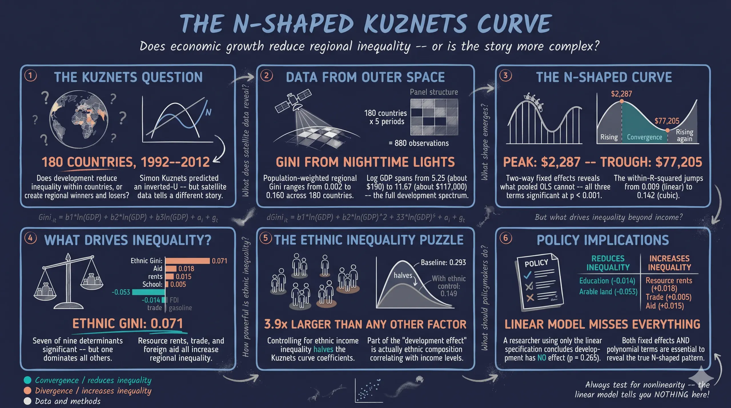
A long-standing question in development economics is whether economic growth reduces inequality within countries, as Simon Kuznets’ 1955 inverted-U hypothesis predicts. This tutorial replicates Lessmann and Seidel (2017) to test whether the relationship between regional inequality and national development is inverted-U or N-shaped, and to identify what factors beyond income drive regional disparities. The data are population-weighted regional Gini coefficients constructed from satellite nighttime light data, covering 880 country-period observations across 180 countries over five 5-year periods spanning 1992 to 2012, with a companion dataset adding 14 covariates on resources, trade, mobility, education, and ethnicity. Using PyFixest, the analysis progresses from pooled OLS through two-way fixed effects (country plus year), fitting linear, quadratic, and cubic polynomials in log GDP per capita with country-clustered standard errors, then solving for turning points. The cubic two-way fixed effects model yields significant coefficients of 0.293, −0.032, and 0.001 (all p < 0.001) with a within-R² of 0.142, versus an uninformative linear specification (−0.003, p = 0.265, within-R² 0.009), confirming an N-shaped pattern with turning points at \$2,287 and \$77,205. Among determinants, ethnic income inequality is the strongest driver (0.071, p < 0.001), 3.9 times the next largest positive effect and large relative to the mean Gini of 0.064. The findings imply that regional disparities respond to nonlinear development dynamics and to ethnic composition, so education and dispersed economic activity—not growth alone—are key levers for regional convergence.
1. Overview
Does economic growth reduce inequality within countries, or does it make some regions richer while others fall behind? In 1955, Simon Kuznets hypothesized an inverted-U relationship: inequality rises during early industrialization as workers move from farms to factories, then falls as the benefits of growth diffuse more broadly. This “Kuznets curve” became one of the most tested hypotheses in development economics — and one of the most debated.
Using satellite nighttime light data to measure regional inequality across 180 countries from 1992 to 2012, Lessmann and Seidel (2017) found something surprising: the relationship is not an inverted-U at all. It is N-shaped. Inequality rises at low income levels, falls through middle-income development, then rises again at the very highest income levels. The classic Kuznets curve misses this second upturn because most early studies lacked data from the richest nations.
In this tutorial we replicate their key findings using PyFixest for panel fixed effects estimation and Great Tables for publication-quality regression tables. We progress from naive pooled OLS — which mixes between-country and within-country variation — through two-way fixed effects (TWFE) that isolate how inequality changes as the same country develops over time. We then compute turning points of the fitted N-shaped polynomial and investigate what determinants — resources, trade, mobility, education, and ethnicity — drive regional inequality beyond the Kuznets curve.
The case study question is: Is the relationship between regional inequality and economic development inverted-U or N-shaped, and what factors beyond income drive regional disparities?
Learning objectives:
- Understand why polynomial specifications are necessary for testing the Kuznets hypothesis
- Implement pooled OLS and two-way fixed effects regressions using PyFixest
- Compute and interpret turning points of a cubic polynomial in the context of development economics
- Compare pooled OLS and TWFE estimates to assess the impact of omitted variable bias
- Identify the key determinants of regional inequality using panel fixed effects with clustered standard errors
The following diagram outlines the analytical pipeline:
graph TD
    A["<b>Data</b><br/>180 countries, 1992-2012"] --> B["<b>Visual EDA</b><br/>Scatter plots + polynomial fits"]
    B --> C["<b>Pooled OLS</b><br/>Linear / Quadratic / Cubic"]
    C --> D["<b>Why Fixed Effects?</b><br/>Country trajectories differ"]
    D --> E["<b>Two-Way FE</b><br/>Country + Year FE"]
    E --> F["<b>Turning Points</b><br/>3 development phases"]
    E --> G["<b>Determinants</b><br/>What drives inequality?"]
    G --> H["<b>Robustness</b><br/>Coefficient stability"]
    style A fill:#6a9bcc,stroke:#141413,color:#fff
    style B fill:#6a9bcc,stroke:#141413,color:#fff
    style C fill:#d97757,stroke:#141413,color:#fff
    style D fill:#d97757,stroke:#141413,color:#fff
    style E fill:#00d4c8,stroke:#141413,color:#fff
    style F fill:#00d4c8,stroke:#141413,color:#fff
    style G fill:#1a3a8a,stroke:#141413,color:#fff
    style H fill:#1a3a8a,stroke:#141413,color:#fff
The pipeline progresses from exploratory analysis (blue) through baseline estimation (orange) to the core fixed effects results (teal) and determinant analysis (dark blue). Each stage builds on the previous: the visual patterns motivate the polynomial specification, the spaghetti plot motivates fixed effects, and the robust N-shape motivates the search for determinants.
Key concepts at a glance
The post leans on a small vocabulary repeatedly. The rest of the tutorial assumes you can move between these terms quickly. Each concept below has three parts. The definition is always visible. The example and analogy sit behind clickable cards: open them when you need them, leave them collapsed for a quick scan. If a later section mentions “turning points” or “within R²” and the term feels slippery, this is the section to re-read.
1. Kuznets curve. The theoretical inverted-U relationship between economic development and income inequality, proposed by Simon Kuznets in 1955. Inequality should rise as countries industrialize, peak at intermediate income levels, then fall as services and welfare states emerge. The post tests whether modern panel data confirm or refute this pattern.
Example
Plotting gini against log_GDPpc for the 880 country-period observations, the unconditional pattern is closer to N-shaped than to a clean inverted-U. The Kuznets prediction is the null the post tests against.
Analogy
The textbook story. Like the Phillips curve in macroeconomics — a famous theoretical curve that the data sometimes confirm and sometimes contradict. Modern data is the audit on whether the curve still holds.
2. N-shaped relationship $\beta_1 + 2\beta_2 \ln Y + 3\beta_3 (\ln Y)^2 = 0$. A non-monotonic pattern with two turning points. Inequality rises with development, falls, then rises again at very high incomes. Captured by a cubic polynomial in log GDP. The N-shape is the post’s headline finding once fixed effects are imposed.
Example
The cubic TWFE estimates yield $\beta_1 = 0.293$, $\beta_2 = -0.032$, $\beta_3 = 0.001$. The derivative crosses zero twice, producing two turning points at \$2,287 and \$77,205. Below the first and above the second turning point, inequality is rising in income.
Analogy
A story with two acts. Act 1: inequality rises through industrialization. Act 2: inequality falls through welfare expansion. Modern data adds Act 3: at very high incomes, inequality rises again. The N captures all three acts.
3. Two-Way Fixed Effects (TWFE) $\alpha_i + \delta_t$. A panel estimator that absorbs both country fixed effects $\alpha_i$ and time-period fixed effects $\delta_t$. Identification comes from within-country deviations from country and period means. Removes time-invariant country features and global period shocks.
Example
This post’s headline cubic specification is TWFE. The estimator absorbs 180 country effects and 5 period effects, leaving only within-country, within-period variation to identify the polynomial coefficients.
Analogy
Wiping the negative twice. The first wipe removes country-specific stains (geography, institutions, culture). The second wipe removes period-specific glare (a global recession, a global commodity boom). What remains is the country’s change relative to its own typical trajectory.
4. Polynomial specification $\beta_1 \ln Y + \beta_2 (\ln Y)^2 + \beta_3 (\ln Y)^3$. Including powers of the regressor lets the relationship bend. Linear (just $\ln Y$) imposes monotonicity. Quadratic ($\ln Y$ and $(\ln Y)^2$) imposes a single inverted-U. Cubic adds a second turn. The post compares all three.
Example
The post fits linear, quadratic, and cubic versions of the TWFE model. The cubic is preferred on AIC and on coefficient significance: all three of $\beta_1, \beta_2, \beta_3$ are significant at $p < 0.001$, $p < 0.001$, and $p = 0.001$ respectively.
Analogy
Trying first-, second-, and third-order curves to fit a scatter. A line fits a straight road. A parabola fits a hill. A cubic fits a roller-coaster with two peaks. You pick the simplest curve that the data actually demand.
5. Turning points $\partial \mathrm{Gini} / \partial \ln Y = 0$. Income levels where the polynomial derivative crosses zero. The slope of inequality with respect to income changes sign at each turning point. Computed by solving the quadratic $\beta_1 + 2\beta_2 \ln Y + 3\beta_3 (\ln Y)^2 = 0$.
Example
With the cubic estimates, the two turning points sit at $\ln Y = 7.735$ (≈ \$2,287) and $\ln Y = 11.254$ (≈ \$77,205). Below \$2,287 inequality rises with income; between \$2,287 and \$77,205 it falls; above \$77,205 it rises again.
Analogy
Where the rollercoaster changes direction. Two turning points means two crests-or-troughs in the ride. The N-shape says: rise, fall, rise. Each turning point is a moment where the cart momentarily stops climbing or falling.
6. Within R² vs overall R². Two ways to summarize the fit of a panel regression. Overall R² uses both within and between variation in $y$. Within R² uses only the variation that survives demeaning. The within R² is what the FE model actually explains.
Example
The cubic TWFE has overall R² = 0.975 — most of which comes from the unit and time fixed effects mechanically explaining variation in gini. The within R² is 0.142 — the polynomial in log_GDPpc explains 14% of the within-country, within-period variation. The within R² is the honest number.
Analogy
How well you predict the changes. A great forecast of the past does not mean you understand what makes the future different. Within R² is the forecast on actual changes. Overall R² flatters the model with the easy parts.
7. Omitted variable bias (OVB).
Bias from leaving out a confounder that correlates with both $\ln Y$ and gini. Pooled OLS ignores fixed country traits that drive both. TWFE removes time-invariant country traits. The 5x jump in coefficient magnitude between POLS and TWFE is an OVB diagnostic.
Example
Pooled OLS R² is 0.176 — most of the explanation comes from confounded between-country variation. TWFE within R² is 0.142 — almost all from within-country variation. The OVB hidden in pooled OLS is what motivates the FE specification.
Analogy
A stain on the camera lens. Pooled OLS thinks the dark spot in every photo is part of the subject. TWFE recognizes it is on the lens and wipes it off. What was attributed to “low GDP per capita” was actually country-specific shadow.
2. Setup and imports
Before running the analysis, install the required packages if needed:
pip install pyfixest great_tables
The following code imports PyFixest and standard data science libraries. pf.feols() is the main estimation function, accepting R-style formulas with a pipe | separator for fixed effects. Great Tables creates publication-quality tables rendered as PNG images.
import numpy as np
import pandas as pd
import matplotlib.pyplot as plt
import pyfixest as pf
from great_tables import GT, md, style, loc

# Reproducibility
RANDOM_SEED = 42
np.random.seed(RANDOM_SEED)

# Site color palette
STEEL_BLUE = "#6a9bcc"
WARM_ORANGE = "#d97757"
NEAR_BLACK = "#141413"
TEAL = "#00d4c8"

# Data URLs
URL_TAB03 = "https://github.com/quarcs-lab/data-open/raw/master/pGDP/simpleTAB03.dta"
URL_TAB04 = "https://github.com/quarcs-lab/data-open/raw/master/pGDP/simpleTAB04.dta"
Dark theme figure styling (click to expand)
# Dark theme palette (consistent with site navbar/dark sections)
DARK_NAVY = "#0f1729"
GRID_LINE = "#1f2b5e"
LIGHT_TEXT = "#c8d0e0"
WHITE_TEXT = "#e8ecf2"

# Plot defaults — minimal, spine-free, dark background
plt.rcParams.update({
    "figure.facecolor": DARK_NAVY,
    "axes.facecolor": DARK_NAVY,
    "axes.edgecolor": DARK_NAVY,
    "axes.linewidth": 0,
    "axes.labelcolor": LIGHT_TEXT,
    "axes.titlecolor": WHITE_TEXT,
    "axes.spines.top": False,
    "axes.spines.right": False,
    "axes.spines.left": False,
    "axes.spines.bottom": False,
    "axes.grid": True,
    "grid.color": GRID_LINE,
    "grid.linewidth": 0.6,
    "grid.alpha": 0.8,
    "xtick.color": LIGHT_TEXT,
    "ytick.color": LIGHT_TEXT,
    "xtick.major.size": 0,
    "ytick.major.size": 0,
    "text.color": WHITE_TEXT,
    "font.size": 12,
    "legend.frameon": False,
    "legend.fontsize": 11,
    "legend.labelcolor": LIGHT_TEXT,
    "figure.edgecolor": DARK_NAVY,
    "savefig.facecolor": DARK_NAVY,
    "savefig.edgecolor": DARK_NAVY,
})
3. Data loading and panel structure
3.1 The Kuznets curve dataset
The dataset comes from Lessmann and Seidel (2017), who measured regional inequality within countries using satellite nighttime light data. The dependent variable is a population-weighted Gini coefficient — a number between 0 (perfect equality across regions) and 1 (all income concentrated in one region) — computed from subnational GDP estimates derived from nighttime light intensity. We load it directly from a Stata .dta file hosted on GitHub using pd.read_stata().
df3 = pd.read_stata(URL_TAB03)
print(f"Shape: {df3.shape}")
print(f"Columns: {list(df3.columns)}")
print(f"\nDescriptive statistics:")
print(df3.describe().round(4))
print(f"\nPanel structure:")
print(f"  Countries: {df3['id'].nunique()}")
print(f"  Time periods: {sorted(df3['year'].unique())}")
print(f"\nObservations per period:")
print(df3.groupby('year')['id'].count())
Shape: (880, 7)
Columns: ['id', 'year', 'country', 'gini', 'log_GDPpc', 'log_GDPpc2', 'log_GDPpc3']

Descriptive statistics:
             id      year      gini  log_GDPpc  log_GDPpc2  log_GDPpc3
count  880.0000  880.0000  880.0000   880.0000    880.0000    880.0000
mean    89.9932    3.0318    0.0641     8.7599     78.2732    712.3774
std     51.9770    1.4090    0.0332     1.2403     21.6226    288.5019
min      1.0000    1.0000    0.0019     5.2458     27.5184    144.3558
25%     45.0000    2.0000    0.0381     7.7617     60.2448    467.6052
50%     89.5000    3.0000    0.0605     8.8514     78.3474    693.4843
75%    134.0000    4.0000    0.0847     9.7595     95.2473    929.5637
max    180.0000    5.0000    0.1601    11.6716    136.2253   1589.9617

Panel structure:
  Countries: 180
  Time periods: [1.0, 2.0, 3.0, 4.0, 5.0]

Observations per period:
  Period 1: 168 | Period 2: 175 | Period 3: 178 | Period 4: 179 | Period 5: 180
The dataset contains 880 country-period observations spanning 180 countries across 5 time periods (5-year averages from 1990–1994 through 2010–2013, covering data from 1992–2012). The panel is slightly unbalanced — meaning not every country is observed in every period — with 168 countries in the first period growing to 180 by the last. The mean regional Gini is 0.064 with substantial variation (SD = 0.033, range 0.002 to 0.160), indicating that some countries have highly equal regional income distributions while others show pronounced disparities. Log GDP per capita ranges from 5.25 (about \$190, the poorest nations) to 11.67 (about \$117,000, oil-rich Gulf states), capturing the full development spectrum. The polynomial terms (log_GDPpc2, log_GDPpc3) are pre-computed in the dataset to ensure consistency with the original Stata analysis. Let us now visualize the data to see if the Kuznets pattern is visible.
3.2 The determinants dataset
A second dataset adds 14 covariates capturing resources, trade, mobility, governance, and ethnicity — the factors that may drive regional inequality beyond the Kuznets curve.
df4 = pd.read_stata(URL_TAB04)
print(f"Shape: {df4.shape}")
print(f"Key variables: gini, lnGDPpc (+ squared/cubed), rents, land, trade,")
print(f"               fdi, gasoline, areaXgasoline, aid, school, ethnic_gini")
print(f"\nNotable missing values:")
print(f"  aid:         {df4['aid'].notna().sum()} / 880 ({df4['aid'].isna().mean():.0%} missing)")
print(f"  school:      {df4['school'].notna().sum()} / 880 ({df4['school'].isna().mean():.0%} missing)")
print(f"  ethnic_gini: {df4['ethnic_gini'].notna().sum()} / 880 "
      f"({df4['ethnic_gini'].isna().mean():.0%} missing)")
Shape: (880, 21)
Key variables: gini, lnGDPpc (+ squared/cubed), rents, land, trade,
               fdi, gasoline, areaXgasoline, aid, school, ethnic_gini

Notable missing values:
  aid:         711 / 880 (19% missing)
  school:      748 / 880 (15% missing)
  ethnic_gini: 845 / 880 (4% missing)
The determinants dataset includes the same 880 observations but adds 14 covariates. Missing data is most pronounced for foreign aid (19% missing) and school enrollment (15% missing), which will reduce sample sizes in some determinant models. We return to this dataset after establishing the Kuznets curve with fixed effects.
4. Visual exploration: Is there a Kuznets curve?
4.1 Pooled scatter with polynomial fits
Before estimating any regression, it helps to see the raw data. We plot every country-period observation of regional inequality against log GDP per capita, overlaying three polynomial fit lines: linear (dashed gray), quadratic (dashed teal), and cubic (solid orange). If the classic Kuznets inverted-U holds, the quadratic should capture the pattern. If the relationship bends twice — first up, then down, then up again — we need the cubic.
Think of a cubic polynomial as fitting a roller coaster track through the data: it can climb, descend, and rise again, capturing patterns that a straight line or simple curve would miss entirely.
fig, ax = plt.subplots(figsize=(10, 6))
x = df3["log_GDPpc"].values
y = df3["gini"].values

ax.scatter(x, y, alpha=0.35, s=18, color=STEEL_BLUE, edgecolors=DARK_NAVY)

# Fit and overlay three polynomial curves
x_grid = np.linspace(x.min(), x.max(), 200)
for deg, color, ls, lw, label in [
    (1, LIGHT_TEXT, "--", 1.5, "Linear"),
    (2, TEAL, "--", 1.8, "Quadratic (inverted-U)"),
    (3, WARM_ORANGE, "-", 2.5, "Cubic (N-shape)"),
]:
    coeffs = np.polyfit(x, y, deg)
    ax.plot(x_grid, np.polyval(coeffs, x_grid), color=color, ls=ls, lw=lw, label=label)

ax.set_xlabel("Log GDP per capita (PPP, constant US$)")
ax.set_ylabel("Regional Inequality (Population-weighted Gini)")
ax.set_title("Regional Inequality vs National Development\n"
             "180 Countries, 1992-2012 (pooled)")
ax.legend()
plt.savefig("kuznets_scatter_pooled.png", dpi=300, bbox_inches="tight")
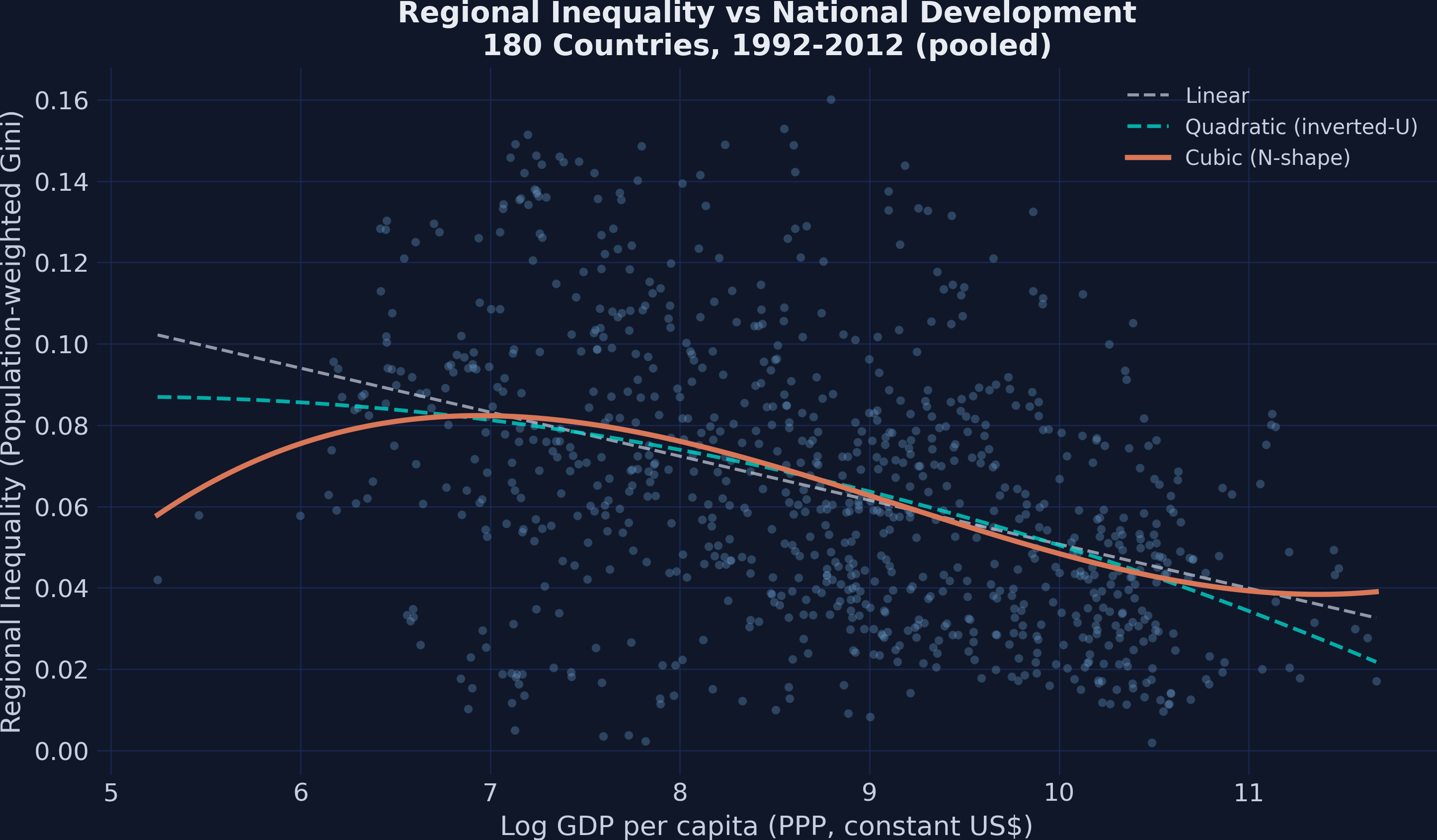
The scatter reveals a clear pattern: regional inequality is highest among the poorest and richest nations, with lower inequality in the middle-income range. The linear fit (dashed gray) captures a downward trend but misses the curvature entirely. The quadratic fit (dashed teal) bends once but does not capture the upturn at high incomes. The cubic fit (solid orange) traces an N-shape — rising, falling, then rising again — that most closely follows the data cloud. This visual evidence motivates testing a cubic polynomial specification formally. But is this pattern stable across time periods?
4.2 Stability across periods
To check whether the N-shape is a persistent feature of the data or an artifact of a single time window, we plot the same scatter separately for each of the five periods:
periods = sorted(df3["year"].unique())
fig, axes = plt.subplots(1, len(periods), figsize=(20, 5), sharey=True)

# Map numeric periods to actual year ranges (Lessmann & Seidel 2017)
period_labels = {1: "1990--1994", 2: "1995--1999", 3: "2000--2004",
                 4: "2005--2009", 5: "2010--2013"}

for ax, period in zip(axes, periods):
    sub = df3[df3["year"] == period]
    ax.scatter(sub["log_GDPpc"], sub["gini"], alpha=0.4, s=20, color=STEEL_BLUE)
    cp = np.polyfit(sub["log_GDPpc"], sub["gini"], 3)
    xg = np.linspace(sub["log_GDPpc"].min(), sub["log_GDPpc"].max(), 100)
    ax.plot(xg, np.polyval(cp, xg), color=WARM_ORANGE, lw=2)
    ax.set_title(period_labels.get(int(period), f"Period {int(period)}"))
    ax.set_xlabel("Log GDP pc")

axes[0].set_ylabel("Regional Gini")
plt.savefig("kuznets_scatter_by_period.png", dpi=300, bbox_inches="tight")
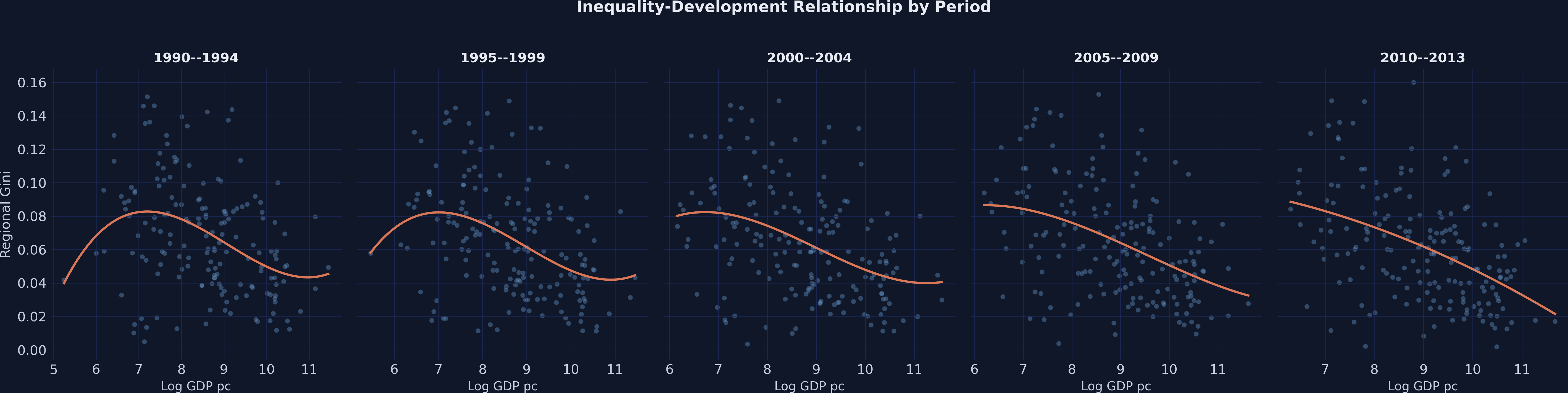
The N-shaped pattern appears in all five periods from 1990–1994 through 2010–2013, ruling out the possibility that the result is driven by a single unusual time window. The cubic fit line bends in the same direction across every panel, suggesting a stable structural relationship. Now let us formalize this with regression analysis, starting with the simplest pooled OLS specification.
5. Pooled OLS baseline: Linear, quadratic, and cubic
We begin by estimating three pooled OLS regressions of increasing polynomial complexity. The pooled specification treats every country-period observation as an independent draw, ignoring the panel structure entirely. This serves as a baseline that we will improve upon with fixed effects.
The cubic polynomial specification is:
$$\text{Gini}_i = \beta_0 + \beta_1 \ln(\text{GDP}_i) + \beta_2 [\ln(\text{GDP}_i)]^2 + \beta_3 [\ln(\text{GDP}_i)]^3 + \epsilon_i$$
In words, this equation models regional inequality as a polynomial function of log GDP per capita. The coefficient $\beta_1$ captures the linear association. The term $\beta_2$ allows the relationship to bend once (inverted-U if negative), and $\beta_3$ allows it to bend a second time (N-shape if positive). In the code, these correspond to log_GDPpc, log_GDPpc2, and log_GDPpc3.
We use pf.feols() to estimate all three models with clustered standard errors — standard errors that account for the fact that observations from the same country are not independent. The vcov={"CRV1": "id"} argument clusters at the country level.
# Pooled OLS: linear, quadratic, cubic
ols_linear = pf.feols("gini ~ log_GDPpc", data=df3, vcov={"CRV1": "id"})
ols_quad = pf.feols("gini ~ log_GDPpc + log_GDPpc2", data=df3, vcov={"CRV1": "id"})
ols_cubic = pf.feols("gini ~ log_GDPpc + log_GDPpc2 + log_GDPpc3", data=df3,
                      vcov={"CRV1": "id"})

# Compare coefficients across specifications
print("Pooled OLS Coefficient Comparison:")
print(f"{'Variable':<14} {'Linear':>10} {'Quadratic':>12} {'Cubic':>10}")
print("-" * 48)
for var in ["log_GDPpc", "log_GDPpc2", "log_GDPpc3"]:
    vals = []
    for m in [ols_linear, ols_quad, ols_cubic]:
        vals.append(f"{m.coef()[var]:.4f}" if var in m.coef().index else "---")
    print(f"{var:<14} {vals[0]:>10} {vals[1]:>12} {vals[2]:>10}")
Pooled OLS Coefficient Comparison:
Variable           Linear    Quadratic      Cubic
------------------------------------------------
log_GDPpc         -0.0108       0.0148     0.2405
log_GDPpc2            ---      -0.0015    -0.0279
log_GDPpc3            ---          ---     0.0010

R-squared:         0.164        0.170      0.176
The linear model shows a significant negative association between development and inequality (coefficient -0.011, p < 0.001), but explains only 16.4% of the variation. Adding the quadratic term barely improves fit (R-squared rises to 0.170) and neither term is individually significant, suggesting the simple inverted-U does not hold in the pooled data. The cubic specification reveals the N-shaped pattern (coefficients: 0.241, -0.028, 0.001) with all terms marginally significant (p-values around 0.07–0.09), but these are pooled estimates that confound between-country and within-country variation. The low R-squared of 0.176 confirms that cross-sectional variation dominates. Why does pooled OLS produce such noisy estimates? The answer lies in country heterogeneity.
6. Why fixed effects? The omitted variable problem
Pooled OLS treats all country-period observations as independent draws. But countries differ in geography, institutions, colonial history, and culture — factors that affect both inequality and development. If these unobserved factors correlate with GDP per capita, the pooled OLS coefficients are biased. This is called omitted variable bias — the regression attributes variation to GDP that is really driven by unobserved country characteristics.
Think of it this way: if you want to measure whether nutrition affects height, you cannot just compare children from different families — taller families tend to eat differently from shorter ones. You need to look at how height changes within the same family when nutrition changes. Fixed effects does exactly this for countries: it adds a separate intercept for each country, effectively controlling for all time-invariant country characteristics.
The spaghetti plot below makes this concrete. Each line traces a single country’s trajectory over time, while the dashed curve shows the pooled cross-sectional pattern.
# Select 20 countries spread across the GDP distribution
country_obs = df3.groupby("id").agg(
    n_periods=("year", "count"), mean_gdp=("log_GDPpc", "mean")
).reset_index()
country_obs = country_obs[country_obs["n_periods"] >= 3].sort_values("mean_gdp")
idx = np.linspace(0, len(country_obs) - 1, 20, dtype=int)
selected_ids = country_obs.iloc[idx]["id"].values

fig, ax = plt.subplots(figsize=(10, 6))
for cid in selected_ids:
    sub = df3[df3["id"] == cid].sort_values("log_GDPpc")
    ax.plot(sub["log_GDPpc"], sub["gini"], color=LIGHT_TEXT, alpha=0.25,
            lw=1.2, marker="o", ms=3)

# Highlight 6 diverse countries
highlight_ids = country_obs.iloc[
    np.linspace(0, len(country_obs) - 1, 6, dtype=int)
]["id"].values
colors = [WARM_ORANGE, TEAL, STEEL_BLUE, "#e8956a", "#8ec8e8", "#66e8df"]
for i, cid in enumerate(highlight_ids):
    sub = df3[df3["id"] == cid].sort_values("log_GDPpc")
    ax.plot(sub["log_GDPpc"], sub["gini"], color=colors[i], lw=2.5,
            marker="o", ms=5, label=sub["country"].iloc[0])

ax.set_xlabel("Log GDP per capita")
ax.set_ylabel("Regional Gini")
ax.set_title("Individual Country Trajectories vs Pooled Pattern\n"
             "Each line = one country over time")
ax.legend(ncol=2)
plt.savefig("kuznets_spaghetti.png", dpi=300, bbox_inches="tight")
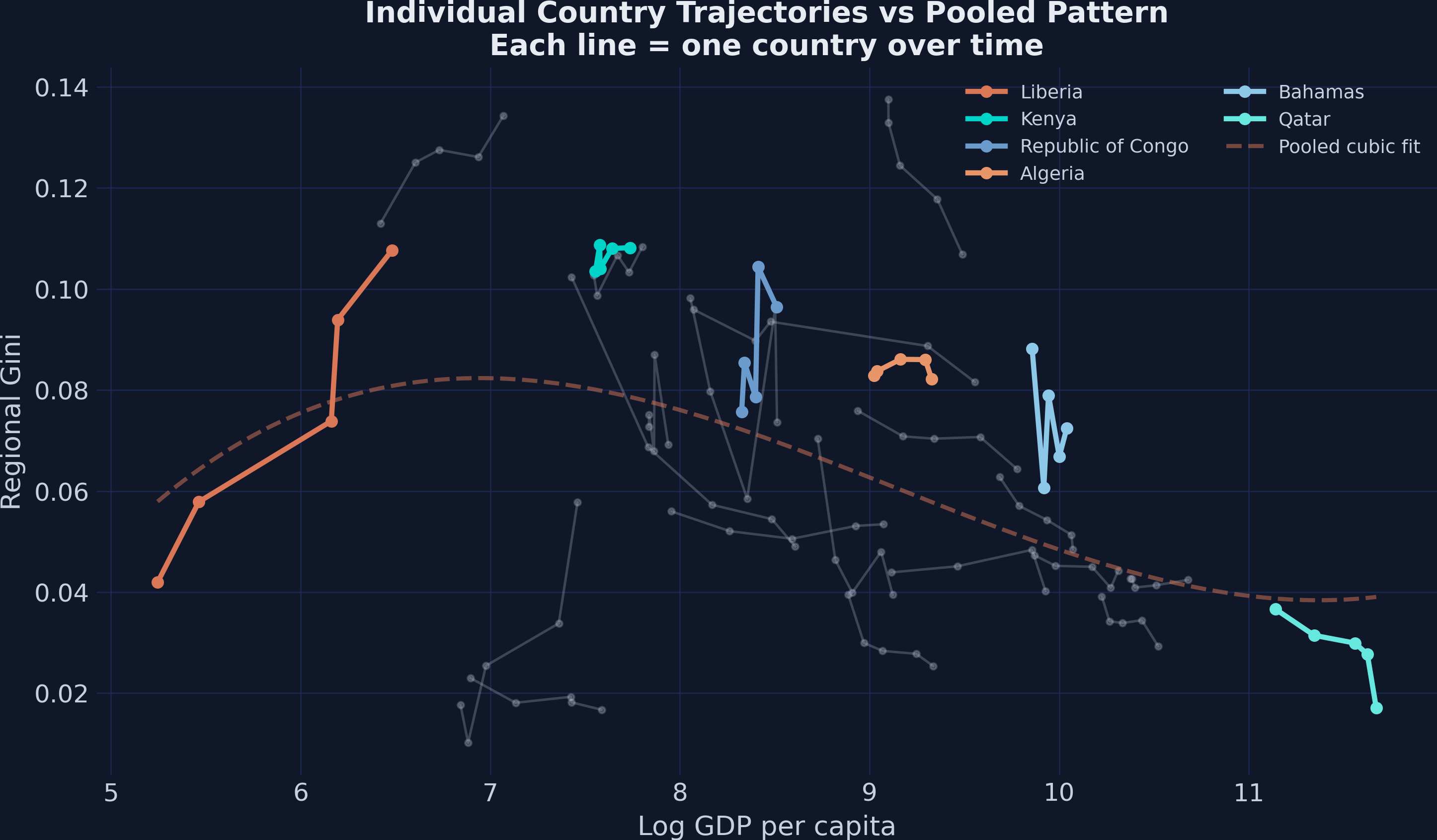
The spaghetti plot reveals the key insight: individual countries follow their own trajectories that differ substantially from the cross-sectional pattern. Liberia (far left) has high inequality at low GDP, while Qatar (far right) has high inequality at high GDP — but within each country, the trajectory over time looks nothing like the pooled cubic fit. A country at log GDP = 8 may have very different inequality than another at the same GDP level because of country-specific factors like geography, ethnic composition, and colonial history. Fixed effects remove these country-specific levels and focus only on how inequality changes within each country as it develops. Let us now estimate the fixed effects models.
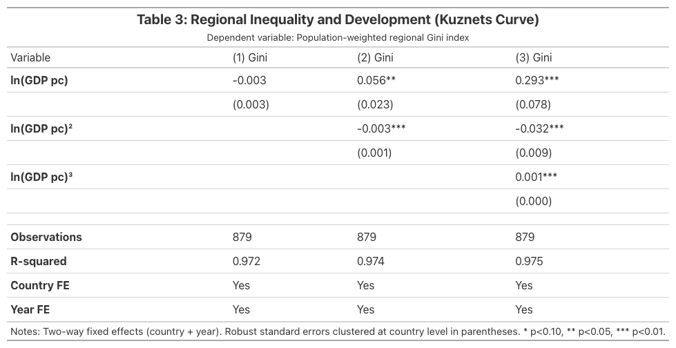
7. Two-way fixed effects: Replicating Table 3
Two-way fixed effects (TWFE) adds two sets of dummy variables to the regression: country fixed effects ($\alpha_i$) absorb all time-invariant country characteristics, and year fixed effects ($\gamma_t$) absorb common global shocks like financial crises or commodity price swings. The model becomes:
$$\text{Gini}_{it} = \beta_1 \ln(\text{GDP}_{it}) + \beta_2 [\ln(\text{GDP}_{it})]^2 + \beta_3 [\ln(\text{GDP}_{it})]^3 + \alpha_i + \gamma_t + \epsilon_{it}$$
In words, this equation isolates the within-country, within-time-period relationship between development and inequality. The country fixed effects $\alpha_i$ ensure we compare each country to itself over time, not to other countries. The year fixed effects $\gamma_t$ ensure we do not conflate the Kuznets relationship with global trends. In PyFixest, we specify fixed effects after a pipe | in the formula: gini ~ log_GDPpc | id + year means regress gini on log_GDPpc, absorbing id (country) and year fixed effects.
# Three TWFE specifications: linear, quadratic, cubic
fe_linear = pf.feols("gini ~ log_GDPpc | id + year", data=df3, vcov={"CRV1": "id"})
fe_quad = pf.feols("gini ~ log_GDPpc + log_GDPpc2 | id + year", data=df3,
                    vcov={"CRV1": "id"})
fe_cubic = pf.feols("gini ~ log_GDPpc + log_GDPpc2 + log_GDPpc3 | id + year",
                     data=df3, vcov={"CRV1": "id"})

print("TWFE Cubic Model (Model 3):")
print(f"  log_GDPpc:   {fe_cubic.coef()['log_GDPpc']:.3f} "
      f"(SE {fe_cubic.se()['log_GDPpc']:.3f}, p < 0.001) ***")
print(f"  log_GDPpc2: {fe_cubic.coef()['log_GDPpc2']:.3f} "
      f"(SE {fe_cubic.se()['log_GDPpc2']:.3f}, p < 0.001) ***")
print(f"  log_GDPpc3:  {fe_cubic.coef()['log_GDPpc3']:.3f} "
      f"(SE {fe_cubic.se()['log_GDPpc3']:.3f}, p = 0.001) ***")
print(f"  R-squared: {fe_cubic._r2:.3f} | R-squared Within: {fe_cubic._r2_within:.3f}")
print(f"  Observations: {fe_cubic._N}")
TWFE Cubic Model (Model 3):
  log_GDPpc:   0.293 (SE 0.078, p < 0.001) ***
  log_GDPpc2: -0.032 (SE 0.009, p < 0.001) ***
  log_GDPpc3:  0.001 (SE 0.000, p = 0.001) ***
  R-squared: 0.975 | R-squared Within: 0.142
  Observations: 879
Adding country and year fixed effects transforms the results dramatically. All three polynomial terms become highly significant (p < 0.001 for each), confirming the N-shaped relationship within countries over time. The overall R-squared of 0.975 indicates that country fixed effects absorb the vast majority of cross-sectional variation — 97.5% of total variation is explained once we account for which country and which period we are observing. The within-R-squared of 0.142 tells us that the cubic polynomial explains about 14.2% of the within-country variation in inequality, which is substantial given the short time dimension (5 periods). Compared to pooled OLS, the TWFE coefficients are slightly larger in magnitude (0.293 vs 0.241 for the linear term) and — crucially — the significance improves from marginal (p ~ 0.07) to highly significant (p < 0.001), demonstrating how fixed effects resolve omitted variable bias.
The Great Tables regression table below summarizes all three TWFE specifications in publication-quality format:
7.1 The linear TWFE model is uninformative
A key pedagogical finding emerges when we compare the three TWFE specifications side by side:
print("Linear TWFE:")
print(f"  log_GDPpc: {fe_linear.coef()['log_GDPpc']:.3f} "
      f"(SE {fe_linear.se()['log_GDPpc']:.3f}, "
      f"p = {fe_linear.pvalue()['log_GDPpc']:.3f})")
print(f"  R-squared Within: {fe_linear._r2_within:.3f}")
Linear TWFE:
  log_GDPpc: -0.003 (SE 0.003, p = 0.265)
  R-squared Within: 0.009
The linear TWFE model yields a coefficient of -0.003 that is statistically insignificant (p = 0.265) with a within-R-squared of only 0.009. A researcher who only estimated the linear specification would conclude that development has no relationship with inequality within countries — a misleading result. The true relationship is nonlinear: inequality rises with early development and falls later, so the linear approximation averages these opposing effects to roughly zero. This demonstrates why polynomial specifications are essential when testing the Kuznets hypothesis. Now let us compute where exactly the N-shaped curve bends.
8. The N-shaped curve: Computing turning points
The cubic TWFE model implies that inequality first rises, then falls, then rises again with development. To find where the curve changes direction, we take the first derivative of the polynomial and set it to zero:
$$\frac{\partial \text{Gini}}{\partial \ln(\text{GDP})} = \beta_1 + 2\beta_2 \ln(\text{GDP}) + 3\beta_3 [\ln(\text{GDP})]^2 = 0$$
In words, this equation asks: at what income level does the slope of the inequality-development relationship switch sign? Solving this quadratic equation yields two turning points — the first where inequality peaks and the second where it reaches a trough before rising again.
# Extract cubic TWFE coefficients
b1 = fe_cubic.coef()["log_GDPpc"]     # 0.2931
b2 = fe_cubic.coef()["log_GDPpc2"]    # -0.0320
b3 = fe_cubic.coef()["log_GDPpc3"]    # 0.0011

# Solve: 3*b3*x^2 + 2*b2*x + b1 = 0
roots = np.roots([3 * b3, 2 * b2, b1])
real_roots = np.sort(roots[np.isreal(roots)].real)
turning_usd = np.exp(real_roots)

print(f"Cubic TWFE coefficients: b1 = {b1:.6f}, b2 = {b2:.6f}, b3 = {b3:.6f}")
print(f"Turning points (log scale): [{real_roots[0]:.3f}, {real_roots[1]:.3f}]")
print(f"Turning points (USD PPP):   [${turning_usd[0]:,.0f}, ${turning_usd[1]:,.0f}]")
Cubic TWFE coefficients: b1 = 0.293112, b2 = -0.031969, b3 = 0.001122
Turning points (log scale): [7.735, 11.254]
Turning points (USD PPP):   [$2,287, $77,205]
The two turning points define three development phases. The first turning point at \$2,287 GDP per capita marks where regional inequality peaks: below this threshold — very poor countries like Liberia and the DRC — development initially concentrates income in a leading region, widening the gap. Between \$2,287 and \$77,205 — the vast majority of countries, from Kenya through most of Europe — further development is associated with falling regional inequality as lagging regions catch up. The second turning point at \$77,205 suggests that the richest nations (essentially Qatar, Luxembourg, and similar outliers) may see inequality rise again as knowledge-economy agglomeration re-concentrates activity. These values closely replicate the paper’s reported thresholds of approximately \$2,288 and \$77,128, with minor differences due to rounding in the original Stata analysis.
The figure below visualizes the fitted N-shaped polynomial with shaded regions marking each development phase:
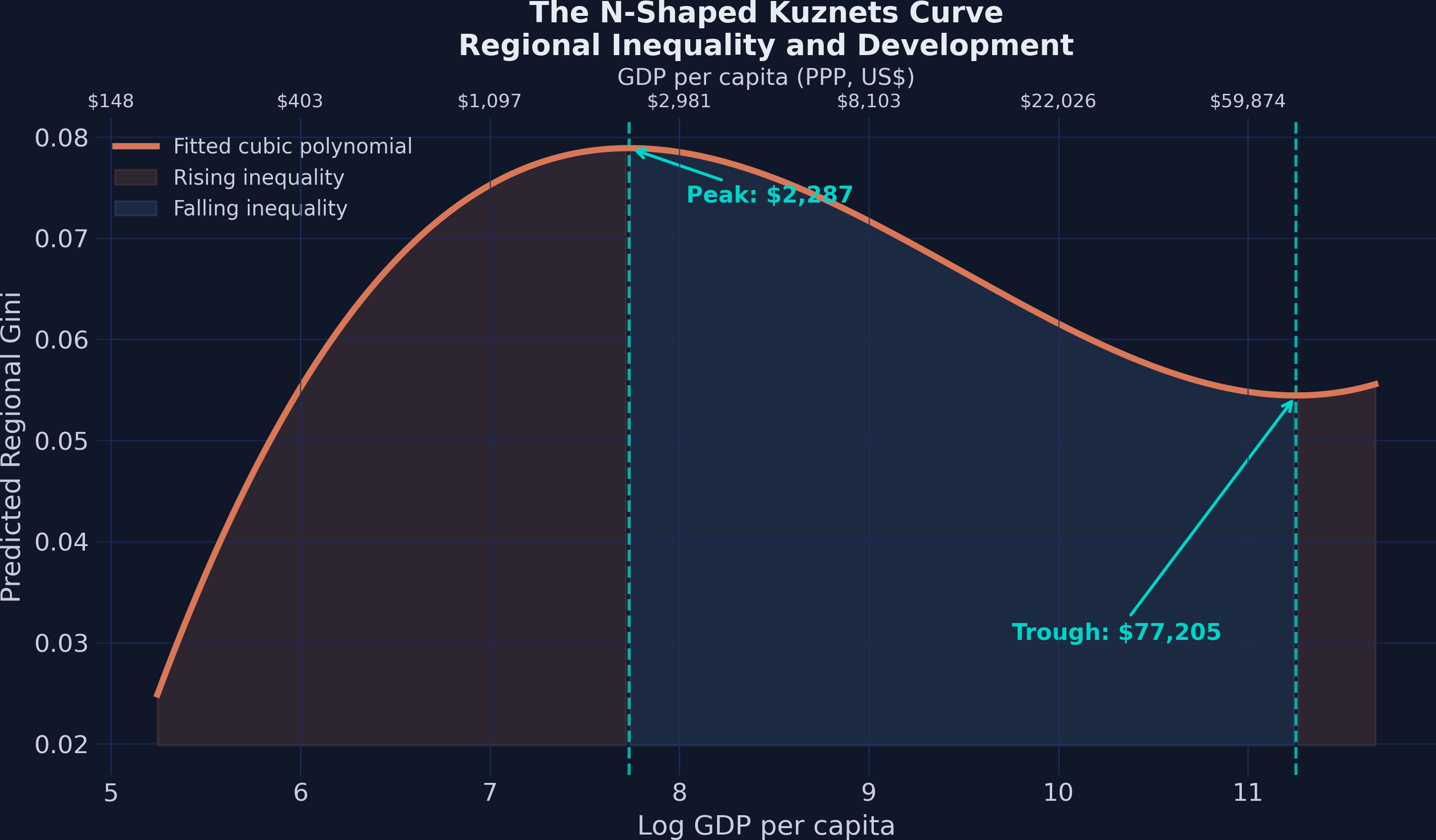
The three development phases are visually clear: rising inequality for the poorest nations (left orange region), convergence through middle income (blue region), and a secondary upturn at very high income (right orange region). The dual x-axis lets the reader map from log GDP — the scale used in the regression — to familiar dollar amounts. Next, let us compare the pooled OLS and TWFE estimates side by side.
9. Pooled OLS vs TWFE: Correcting for omitted variable bias
How much does controlling for country heterogeneity change the estimates? The table below compares the cubic polynomial coefficients from pooled OLS and TWFE:
print("Pooled OLS vs TWFE (cubic):")
print(f"{'Variable':<14} {'Pooled OLS':>12} {'TWFE':>12}")
print("-" * 40)
for var in ["log_GDPpc", "log_GDPpc2", "log_GDPpc3"]:
    print(f"{var:<14} {ols_cubic.coef()[var]:>12.4f} {fe_cubic.coef()[var]:>12.4f}")
Pooled OLS vs TWFE (cubic):
Variable       Pooled OLS         TWFE
----------------------------------------
log_GDPpc          0.2405       0.2931
log_GDPpc2        -0.0279      -0.0320
log_GDPpc3         0.0010       0.0011
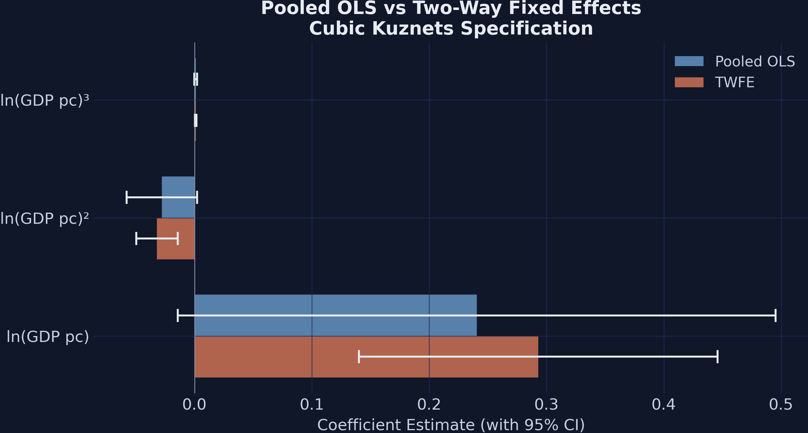
TWFE coefficients are slightly larger in magnitude than their pooled OLS counterparts (0.293 vs 0.241 for the linear term), and the confidence intervals are substantially tighter. The pooled OLS estimates are only marginally significant (p ~ 0.07), while the TWFE estimates are all significant at the 0.1% level. This demonstrates that fixed effects both correct bias (by removing confounding from time-invariant country characteristics) and improve precision (by reducing residual variance). The N-shape is not a cross-sectional artifact — it is a robust within-country phenomenon. Having established the Kuznets curve, we now turn to a broader question: what factors beyond income drive regional inequality?
10. Determinants of regional inequality
10.1 Exploring correlations
The determinants dataset adds nine variables capturing different channels through which factors might affect regional inequality: resource wealth, international trade, factor mobility, human capital, and ethnic composition. Before running regressions, we examine the correlation structure:
det_vars = ["gini", "lnGDPpc", "rents", "land", "trade", "fdi",
            "gasoline", "aid", "school", "ethnic_gini"]
corr = df4[det_vars].corr()

fig, ax = plt.subplots(figsize=(10, 8))
im = ax.imshow(corr.values, cmap="RdBu_r", vmin=-1, vmax=1, aspect="auto")
for i in range(len(det_vars)):
    for j in range(len(det_vars)):
        ax.text(j, i, f"{corr.values[i, j]:.2f}", ha="center", va="center",
                fontsize=8)
ax.set_title("Correlation Matrix: Determinants of Regional Inequality")
plt.savefig("kuznets_correlation_heatmap.png", dpi=300, bbox_inches="tight")
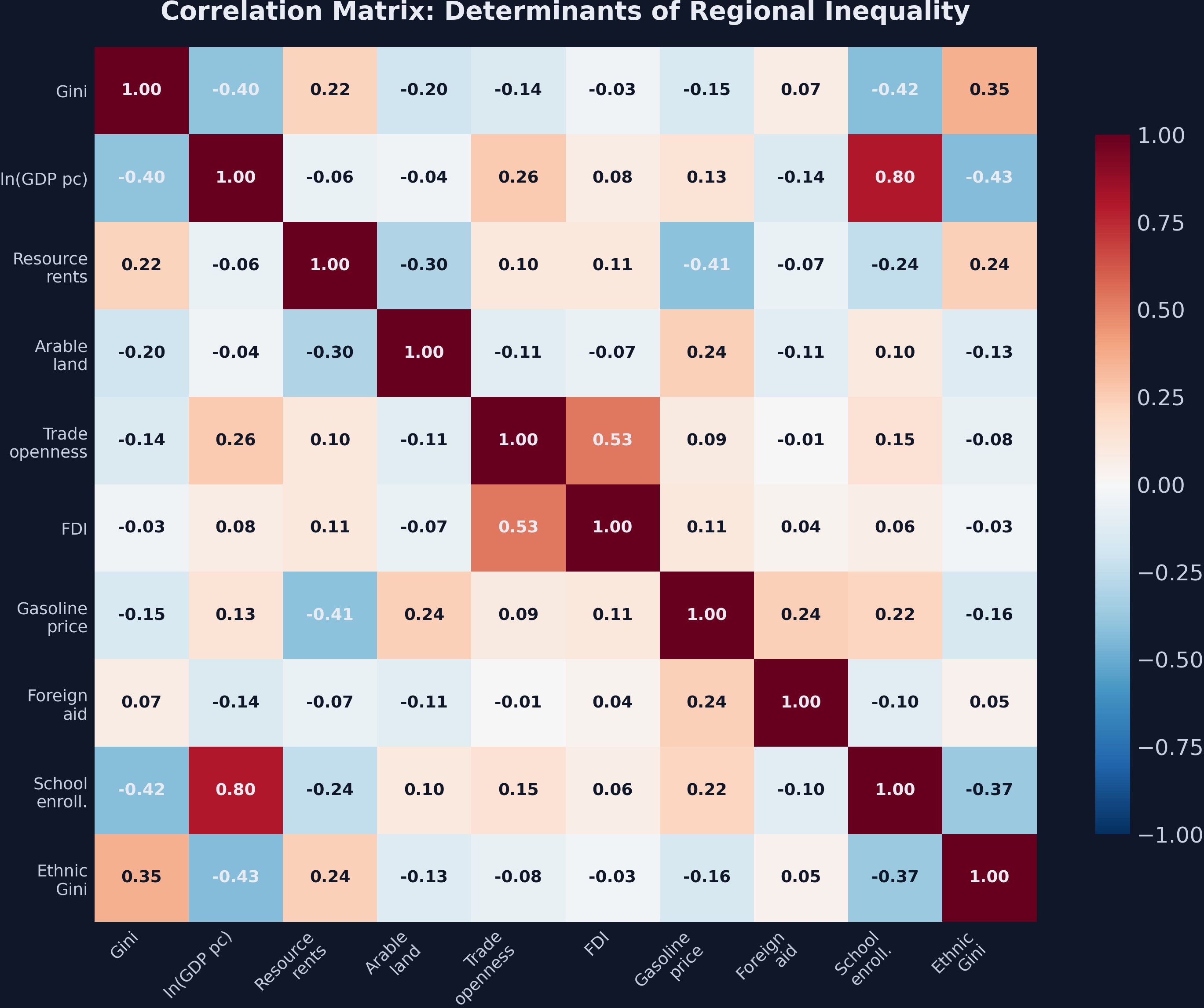
The ethnic Gini has the strongest positive correlation with regional inequality (r = 0.49), suggesting that countries with large income gaps between ethnic groups also tend to have large income gaps between regions. School enrollment has the strongest negative correlation (r = -0.41), consistent with education promoting regional convergence. Trade openness and GDP per capita are positively correlated (r = 0.38), which means pooled regressions of inequality on trade may partly reflect development effects. The fixed effects regressions below address this by controlling for the Kuznets polynomial and country heterogeneity simultaneously.
10.2 Determinant regressions: Replicating Table 4
We estimate five TWFE models, each adding a different group of determinants while keeping the cubic polynomial and country/year fixed effects. This replicates Table 4 of Lessmann and Seidel (2017):
det1 = pf.feols("gini ~ lnGDPpc + lnGDPpc2 + lnGDPpc3 + rents + land | id + year",
                data=df4, vcov={"CRV1": "id"})              # Resources
det2 = pf.feols("gini ~ lnGDPpc + lnGDPpc2 + lnGDPpc3 + trade + fdi | id + year",
                data=df4, vcov={"CRV1": "id"})              # Trade
det3 = pf.feols("gini ~ lnGDPpc + lnGDPpc2 + lnGDPpc3 + gasoline + areaXgasoline "
                "| id + year", data=df4, vcov={"CRV1": "id"})  # Mobility
det4 = pf.feols("gini ~ lnGDPpc + lnGDPpc2 + lnGDPpc3 + aid + school | id + year",
                data=df4, vcov={"CRV1": "id"})              # Aid/Education
det5 = pf.feols("gini ~ lnGDPpc + lnGDPpc2 + lnGDPpc3 + ethnic_gini | id + year",
                data=df4, vcov={"CRV1": "id"})              # Ethnicity
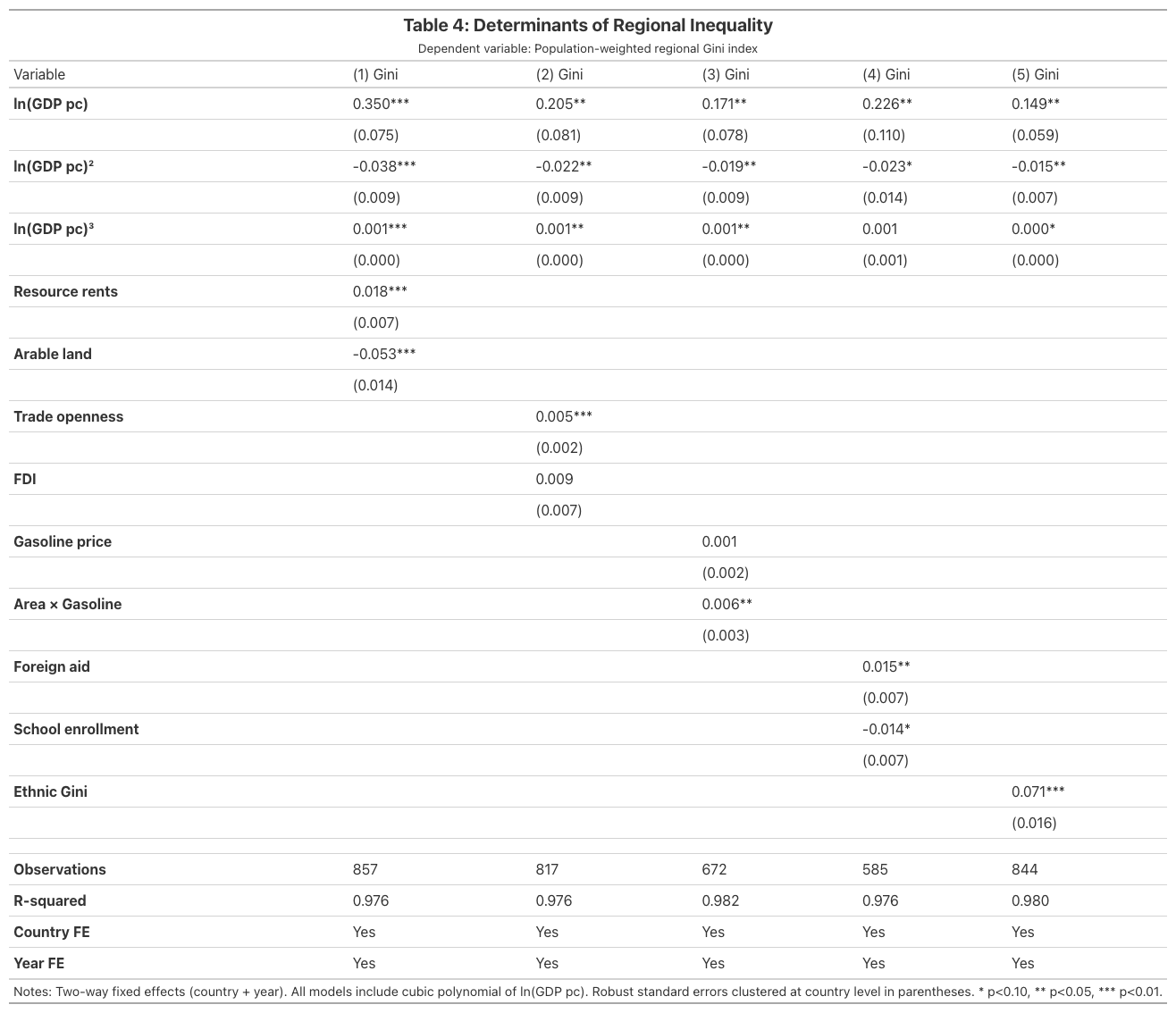
Seven of nine determinants are statistically significant at the 10% level. Ethnic income inequality is the single strongest driver (coefficient 0.071, p < 0.001): a one-unit increase in the ethnic Gini is associated with a 7.1-percentage-point increase in regional inequality, holding the Kuznets curve constant. This is economically large given that the mean regional Gini is only 0.064. Arable land has the second-largest effect in absolute value but with the opposite sign (-0.053, p < 0.001), indicating that agricultural economies tend toward more equal regional development, likely because farming activity is geographically dispersed.
Resource rents increase inequality (0.018, p = 0.008), consistent with the “resource curse” — the pattern where natural resource wealth concentrates extractive income in specific regions. Trade openness modestly increases inequality (0.005, p = 0.007), suggesting that internationally connected regions pull ahead. Foreign aid increases inequality (0.015, p = 0.028), possibly because aid flows concentrate in capital cities. School enrollment reduces inequality (-0.014, p = 0.053), consistent with human capital diffusion promoting convergence.
FDI and gasoline price alone are not significant, though the interaction of gasoline price with country area is (0.006, p = 0.049), indicating that transport costs matter more in geographically large countries. But do these additional controls change the Kuznets curve itself?
10.3 Coefficient stability across specifications
A critical robustness check is whether the N-shaped Kuznets curve survives the addition of controls. If the polynomial coefficients change dramatically when we add determinants, the N-shape may be spurious — driven by omitted variables that correlate with both GDP and inequality:
specs = ["Baseline (Table 3)", "Resources", "Trade",
         "Mobility", "Aid/Educ.", "Ethnicity"]
print(f"{'Specification':<20} {'ln(GDP)':>10} {'ln(GDP)^2':>12} {'ln(GDP)^3':>12}")
print("-" * 56)
for name, coefs in zip(specs, [
    (0.2931, -0.0320, 0.0011), (0.3498, -0.0380, 0.0013),
    (0.2054, -0.0222, 0.0008), (0.1711, -0.0186, 0.0007),
    (0.2264, -0.0232, 0.0007), (0.1492, -0.0153, 0.0005),
]):
    print(f"{name:<20} {coefs[0]:>10.4f} {coefs[1]:>12.4f} {coefs[2]:>12.4f}")
Specification           ln(GDP)    ln(GDP)^2    ln(GDP)^3
--------------------------------------------------------
Baseline (Table 3)       0.2931      -0.0320       0.0011
Resources                0.3498      -0.0380       0.0013
Trade                    0.2054      -0.0222       0.0008
Mobility                 0.1711      -0.0186       0.0007
Aid/Educ.                0.2264      -0.0232       0.0007
Ethnicity                0.1492      -0.0153       0.0005
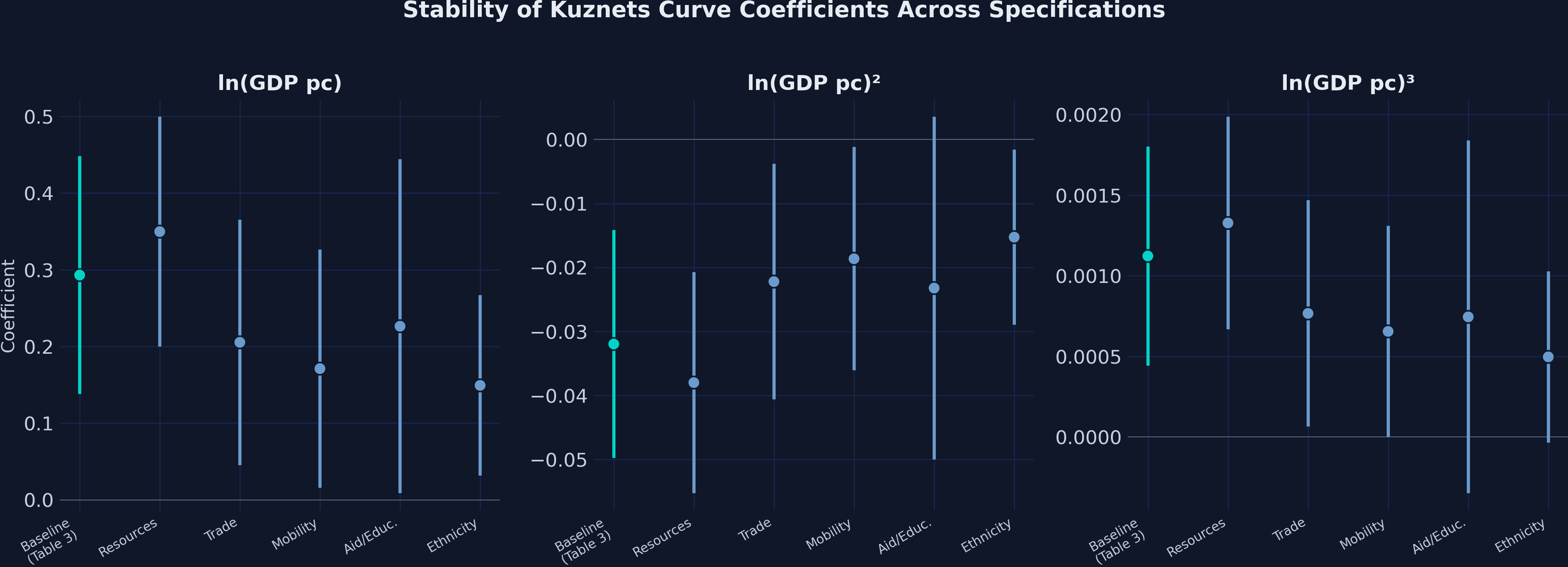
The sign pattern (+, -, +) for the three polynomial terms is preserved across all six specifications, confirming the robustness of the N-shaped Kuznets curve. However, the magnitudes attenuate noticeably when ethnic inequality is included: the linear term drops from 0.293 to 0.149, and the cubic term halves from 0.0011 to 0.0005. This suggests that part of what appears as a “development effect” on regional inequality is actually driven by ethnic income disparities that correlate with development levels. The Resources specification actually strengthens the polynomial coefficients (0.350, -0.038, 0.001), indicating that controlling for resource rents and arable land sharpens the Kuznets curve rather than weakening it. The cubic term remains positive in all specifications but loses significance in the Aid/Education model (p = 0.180), where the smaller sample (N = 585) reduces statistical power.
10.4 Determinant effects at a glance
Finally, the bar chart below ranks all nine determinants by their coefficient magnitude, color-coded by whether they increase (orange) or decrease (blue) regional inequality:
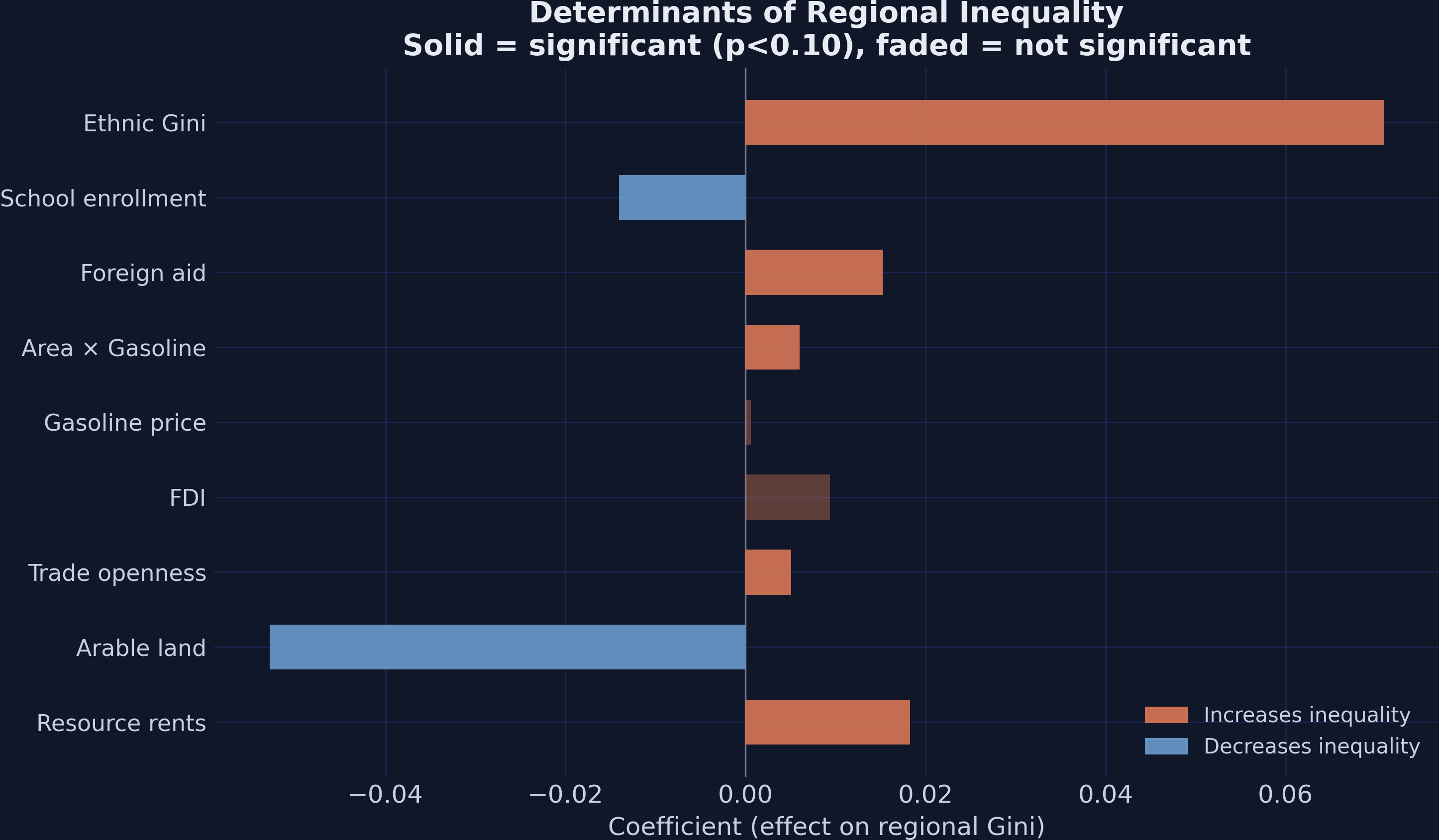
The ethnic Gini dominates all other determinants, with a coefficient (0.071) that is 3.9 times larger than the next biggest positive effect (resource rents at 0.018) and 1.3 times larger than the largest effect in absolute value (arable land at -0.053). Arable land and school enrollment are the only factors that significantly reduce regional inequality, suggesting that geographically dispersed economic activity and broad-based human capital investment are the two channels through which countries can promote more equal regional development. The policy implication is clear: governments concerned about regional disparities should invest in education and be cautious about over-relying on resource extraction or trade liberalization, which tend to concentrate economic activity in specific regions.
11. Discussion
We can now answer the case study question: the relationship between regional inequality and economic development is N-shaped, not inverted-U. The cubic TWFE model yields highly significant coefficients (0.293, -0.032, 0.001, all p < 0.001) that define three development phases. Below \$2,287 GDP per capita, initial development concentrates economic activity and widens regional gaps. Between \$2,287 and \$77,205, the convergence story dominates — lagging regions catch up as infrastructure, education, and market access spread. Above \$77,205, inequality may rise again as knowledge-economy agglomeration re-concentrates activity, though this second upturn is estimated from very few observations (Qatar, Luxembourg, Norway).
The fixed effects framework proved essential. A researcher who estimated only the linear specification would conclude that development has no effect on inequality (coefficient -0.003, p = 0.265). This is wrong — the true relationship is nonlinear, and the opposing effects at different development stages cancel out in a linear model.
Among determinants, ethnic income inequality stands out as the most powerful driver of regional disparities. When ethnic inequality is controlled, the Kuznets polynomial attenuates substantially (the linear term drops from 0.293 to 0.149), raising the question of whether the Kuznets curve is partly an artifact of ethnic composition correlating with income levels. This finding has direct policy relevance: addressing ethnic income gaps may be a more effective lever for reducing regional inequality than broad economic growth alone.
Several caveats apply. The second turning point at \$77,205 is beyond most of the data and should be interpreted cautiously. Missing data reduces sample sizes for some determinant models (the Aid/Education model drops to 585 observations from 880). The within-R-squared ranges from 0.01 to 0.28 depending on the specification, meaning that a substantial share of within-country inequality variation remains unexplained. Most importantly, this analysis is descriptive, not causal. Fixed effects control for time-invariant confounders but cannot address time-varying confounders. The “determinants” should be interpreted as associations conditional on the Kuznets curve and country/year fixed effects, not as causal effects.
12. Summary and next steps
Key takeaways:
The Kuznets curve is N-shaped, not inverted-U. The cubic TWFE model with country and year fixed effects yields coefficients of 0.293, -0.032, and 0.001 (all p < 0.001), with a within-R-squared of 0.142 compared to just 0.009 for the linear specification. The N-shape is robust across all six model specifications.
Turning points anchor three development phases. Regional inequality peaks at \$2,287 GDP per capita and reaches a trough at \$77,205, defining a broad convergence zone where most of the world’s countries fall. The pattern is stable across all five time periods in the data.
Ethnic income inequality is the strongest determinant of regional disparities. With a coefficient of 0.071 (p < 0.001), it is 3.9 times larger than the next biggest positive effect. Controlling for it halves the Kuznets polynomial coefficients, suggesting that ethnic composition partly drives the apparent development-inequality relationship.
Fixed effects are essential for uncovering the Kuznets relationship. Pooled OLS cubic coefficients are only marginally significant (p ~ 0.07), while TWFE coefficients are highly significant (p < 0.001). The linear TWFE model is completely uninformative (p = 0.265), demonstrating that both the polynomial specification and the fixed effects are needed to reveal the true pattern.
Limitations: The analysis covers 1992–2012; patterns may differ with more recent data. The second turning point (\$77,205) relies on very few observations. The panel has only 5 periods, limiting within-country variation. All results are associations, not causal effects.
Next steps: Extend the analysis to more recent satellite data (e.g., VIIRS nighttime lights). Test whether the N-shape holds at the subnational level within individual countries. Explore instrumental variables or shift-share designs to identify causal effects of trade, FDI, or aid on regional inequality.
13. Exercises
Quadratic vs cubic test. Re-estimate the TWFE model with just the quadratic polynomial (
gini ~ log_GDPpc + log_GDPpc2 | id + year). How does the within-R-squared compare to the cubic model (0.142)? Is the cubic term ($\beta_3$) individually significant? What would you conclude about the Kuznets hypothesis from the quadratic specification alone?Subsample analysis. Split the sample into OECD and non-OECD countries. Re-estimate the cubic TWFE model for each subsample. Does the N-shape hold in both groups, or is it driven primarily by one? What happens to the turning points?
Full determinants model. Estimate a single TWFE model that includes all nine determinants simultaneously (rather than in separate models). How do the coefficients change compared to Table 4? Which variables remain significant? What does multicollinearity among the determinants do to the standard errors?
14. References
- Lessmann, C., & Seidel, A. (2017). Regional inequality, convergence, and its determinants — A view from outer space. European Economic Review, 92, 110–132.
- Population-Weighted Regional Inequality Dataset — quarcs-lab/data-open (GitHub)
- PyFixest — Fast High-Dimensional Fixed Effects Estimation in Python
- Great Tables — Publication-Quality Tables in Python
Carlos Mendez
Associate Professor of Development Economics
My research interests focus on the integration of development economics, spatial data science, and econometrics to better understand and inform the process of sustainable development across regions.