PCA for Development Indicators

Compressing correlated indicators into one composite index

97.97%variance captured by PC1
0.7071equal weight on each indicator
1.3e-15manual vs scikit-learn gap

Carlos Mendez

Nagoya University (GSID)

June 11, 2026

The Tension

Act I

How do you rank 50 countries when health has many faces?

Life expectancy is in years. Infant mortality is a rate per 1,000. You cannot add years to rates.

And the two pull in opposite directions — more years is good, more deaths is bad. Which single number captures a country’s health?

The two indicators tell one story — in opposite directions

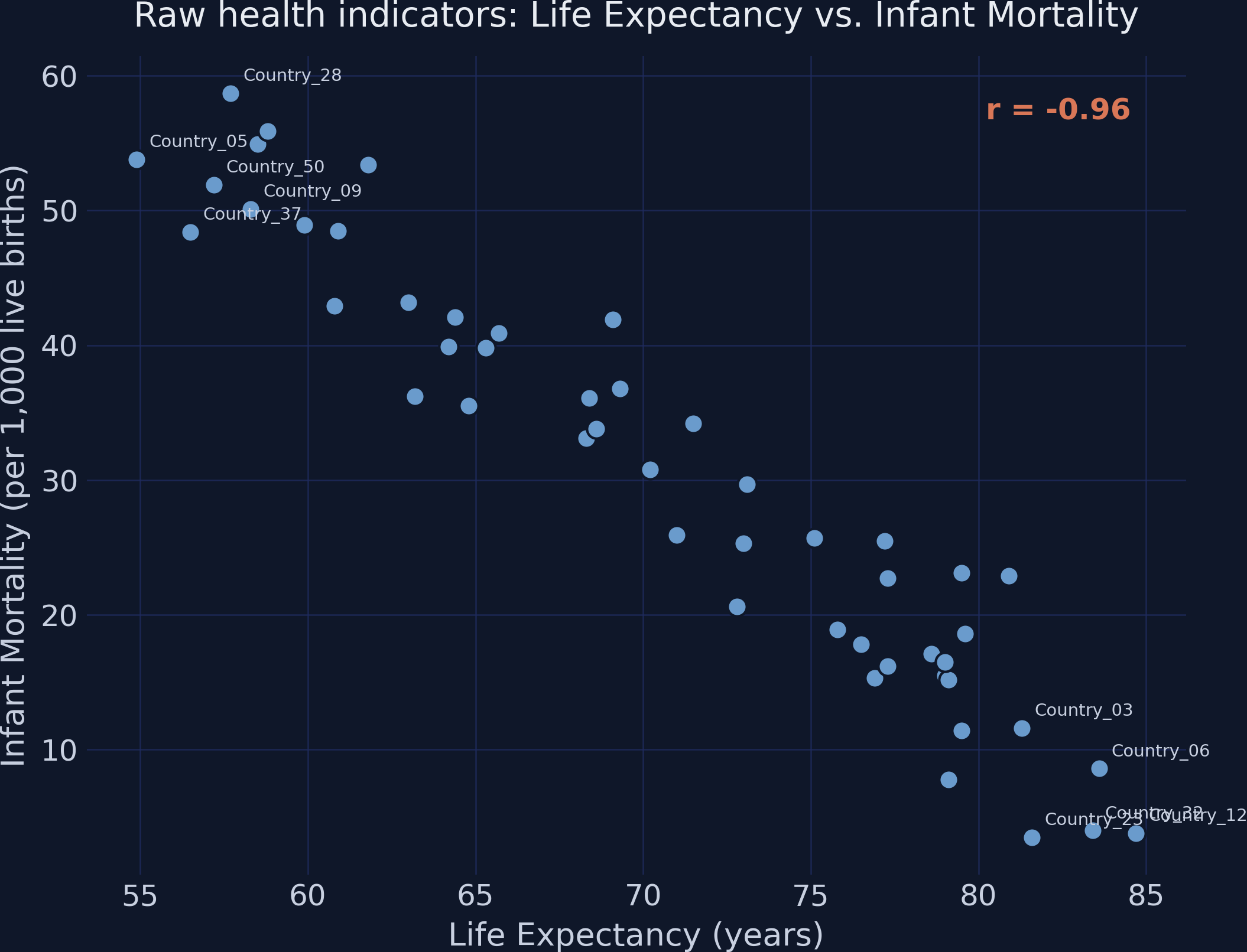
Raw health indicators for 50 simulated countries: a very strong negative relationship, \(r = -0.96\).

Where we’re going

  • Align indicator directions, then put them on a common scale
  • Measure how much the two indicators overlap
  • Let eigen-decomposition find the optimal blending weights
  • Project, rescale, and verify against scikit-learn

The Investigation

Act II

Six steps turn two raw indicators into one composite index

  • Step 1 — Polarity adjustment: flip “more is bad” indicators
  • Step 2 — Standardization: z-scores, mean 0, SD 1
  • Step 3 — Covariance matrix: measure the overlap
  • Step 4 — Eigen-decomposition: find the optimal direction
  • Step 5 — Scoring: project onto PC1
  • Step 6 — Normalization: rescale to \([0, 1]\)

No step can be skipped — each one feeds the next.

Step 1 — flip infant mortality so “up” always means “better”

\[IM_i^{*} = -1 \times IM_i\]

Multiply the “more is bad” indicator by \(-1\) — now bigger always means healthier.

The raw correlation flips from \(-0.96\) to \(+0.96\); same relationship, properly aligned.

Step 2 — standardize so years and rates share one ruler

\[Z_{ij} = \frac{X_{ij} - \bar{X}_j}{\sigma_j}\]

Subtract the mean, divide by the SD — both indicators become mean 0, SD 1 and directly comparable.

We use the population SD (\(\sigma\), ddof=0): PCA treats the dataset as the full population.

Step 3 — for standardized data, covariance is correlation

\[\Sigma = \frac{1}{n} Z^\top Z = \begin{pmatrix} 1 & r \\ r & 1 \end{pmatrix}\]

Standardized data puts 1s on the diagonal and the correlation \(r\) off-diagonal.

Here the off-diagonal is \(r = 0.96\) — the two indicators move almost in lockstep.

Step 4 — eigen-decomposition finds the direction of maximum spread

\[\Sigma \mathbf{v} = \lambda \mathbf{v}\]

Eigenvector \(\mathbf{v}\) = direction of greatest spread (the index weights). Eigenvalue \(\lambda\) = variance along it.

For a \(2\times2\) correlation matrix: \(\lambda_1 = 1 + r\), \(\lambda_2 = 1 - r\).

With \(r = 0.96\), PC1 absorbs almost all the variance: 97.97%

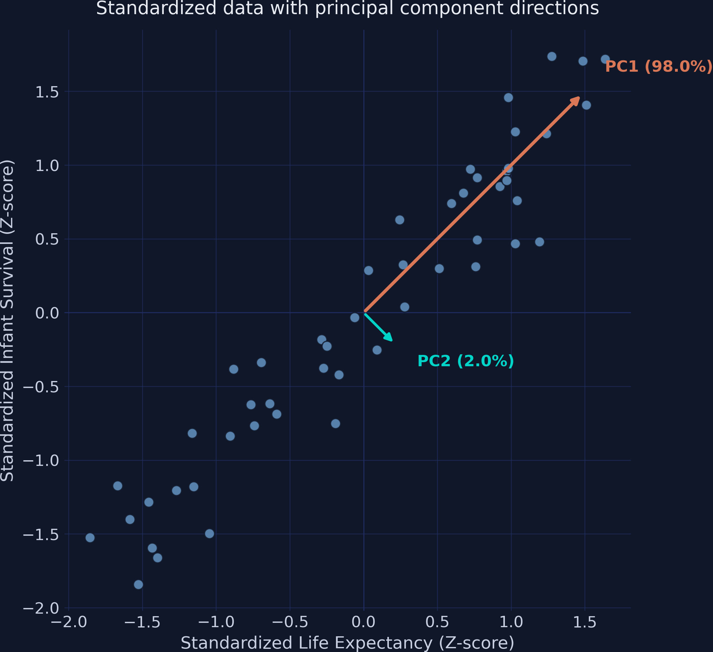
PC1 and PC2 eigenvector arrows over the standardized data — PC1 (orange) runs along the diagonal of maximum spread.

A single number keeps 98% of the information

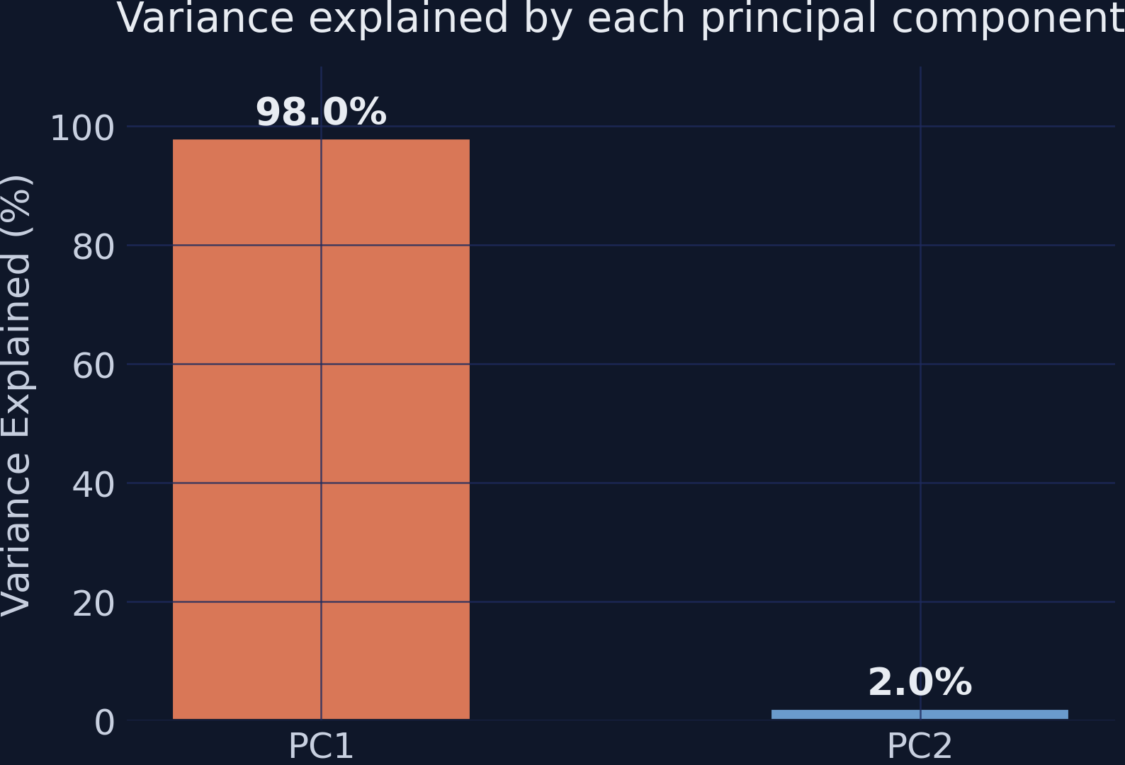
PC1 captures 98.0% of total variance; PC2 captures just 2.0%.

Two standardized variables always get equal weights — 0.7071 each

Component \(w_1\) (LE) \(w_2\) (IM*) Variance
PC1 0.7071 0.7071 97.97%
PC2 0.7071 −0.7071 2.03%

\(0.7071 \approx 1/\sqrt{2}\) — a mathematical certainty for any two standardized variables, regardless of \(r\).

Step 5 — project each country onto PC1 to get its score

\[PC1_i = w_1 Z_{i,LE} + w_2 Z_{i,IM}\]

The eigenvector is the recipe — multiply each z-score by its weight and sum.

w1, w2 = eigenvectors[0, 0], eigenvectors[1, 0]   # 0.7071, 0.7071
df["pc1"] = w1 * df["z_le"] + w2 * df["z_im"]      # project onto PC1

PC1 scores rank every country on one health axis

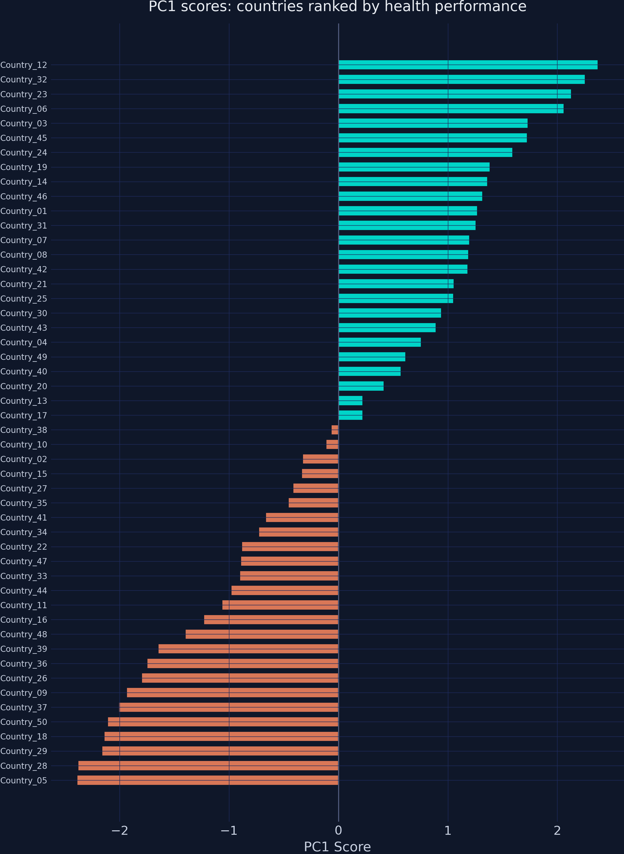
50 countries ranked by PC1 score — teal above average, orange below, roughly symmetric around zero.

Step 6 — rescale to [0, 1] so a policymaker can read it

\[HI_i = \frac{PC1_i - PC1_{\min}}{PC1_{\max} - PC1_{\min}}\]

Min-max scaling: worst → 0, best → 1, everyone proportional between.

Country_01’s PC1 of 1.27 becomes a Health Index of 0.77 — “better than 77% of the scale.”

The Health Index reveals a stark three-tier health divide

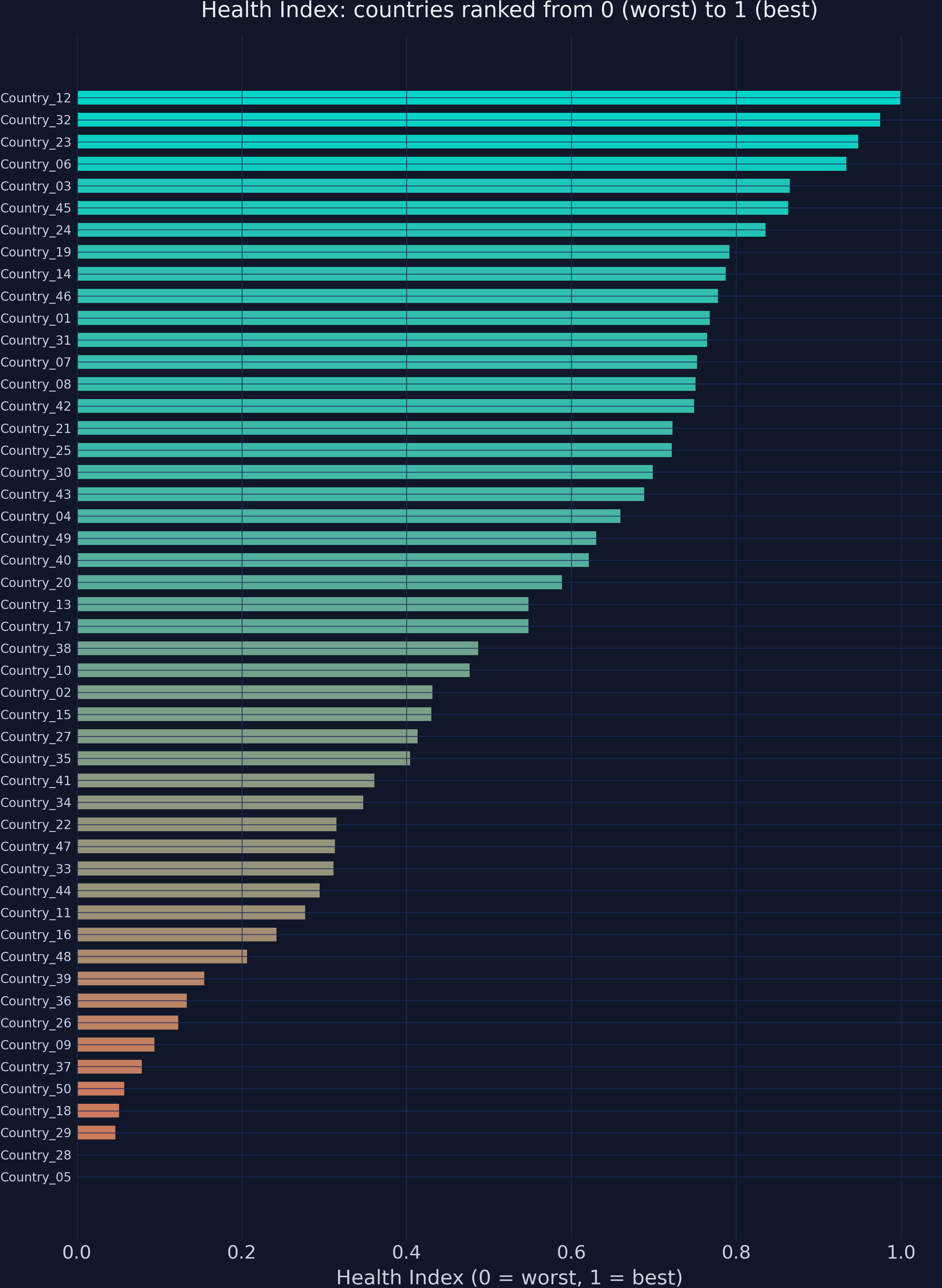
Health Index for 50 countries, orange (worst) to teal (best). Country_05 sits at exactly 0.00.

The Resolution

Act III

PC1 captures 97.97% of the variance — almost lossless compression

97.97%

variance retained by a single composite index built from two correlated indicators

The manual pipeline matches scikit-learn to machine precision

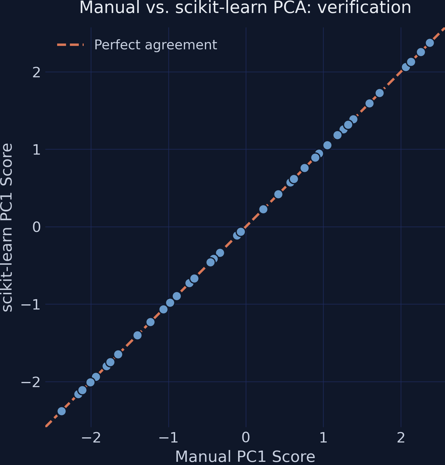
Manual vs scikit-learn PC1 scores: all 50 points fall on the 45-degree line of perfect agreement.

The whole pipeline, end to end

Step Output Key result
Polarity \(IM^{*} = -IM\) \(r\): \(-0.96 \to +0.96\)
Standardize \(Z\) mean 0, SD 1
Covariance \(2\times2\) matrix off-diagonal \(r = 0.96\)
Eigen-decompose \(\lambda\), \(\mathbf{v}\) PC1 = 98.0%
Score PC1 range \([-2.39, 2.37]\)
Normalize Health Index range \([0.00, 1.00]\)

Does an equal-weight average make PCA pointless here? No

Objection. With two standardized variables the weights are forced to 0.7071 each, so PC1 is just a scaled average — why bother with eigen-decomposition?

Response. True in the two-variable case. But the machinery is what scales: with 15 or 20 indicators PCA discovers unequal weights that reflect each variable’s unique contribution — something no manual averaging scheme can find. The two-variable case is a transparent warm-up, not the destination.

The index measures relative performance — read it with care

  • A score of 1.0 means best in this sample, not perfect health
  • Adding or removing countries shifts every score (z-scores and min-max bounds both move)
  • A health index of 0.77 is not comparable to an education index of 0.77 — different eigenvectors, different scales
  • Year-by-year comparison needs a pooled PCA to hold the weights fixed

Highly correlated indicators compress almost losslessly — but PCA earns its keep in high dimensions.