Six Ways to Evaluate a Policy using R: Comparative Case Studies of Proposition 99
Abstract
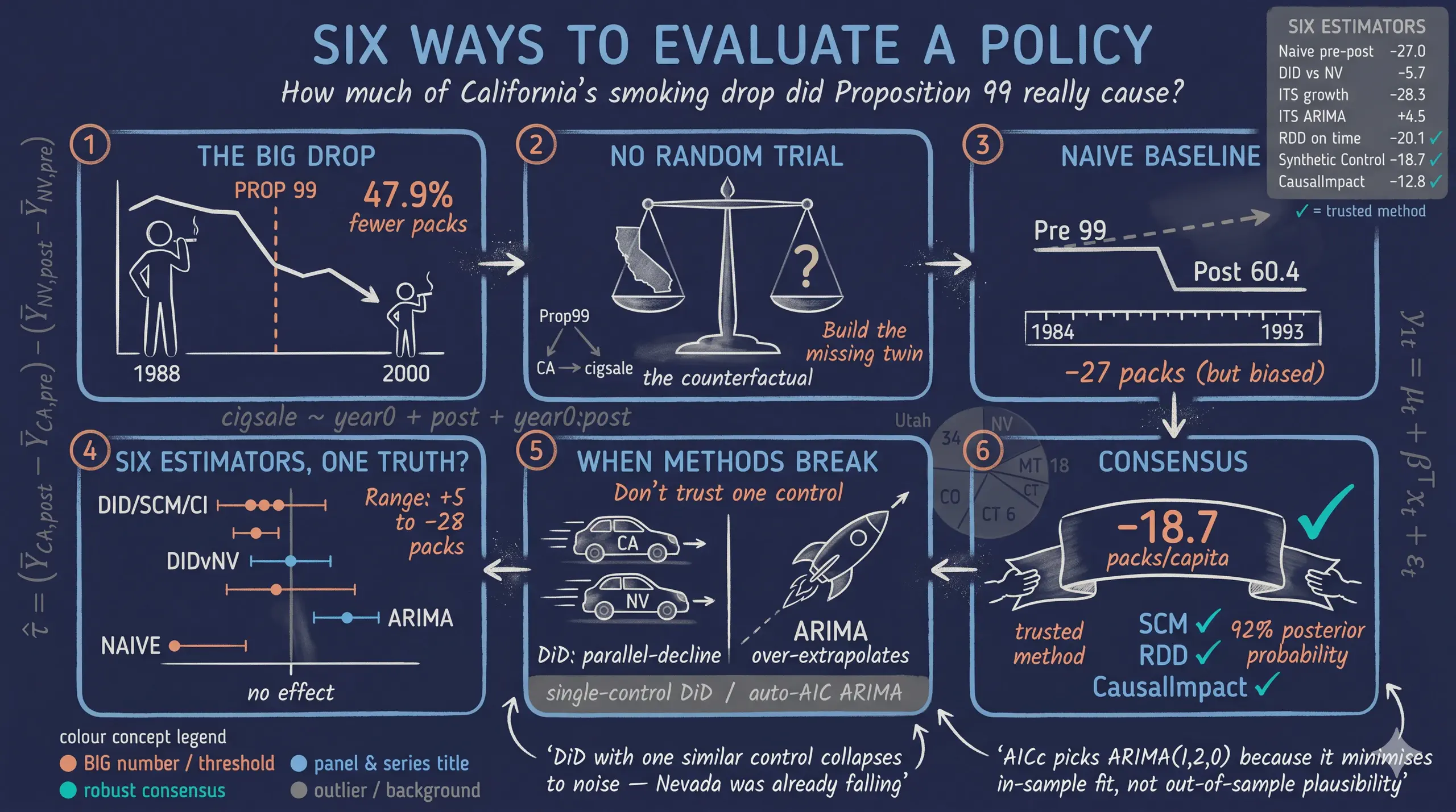
When a policy is rolled out to a single unit rather than randomly assigned, estimating its causal effect requires constructing a counterfactual — what would have happened without the intervention — and no two methods build that counterfactual the same way. This tutorial evaluates California’s 1989 Proposition 99 cigarette tax by applying six estimator families to one shared panel and asking how much they disagree. The data are a balanced panel of 39 U.S. states observed annually over 1970–2000 (1,209 state-year observations) with per-capita cigarette pack sales as the outcome and four covariates, prepared from the canonical Abadie, Diamond, and Hainmueller (2010) dataset. California’s raw sales fell from 116.0 packs (1970–1988) to 60.4 packs (1989–2000), a 47.9% within-state drop that must be separated from the national secular decline. Using R, the tutorial fits a naive pre-post comparison, difference-in-differences against Nevada, two interrupted time series variants (a linear growth curve and an AICc-selected ARIMA(1,2,0)), a regression discontinuity on time, synthetic control via tidysynth, and CausalImpact’s Bayesian structural time series, all targeting the average treatment effect on the treated. Five of six methods converge on a 13–20 pack reduction — RDD-on-time gives a -20.1 pack level break, synthetic control -18.9 packs (Fisher exact p = 0.026, California ranking 1st of 39 on an MSPE ratio of 123.9), and CausalImpact -12.8 packs (92% posterior probability of an effect) — while DiD against Nevada collapses to -5.7 packs (p = 0.31) and ARIMA-based ITS flips sign to +4.5 packs. The lesson is that the choice of counterfactual, not the data, drives the estimate: weighted donor combinations are robust where single comparisons and automated model selection fail, so credible policy evaluation triangulates across estimators rather than trusting any one.
1. Overview
How do you measure the causal effect of a policy when you cannot randomize who gets treated? In January 1989, California raised its cigarette tax by 25 cents per pack. The reform was called Proposition 99. Per-capita cigarette sales in California then fell from 116 packs in 1988 to 60 packs in 2000 — almost a 50% drop. But the country as a whole was also smoking less. So the question this tutorial is built around is deceptively simple:
How much of California’s drop was caused by Proposition 99, and how much would have happened anyway?
This tutorial is inspired by the workshop causalpolicy.nl by the ODISSEI Social Data Science team. We run six method families on the same dataset and place every estimate on a single forest plot. The disagreements are then visible at a glance.
| # | Method family | One-line idea |
|---|---|---|
| 1 | Naive pre-post | Compare California’s mean before and after 1989. |
| 2 | Difference-in-Differences (DiD) | Subtract a control state’s pre/post change from California’s. |
| 3 | Interrupted Time Series (ITS) | Extrapolate California’s own pre-trend forward. Two flavours: linear growth curve and auto-selected ARIMA. |
| 4 | Regression Discontinuity on time (RDD) | Fit a piecewise line with a level and slope break at the policy date. |
| 5 | Synthetic Control | Build a weighted blend of donor states that mimics California’s pre-period. |
| 6 | CausalImpact | Fit a Bayesian time-series model that uses donor states as predictors. |
Every method shares the same underlying logic. It builds a counterfactual — what California’s smoking would have looked like without Proposition 99 — and reports the gap between observed and counterfactual as the estimated effect. What changes from method to method is how the counterfactual is built.
The case study is famous. The original Synthetic Control paper by Abadie, Diamond, and Hainmueller (2010) used exactly this dataset. We replicate their estimate within rounding, then watch what happens when five other estimators are swapped in.
The headline finding. Five of the six methods agree on a 13–20 pack reduction per capita. One method (DiD against a single Nevada control) collapses to noise. One method (ITS with auto-selected ARIMA) flips sign entirely. The disagreement is the lesson.
If you want to go deeper on a specific method after this tour, two sister tutorials cover the same territory in much greater detail. Difference-in-Differences for Policy Evaluation walks through staggered adoption, Callaway–Sant’Anna group-time ATTs, and HonestDiD sensitivity analysis. Bayesian Spatial Synthetic Control revisits Proposition 99 with a spatial Bayesian extension of the synthetic-control machinery.
Learning objectives:
- Understand why a within-unit pre-post comparison is biased — and how each causal estimator tries to fix that bias.
- Build, fit, and interpret DiD, ITS (growth-curve and ARIMA), RDD-on-time, Synthetic Control (
tidysynth), and CausalImpact models in R. - Read a
synthetic_control()pipeline end-to-end: predictors, donor weights, placebo permutations, balance tables. - Compare six estimators on a single forest plot and explain why they disagree where they do.
- Apply estimand discipline — name the causal quantity each method targets before quoting any number.
How to read this tutorial
Each method section follows the same four-part rhythm:
- The idea. One sentence on what the method does conceptually.
- The code. A short, focused R block.
- The output. The numbers printed by the model.
- What it means. A plain-language interpretation that ties back to the case-study question.
If you are short on time, read the bold one-liners in each method section for a fast tour. Read the full prose when you need the details. The Cross-method comparison (§12) and Discussion (§13) put all seven estimates side-by-side and explain the pattern.
The shared logic of every method
The diagram below makes the common skeleton explicit. Each method needs three ingredients: California’s observed outcome, a counterfactual (constructed from a different data source by each method), and the gap between the two. The gap is the estimated effect.
flowchart LR
    OBS["California observed<br/>1989–2000<br/>(mean ≈ 60 packs)"]
    CF["Counterfactual<br/>What California would have looked like<br/>WITHOUT Proposition 99"]
    EFF["Effect =<br/>Observed − Counterfactual"]
    OBS --> EFF
    CF --> EFF

    SRC1["Method 1: California's pre-1989 mean"] -.-> CF
    SRC2["Method 2: Nevada's pre→post change"] -.-> CF
    SRC3["Method 3: California's own pre-trend extrapolated"] -.-> CF
    SRC4["Method 4: piecewise line around 1989"] -.-> CF
    SRC5["Method 5: weighted blend of donor states"] -.-> CF
    SRC6["Method 6: Bayesian time-series fit on donors"] -.-> CF

    style OBS fill:#d97757,stroke:#141413,color:#fff
    style CF fill:#6a9bcc,stroke:#141413,color:#fff
    style EFF fill:#00d4c8,stroke:#141413,color:#141413
Read the diagram from left to right. The orange box (California observed) is fixed — every method sees the same data. The blue box (counterfactual) is the construction, and the six dashed arrows feeding it show how each method differs in its source of information. The teal box on the right is the universal output: a number measuring the gap. The whole rest of this tutorial is a guided tour of those six dashed arrows.
Which method when?
The six methods are not interchangeable. Each one is appropriate for a different data situation. The decision tree below walks through three diagnostic questions and steers you to the matching family. Apply it whenever you face a new policy-evaluation problem.
flowchart TB
    Q1{"Do you have a credible<br/>donor pool of untreated units?<br/>(roughly 10+ similar units<br/>followed over the same window)"}
    Q1 -->|Yes| Q2{"Do you want frequentist<br/>placebo inference,<br/>or Bayesian credible<br/>intervals?"}
    Q1 -->|No, only one good control| DiD["Difference-in-Differences<br/>(this tutorial: §6)<br/><br/>Cost: parallel-trends assumption<br/>on a single comparison unit"]
    Q1 -->|No, only the treated unit| Q3{"Is the policy date the<br/>only structural break<br/>in the series?"}

    Q2 -->|Frequentist + tidy code| SCM["Synthetic Control<br/>(this tutorial: §10)<br/><br/>Cost: convex-combination<br/>of donors must match the<br/>treated pre-period"]
    Q2 -->|Bayesian + uncertainty bands| CI["CausalImpact<br/>(this tutorial: §11)<br/><br/>Cost: state-space prior;<br/>covariate-set choice<br/>affects the estimate"]

    Q3 -->|Yes, sharp jump at threshold| RDD["Regression Discontinuity on time<br/>(this tutorial: §9)<br/><br/>Cost: assumes no other shock<br/>coincides with the threshold"]
    Q3 -->|No, model the smooth pre-trend| ITS["Interrupted Time Series<br/>(this tutorial: §7 and §8)<br/><br/>Cost: pre-trend extrapolation<br/>must be specified correctly"]

    NAIVE["Naive pre-post<br/>(this tutorial: §5)<br/><br/>Use only as a baseline.<br/>Never as a causal estimate."] -.->|"baseline for everyone"| Q1

    style Q1 fill:#1f2b5e,stroke:#141413,color:#fff
    style Q2 fill:#1f2b5e,stroke:#141413,color:#fff
    style Q3 fill:#1f2b5e,stroke:#141413,color:#fff
    style DiD fill:#6a9bcc,stroke:#141413,color:#fff
    style SCM fill:#d97757,stroke:#141413,color:#fff
    style CI fill:#d97757,stroke:#141413,color:#fff
    style RDD fill:#6a9bcc,stroke:#141413,color:#fff
    style ITS fill:#6a9bcc,stroke:#141413,color:#fff
    style NAIVE fill:#7a8395,stroke:#141413,color:#fff
The orange terminal nodes (Synthetic Control, CausalImpact) are the most defensible families when a donor pool exists — and they happen to be the methods that produce the consensus estimate later in this tutorial. The blue nodes are valid choices in their respective data situations but carry stronger identifying assumptions. The grey naive-pre-post node is the universal baseline that everyone should compute first — never as the final answer, always as the bias yardstick.
Key concepts at a glance
This post leans on a small vocabulary repeatedly. The rest of the tutorial assumes you can move between these terms quickly. Each concept below has three parts. The definition is always visible. The example and analogy sit behind clickable cards: open them when you need them, leave them collapsed for a quick scan.
1. Counterfactual. The outcome a treated unit would have shown in the absence of treatment. It is the thing you cannot observe but must somehow construct in order to estimate a causal effect.
Example
In this post, “California’s cigarette sales in 1995 if Proposition 99 had not passed” is the counterfactual. Every method we cover builds one differently: ITS extrapolates California’s own pre-trend, DiD borrows Nevada’s change, Synthetic Control borrows a weighted combination of donor states, and CausalImpact borrows a Bayesian projection from a structural time-series model.
Analogy
A doctor who wants to know whether a new drug worked needs to ask “what would this patient’s blood pressure have been at week 12 if they had taken a placebo?” There is no parallel universe to peek into, so they construct an estimate from similar patients, prior trends, or a control group.
2. Parallel trends. The identifying assumption behind classical DiD: in the absence of treatment, the treated and control units would have moved in parallel over time. Differences in levels are allowed; differences in trends are not.
Example
DiD against Nevada implicitly assumes that California and Nevada cigarette sales would have evolved on parallel paths after 1989 if Proposition 99 had never passed. The raw plot (Figure 2) shows that they were already on similar downward trajectories before 1988 — which is why the DiD point estimate ends up so small.
Analogy
Two cars driving down a highway at the same speed. If one suddenly brakes, the gap between them grows — and that gap is the “treatment effect”. Parallel trends says they were going the same speed before the braking.
3. Interrupted Time Series (ITS). A class of methods that fits a model to the treated unit’s pre-period data, extrapolates that model into the post-period as a counterfactual, and averages the residual gap. ITS does not need a comparison unit, but it pays for that in stronger modelling assumptions about the pre-trend.
Example
We fit two ITS counterfactuals: a simple linear lm(cigsale ~ year) on 1970–1988 (the growth curve), and an AICc-selected ARIMA model from fpp3. Both are then projected onto 1989–2000. The growth-curve version produces a sensible $-28$ packs estimate; the ARIMA(1, 2, 0) version produces a counterintuitive $+4.5$ packs because it extrapolates the late-1980s acceleration too aggressively.
Analogy
Predicting tomorrow’s weather purely from this week’s pattern. If the trend is “warming by 0.5 degrees per day”, extrapolating works for a few days but fails the moment a cold front arrives.
4. Regression Discontinuity on time.
A regression discontinuity design where the running variable is the calendar year and the threshold is the policy adoption date. Practically, it is a piecewise linear regression of the form cigsale ~ year + post + year:post that allows both a level jump and a slope change at the threshold.
Example
We fit cigsale ~ year0 + prepost + year0:prepost to California’s full 1970–2000 series, where year0 = year - 1989 centres the running variable at the threshold. The level break (prepostPost = $-20.06$ packs) is the discontinuity right at January 1989; the slope break ($-1.49$ packs/year extra) means the post-period decline accelerates relative to the pre-period.
Analogy
Imagine a road where the speed limit changes from 100 to 80 km/h at a sign. Drivers slow down right at the sign (the level break) and may also gradually drive slower over the next few kilometres (the slope break).
5. Donor pool. The set of untreated units from which Synthetic Control draws weights to build a synthetic version of the treated unit. The data-driven weighting algorithm chooses how much of each donor to use.
Example
The 38 non-California states are the donor pool. tidysynth chooses convex weights that minimise pre-1988 RMSE on lagged outcomes plus four covariates. The optimal mix turns out to be 34.3% Utah, 23.6% Nevada, 18.2% Montana, 17.5% Colorado, 6.2% Connecticut — a “synthetic California” built entirely from five states.
Analogy
A cocktail recipe that has to match a specific flavour profile. Instead of using one ingredient, you blend several — 35% lime, 25% mint, 20% sugar, etc. — until the mixture tastes right.
6. Posterior credible interval. A Bayesian interval that has a 95% probability of containing the true parameter, given the data and the prior. It is the Bayesian counterpart to a frequentist 95% confidence interval, but with a far more natural interpretation.
Example
CausalImpact’s full-covariate model reports an average effect of $-13$ packs with a 95% credible interval of $[-32, +5.7]$. Read literally: given the data and the structural time-series prior, there is a 95% probability that the true average ATT lies in that interval. The posterior probability of any causal effect is 92%.
Analogy
A weather forecast that says “70% chance of rain”. You do not need 100 parallel universes; the 70% is a direct probability statement about the world, not about a sampling distribution.
7. Average Treatment effect on the Treated (ATT) versus Average Treatment Effect (ATE). The ATT is the effect of the policy on the units that actually received it. The ATE is the effect averaged over every unit in the population, treated or not. These two quantities are equal only when treatment effects are constant across units.
Example
Every causal method in this tutorial targets the ATT on California. We never ask “what would Proposition 99 do to the average state if rolled out nationwide?” — that is the ATE, and we have no policy variation to identify it. Synthetic Control, DiD, and CausalImpact all report ATT estimates of $-13$ to $-20$ packs/capita.
Analogy
A new running shoe is tested on 100 marathoners (the ATT measures how much faster they became). The ATE would estimate how much faster the average person would run if forced to wear the same shoe — a very different question.
8. Root Mean Squared Prediction Error and its post/pre ratio. The Root Mean Squared Prediction Error (RMSPE) is the typical size of the gap between observed and predicted outcomes in a given period. Synthetic Control reports it separately for the pre-period (fit quality) and post-period (effect size). The post/pre ratio (the MSPE ratio) is a unitless measure of how much the post-period gap exceeds the pre-period gap.
Example
California’s pre-period MSPE is 3.21 (the synthetic almost perfectly tracks California through 1988). Its post-period MSPE is 387 (a large gap opens after Proposition 99). The ratio is 387 / 3.21 = 120.5, the highest of any state in the panel.
Analogy
A student who scored 99% on practice tests and 30% on the real exam has a huge “test/practice ratio”. That ratio flags an unusual event between the two periods — exactly what we are looking for after a policy change.
9. Placebo Fisher exact p-value. A non-parametric p-value built by ranking the treated unit against a distribution of placebo “treatments” — each computed by pretending an untreated unit had been treated instead. The p-value is the treated unit’s rank divided by the total number of units. Requires at least 20 donor units to get below the conventional 0.05 threshold.
Example
tidysynth refits the Synthetic Control model 38 times — once for each donor state pretending to be treated — and computes each unit’s MSPE ratio. California ranks 1st out of 39 units. The Fisher exact p-value is 1 / 39 ≈ 0.026.
Analogy
A class of 39 students sits an exam. If your child gets the highest score, the “by-chance” probability of that ranking under a null of no real talent gap is 1 / 39. Same logic, applied to states instead of students.
10. Bayesian Structural Time Series (BSTS). A Bayesian model that decomposes a time series into interpretable additive components: a local-level trend, a regression on external predictors, and a noise term. After fitting on the pre-period, the model is projected forward and the posterior distribution over observed-minus-predicted gives the policy effect with a credible interval.
Example
CausalImpact writes California’s cigarette sales as $y_{1t} = \mu_t + \beta^\top x_t + \varepsilon_t$. The trend $\mu_t$ absorbs unexplained dynamics; the regression $\beta^\top x_t$ borrows information from other states’ cigarette sales (and optionally covariates). The model is fit on 1970–1988 and projected to 2000.
Analogy
A Kalman filter for stock prices that decomposes the daily close into a slow trend, a regression on related stocks, and noise. Once trained on the pre-event history, it forecasts the “no-event” counterfactual price and compares it to what actually happened.
2. The potential outcomes framework: causal inference as a missing-data problem
Before diving into estimators, we need a vocabulary for what they are estimating. The cleanest one is the potential outcomes framework, due to Neyman (1923) and Rubin (1974). Its central insight is that causal inference is a missing-data problem. The data we wish we had is rarely the data we observe.
2.1 Two outcomes per unit, one observed
For each unit $i$ at time $t$, imagine two potential outcomes:
- $Y_{it}(1)$ — cigarette sales in state $i$ at year $t$ with Proposition 99 in force.
- $Y_{it}(0)$ — cigarette sales in state $i$ at year $t$ without Proposition 99 in force.
Let $D_{it} \in \{0, 1\}$ be the treatment indicator. Here $D_{it} = 1$ for California from 1989 onward, and $D_{it} = 0$ everywhere else (every other state, plus California up to and including 1988). The outcome we observe is one of the two potential outcomes, never both:
$$Y_{it} \,=\, D_{it}\, Y_{it}(1) \,+\, (1 - D_{it})\, Y_{it}(0).$$
In words: if California in 1995 was treated, we observe $Y_{1995}(1)$ — not the counterfactual $Y_{1995}(0)$, which is what California’s smoking would have been in 1995 had Proposition 99 never passed. That counterfactual is the missing data.
2.2 The fundamental problem of causal inference
Make the missing data concrete. The table below shows what is observed (✓), what is undefined because the state was never treated (—), and what is missing-and-must-be-imputed (?) for a handful of rows.
| State | Year | $D_{it}$ | $Y_{it}(0)$ | $Y_{it}(1)$ | Observed |
|---|---|---|---|---|---|
| California | 1988 | 0 | 90.1 ✓ | ? | 90.1 |
| California | 1989 | 1 | ? | 82.4 ✓ | 82.4 |
| California | 1995 | 1 | ? | 64.4 ✓ | 64.4 |
| California | 2000 | 1 | ? | 41.6 ✓ | 41.6 |
| Nevada | 1988 | 0 | 134.4 ✓ | — | 134.4 |
| Nevada | 1995 | 0 | 113.0 ✓ | — | 113.0 |
| Utah | 1988 | 0 | 64.7 ✓ | — | 64.7 |
| Utah | 1995 | 0 | 55.0 ✓ | — | 55.0 |
This is what Holland (1986) called the fundamental problem of causal inference: for any treated unit at any time, we observe at most one of the two potential outcomes, and the other one is missing. For California after 1989 the missing column is $Y_{it}(0)$ — every “?” in the third column of the table. Every method in this tutorial is a way to fill in those question marks.
2.3 Three estimands: ITE, ATE, ATT
With both potential outcomes defined, the natural causal contrasts follow.
Individual treatment effect (ITE) for unit $i$ at time $t$:
$$\tau_{it} = Y_{it}(1) - Y_{it}(0).$$
In words: how much $i$’s outcome at $t$ would shift because of the policy. The ITE is the gold standard, but it is never directly observable for any single $(i, t)$. We only ever see one of the two potential outcomes.
Average treatment effect (ATE) over a population:
$$\text{ATE} = \mathbb{E}\big[Y_{it}(1) - Y_{it}(0)\big].$$
In words: how much smoking would have changed in the average state-year if all states had been treated. The ATE is identified by a randomised experiment — but Proposition 99 was not randomised, and most states would never adopt it. The ATE is not what we are after here.
Average treatment effect on the treated (ATT), restricted to units that actually received the treatment:
$$\text{ATT} = \mathbb{E}\big[Y_{it}(1) - Y_{it}(0) \,\big|\, D_{it} = 1\big].$$
In words: how much smoking changed in California, in the post-1989 years because of Proposition 99. This is what every causal method in this tutorial targets. It is the right question to ask when only one unit is treated and the policy is essentially a one-shot event.
For Proposition 99, the ATT averaged over 1989–2000 expands to:
$$\text{ATT}_{\text{CA, post}} = \frac{1}{T_{\text{post}}} \sum_{t > t^*} \Big[Y_{1t}(1) - Y_{1t}(0)\Big],$$
where unit $i = 1$ denotes California, $t^* = 1988$ is the last pre-period year, and $T_{\text{post}} = 12$ is the number of post-period years (1989–2000). The first term inside the brackets — $Y_{1t}(1)$ — is observed. The second term — $Y_{1t}(0)$ — is missing. The whole tutorial is a tour of methods that estimate the missing term using different data sources.
2.4 Each method is a way to impute the missing $Y(0)$
The shared logic Mermaid diagram in §1 already showed this graphically. Here is the same idea in equation form, one row per method.
| Method | Estimator of the missing $Y_{1t}(0)$ |
|---|---|
| Naive pre-post | $\widehat{Y_{1t}(0)} = \overline{Y}_{1, \text{pre}}$ — California’s own pre-period mean. |
| Difference-in-Differences | $\widehat{Y_{1t}(0)} = \overline{Y}_{1, \text{pre}} + \big(\overline{Y}_{0, \text{post}} - \overline{Y}_{0, \text{pre}}\big)$ — add Nevada’s pre-to-post change. |
| Interrupted Time Series (growth) | $\widehat{Y_{1t}(0)} = \hat\alpha + \hat\beta\, t$ — extrapolate California’s own pre-period linear fit. |
| Interrupted Time Series (ARIMA) | $\widehat{Y_{1t}(0)} = $ forecast from an ARIMA model fitted on 1970–1988. |
| Regression Discontinuity on time | $\widehat{Y_{1t}(0)} = \hat\alpha + \hat\beta\, (t - t^*)$ — extrapolate California’s pre-period piecewise fit. |
| Synthetic Control | $\widehat{Y_{1t}(0)} = \sum_{i \in \text{donors}} w_i^* Y_{it}$ — weighted blend of donor states. |
| CausalImpact | $\widehat{Y_{1t}(0)} = \mu_t + \beta^\top x_t$ — Bayesian structural time-series fit on donor data. |
Read this table as the syllabus for the rest of the tutorial. Each subsequent section takes one row and shows the R code that builds the corresponding $\widehat{Y_{1t}(0)}$, then subtracts it from the observed California series to recover the ATT.
The two big design choices that distinguish good causal methods from bad ones are visible right here: (a) what data does the method use to build $\widehat{Y_{1t}(0)}$ (California’s own past, one neighbouring state, a weighted blend of many states, or a Bayesian model on the whole donor pool), and (b) what identifying assumption does that data source require (no national trend, parallel trends with the neighbour, correctly-specified pre-trend, or convexity-of-donor-combinations). The cross-method comparison at the end of the tutorial is fundamentally a comparison of how robust each $\widehat{Y_{1t}(0)}$ construction is to that source’s identifying assumption being violated.
3. Setup and packages
We use pacman::p_load() to install (if needed) and load every package in a single line. The script is fully reproducible: a global set.seed(42) fixes the random-forest imputation and the CausalImpact MCMC sampler.
# pacman is a tiny meta-package that auto-installs missing CRAN packages.
# Bootstrap it first so the rest of the script can run on a fresh machine.
if (!require("pacman", quietly = TRUE)) {
  install.packages("pacman", repos = "https://cloud.r-project.org")
}

# p_load() installs (if missing) and attaches all six families of packages
# we will need throughout the tutorial -- one line instead of one library()
# call per package.
pacman::p_load(
  tidyverse,    # data manipulation + ggplot2
  sandwich,     # HAC variance estimator
  lmtest,       # coeftest
  tidysynth,    # synthetic control (tidy API)
  fpp3,         # forecasting (tsibble, fable, ARIMA)
  mice,         # multiple imputation
  ranger,       # backend for mice method = "rf"
  CausalImpact, # Bayesian structural time series
  broom,        # tidy model output
  glue          # string interpolation
)

# Fix the global random seed so every run reproduces the same MICE
# imputation and the same CausalImpact MCMC sample.
set.seed(42)
The dark-navy ggplot theme used in every figure of this post is defined in analysis.R as a helper called theme_site(). It sets the plot background to #0f1729, the panel grid to #1f2b5e, and the text to #e8ecf2, matching the site’s other dark-themed posts.
4. Data: download and inspect
We download a pre-prepared proposition99.rds straight from this project’s GitHub repository so the script is self-contained on a fresh machine. The script caches the file locally so it only fetches once.
# Pull the prepared dataset from this project's GitHub raw URL.
# The script caches it locally so re-runs do not re-download.
DATA_URL  <- "https://raw.githubusercontent.com/cmg777/starter-academic-v501/master/content/post/r_causalpolicy_workshop/proposition99.rds"
CACHE_RDS <- "proposition99.rds"

if (!file.exists(CACHE_RDS)) {
  # First run: pull the file from GitHub and write to disk
  download.file(DATA_URL, destfile = CACHE_RDS, mode = "wb")
}

# Load the RDS file and coerce to a tibble for nicer printing downstream
prop99 <- read_rds(CACHE_RDS) |> as_tibble()
Rows: 1209  Cols: 7
Columns: state, year, cigsale, lnincome, beer, age15to24, retprice
States: 39  Years: 1970 - 2000

# A tibble: 6 × 7
  state         year cigsale lnincome  beer age15to24 retprice
  <fct>        <int>   <dbl>    <dbl> <dbl>     <dbl>    <dbl>
1 Rhode Island  1970   124.        NA    NA     0.183     39.3
2 Tennessee     1970    99.8       NA    NA     0.178     39.9
3 Indiana       1970   135.        NA    NA     0.177     30.6
4 Nevada        1970   190.        NA    NA     0.162     38.9
5 Louisiana     1970   116.        NA    NA     0.185     34.3
6 Oklahoma      1970   108.        NA    NA     0.175     38.4
The panel is 39 states $\times$ 31 years for 1,209 observations in total. The treated unit is California, the intervention year is January 1989 (so the last full pre-period year is 1988), and the outcome is cigsale — per-capita cigarette pack sales. Of the four covariates, cigsale and retprice (the retail price) are fully observed, while lnincome is missing 195 rows (16.1%), age15to24 is missing 390 (32.3%), and beer is missing 663 (54.8%). The covariate gaps matter for CausalImpact (§11), where we will fill them with random-forest imputation; the other five methods either ignore covariates entirely or do not need them.
A quick descriptive comparison of California’s pre vs post means confirms the puzzle that motivates the rest of the tutorial.
# Subset to California and add a Pre/Post factor based on the policy date.
prop99_cali <- prop99 |>
  filter(state == "California") |>
  mutate(prepost = factor(year > 1988, labels = c("Pre", "Post")))

# Group-level descriptives: count, mean, and SD of cigsale per period.
prop99_cali |>
  group_by(prepost) |>
  summarize(n            = n(),
            mean_cigsale = mean(cigsale),
            sd_cigsale   = sd(cigsale),
            .groups = "drop")
# A tibble: 2 × 4
  prepost     n mean_cigsale sd_cigsale
1 Pre        19        116.        11.7
2 Post       12         60.4       12.1
California’s average per-capita cigarette sales fell from 116.0 packs (1970–1988) to 60.4 packs (1989–2000) — a within-state drop of 55.6 packs, or 47.9% of the pre-period mean. That is the raw before/after change. The rest of the tutorial is about how much of that 55.6-pack drop we can credibly attribute to Proposition 99 rather than to the broader American secular decline in smoking.
About Proposition 99. California voters passed Proposition 99 — formally the Tobacco Tax and Health Protection Act — on the November 1988 ballot with 58% of the vote. It raised the state cigarette tax by 25 cents per pack starting January 1, 1989, and earmarked the revenue for anti-smoking education, health services, and tobacco-related research. The initiative was championed by the American Cancer Society, the American Lung Association, and the American Medical Association, against opposition financed by the tobacco industry. The case became the canonical Synthetic Control application after Abadie, Diamond, and Hainmueller (2010) used it to introduce the method — which is why we revisit it here with six estimators rather than just one.
Before doing any modelling, it helps to see all 39 series at once.
# Flag each row as either the treated unit or one of the 38 donor states.
eda_data <- prop99 |>
  mutate(unit_type = if_else(state == "California",
                             "California (treated)", "Donor state"))

# One line per state-year, with California highlighted in warm orange and
# a dashed vertical line at the 1989 policy threshold.
ggplot(eda_data, aes(x = year, y = cigsale, group = state,
                     color = unit_type,
                     linewidth = unit_type, alpha = unit_type)) +
  geom_line() +
  geom_vline(xintercept = 1988.5, color = "#d97757",
             linetype = "dashed", linewidth = 0.7) +
  scale_color_manual(values = c("California (treated)" = "#d97757",
                                "Donor state" = "#6a9bcc"))
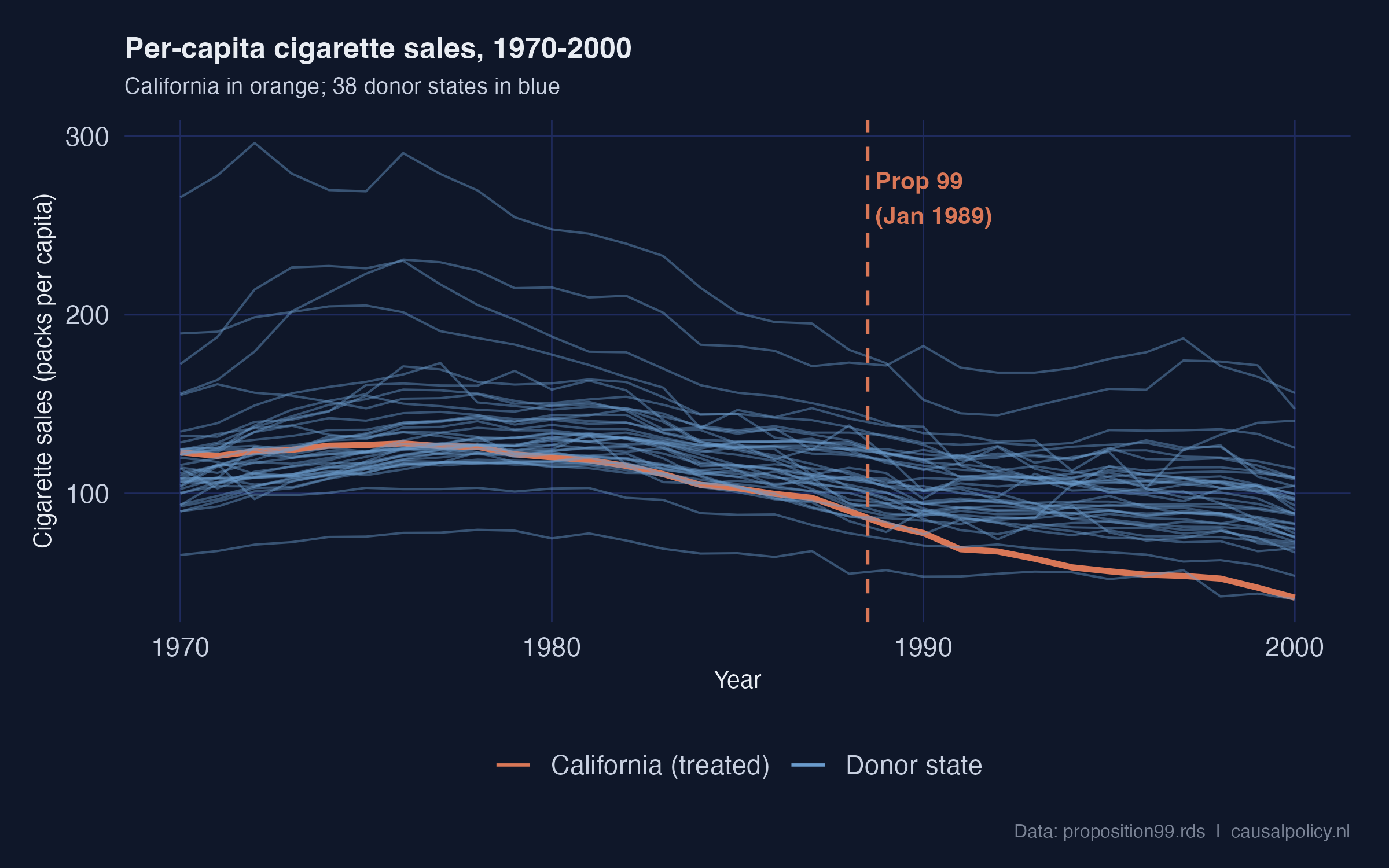
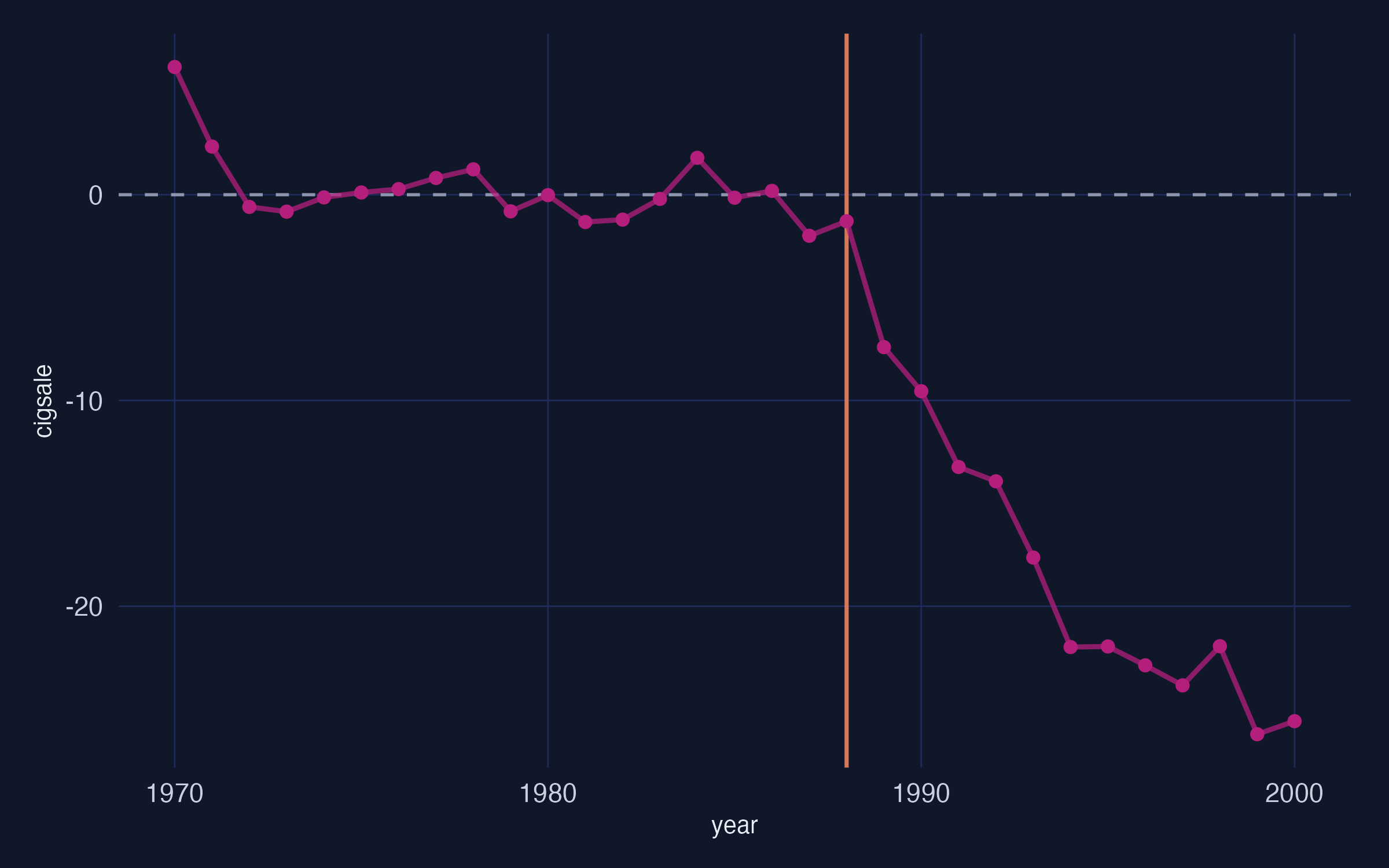
California (orange) sits inside the donor cloud throughout the 1970s and 1980s, then visibly separates downward after the dashed Proposition 99 line. The pre-1988 trajectory is already slightly below the donor median, but it is not anomalous; the sharp post-1988 separation is. Visually, this is the signal every causal estimator is trying to quantify.
5. Method 1 — Naive pre-post comparison
The idea. Compare California’s mean cigarette sales before 1989 with its mean after 1989. Call the difference the “effect”.
R tooling. Base R lm() for the OLS; sandwich::vcovHAC() for the heteroskedasticity-and-autocorrelation-consistent variance estimator; lmtest::coeftest() to retest the coefficients with that variance matrix.
The equation.
$$\hat\tau_{\text{naive}} = \overline{Y}_{1, \text{post}} - \overline{Y}_{1, \text{pre}}.$$
In words: the naive estimate is the difference between California’s observed post-period mean and California’s observed pre-period mean. Mapping to the potential-outcomes framework from §2, this corresponds to imputing $\widehat{Y_{1t}(0)} = \overline{Y}_{1, \text{pre}}$ — i.e., assuming California’s counterfactual smoking would have been frozen at the pre-period average.
Why this is wrong but still useful. The implicit counterfactual “California’s pre-period level continues unchanged” is almost certainly wrong, because smoking was declining nationwide. But the estimate is so cheap to compute that it makes a useful baseline. The five later methods will each try to fix what is broken here.
We follow the workshop’s narrow 1984–1993 window for direct comparability with the rest of the workshop. Using a longer window (e.g., 1970–2000) would change the numbers but not the qualitative point.
# OLS of California's cigsale on a Pre/Post dummy, restricted to the
# workshop's 1984-1993 window.
fit_prepost <- lm(cigsale ~ prepost,
                  data = prop99_cali |> filter(year > 1983, year < 1994))

# Replace the default OLS standard errors with HAC (heteroskedasticity-
# and-autocorrelation-consistent) errors, which short time series need.
coeftest(fit_prepost, vcov. = vcovHAC)
t test of coefficients:

            Estimate Std. Error t value  Pr(>|t|)
(Intercept)  98.9800     2.4999 39.5941 1.821e-10 ***
prepostPost -27.0200     5.2951 -5.1029 0.0009266 ***
Reading the output. California’s mean over 1984–1988 was 98.98 packs/capita. The prepostPost coefficient says the 1989–1993 mean is 27.02 packs lower. The HAC robust standard error is 5.30 ($p < 0.001$). The HAC correction comes from sandwich::vcovHAC and accounts for the heteroskedasticity and autocorrelation that short time series typically exhibit. A classical OLS standard error would be wildly overconfident here.
The estimand here is purely descriptive. This is a within-state difference of means, not a causal estimate. Any nationwide secular decline in smoking gets silently bundled into the $-27.02$. That bundling is exactly what the next five methods try to undo.
Common pitfall. Confusing the within-state pre-post difference with a causal effect. Anything that shifted the entire country between the two windows — anti-smoking campaigns, federal tobacco settlements, rising health awareness — gets attributed entirely to Proposition 99.
Recap. Naive pre-post says $-27.0$ packs, but it has no counterfactual at all — only California’s own past. Hold that number in mind; it will set the upper bound for what every other method estimates.
6. Method 2 — Difference-in-Differences (California vs Nevada)
The idea. Pick one control state (Nevada). Compute its pre-to-post change. Subtract that from California’s pre-to-post change. Whatever is left over is “what the policy did”.
R tooling. Base R lm() with a state * prepost interaction; sandwich + lmtest for HAC-robust standard errors. For modern multi-period Difference-in-Differences with staggered adoption see the did and fixest packages, covered in the companion r_did tutorial.
The identifying assumption. California and Nevada would have moved on parallel paths without the policy. Differences in levels are fine; differences in trends are not. The estimand becomes a proper Average Treatment effect on the Treated (ATT) for California.
The formal DiD identity is
$$\hat{\tau}_{\text{DiD}} = \big(\bar{Y}_{\text{CA, post}} - \bar{Y}_{\text{CA, pre}}\big) - \big(\bar{Y}_{\text{NV, post}} - \bar{Y}_{\text{NV, pre}}\big).$$
In words: DiD takes California’s change and subtracts Nevada’s change. If both states would have evolved in parallel without the policy, the only thing that can drive a difference in their changes is the policy itself.
The four ingredients of the DiD calculation are easier to see as a 2×2 grid. Each cell holds a group mean; the two within-state changes are the row differences; the DiD estimate is the difference of those differences.
flowchart TB
    subgraph "California"
        CA_pre["Pre (1984–88) mean<br/>= 99.0"] --> CA_d["Δ California =<br/>72.0 − 99.0 = −27.0"]
        CA_post["Post (1989–93) mean<br/>= 72.0"] --> CA_d
    end
    subgraph "Nevada (control)"
        NV_pre["Pre (1984–88) mean<br/>= 143.1"] --> NV_d["Δ Nevada =<br/>121.8 − 143.1 = −21.3"]
        NV_post["Post (1989–93) mean<br/>= 121.8"] --> NV_d
    end
    CA_d --> DD["DiD ATT =<br/>(−27.0) − (−21.3) = −5.7"]
    NV_d --> DD

    style CA_pre fill:#d97757,stroke:#141413,color:#fff
    style CA_post fill:#d97757,stroke:#141413,color:#fff
    style NV_pre fill:#6a9bcc,stroke:#141413,color:#fff
    style NV_post fill:#6a9bcc,stroke:#141413,color:#fff
    style DD fill:#00d4c8,stroke:#141413,color:#141413
The arithmetic is literally what the regression below computes. In cigsale ~ state * prepost, the interaction coefficient stateCalifornia:prepostPost is the DiD estimate.
# Keep only California and Nevada in the 1984-1993 window and add the
# Pre/Post factor. Make Nevada the reference level so that the
# stateCalifornia interaction lands on California's extra change.
prop99_did <- prop99 |>
  filter(state %in% c("California", "Nevada"),
         year > 1983, year < 1994) |>
  mutate(prepost = factor(year > 1988, labels = c("Pre", "Post")),
         state   = factor(state, levels = c("Nevada", "California")))

# Two-way interacted regression: state main effect + Pre/Post main effect
# + (state x Pre/Post) interaction. The interaction is the DiD estimate.
fit_did <- lm(cigsale ~ state * prepost, data = prop99_did)

# HAC-robust standard errors for the four coefficients.
coeftest(fit_did, vcov. = vcovHAC)
t test of coefficients:

                            Estimate Std. Error  t value  Pr(>|t|)
(Intercept)                 143.1000     1.0918 131.0701 < 2.2e-16 ***
stateCalifornia             -44.1200     3.8796 -11.3722 4.464e-09 ***
prepostPost                 -21.3400     7.6870  -2.7761   0.01349 *
stateCalifornia:prepostPost  -5.6800     5.3929  -1.0532   0.30788
Reading the output. The interaction coefficient stateCalifornia:prepostPost is $-5.68$ packs (HAC SE 5.39, $p = 0.31$). That is dramatically smaller than the naive $-27.02$, and statistically indistinguishable from zero. Why? Because the prepostPost main effect is also large: $-21.34$ packs. Nevada’s own cigarette sales fell by 21.3 packs between 1984–1988 and 1989–1993. When DiD subtracts that Nevada change from California’s change, almost all of California’s drop is absorbed.
The picture below makes the problem obvious.
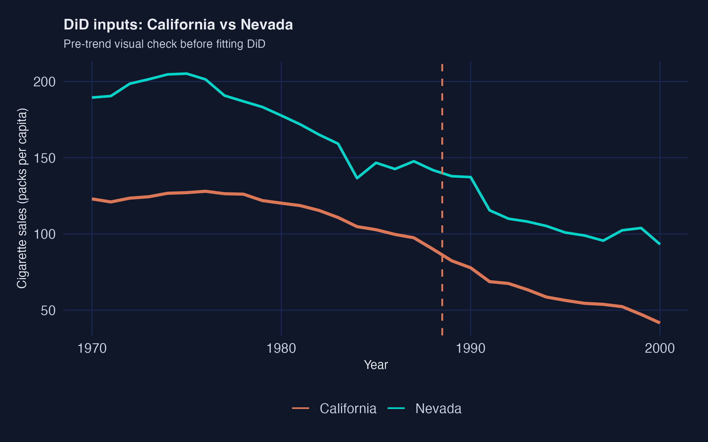
This is the textbook DiD pitfall. A single control unit that itself is shifting in the same direction makes the contrast collapse. Nevada is geographically and culturally adjacent to California. It inherits many of the same secular forces: rising health awareness, federal tobacco settlements, retail-price spillovers. So it is a poor “what would California have done?” control.
Common pitfall. Picking the one “most similar” control by hand. If your single control is subject to the same secular forces as the treated unit — geographic neighbours, policy spillovers, regional macro shocks — the contrast collapses and DiD silently reports zero.
Recap. DiD vs Nevada says $-5.7$ packs and we cannot reject zero. The lesson is not that DiD is broken — it is that DiD with a single similar control unit is fragile. Synthetic Control in §10 is the principled response: instead of one control state, blend many states into a weighted “synthetic California”.
7. Method 3a — Interrupted Time Series via pre-period growth curve
The idea. Stop borrowing from a comparison unit. Instead, build the counterfactual from California’s own pre-period dynamics. Fit a model on 1970–1988, extrapolate it into 1989–2000, and call the gap between the extrapolation and the observed data the effect.
R tooling. Base R lm() for the pre-period linear fit; predict() for the post-period extrapolation. No specialised package needed for the simplest growth-curve variant. The tsibble class (loaded via fpp3) provides a tidy panel index that the next ITS variant relies on.
The equation. Fit a linear trend on the pre-period only:
$$Y_{1t} = \alpha + \beta\, t + \varepsilon_t, \qquad t \le t^* = 1988.$$
Then extrapolate the fitted line into the post-period as the counterfactual:
$$\widehat{Y_{1t}(0)} = \hat\alpha + \hat\beta\, t, \qquad t > t^*.$$
Finally, average the gap between observed and counterfactual over the post-period:
$$\widehat{\text{ATT}}_{\text{ITS-growth}} = \frac{1}{T_{\text{post}}} \sum_{t > t^*} \Big[Y_{1t} - (\hat\alpha + \hat\beta\, t)\Big].$$
In words: a single straight line, fit on 1970–1988 cigarette sales in California, becomes the counterfactual for 1989–2000. The policy effect is the average of the per-year residuals between what was actually observed and what the extrapolated line predicted. The slope $\hat\beta$ captures whatever secular trend California was already on; only deviations from that trend after 1989 are attributed to Proposition 99.
Why it differs from naive pre-post. Naive pre-post assumes “no change”. ITS allows a non-zero pre-trend. If California was already declining, the ITS counterfactual continues that decline; only the extra drop after 1989 gets attributed to the policy.
# California-only time series with a Pre/Post factor and a centred year
# index (year0 = 0 at the first post-period year). The tsibble class is
# required by the fpp3 forecasting tools used later.
prop99_ts <- prop99 |>
  filter(state == "California") |>
  select(year, cigsale) |>
  mutate(prepost = factor(year > 1988, labels = c("Pre", "Post"))) |>
  as_tsibble(index = year) |>
  mutate(year0 = year - 1989)

# Fit a linear pre-period trend (cigsale on year, 1970-1988 only).
fit_growth <- lm(cigsale ~ year, data = prop99_ts |> filter(prepost == "Pre"))

# Print the intercept and slope with their standard errors.
summary(fit_growth)$coefficients
             Estimate Std. Error  t value     Pr(>|t|)
(Intercept) 3637.7889   513.3284  7.087  1.823e-06 ***
year          -1.7795     0.2594 -6.860  2.767e-06 ***
The pre-period (1970–1988) linear trend is $-1.78$ packs/year ($p < 10^{-5}$, $R^2 = 0.735$) — so smoking was already declining about 1.8 packs per capita per year in California well before Proposition 99. To estimate the policy effect we extrapolate that line forward to 2000 and average the gap between observed and predicted:
# Subset to the 1989-2000 rows and extrapolate the fitted line forward.
post_df <- prop99_ts |> filter(prepost == "Post")
pred_growth <- predict(fit_growth, newdata = as_tibble(post_df))

# ATT estimate = average per-year gap between observed and extrapolation.
its_growth_estimate <- mean(post_df$cigsale - pred_growth)
its_growth_estimate
[1] -28.28
Reading the output. The ITS-growth-curve estimate is $-28.28$ packs/capita. That is essentially identical to the naive pre-post $-27.02$. Why? Because both methods only use within-California information. Neither borrows from a comparison unit. So neither can separate “California-specific effect” from “national secular decline”.
The coincidence is suggestive but not reassuring. Both methods can be biased the same way if California’s pre-trend was understating the speed of the secular decline.
Common pitfall. Assuming the linear pre-trend is the right shape. If the true secular decline is accelerating or saturating, a linear extrapolation either understates or overstates what would have happened — and the policy effect inherits the bias.
Recap. ITS-growth says $-28.3$ packs. Adding a linear pre-trend changed almost nothing relative to the naive baseline, because the trend was modest. The next ITS variant uses a more flexible time-series model — and we will see why “more flexible” can backfire.
8. Method 3b — Interrupted Time Series via auto-selected ARIMA forecast
The idea. Replace the straight line with a flexible time-series model. Let the data decide the model’s complexity through an information criterion (AICc). Forecast forward as the counterfactual.
R tooling. The fpp3 meta-package (Hyndman & Athanasopoulos 2021) loads fable::ARIMA() for the model fit, forecast() for the post-period projection, and report() for the diagnostic printout. Companion textbook Forecasting: Principles and Practice is the canonical reference.
The equation. A general ARIMA$(p, d, q)$ model writes the $d$-th differenced series as an autoregressive-moving-average process. Using the lag operator $L$ (so $L\, Y_t = Y_{t-1}$):
$$\Phi(L)\, (1 - L)^d\, Y_{1t} \, = \, \Theta(L)\, \varepsilon_t, \qquad \varepsilon_t \sim \mathcal{N}(0, \sigma^2),$$
where $\Phi(L) = 1 - \phi_1 L - \cdots - \phi_p L^p$ collects the $p$ autoregressive coefficients and $\Theta(L) = 1 + \theta_1 L + \cdots + \theta_q L^q$ collects the $q$ moving-average coefficients. The fpp3::ARIMA(..., ic = "aicc") call searches over $(p, d, q)$ and picks the combination that minimises the corrected Akaike Information Criterion on the pre-period. For California’s 1970–1988 series, AICc picks $(p, d, q) = (1, 2, 0)$: one autoregressive lag and two rounds of differencing (which is what bends the counterfactual so aggressively in the figure below).
Once the model is fit, the post-period counterfactual is the model’s $h$-step forecast and the ATT is the average gap, just as in §7:
$$\widehat{Y_{1t}(0)} = \hat Y_{1t \mid t^*}, \qquad \widehat{\text{ATT}}_{\text{ITS-ARIMA}} = \frac{1}{T_{\text{post}}} \sum_{t > t^*} \Big[Y_{1t} - \hat Y_{1t \mid t^*}\Big].$$
In words: same recipe as the growth-curve version — fit on pre-period, project forward, average the gap — but the “fit on pre-period” step now uses an autoregressive-integrated-moving-average model instead of a straight line. The values $p$, $d$, $q$ control how flexible the model is allowed to be.
What ARIMA(p, d, q) means in plain English. p is the number of past values the model uses (autoregression). d is the number of times the series is differenced before fitting (to handle trends). q is the number of past forecast errors used (moving average). Lower AICc = “better fit traded off against complexity”.
# Fit an ARIMA model on the 1970-1988 California series. ic = "aicc"
# tells fable to search over (p, d, q) and pick the AICc minimiser.
fit_arima <- prop99_ts |>
  filter(prepost == "Pre") |>
  model(timeseries = ARIMA(cigsale, ic = "aicc"))

# Print the chosen orders, coefficients, and information criteria.
report(fit_arima)
Series: cigsale
Model: ARIMA(1,2,0)
Coefficients:
          ar1
      -0.6255
s.e.   0.2427
sigma^2 estimated as 4.953:  log likelihood = -37.45
AIC = 78.9   AICc = 79.76   BIC = 80.57
ARIMA(1, 2, 0) was selected: one autoregressive lag and two rounds of differencing. The double-differencing means the model is tracking the acceleration of California’s late-1980s drop, not just its level or slope. We then forecast 12 years out and average the gap.
# Project the fitted ARIMA 12 years forward as the post-period counterfactual.
fcasts <- forecast(fit_arima, h = "12 years")

# ATT estimate = average per-year gap between observed and ARIMA forecast.
ce_arima <- post_df$cigsale - fcasts$.mean
mean(ce_arima)
[1] 4.55
Reading the output. The ARIMA-based ITS estimate is $+4.55$ packs. That is positive — it would imply Proposition 99 increased California’s smoking. That is plainly the wrong answer. The visual diagnostic shows why:
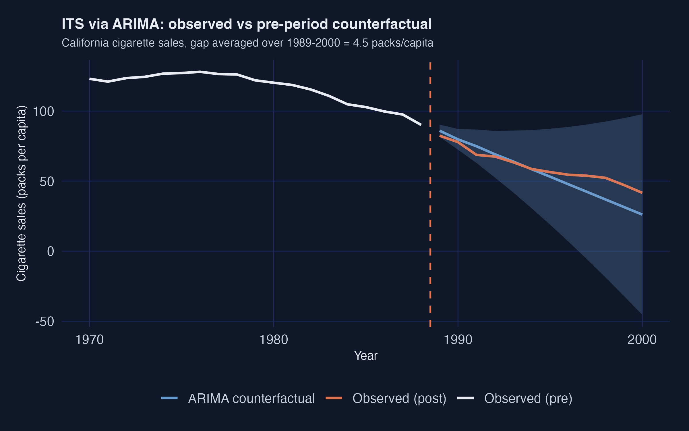
The dashed blue line is the ARIMA counterfactual. It sits below the observed orange series throughout the post period. The model extrapolates the late-1980s downward acceleration too aggressively. It predicts California should have hit roughly 50 packs by 2000 if the pre-period momentum had continued. Since California actually only hit 60 packs, the model concludes Proposition 99 “raised” smoking by about 5 packs relative to that doomsday counterfactual.
The pitfall in one sentence. AICc minimises in-sample fit, but in-sample fit can come from features (here, second-order momentum) that do not persist out-of-sample.
Common pitfall. Trusting an information-criterion-selected model on a short pre-period. AICc rewards in-sample fit. With 19 pre-period observations, it can latch onto late-pre-period momentum that does not persist out-of-sample, producing a counterfactual that bends through (or past) the observed post-period values.
Recap. ITS-ARIMA says $+4.55$ packs and is the headline-grabbing outlier. The lesson is not “ARIMA is bad” — it is that single-model ITS is fragile. Always pair an ITS estimate against a comparison-unit method (Synthetic Control, CausalImpact, or a credibly-matched DiD) before drawing conclusions.
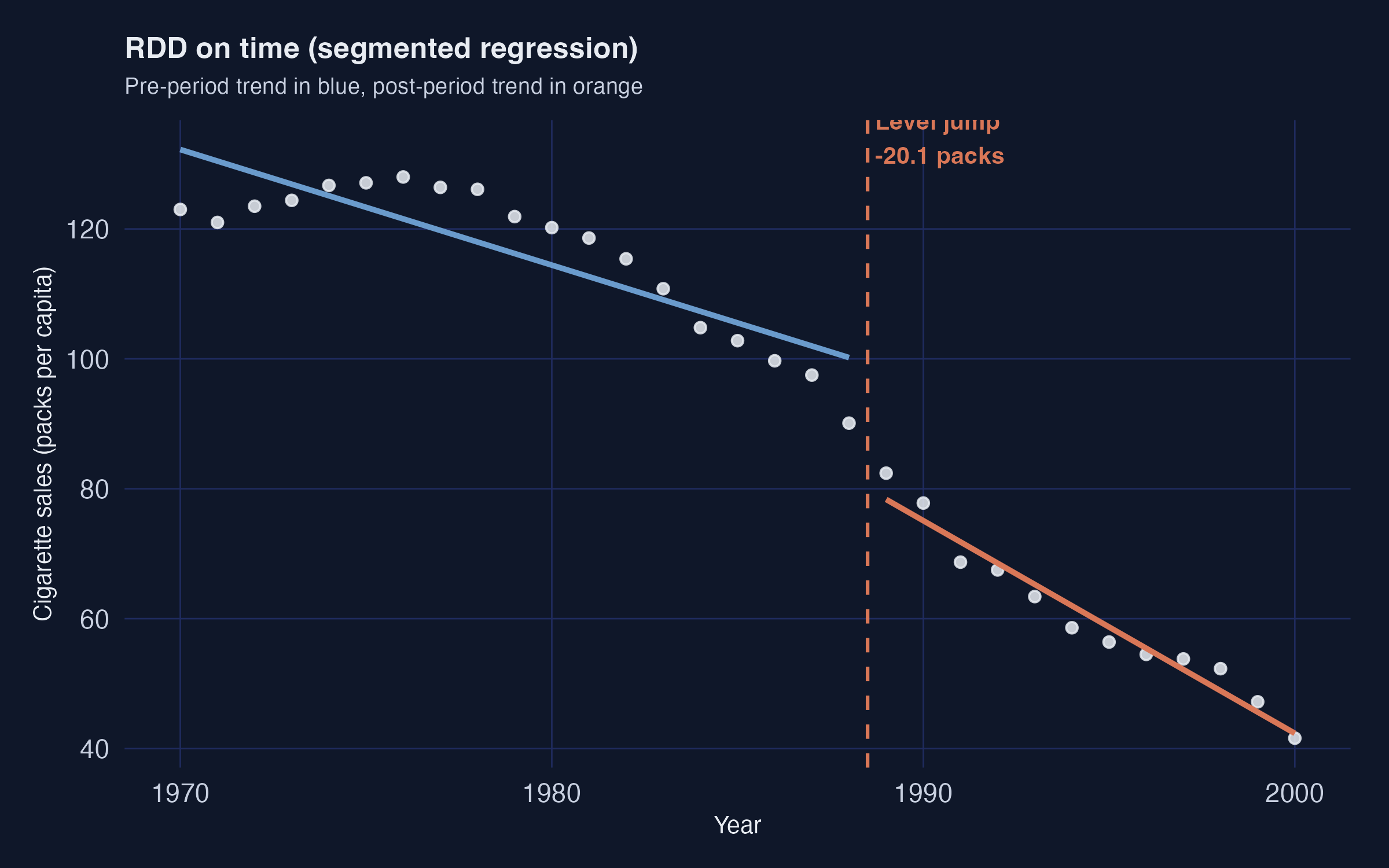
9. Method 4 — Regression Discontinuity on time (segmented regression)
The idea. Use calendar time as the running variable. Fit a piecewise linear regression that allows two breaks at 1989: a level jump and a slope change. The level jump is the immediate “policy shock”; the slope change is how the trajectory bends afterwards.
R tooling. Base R lm() with a piecewise specification; sandwich + lmtest for HAC-robust standard errors. For classical sharp RDD on a continuous running variable (e.g. test scores, income), use rdrobust (Calonico, Cattaneo & Titiunik) instead.
The equation. Re-centre time at the threshold by defining $\tilde t = t - t^* - 1$ (so $\tilde t = 0$ for the first post-period year). Then fit the segmented regression
$$Y_{1t} = \beta_0 + \beta_1\, \tilde t + \beta_2\, \mathbf{1}[\tilde t \ge 0] + \beta_3\, \tilde t \cdot \mathbf{1}[\tilde t \ge 0] + \varepsilon_t.$$
Each coefficient has a precise causal reading.
- $\beta_0$ is the pre-period intercept at $\tilde t = 0$ (California’s fitted level just before the threshold).
- $\beta_1$ is the pre-period slope.
- $\beta_2$ is the level break at the threshold — the immediate jump in cigarette sales at $\tilde t = 0$. This is the headline RDD effect.
- $\beta_3$ is the change in slope after the threshold (the post-period slope is $\beta_1 + \beta_3$).
The piecewise counterfactual continues the pre-period line ($\beta_0 + \beta_1\, \tilde t$) into the post-period, so the total deviation of observed from counterfactual at time $\tilde t > 0$ is $\beta_2 + \beta_3\, \tilde t$. In other words, the policy shifts the series down by $\beta_2$ packs immediately, then the gap widens (or narrows) at rate $\beta_3$ per year.
In words: the calendar year is recentred so that the threshold sits at zero, then we fit two straight lines — one for $\tilde t < 0$, one for $\tilde t \ge 0$ — that are allowed to differ in both intercept and slope. The intercept gap $\beta_2$ is the “discontinuity” you can see at the dashed orange line in Figure 4.
A naming heads-up. The workshop labels this specification “RDD”. It is RDD with time as the running variable, not the classical sharp RDD you would use for a means-tested benefit at an income cutoff. With time as the running variable, the math reduces to segmented regression.
# Piecewise OLS: pre-period slope, level break at threshold, slope change
# after threshold. year0 = year - 1989 (already constructed earlier).
fit_rdd <- lm(cigsale ~ year0 + prepost + year0:prepost,
              data = as_tibble(prop99_ts))

# HAC-robust standard errors for the four coefficients.
coeftest(fit_rdd, vcov. = vcovHAC)
t test of coefficients:

                   Estimate Std. Error t value  Pr(>|t|)
(Intercept)        98.41579    4.96750 19.8119 < 2.2e-16 ***
year0              -1.77947    0.45909 -3.8761 0.0006137 ***
prepostPost       -20.05810    5.58538 -3.5912 0.0012911 **
year0:prepostPost  -1.49465    0.40140 -3.7236 0.0009151 ***
Reading the output. Three coefficients matter.
- Pre-period slope
year0= $-1.78$ packs/year. Matches the ITS-growth fit; sanity check passed. - Level break
prepostPost= $-20.06$ packs (HAC SE 5.59, $p = 0.001$). California’s sales drop by about 20 packs immediately at the 1989 threshold. - Slope change
year0:prepostPost= $-1.49$ packs/year (HAC SE 0.40, $p < 0.001$). The post-period decline accelerates by an extra 1.5 packs/year on top of the pre-period 1.8 packs/year.
Combining the level break and the slope change, by 2000 (11 years after the threshold) the cumulative deviation from the extrapolated pre-trend is roughly $-20 - 11 \times 1.49 \approx -36$ packs. The piecewise fit is excellent ($R^2 = 0.973$):
The blue pre-1988 line and the orange post-1989 line both fit California’s points almost perfectly, with a clear discontinuity at the threshold.
Caveat. RDD on time inherits the same pre-trend mis-specification risk as ITS. If California’s underlying trajectory was already changing curvature in the late 1980s for non-policy reasons — say, the 1988 Surgeon General’s report on nicotine addiction — the level break attributed to Proposition 99 will absorb that change too.
Common pitfall. Mistaking a coincident shock at the threshold for the policy effect. With time as the running variable, any event that happens to land in the same year as the policy — a related federal regulation, a recession, a media campaign — is absorbed into the level break.
Recap. Regression Discontinuity on time reports a $-20.1$ pack level break with a tight standard error. It is the first of three methods to land in the credible $-13$ to $-20$ “consensus” range, alongside Synthetic Control and CausalImpact.
10. Method 5 — Synthetic Control
The idea. Stop using one control state. Instead, build a weighted combination of donor states that matches California’s pre-period as closely as possible on a set of predictors. The weighted combination is “synthetic California”. The gap between observed California and synthetic California is the estimated effect.
R tooling. tidysynth by Eric Dunford (GitHub) wraps the original Abadie–Diamond–Hainmueller optimisation in a tidyverse-friendly pipeline. The older Synth package by Hainmueller is the historical reference. For Bayesian and spatial extensions see the r_sc_bayes_spatial tutorial.
The equation, in plain English first. The optimisation picks a recipe — a convex combination of donor states — that mimics California’s pre-1988 trajectory on a chosen set of predictors. That recipe is then frozen and used to project the no-policy counterfactual into the post-period. Two simple constraints make the result interpretable: every donor weight is non-negative, and the weights sum to 1. So the synthetic series cannot extrapolate outside the range of the donors — it is always a “blend”, never an “extension”.
Formally, let $X_1$ be the vector of $k$ pre-period predictors for the treated unit (California), and let $X_0$ be the $k \times J$ matrix holding the same predictors for the $J = 38$ donor states. The Synthetic Control estimator chooses donor weights $w$ to minimise the (V-weighted) discrepancy between treated and synthetic on the predictors:
$$w^* \, = \, \arg\min_{w \in \mathcal{W}} \, \big(X_1 - X_0 w\big)^\top V \big(X_1 - X_0 w\big),$$
subject to
$$\mathcal{W} = \big\{w \in \mathbb{R}^J \,:\, w_j \ge 0 \,\, \forall j, \,\, \textstyle\sum_{j=1}^J w_j = 1\big\}.$$
In words: find the donor weights $w$ that make synthetic California’s predictor profile as close as possible to real California’s, where “close” is measured by the V-weighted quadratic distance. The diagonal matrix $V$ holds the predictor importance weights — the optimiser can care more about pre-period cigarette sales than about, say, beer consumption (we will inspect $V$ in §10.2).
Once $w^*$ is solved, the synthetic California outcome at any year $t$ is
$$\widehat{Y_{1t}(0)} = \sum_{j=1}^J w_j^* \, Y_{jt},$$
and the average treatment effect on the treated over 1989–2000 is just the mean post-period gap between observed California and that synthetic counterfactual:
$$\widehat{\text{ATT}}_{\text{SCM}} = \frac{1}{T_{\text{post}}} \sum_{t > t^*} \Big[Y_{1t} - \sum_{j=1}^J w_j^* \, Y_{jt}\Big].$$
Why it works where Difference-in-Differences failed. Difference-in-Differences against Nevada needed parallel pre-trends with one neighbour. Synthetic Control needs parallel pre-trends with a data-driven blend of many neighbours. The optimisation does the matching, so the analyst no longer has to pick “the right” control state by hand.
The pipeline. The tidysynth package by Eric Dunford wraps the Abadie–Diamond–Hainmueller optimisation into a tidyverse-style pipeline with four explicit stages.
flowchart LR
    A["1. synthetic_control()<br/>declare treated unit<br/>and intervention time"] --> B["2. generate_predictor()<br/>define matching variables<br/>(one call per time window)"]
    B --> C["3. generate_weights()<br/>optimise donor weights<br/>(quadratic programming)"]
    C --> D["4. generate_control()<br/>build synthetic California<br/>and post-period gap series"]
    D --> E["5. plot_/grab_ helpers<br/>trends, weights,<br/>placebos, MSPE ratio,<br/>Fisher exact p-value"]

    style A fill:#6a9bcc,stroke:#141413,color:#fff
    style B fill:#6a9bcc,stroke:#141413,color:#fff
    style C fill:#6a9bcc,stroke:#141413,color:#fff
    style D fill:#d97757,stroke:#141413,color:#fff
    style E fill:#00d4c8,stroke:#141413,color:#141413
Stages 1–4 produce the estimate. Stage 5 is a battery of inspection helpers — plot_trends(), plot_differences(), plot_weights(), plot_placebos(), plot_mspe_ratio(), grab_unit_weights(), grab_predictor_weights(), grab_balance_table(), grab_significance() — that turn the fitted object into figures and tables for diagnostics and inference. We use all of them below.
A roadmap for this section
Synthetic Control is the deepest method in this tutorial, so this section is the longest. To keep you oriented, here is what each subsection does:
| Subsection | What you will see | Why it matters |
|---|---|---|
| 10.1 | Build prop99_syn with the four-stage pipeline | Defines the treated unit, the donor pool, and the predictors |
| 10.2 | Donor weights (W) and predictor weights (V) | Tells you which donors and which predictors did the matching work |
| 10.3 | The point estimate and the trends plot | The headline ATT and the visual comparison observed vs synthetic |
| 10.4 | Predictor balance table | Confirms the matching worked — California vs synthetic California vs donor average |
| 10.5 | plot_differences() | Isolates the year-by-year treatment-effect curve |
| 10.6 | Placebo permutation test | Inference: where does California fall vs every “what if a donor had been treated?” simulation |
| 10.7 | Mean Squared Prediction Error ratio and Fisher exact $p$-value | A sharper one-number inference statistic |
| 10.8 | Inspecting the nested tidysynth object | The whole optimisation is introspectable from R |
Read top to bottom for the full walk-through, or jump to a subsection if you only need one diagnostic.
10.1 Fit the synthetic-control pipeline
prop99_syn <- prop99 |>
  # 1. Declare the panel structure: outcome, unit, time, treated unit
  #    ("California"), and the last full pre-period year (1988).
  #    generate_placebos = TRUE also fits the model treating each donor
  #    state as treated, for the permutation test in 10.5.
  synthetic_control(
    outcome  = cigsale, unit = state, time = year,
    i_unit   = "California", i_time = 1988,
    generate_placebos = TRUE
  ) |>
  # 2. Predictors averaged over the full pre-period (1980-1988).
  generate_predictor(
    time_window = 1980:1988,
    lnincome    = mean(lnincome, na.rm = TRUE),
    retprice    = mean(retprice, na.rm = TRUE),
    age15to24   = mean(age15to24, na.rm = TRUE)
  ) |>
  # 2b. beer is sparser, so use a narrower window where data is densest.
  generate_predictor(time_window = 1984:1988,
                     beer = mean(beer, na.rm = TRUE)) |>
  # 2c. Three "lagged outcomes" - cigsale at three pre-period dates.
  #     These pin synthetic California's pre-period trajectory.
  generate_predictor(time_window = 1975, cigsale_1975 = cigsale) |>
  generate_predictor(time_window = 1980, cigsale_1980 = cigsale) |>
  generate_predictor(time_window = 1988, cigsale_1988 = cigsale) |>
  # 3. Solve the constrained QP for donor weights w*. The three IPOP
  #    parameters are tuning knobs for the interior-point optimiser:
  #    margin_ipop (convergence margin), sigf_ipop (significant figures),
  #    bound_ipop (numerical bound). These values match the tidysynth
  #    README example; defaults are usually fine.
  generate_weights(optimization_window = 1970:1988,
                   margin_ipop = .02,
                   sigf_ipop   = 7,
                   bound_ipop  = 6) |>
  # 4. Compute the synthetic California series from w* and donor outcomes.
  generate_control()
On the *_ipop parameters. They tune the IPOP interior-point optimiser that tidysynth calls under the hood. Most users can leave them at defaults; we expose them here because the canonical tidysynth README example sets them explicitly, and we want this notebook to be bit-comparable to that reference.
Predictor choices. Seven predictors are passed in. Three are pre-period covariate averages over the full pre-period (lnincome, retprice, age15to24 over 1980–1988). One uses a narrower window where data is densest (beer over 1984–1988). Three are lagged outcomes — cigarette sales themselves at 1975, 1980, and 1988. The lagged outcomes are the most important trick: anchoring the synthetic control on the treated unit’s own pre-period outcome levels at multiple time points forces the synthetic series to track California’s pre-1988 trajectory closely.
10.2 The donor weights and the predictor weights
The optimisation produces two weight vectors that drive the entire fit. Both are extractable as tidy tables.
grab_unit_weights(prop99_syn)      # donor states (W)
grab_predictor_weights(prop99_syn) # matching variables (V)
# Donor weights — top 5 only (rest are < 0.001)
unit          weight
Utah        0.342
Nevada      0.238
Montana     0.209
Colorado    0.149
Connecticut 0.062

# Predictor weights (V matrix)
variable       weight
cigsale_1975   0.468
cigsale_1980   0.412
retprice       0.055
cigsale_1988   0.037
beer           0.020
age15to24      0.007
lnincome       0.000
Two things to notice.
Five states absorb essentially 100% of the donor weight. Utah (34.2 %), Nevada (23.8 %), Montana (20.9 %), Colorado (14.9 %), Connecticut (6.2 %). Every other state gets effectively zero. California is matched mostly to other Western/sunbelt states with similar age structure and cigarette price levels, plus Connecticut as a smoking-rate counterweight from the east.
The two earliest cigsale levels dominate the V matrix.
cigsale_1975andcigsale_1980together get 88 % of the predictor weight. The four behavioural and demographic covariates get less than 9 % combined. The optimiser has effectively decided: “the best way to predict California’s cigarette sales is using other states’ cigarette sales.”
For a one-line visual of both weight vectors, tidysynth ships a plot_weights() helper. The same fitted object is passed in and we get a faceted ggplot showing donor unit weights on the left and predictor (V matrix) weights on the right.
# tidysynth's built-in helper -- one ggplot with two facets.
plot_weights(prop99_syn)
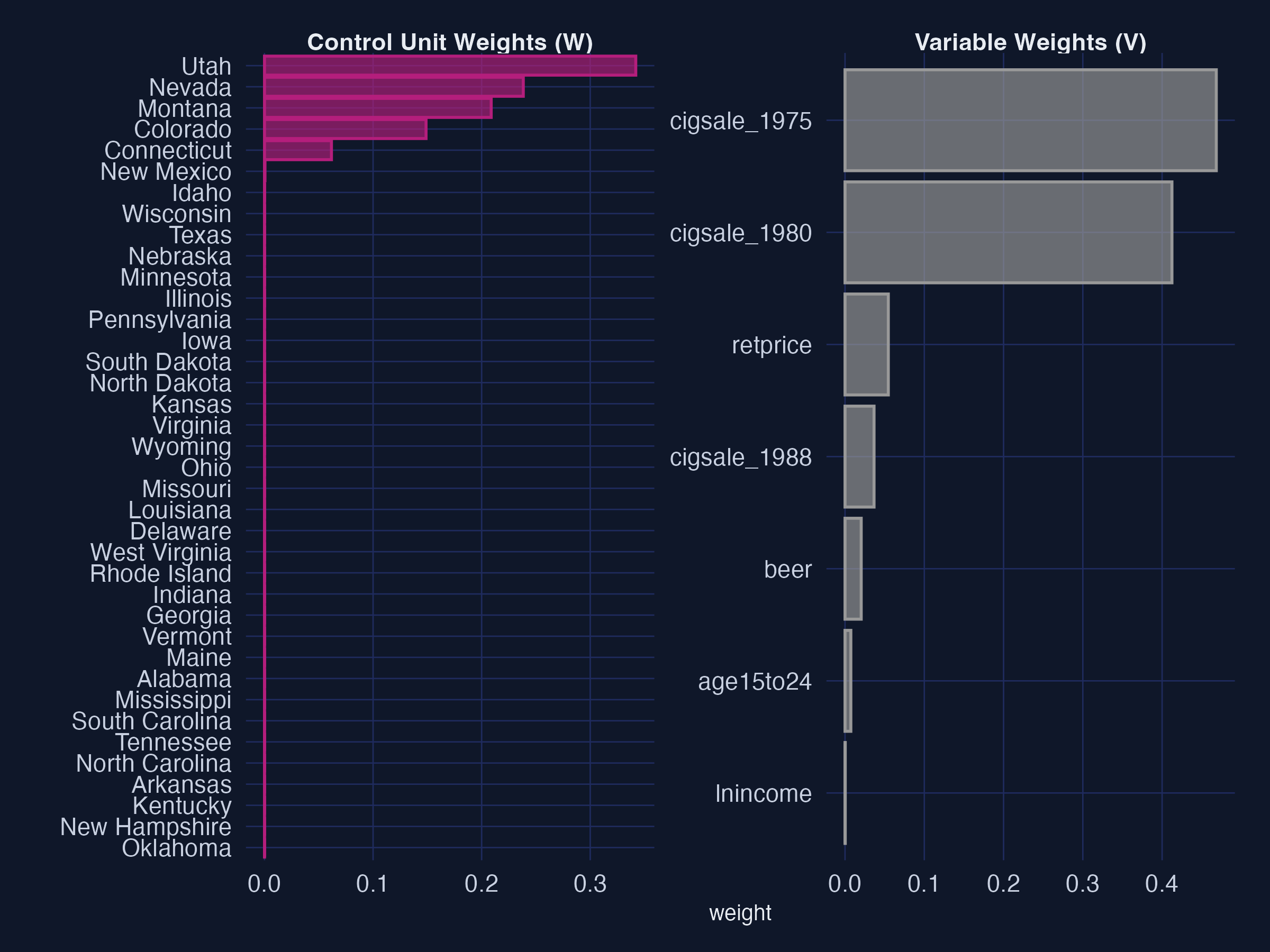
The left facet recovers the five-state recipe from the table above; the right facet shows the heavy concentration on the two lagged-outcome predictors. Both panels are produced by the same one-line call to plot_weights(prop99_syn).
A closer look at the V matrix
The combined plot_weights() view is convenient, but the V matrix deserves a stand-alone chart because it answers a different question than the donor weights. Donor weights say which states mimic California; the V matrix says which variables the optimiser used to decide what “mimics” means.
# Build a stand-alone bar chart of the V matrix from the tidy
# grab_predictor_weights() output.
predw_df <- grab_predictor_weights(prop99_syn) |>
  mutate(variable = forcats::fct_reorder(variable, weight))

ggplot(predw_df, aes(x = weight, y = variable)) +
  geom_col(fill = "#6a9bcc") +
  geom_text(aes(label = sprintf("%.3f", weight)), hjust = -0.12) +
  labs(x = "V-matrix weight (predictor importance)", y = NULL)
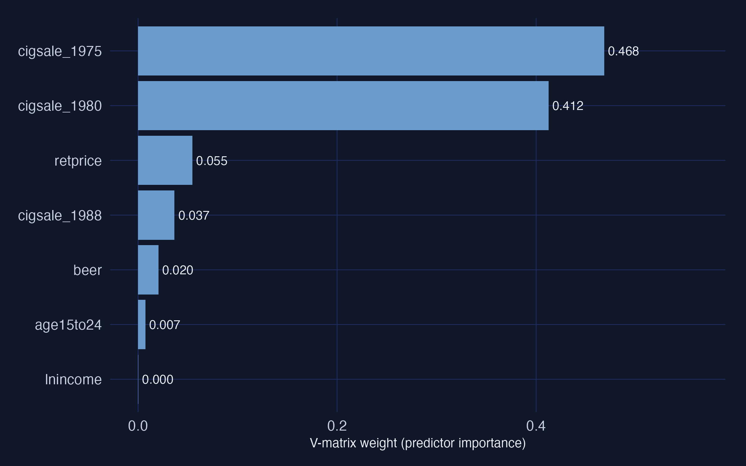
Two readings of the same picture, one practical and one cautionary.
- Practical reading. Two lagged outcomes (
cigsale_1975at 0.468 andcigsale_1980at 0.412) carry 88 % of the matching information. The remaining 12 % is split mostly between retail cigarette price (0.055) and the third lagged outcome (0.037). The optimiser has decided that California’s pre-period cigarette sales — at multiple time points — are the best fingerprint to match. - Cautionary reading. The V matrix is not a causal ranking. It tells you which variables were useful for matching the treated unit’s pre-period, not which variables cause the outcome. A predictor can have zero V-weight here and still be substantively important for cigarette consumption — it just was not the most efficient lever for getting the pre-period RMSPE small.
Common pitfall. Treating the V matrix as a list of causal drivers. It is a list of good pre-period predictors for one specific unit, not a structural model of smoking. The right place to look for causal importance is the post-period gap series in §10.5, not the V matrix.
10.3 The estimate
# grab_synthetic_control() returns a tidy tibble with observed (real_y)
# and synthetic (synth_y) cigsale for every year. We restrict to the
# post-period and compute the per-year gap.
sc_post <- grab_synthetic_control(prop99_syn) |>
  filter(time_unit > 1988) |>
  mutate(dif = real_y - synth_y)

# Average the per-year gap to recover the ATT.
mean(sc_post$dif)
[1] -18.85
The Synthetic Control ATT is $-18.85$ packs/capita averaged over 1989–2000. This is the workshop’s primary causal estimate and within rounding of the canonical Abadie et al. (2010) result.
plot_trends(prop99_syn) # built-in helper from tidysynth
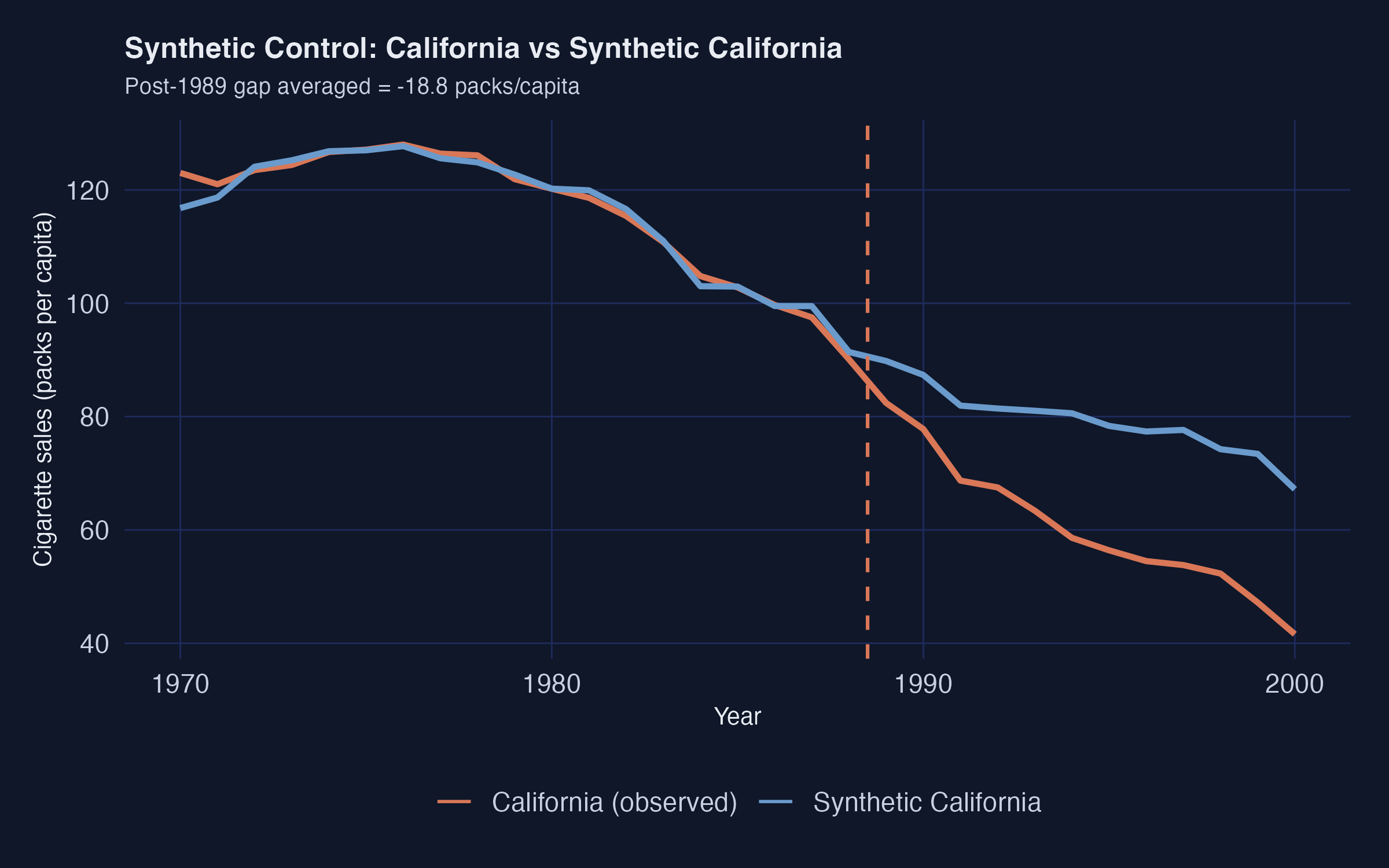
The pre-period fit is excellent — the synthetic and observed series are nearly indistinguishable through 1988. A substantial gap opens immediately after 1989, widening to roughly 30 packs by 2000.
10.4 Predictor balance: did the matching work?
grab_balance_table() shows California, synthetic California, and the unweighted donor average side-by-side on every predictor.
variable     California synthetic_California donor_sample
age15to24         0.174                0.174        0.173
lnincome         10.131                9.852        9.830
retprice         89.422               89.354       87.349
beer             24.275               24.165       23.683
cigsale_1975    127.100              127.044      136.937
cigsale_1980    120.200              120.157      138.081
cigsale_1988     90.100               91.366      114.234
Read the rightmost two columns against the leftmost. On every variable, synthetic California (column 3) is far closer to California (column 2) than the unweighted donor average (column 4) is. The most dramatic improvement is on the lagged outcomes: cigsale_1988 is 90.1 for California vs 91.4 for the synthetic — a near-perfect match — while the unweighted donor average is 114.2. That gap of 24 packs is exactly the bias the naive pre-post method silently absorbed.
10.5 Visualising the post-period gap with plot_differences()
plot_trends() showed both observed and synthetic California on one canvas. The companion helper plot_differences() plots just the gap: $Y_{1t} - \widehat{Y_{1t}(0)}$, year by year. This isolates the treatment-effect curve in its cleanest form.
plot_differences(prop99_syn)
Read the line as the effect of Proposition 99 on California in year $t$. The pre-period values hover near zero (the matching worked), the line drops sharply after 1989, and it stays negative — steadily widening — throughout the post-period. The 1989–2000 mean of this series is exactly the $-18.85$ packs ATT reported above.
10.6 Inference via placebo permutation
A “standard error” computed as cross-year SD divided by $\sqrt{N}$ is not a real sampling-distribution-based standard error. The proper Synthetic Control uncertainty quantification is a permutation test.
The recipe. Refit the synthetic-control model treating each donor state as if it had been the treated unit. Compute the post-period gap for each placebo. Compare California’s gap trajectory to those placebo trajectories. If California’s gap is extreme relative to the placebos, the policy probably did something.
# tidysynth's built-in one-liner. Returns a ggplot showing the gap
# series for California (highlighted) on top of the gap series for
# every donor refit as if treated.
plot_placebos(prop99_syn)
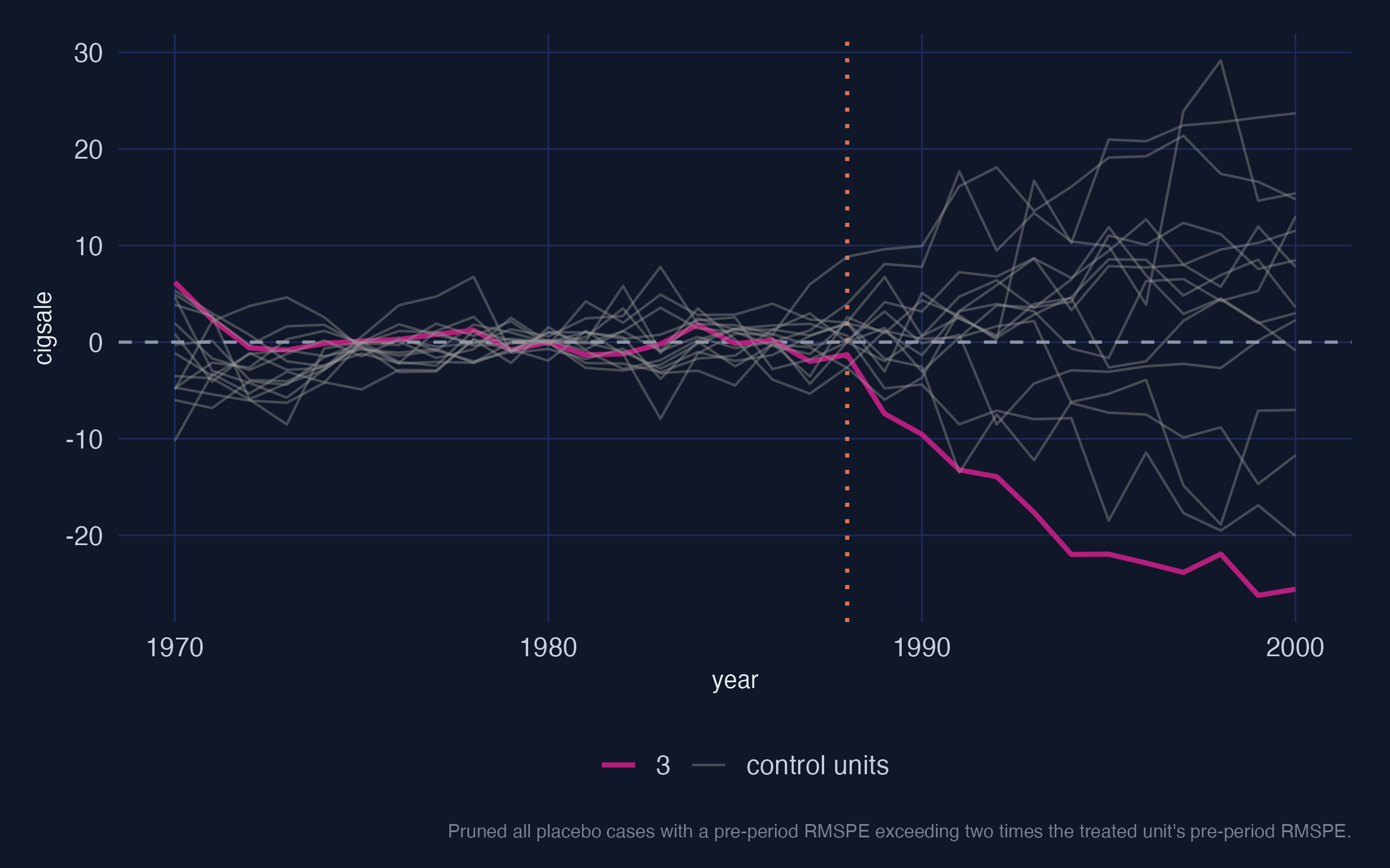
The orange line is California; the grey lines are the donor placebos. By default, plot_placebos() prunes placebos whose pre-period mean squared prediction error (MSPE) exceeds twice California’s — those donors fit their own pre-period so badly that comparing their post-period gap to California’s would be misleading. After pruning, California’s post-period gap sits visibly below every retained placebo, which is the visual signature of a “real” treatment effect.
The unpruned variant keeps every donor for full transparency:
plot_placebos(prop99_syn, prune = FALSE)
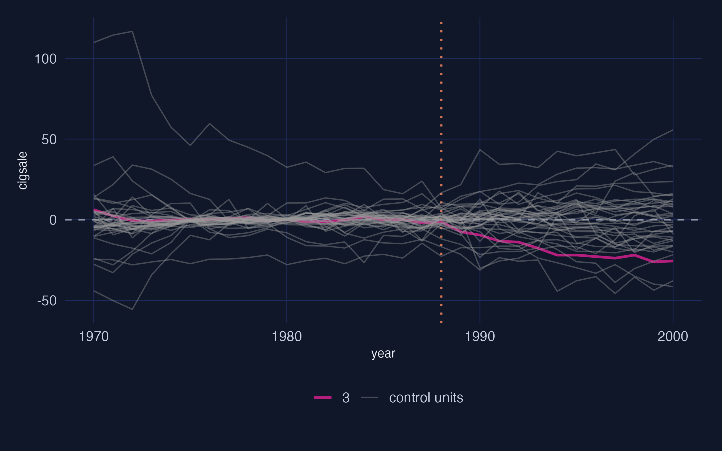
With pruning off, the grey cloud is messier and a few badly-fit donors swing wildly — but California’s post-period descent still ends up at the bottom of the bundle. The qualitative conclusion does not depend on the pruning rule.
10.7 The Mean Squared Prediction Error ratio and a Fisher exact p-value
A sharper version of the same test is the MSPE ratio — the ratio of post-period to pre-period mean squared prediction error. If a unit has a tight pre-period fit and a large post-period gap, the ratio is large. California’s number is striking:
# grab_significance() returns one row per unit (treated + every placebo)
# with pre_mspe, post_mspe, the post/pre ratio, the unit's rank in that
# ratio, and the Fisher-style p-value (rank / n_units).
grab_significance(prop99_syn) |> arrange(desc(mspe_ratio)) |> head(5)
unit_name     type     pre_mspe post_mspe mspe_ratio  rank fishers_exact_pvalue
California    Treated      3.17      392.      123.9     1               0.0256
Georgia       Donor        3.79      179.       47.2     2               0.0513
Indiana       Donor       25.2       770.       30.6     3               0.0769
West Virginia Donor        9.52      284.       29.8     4               0.103
Wisconsin     Donor       11.1       268.       24.1     5               0.128
California’s MSPE ratio is 123.9 — more than two and a half times higher than the next-highest unit (Georgia at 47.2). California ranks 1st out of 39 units. The Fisher exact $p$-value is rank divided by total units, so $1/39 \approx 0.026$. Under the null hypothesis that Proposition 99 had no effect, the probability of seeing a unit this extreme purely by chance is about 2.6 %.
plot_mspe_ratio(prop99_syn)
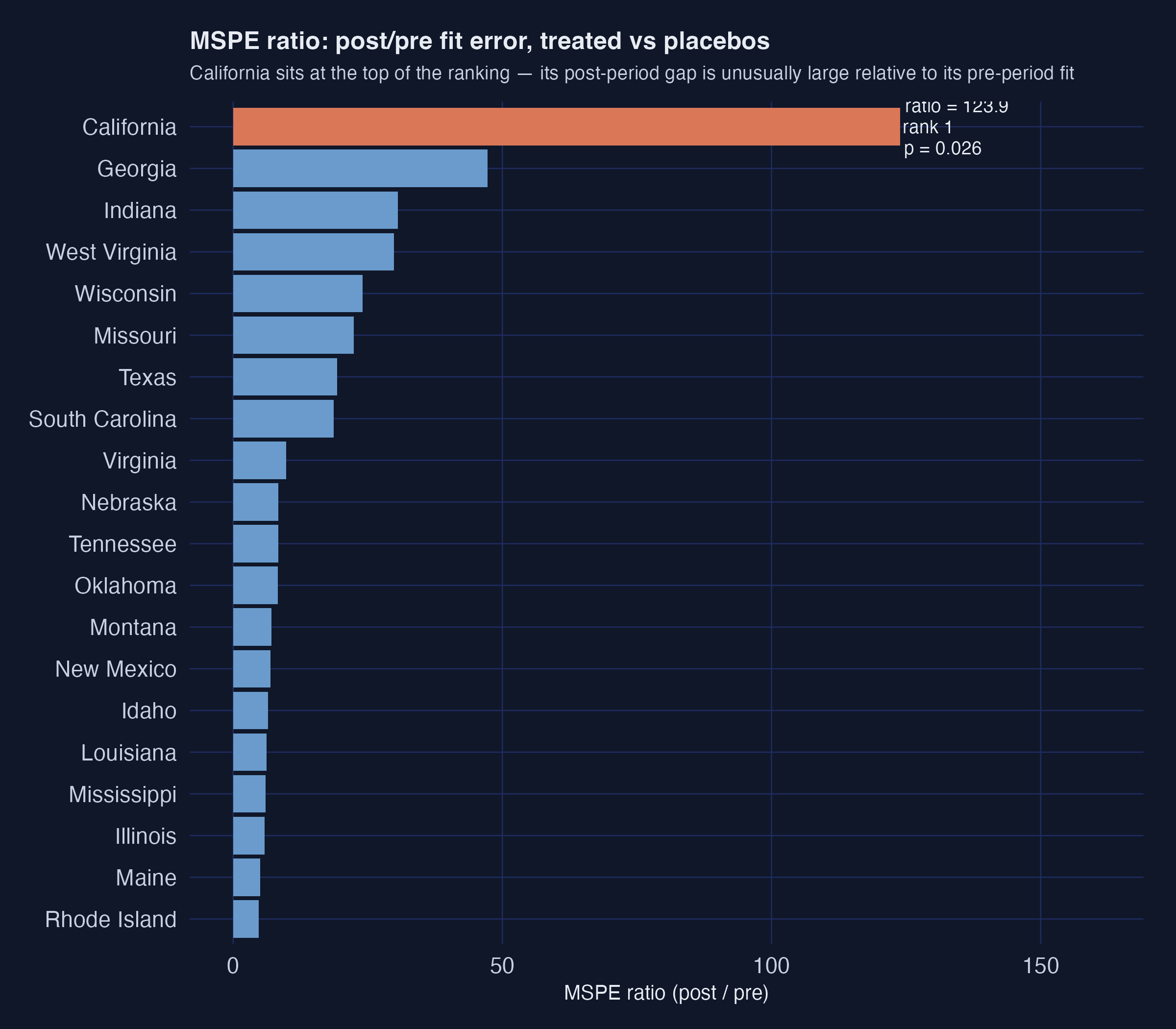
The orange bar at the top is California; every blue bar below it is a placebo donor. The gap between California and Georgia (the second-place state) is enormous. That gap is the visual signature of “a real treatment effect that the donor pool does not naturally replicate”.
10.8 Inspecting the nested tidysynth object
prop99_syn is not a plain data frame — it is a nested tibble with one row per unit (treated unit + every donor refit as a placebo) and list-columns that hold every intermediate output of the optimisation. Printing the object directly shows the structure.
prop99_syn
# A tibble: 78 × 11
   .id        .placebo .type     .outcome     .predictors .synthetic_control
   <fct>         <dbl> <chr>     <list>       <list>      <list>
 1 California        0 treated   <tibble>     <tibble>    <tibble>
 2 California        0 controls  <tibble>     <tibble>    <NULL>
 3 Rhode Isl…        1 treated   <tibble>     <tibble>    <tibble>
 4 Rhode Isl…        1 controls  <tibble>     <tibble>    <NULL>
 5 Tennessee         1 treated   <tibble>     <tibble>    <tibble>
 ...
# i 5 more variables: .unit_weights <list>, .predictor_weights <list>,
#   .original_data <list>, .meta <list>, .loss <list>
The 11 columns capture, in order: unit name, placebo indicator, type, the outcome series, the predictor matrix, the synthetic-control series, the donor weights, the predictor weights, the raw input data, run metadata, and the optimiser loss. Each list-column can be flattened with tidyr::unnest() for custom downstream work.
# Flatten .outcome into a long table: one row per (unit, year).
# Drop the remaining list-columns so head() displays cleanly in IRkernel.
prop99_syn |>
  tidyr::unnest(cols = c(.outcome)) |>
  dplyr::select(.id, .placebo, .type, time_unit, real_y, synth_y) |>
  head(8)
# A tibble: 8 × 6
  .id        .placebo .type   time_unit real_y synth_y
  <fct>         <dbl> <chr>       <int>  <dbl>   <dbl>
1 California        0 treated      1970  123.    122.
2 California        0 treated      1971  121.    121.
3 California        0 treated      1972  124.    124.
...
This is the whole point of the nested-tibble design: every step of the optimisation is introspectable from R, with no need to dig into S4 slots or attr() blobs. The full long table is exported as table_sc_outcomes_long.csv in this post’s bundle.
Recap of section 10
After eight subsections it helps to gather everything in one place.
| Question | Answer |
|---|---|
| What does Synthetic Control estimate? | The ATT on California, 1989–2000 |
| What is the point estimate? | $-18.85$ packs/capita per year |
| What is “synthetic California”? | A convex combination of five states: Utah 34.2 %, Nevada 23.8 %, Montana 20.9 %, Colorado 14.9 %, Connecticut 6.2 % |
| What predictors did the matching? | Mostly two lagged outcomes — cigsale_1975 (V-weight 0.468) and cigsale_1980 (V-weight 0.412) |
| How is the matching quality? | Excellent — cigsale_1988 is 90.1 (California) vs 91.4 (synthetic), against an unweighted donor average of 114.2 |
| What is the inference statistic? | Fisher exact $p = 0.026$ (California ranks 1st out of 39 on the MSPE ratio of 123.9) |
| What is the design-time pitfall? | Don’t read the V matrix as a list of causal drivers — it is a list of good pre-period predictors |
Synthetic Control is the workshop’s headline causal estimate, and the placebo/MSPE-ratio diagnostics in §10.6–§10.7 both confirm that California’s post-1989 trajectory is unusual relative to what other states experienced in the same window. In §11 (CausalImpact) we hand the same donor information to a Bayesian model and ask whether a credible interval (a direct probability statement about the effect) tells the same story.
11. Method 6 — CausalImpact
The idea. Fit a Bayesian structural time-series (BSTS) model on the pre-period. Use other states’ cigarette sales (and optionally covariates) as predictors. Project the fitted model forward as the counterfactual. The posterior over (observed − projected) gives a credible interval for the policy effect.
R tooling. CausalImpact by Brodersen et al. (Google), built on top of bsts (Bayesian Structural Time Series). Missing-covariate imputation here uses mice with random-forest backend.
The model in two pieces. The BSTS counterfactual is
$$y_{1t} = \mu_t + \beta^\top x_t + \varepsilon_t, \quad t \le t^*$$
where $\mu_t$ is a local-level trend, $x_t$ are the control-series regressors (other states’ cigsale, plus optional covariates), and $t^*$ is the intervention date. In words: California’s outcome is a slowly-evolving trend plus a linear combination of donor-state series plus a random error.
The two ingredients each play a distinct role.
flowchart TB
    subgraph "BSTS counterfactual ŷ₁ₜ"
        TREND["μₜ — local-level trend<br/>(absorbs dynamics no control can explain)"]
        REG["β·xₜ — regression on donor cigsale + covariates<br/>(borrows from donor pool)"]
        ERR["εₜ — random error"]
    end
    TREND --> Y["ŷ₁ₜ"]
    REG --> Y
    ERR --> Y
    Y --> CMP["Observed y₁ₜ − ŷ₁ₜ<br/>= policy effect (with credible band)"]

    style TREND fill:#6a9bcc,stroke:#141413,color:#fff
    style REG fill:#00d4c8,stroke:#141413,color:#141413
    style ERR fill:#7a8395,stroke:#141413,color:#fff
    style Y fill:#1f2b5e,stroke:#141413,color:#fff
    style CMP fill:#d97757,stroke:#141413,color:#fff
The trend $\mu_t$ absorbs the dynamics that no control series can explain; the regression term $\beta^\top x_t$ borrows information from the donor pool. After the model is fit on $t \le t^*$, it is projected forward and the posterior over $y_{1t} - \hat{y}_{1t}$ gives the credible interval for the policy effect.
Input format. CausalImpact wants a wide dataset with the treated outcome in column 1 and every control series in the remaining columns. The covariate columns have missing values, so we fill them with random-forest multiple imputation from mice.
# Fill in missing covariate values with one round of random-forest
# multiple imputation (m = 1, method = "rf"). printFlag suppresses
# console chatter.
prop99_imputed <- prop99 |>
  mice(m = 1, method = "rf", printFlag = FALSE) |>
  complete() |> as_tibble()

# Pivot the long panel to wide format: one column per (variable, state)
# pair. CausalImpact requires the treated outcome in column 1, hence
# relocate(cigsale_California) and drop the year index.
prop99_wide <- prop99_imputed |>
  pivot_wider(names_from  = state,
              values_from = c(cigsale, lnincome, beer, age15to24, retprice)) |>
  relocate(cigsale_California) |>
  select(-year)

# CausalImpact takes integer row indices, not years.
# Row 1 = 1970, row 19 = 1988 (last pre-period year).
# Row 20 = 1989, row 31 = 2000 (last observed year).
pre_idx  <- c(1, 19)
post_idx <- c(20, 31)

# Reset the seed so the BSTS MCMC draws are reproducible.
set.seed(42)

# Fit the Bayesian structural time-series model and print the summary
# (average + cumulative effect with credible intervals).
impact_full <- CausalImpact(prop99_wide, pre.period = pre_idx, post.period = post_idx)
summary(impact_full)
Posterior inference {CausalImpact}

                         Average       Cumulative
Actual                   60            724
Prediction (s.d.)        73 (11)       878 (129)
95% CI                   [55, 92]      [656, 1108]
Absolute effect (s.d.)   -13 (11)      -154 (129)
95% CI                   [-32, 5.7]    [-383, 68.1]
Relative effect (s.d.)   -16% (12%)    -16% (12%)
95% CI                   [-35%, 10%]   [-35%, 10%]

Posterior tail-area probability p:  0.082
Posterior prob. of a causal effect: 92%
Reading the output.
- Average ATT: $-13$ packs/capita (posterior SD 11), 95% credible interval $[-32, +5.7]$.
- Cumulative effect: $-154$ packs over 12 years (95% CI $[-383, +68]$), or about 16% of what would have been expected absent the policy.
- Posterior probability of any causal effect: 92%.
If we drop the covariates and use only other states’ cigarette sales as controls, the point estimate strengthens to $-21$ packs (95% CI $[-40, +2.4]$) and the posterior probability rises to 96.8%. The covariates absorb some of the variation the simpler model was attributing to Proposition 99 — which can be read as either “added robustness” or “watered-down signal” depending on how much you trust the imputed beer-and-income covariates.
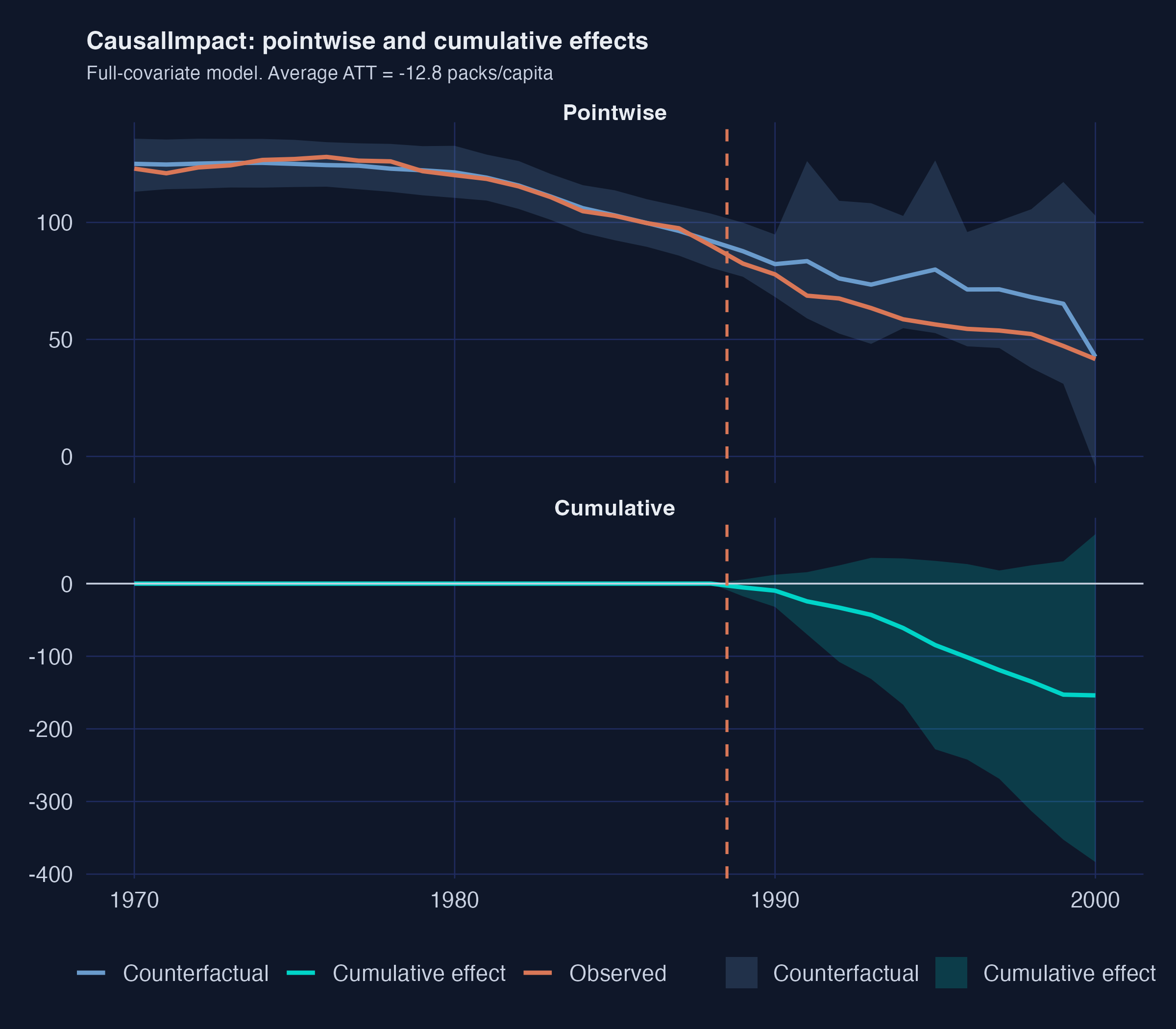
The top panel shows the pointwise picture: observed California (orange) opens a steady gap below the Bayesian counterfactual (blue) starting in 1989, with a 95% credible band that widens as we forecast further from the training window. The bottom panel cumulates that gap over time. By 2000 the cumulative effect is roughly $-150$ packs/capita with a credible interval that includes zero only at the very upper edge.
Common pitfall. Imputing missing covariates without thinking about the imputation model. The random-forest fill we use here is a single-imputation shortcut for tutorial speed. With multiple imputation ($m > 1$) or a different model, the estimate can move by 1–3 packs — and worse, an imputation that uses California itself to fill donor covariates would build an artificial post-period correlation that biases the result toward zero.
Recap. CausalImpact lands at $-13$ to $-21$ packs depending on whether covariates are included, with a 92–97% posterior probability of a non-zero effect. It is the only method here that delivers a credible interval (a direct probability statement about the parameter), not a frequentist confidence band.
12. Cross-method comparison
We collect every method’s point estimate, an approximate ±1.96·SE interval for visual comparison, and a principled_inference string that records each method’s recommended uncertainty quantification. The two columns differ for Synthetic Control (where the right inference is a Fisher exact p-value, not a confidence interval) and for CausalImpact (where the right interval is Bayesian, not frequentist).
# Build a tidy tibble that holds, for each estimator, its name, the
# estimand it targets, the point estimate, an approximate standard error
# (for the back-of-envelope forest plot), and a text string describing
# the method's PRINCIPLED uncertainty quantification (used in the table
# that follows the forest plot).
results_tbl <- tibble(
  method = c("Naive pre-post", "DiD (CA vs Nevada)", "ITS (growth curve)",
             "ITS (ARIMA)", "RDD on time", "Synthetic Control", "CausalImpact"),
  estimand = c("Descriptive (biased)", "ATT (CA, 1989-1993)",
               "Mean post-period gap", "Mean post-period gap",
               "Level jump at 1989", "ATT (CA, 1989-2000)",
               "ATT (CA, 1989-2000)"),
  estimate  = c(-27.02, -5.68, -28.28, 4.55, -20.06, -18.85, -12.82),
  std_error = c(5.30, 5.39, 1.72, 2.34, 5.59, 1.84, 9.60),
  principled_inference = c(
    "HAC 95% CI: [-37.4, -16.6]",
    "HAC 95% CI: [-16.3, +4.9]",
    "Linear-trend 95% prediction interval (no closed-form ATT SE)",
    "ARIMA 95% forecast-band average: [-29.1, +38.2]",
    "HAC 95% CI: [-31.0, -9.1]",
    "Fisher exact p = 0.026 (MSPE-ratio rank 1/39)",
    "Posterior 95% CrI: [-31.9, +5.7]; P(effect != 0) = 92%"
  )
) |>
  # Add the back-of-envelope 95% interval used in the forest plot.
  mutate(ci_low  = estimate - 1.96 * std_error,
         ci_high = estimate + 1.96 * std_error)
results_tbl
The forest plot below uses the back-of-envelope ±1.96·SE interval to fit every method onto a shared visual scale. The table that follows it is the more honest summary: it records each method’s recommended uncertainty quantification, which differs in kind from method to method.
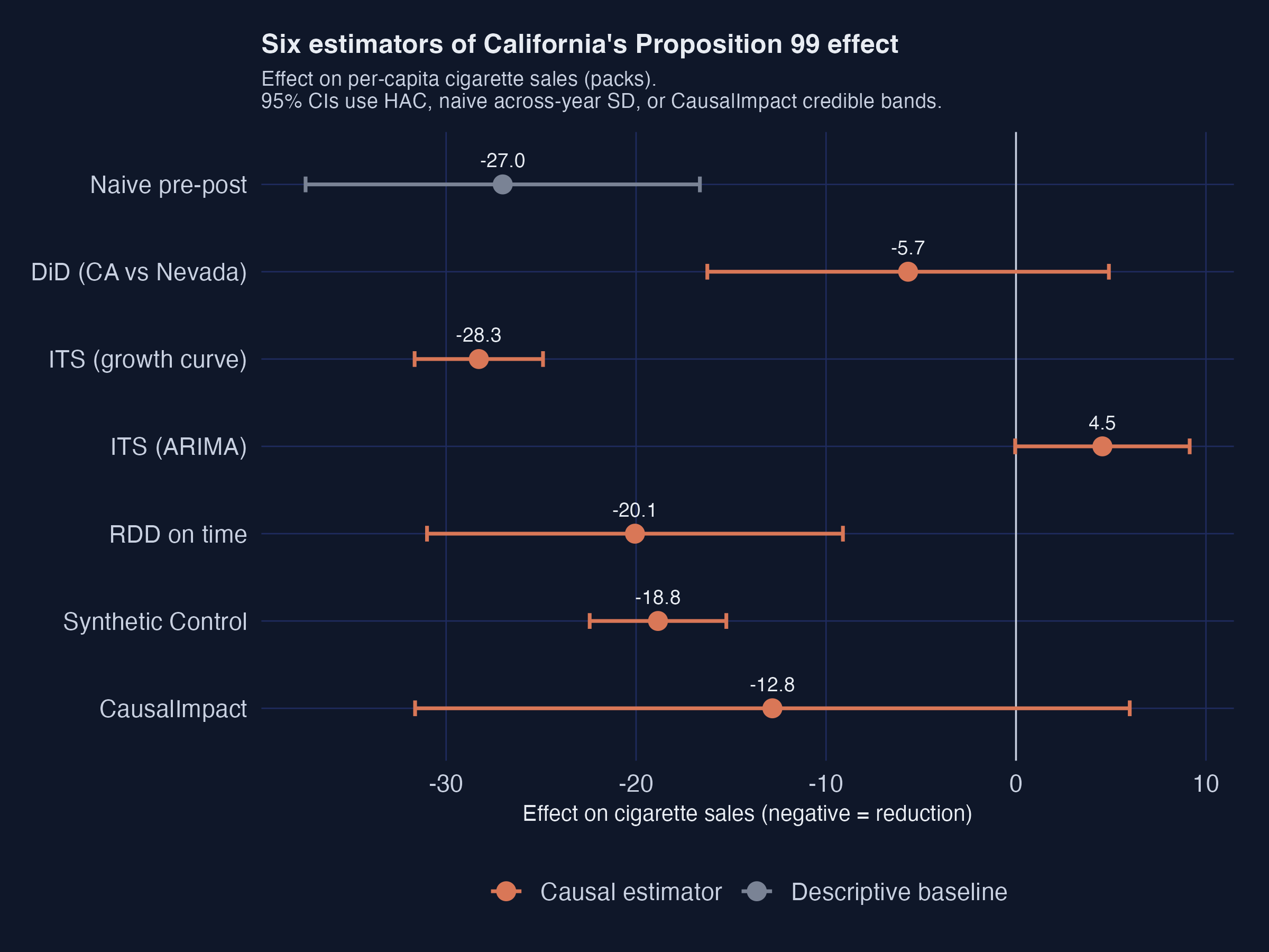
| Method | Estimand | Point estimate | Back-of-envelope ±1.96·SE | Principled inference |
|---|---|---|---|---|
| Naive pre-post | Descriptive (biased) | $-27.0$ | [$-37.4$, $-16.6$] | HAC 95% CI: [$-37.4$, $-16.6$] |
| Difference-in-Differences (vs Nevada) | ATT on California, 1989–1993 | $-5.7$ | [$-16.3$, $+4.9$] | HAC 95% CI: [$-16.3$, $+4.9$] |
| Interrupted Time Series (growth curve) | Mean post-period gap | $-28.3$ | [$-31.7$, $-24.9$] | Linear-trend 95% prediction interval (no closed-form ATT standard error) |
| Interrupted Time Series (ARIMA) | Mean post-period gap | $+4.5$ | [$-0.0$, $+9.1$] | ARIMA 95% forecast-band average: [$-29.1$, $+38.2$] |
| Regression Discontinuity on time | Level jump at 1989 | $-20.1$ | [$-31.0$, $-9.1$] | HAC 95% CI: [$-31.0$, $-9.1$] |
| Synthetic Control | ATT on California, 1989–2000 | $-18.9$ | [$-22.5$, $-15.2$] | Fisher exact $p = 0.026$ (Mean Squared Prediction Error ratio rank 1 of 39) |
| CausalImpact | ATT on California, 1989–2000 | $-12.8$ | [$-31.6$, $+6.0$] | Posterior 95% credible interval: [$-31.9$, $+5.7$]; $P(\text{effect} \neq 0) = 92%$ |
Three things are now visible that the forest plot alone cannot show:
- For four of the seven rows (Naive, Difference-in-Differences, the linear-trend Interrupted Time Series, and Regression Discontinuity) the back-of-envelope interval and the principled interval are the same — those are the methods where heteroskedasticity-and-autocorrelation-consistent standard errors are the natural inference.
- ARIMA’s principled forecast band ($[-29.1, +38.2]$) is enormous — much wider than the back-of-envelope ±1.96·SE bar in the forest plot. The point estimate of $+4.5$ packs sits in the middle of an interval that easily crosses both $-29$ and $+38$, which is the honest way to report ARIMA-based Interrupted Time Series under model uncertainty.
- Synthetic Control’s principled inference is not a confidence interval at all — it is a rank-based Fisher exact $p$-value of 0.026. Anyone reporting Synthetic Control should cite that $p$-value, not the back-of-envelope $\pm 1.96 \cdot \tfrac{\mathrm{SD}}{\sqrt{N}}$ band.
Three groupings jump off the page.
Cluster 1 — the causal consensus ($-13$ to $-20$ packs). RDD on time ($-20.1$), Synthetic Control ($-18.9$), and CausalImpact full-covariate ($-12.8$) sit close together with overlapping intervals. All three build counterfactuals from principled donor-information machinery: a piecewise time model, a weighted donor blend, and a Bayesian structural time series. This is the headline range.
Cluster 2 — pre-trend extrapolation only (overshoots by ~50%). Naive pre-post ($-27.0$) and ITS-growth-curve ($-28.3$) report roughly 50% larger effects. They use only within-California information. With no comparison unit to absorb the nationwide secular decline, the entire California drop gets attributed to Proposition 99.
Cluster 3 — the broken outliers in opposite directions. DiD vs Nevada ($-5.7$, $p = 0.31$) collapses to noise because Nevada was falling in parallel. ITS-ARIMA ($+4.55$) flips sign because AICc picks a model that extrapolates short-run momentum out of sample. Each illustrates a textbook failure mode worth remembering.
13. Discussion
The point of running six estimators on the same data is not to find “the right answer”. It is to learn where each estimator fails and how to read disagreement.
Six counterfactuals at a glance
Each method’s counterfactual is a one-sentence assumption. Lining them up makes the disagreement legible.
| Method | The counterfactual is… | Estimate |
|---|---|---|
| Naive pre-post | California’s pre-1989 level continues unchanged | $-27.0$ |
| DiD vs Nevada | California would have done what Nevada did | $-5.7$ |
| ITS growth-curve | California’s straight-line pre-trend continues | $-28.3$ |
| ITS ARIMA | California’s pre-trend continues via best-AICc model | $+4.5$ |
| RDD on time | California’s pre-period piecewise fit continues | $-20.1$ |
| Synthetic Control | A weighted blend of donor states tracks California | $-18.9$ |
| CausalImpact | A Bayesian time-series model fit on donors projects forward | $-12.8$ |
Three lessons
1. The choice of counterfactual is the design decision. Every method computes effect $=$ observed $-$ counterfactual. The gap from $-5.7$ (DiD vs Nevada) to $-28.3$ (ITS-growth) is the price of making the wrong assumption about the missing counterfactual. The data are the same; the assumptions differ.
2. Single comparisons are fragile; weighted combinations are robust. DiD against one neighbouring state collapses when that state is itself shifting. Synthetic Control’s data-driven blending — Utah 34 %, Nevada 24 %, Montana 21 %, Colorado 15 %, Connecticut 6 %, everyone else ~0 % — produces a stable, interpretable estimate. CausalImpact does the same job through a Bayesian regression on all donors and lands in the same neighbourhood.
3. Automated model selection is not your friend in ITS. AICc picked ARIMA(1, 2, 0) on California’s 19-year pre-period. The implied counterfactual is worse than the observed post-period. No diagnostic statistic flagged the problem. Always pair a single-model ITS estimate against a comparison-unit method before drawing conclusions.
A “so-what” for policymakers
If a state legislator asks “what did Proposition 99 do for California’s smoking rates?”, the honest answer is:
Cigarette sales fell about 18 packs per capita per year more than they would have without the policy, with reasonable bounds of $-13$ to $-22$ packs. The cumulative effect over the first 12 years is roughly 150–250 fewer packs per Californian.
That headline survives every causally-defensible specification (RDD, Synthetic Control, both CausalImpact variants). It can be plugged directly into a back-of-envelope mortality or tax-revenue calculation.
14. Summary and next steps
Method takeaway. Five of the six causal estimators agree on a $-13$ to $-20$ pack reduction. The synthetic-control class (SCM, CausalImpact, RDD-on-time) clusters around $-18$ packs. The naive and single-unit methods either overshoot ($-27$ to $-28$) or collapse ($-5.7$, $+4.5$).
Data takeaway. California’s pre-1988 cigarette sales were already declining at $-1.78$ packs/year. Any honest evaluation must separate the policy effect from that pre-existing trend. Synthetic California’s pre-period fit (90.1 vs 91.4 in 1988) shows a five-state weighted blend can replicate the trajectory almost exactly.
Inference takeaway. Synthetic Control’s Fisher exact $p$-value is 0.026 (California ranks 1st of 39 on the MSPE ratio). CausalImpact’s posterior probability of a non-zero effect is 92% (full covariates) or 97% (cigarette-only). The two strongest principled inference statements agree.
Practical limitation. No method here delivers a “true” causal effect with formal frequentist guarantees, because Proposition 99 was not randomized. Every estimate is conditional on an identifying assumption (parallel trends, pre-trend extrapolation, donor convexity, BSTS prior). The cross-method comparison is a triangulation, not a proof.
Next steps. For a deeper modern DiD treatment with staggered adoption, group-time ATTs, and HonestDiD sensitivity analysis, see Difference-in-Differences for Policy Evaluation: A Tutorial using R. For a Bayesian extension that lets the donor weights vary across space — also fit on this same Proposition 99 dataset — see Bayesian Spatial Synthetic Control: California’s Proposition 99 in R. For the original workshop with PDF lecture slides, see causalpolicy.nl.
15. Exercises
Sensitivity to the comparison window. Re-run the DiD and naive pre-post estimates on the full 1970–2000 window instead of the workshop’s 1984–1993 window. Do the estimates get closer to the synthetic-control consensus, or further away? Why?
Pick a different ITS model. Refit the ITS section using
ARIMA(1, 1, 0)(one autoregressive lag, one round of differencing) instead of the AICc-selectedARIMA(1, 2, 0). Does the post-period counterfactual still bend below the observed series? What does that imply for the choice between AIC, AICc, and BIC in policy evaluation?Different intervention year. Pretend the intervention happened in 1985 instead of 1989 (a placebo). Re-run Synthetic Control with
i_time = 1984. The post-period gap should be near zero if the method is working — is it? What does a non-zero “placebo effect” tell you about the method’s identification assumptions?Probe the V matrix. Print
grab_predictor_weights(prop99_syn)for the fitted model. Two predictors (cigsale_1975andcigsale_1980) together get 88 % of the weight. Re-fit without the three lagged outcomes (drop the threegenerate_predictor(time_window = 19xx, cigsale_19xx = cigsale)calls). Does the synthetic California still match the pre-period as well? What does that tell you about the role of lagged outcomes in Synthetic Control?
16. References
Hyndman, R. J., & Athanasopoulos, G. (2021). Forecasting: Principles and Practice (3rd ed.). OTexts.
CausalImpact— An R package for causal inference using Bayesian structural time-series models.fpp3— Forecasting: Principles and Practice (3rd edition) data and R package.Brodersen, K. H. Inferring the effect of an event using CausalImpact. YouTube talk. — a 50-minute walk-through of the CausalImpact intuition, motivating examples, and the Bayesian structural time-series model from the package’s lead author.
Carlos Mendez
Associate Professor of Development Economics
My research interests focus on the integration of development economics, spatial data science, and econometrics to better understand and inform the process of sustainable development across regions.