Staggered Synthetic Difference-in-Differences (SDID) in Stata: Gender Quotas and Women in Parliament
1. Overview
In a previous tutorial, one unit — California — adopted one policy — Proposition 99 — in one year — 1989. That block design is the textbook setting for synthetic difference-in-differences (SDID). But most real policies do not arrive on a single clock. Parliamentary gender quotas, minimum-wage laws, carbon taxes, and clean-air regulations are adopted by different units in different years. This is the staggered adoption design, and it is where naive panel methods quietly break.
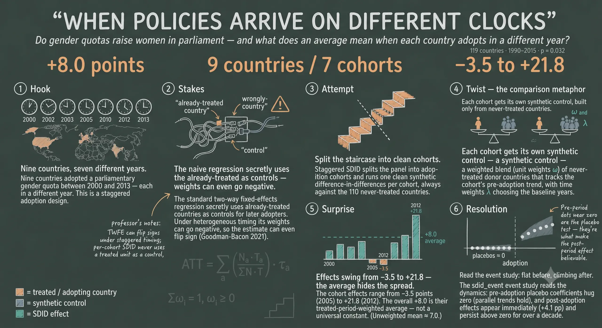
This tutorial extends SDID to staggered adoption and applies it in Stata to a real question in political economy: do parliamentary gender quotas raise the share of women in national parliaments? We use the quota_example dataset that ships with the sdid package — 119 countries observed annually from 1990 to 2015, in which 9 countries adopt a gender quota across 7 different cohorts (2000, 2002, 2003, 2005, 2010, 2012, and 2013).
The headline is a story about heterogeneity. The overall effect of quotas is about +8 percentage points of women in parliament, but the cohort-by-cohort effects swing from −3.5 to +21.8 points. A single number hides that range — and, as we will see, the naive two-way fixed-effects regression that most people reach for first can hide even more.
Why does staggered timing break the naive regression? (click to expand)
The workhorse for panel policy evaluation is the two-way fixed-effects (TWFE) regression — unit dummies, time dummies, and a treatment dummy. With one adoption date it estimates a clean difference-in-differences. With staggered timing and heterogeneous effects, the same regression implicitly uses already-treated units as controls for later adopters (“forbidden comparisons”). The result is a variance-weighted average of every 2×2 comparison in the panel, and some of those weights can be negative — so the estimate can even take the wrong sign (Goodman-Bacon, 2021; de Chaisemartin & D’Haultfœuille, 2020). Staggered SDID sidesteps this by estimating a separate, clean SDID effect for each adoption cohort and aggregating with transparent, non-negative weights.
graph TD
    subgraph "Block design — predecessor (Prop 99)"
        B1["California<br/>adopts 1989"] --> BATT["one ATT"]
        B2["other states<br/>never treated"] --> BATT
    end
    subgraph "Staggered design — this post (gender quotas)"
        S1["cohort 2000"] --> SATT["aggregate ATT"]
        S2["cohort 2002"] --> SATT
        S3["cohorts 2003 to 2013"] --> SATT
        SC["110 never-treated<br/>controls"] -.donor pool.-> SATT
    end
    style B1 fill:#d97757,stroke:#141413,color:#fff
    style B2 fill:#6a9bcc,stroke:#141413,color:#fff
    style BATT fill:#00d4c8,stroke:#141413,color:#141413
    style S1 fill:#d97757,stroke:#141413,color:#fff
    style S2 fill:#d97757,stroke:#141413,color:#fff
    style S3 fill:#d97757,stroke:#141413,color:#fff
    style SC fill:#6a9bcc,stroke:#141413,color:#fff
    style SATT fill:#00d4c8,stroke:#141413,color:#141413
1.1 Learning objectives
By the end of this tutorial you will be able to:
- Explain why staggered adoption breaks naive TWFE difference-in-differences, and how per-cohort SDID avoids the forbidden-comparison problem.
- Derive the SDID estimator from first principles — unit weights $\omega$, time weights $\lambda$, and the weighted two-way fixed-effects objective — and the rule that aggregates cohort-specific effects $\hat{\tau}_a$ into one overall ATT.
- Estimate the effect of gender quotas with
sdidon a staggered panel, add a covariate two different ways (optimizedvsprojected), and choose among bootstrap, jackknife, and placebo inference. - Read an SDID event-study plot produced by
sdid_event, distinguishing pre-trend placebo coefficients from post-period dynamic effects.
2. Key concepts at a glance
Each card gives a plain-language definition, a concrete example from this quota study, and an everyday analogy. Open any term that is unfamiliar.
1. ATT (average treatment effect on the treated) — the question we actually answer.
Definition. The effect of adopting a quota on the women-in-parliament share, in the countries that adopted one, averaged over their post-adoption years. It is not the effect a quota would have everywhere — only where one was actually tried.
Example. Our headline ATT is +8.0 percentage points: across the nine adopting countries, quotas raised women’s parliamentary share by about eight points relative to their no-quota counterfactual.
Analogy. Like asking “how much did the patients who took the drug improve?” — not “how much would everyone improve?” You measure only the units that were actually treated.
2. Synthetic control — a made-to-order comparison country.
Definition. A weighted blend of never-treated “donor” countries, built so its pre-adoption path mimics the treated cohort. It stands in for the unobservable counterfactual: what the cohort’s outcome would have been without a quota.
Example. The 2002 cohort’s synthetic control mixes dozens of donors (Belgium, Paraguay, Cuba, …) so that, before 2002, the blend tracks the cohort’s trend — then keeps going as the cohort would have without the law.
Analogy. A stunt double cast to match the lead actor’s build and movement — close enough that, in the shots you cannot film the star, the double stands in convincingly.
3. Unit weights (ω) — how much each donor counts.
Definition. Non-negative weights, one per donor country, summing to one, that build the synthetic control. Each cohort gets its own ω.
Example. In the 2000 cohort, 80 donors receive nonzero weight — Argentina ≈ 0.061, Guatemala ≈ 0.057, Austria ≈ 0.045 — a diffuse blend rather than one or two stand-ins.
Analogy. A recipe calling for many ingredients in small, precise amounts: no single one dominates, so the dish survives a bad batch of any one ingredient.
4. Time weights (λ) — which "before" years matter.
Definition. Non-negative weights on the pre-adoption years, summing to one, that decide which pre-periods define the baseline. They up-weight the years most like the post-period.
Example. For the 2002 cohort, λ concentrates on the late 1990s and 2001 rather than spreading evenly across 1990–2001 — the recent past is the relevant baseline.
Analogy. Forecasting tomorrow’s weather, you trust last week far more than the same date five years ago. Time weights formalize “recent and similar counts more.”
5. Adoption cohort (a) — units that switch on together.
Definition. The set of countries that first adopt a quota in the same calendar year. Staggered SDID runs one self-contained SDID per cohort, always against the never-treated controls.
Example. There are seven cohorts — 2000, 2002, 2003, 2005, 2010, 2012, 2013 — with two countries each in 2002 and 2003, and one in the rest.
Analogy. School graduating classes: the “class of 2002” and the “class of 2010” share a start date and are analyzed as groups, even though all attend the same school.
6. Staggered adoption & the forbidden comparison — why the naive regression breaks.
Definition. Staggered adoption means units are treated at different times. The hazard: a two-way fixed-effects regression can use already-treated units as controls for later adopters — a “forbidden comparison” that places negative weights on some effects and can flip the sign.
Example. When the 2012 cohort adopts, a naive TWFE quietly treats the 2002 cohort — already treated, already changed — as part of its control group. Staggered SDID never does this: each cohort is compared only to the 110 never-treated countries.
Analogy. Timing a late runner against runners who already crossed the line and slowed to a walk — your “control” is contaminated because it has already run the race.
7. Event time (relative period) — every cohort on its own clock.
Definition. Time measured relative to each cohort’s own adoption year (… −2, −1, 0, +1 …), so cohorts that adopted in different calendar years can be lined up and averaged.
Example. Event time 0 is the year 2000 for the first cohort but 2013 for the last; re-centring lets us ask “what happens three years after a quota?” across all cohorts at once.
Analogy. Comparing marathon runners by their own start gun, not the wall clock: a runner who started at 9:05 and one who started at 9:20 are both “at mile 10” measured from their own start.
8. ATT aggregation — from many cohort effects to one number.
Definition. The overall ATT is a weighted average of the cohort effects, each weighted by its share of treated unit-by-post-period observations — earlier, longer-exposed, larger cohorts count more.
Example. The seven cohort effects span −3.5 to +21.8; weighted by treated country-years they average to +8.0 (the plain unweighted mean would be ≈ 7.0).
Analogy. A course grade that weights the final exam more than a pop quiz: the cohorts you observe for longer carry more of the final mark.
9. Pre-trend placebo test — the assumption you can see.
Definition. Event-study coefficients for the pre-adoption periods. If treated and synthetic-control countries moved in parallel before treatment, these sit near zero — a falsification check.
Example. For the 2002 cohort, all twelve pre-period placebos fall in [−0.2, +0.8] points — flat, so we cannot reject parallel synthetic trends.
Analogy. Checking a scale by weighing nothing first: if it does not read zero when empty, you distrust every later reading. Flat placebos are that “reads zero when empty” check.
10. Bootstrap, jackknife, placebo — three rulers for uncertainty.
Definition. Three ways to attach a standard error to the ATT. With many treated units all three are available; they share one point estimate but report different spread.
Example. On the two-cohort subsample the ATT is 10.3 for all three, but the SE is 4.7 (bootstrap), 6.0 (jackknife, most conservative), and 2.3 (placebo, tightest).
Analogy. Measuring a table with a tape, a folding ruler, and a laser: they agree on the length but disagree on the error bars — the cautious carpenter reports the widest.
3. The data: gender quotas across 119 countries
We use quota_example.dta, the balanced panel from Bhalotra, Clarke, Gomes & Venkataramani (2023) distributed with the sdid package. The outcome is the percentage of seats held by women in the national parliament; the treatment is the adoption of a reserved-seat gender quota; the covariate is log GDP per capita.
webuse set www.damianclarke.net/stata/
webuse quota_example, clear
label variable quota "Parliamentary gender quota"
xtset country year
codebook country year quota womparl lngdp, compact
Variable    Obs Unique      Mean     Min       Max  Label
----------------------------------------------------------------------------
country    3094    119         .       .         .  Country
year       3094     26    2002.5    1990      2015  Year
quota      3094      2  .0303814       0         1  =1 if country has a gender quota
womparl    3094    449  14.96531       0      63.8  Women in parliament
lngdp      2990   2956  9.154291  5.8701  11.61789  log(GDP)
----------------------------------------------------------------------------
The panel is balanced: 119 countries times 26 years equals 3,094 observations, with no gaps in the outcome or treatment (lngdp has 104 missing values, which will matter only when we add the covariate). The treatment indicator quota equals one for just 3% of observations, a reminder that treated country-years are scarce. Crucially, quota is absorbing — once a country adopts a quota it stays treated — which SDID requires.
| Variable | Role | Symbol | Description |
|---|---|---|---|
country | unit | $i$ | 119 countries (9 ever-treated, 110 never-treated) |
year | time | $t$ | 1990–2015 (26 years) |
womparl | outcome | $Y_{it}$ | % women in the national parliament |
quota | treatment | $W_{it}$ | 1 once a country has a quota, 0 before / never |
lngdp | covariate | $X_{it}$ | log GDP per capita |
The estimand. Our target is the average treatment effect on the treated (ATT): the effect of adopting a quota on the women-in-parliament share in the countries that adopted one, averaged over their post-adoption years. Formally,
$$ \tau = \frac{1}{N_{tr}\, T_{post}} \sum_{i:\, W_i = 1}\ \sum_{t > T_{pre}} \left[\, Y_{it}(1) - Y_{it}(0) \,\right] $$
In words: for every treated country and every post-adoption year, take the gap between the share of women with a quota, $Y_{it}(1)$, and the share that would have occurred without one, $Y_{it}(0)$ — then average. The first term is observed; the second is the counterfactual that the synthetic control must impute, because we never see a quota-adopting country in the parallel world where it abstained.
An observational, not experimental, setting. Quotas are not randomly assigned. Countries that adopt them early may differ systematically — they may be wealthier, more democratic, or already on a rising trajectory of women’s representation. That is exactly why we need a method that builds a credible counterfactual from comparison countries rather than assuming a simple before/after change would have held. Identification rests on assumptions we will keep visible: that treated and synthetic-control countries share a common (synthetic) trend absent treatment, no anticipation of the quota, no spillovers across countries, and that adoption timing is not itself driven by the outcome’s future path.
3.1 The staggered structure
Before modelling, let us see the timing directly. The adoption year is the first year a country is treated; we tabulate the cohorts.
bysort country (year): egen firsttreat = min(cond(quota==1, year, .))
preserve
    keep country firsttreat
    duplicates drop
    tab firsttreat, missing
restore
 firsttreat |      Freq.     Percent        Cum.
------------+-----------------------------------
       2000 |          1        0.84        0.84
       2002 |          2        1.68        2.52
       2003 |          2        1.68        4.20
       2005 |          1        0.84        5.04
       2010 |          1        0.84        5.88
       2012 |          1        0.84        6.72
       2013 |          1        0.84        7.56
          . |        110       92.44      100.00
------------+-----------------------------------
      Total |        119      100.00
Nine countries adopt a quota, spread across seven cohorts; the 2002 and 2003 cohorts contain two countries each, the rest one. The remaining 110 countries are never treated — they form the donor pool from which every cohort’s synthetic control is built. This staircase of adoption dates is the defining feature of a staggered design, and the reason a single “post” dummy is too blunt.
4. Exploratory analysis with panelview
A staggered design is best understood by looking at it. The panelview command (Xu & Hua) draws two pictures we need: a heatmap of who is treated when, and the raw outcome trajectories colored by treatment status.
ssc install panelview, replace
panelview womparl quota, i(country) t(year) type(treat) bytiming
panelview womparl quota, i(country) t(year) type(outcome)
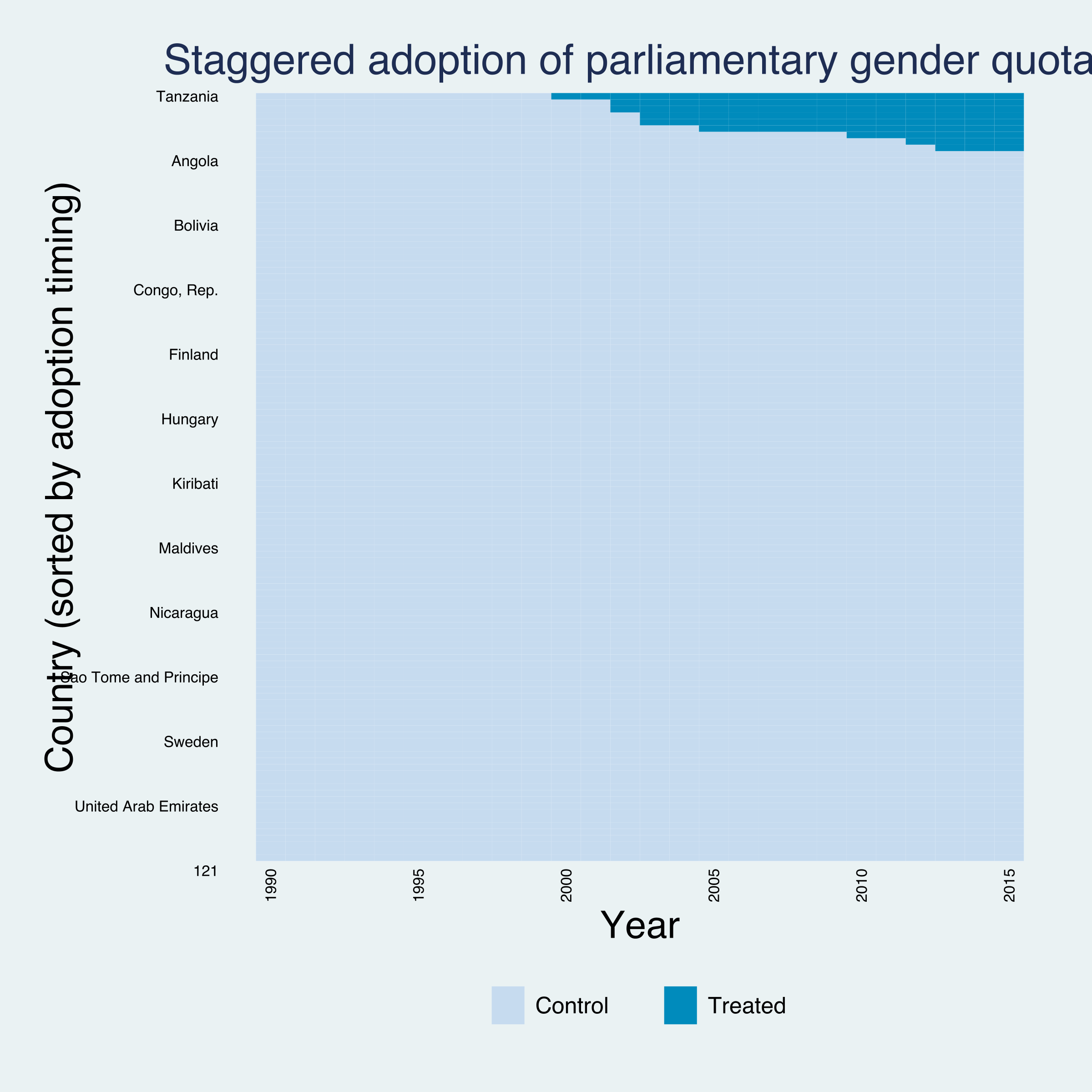
The treatment heatmap (type(treat), sorted with bytiming) makes the staggered structure unmistakable: the dark treated cells appear in the top-right corner as a staircase, each step a different cohort switching on between 2000 and 2013, against a sea of never-treated controls. This is the visual opposite of a block design, where every treated cell would switch on in the same column.
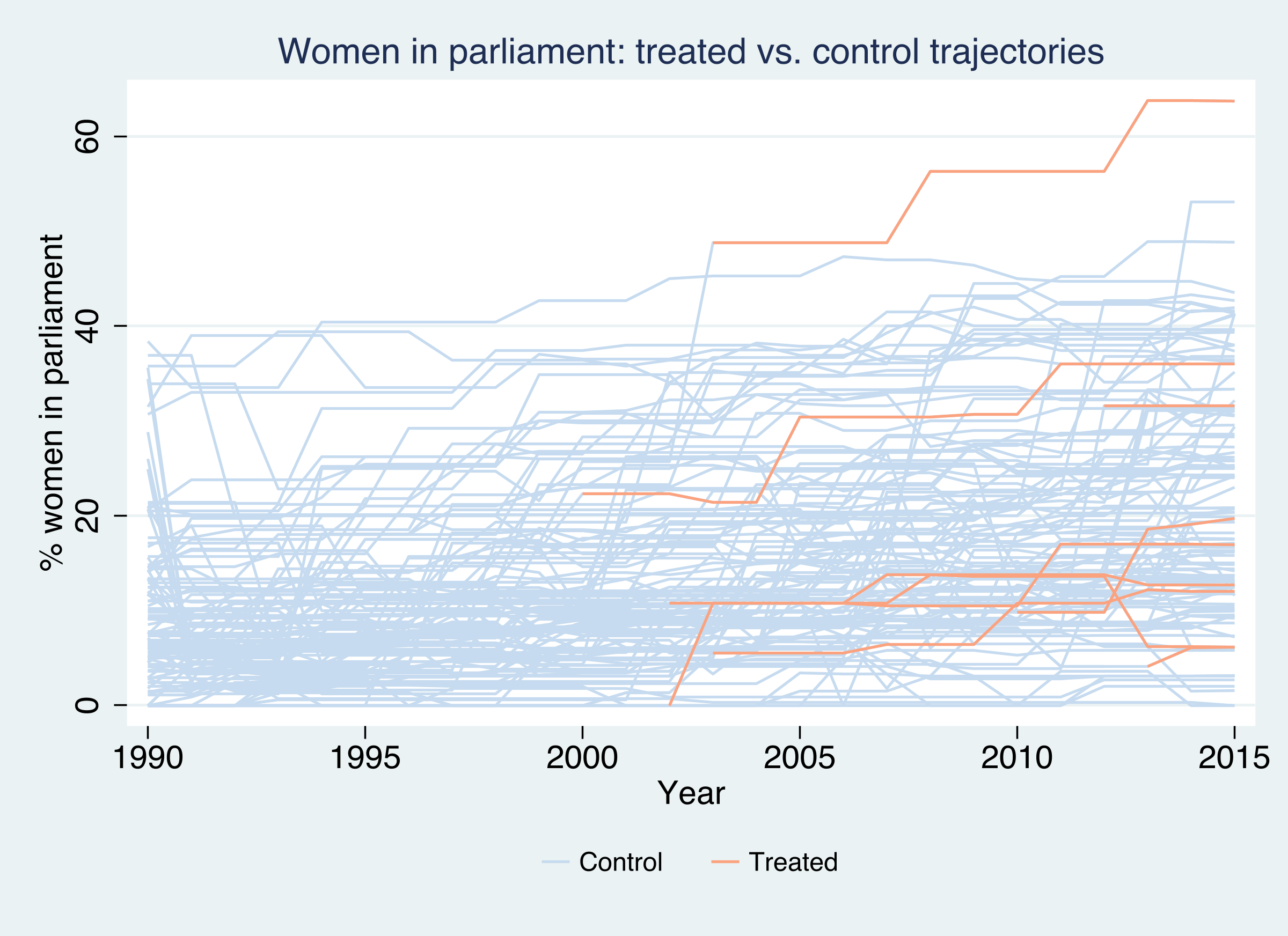
The outcome plot (type(outcome)) overlays all 119 women-in-parliament series, with the 9 treated countries in orange. Several treated countries start near the bottom of the distribution and climb steeply after their adoption year — a hint of a positive effect — but the climbs begin at different times, and a few treated countries barely move. No single “treated average” line could summarize this; we need cohort-specific counterfactuals.
collapse (mean) womparl, by(evertreat year)
* ... reshape and plot ever- vs never-adopting means ...
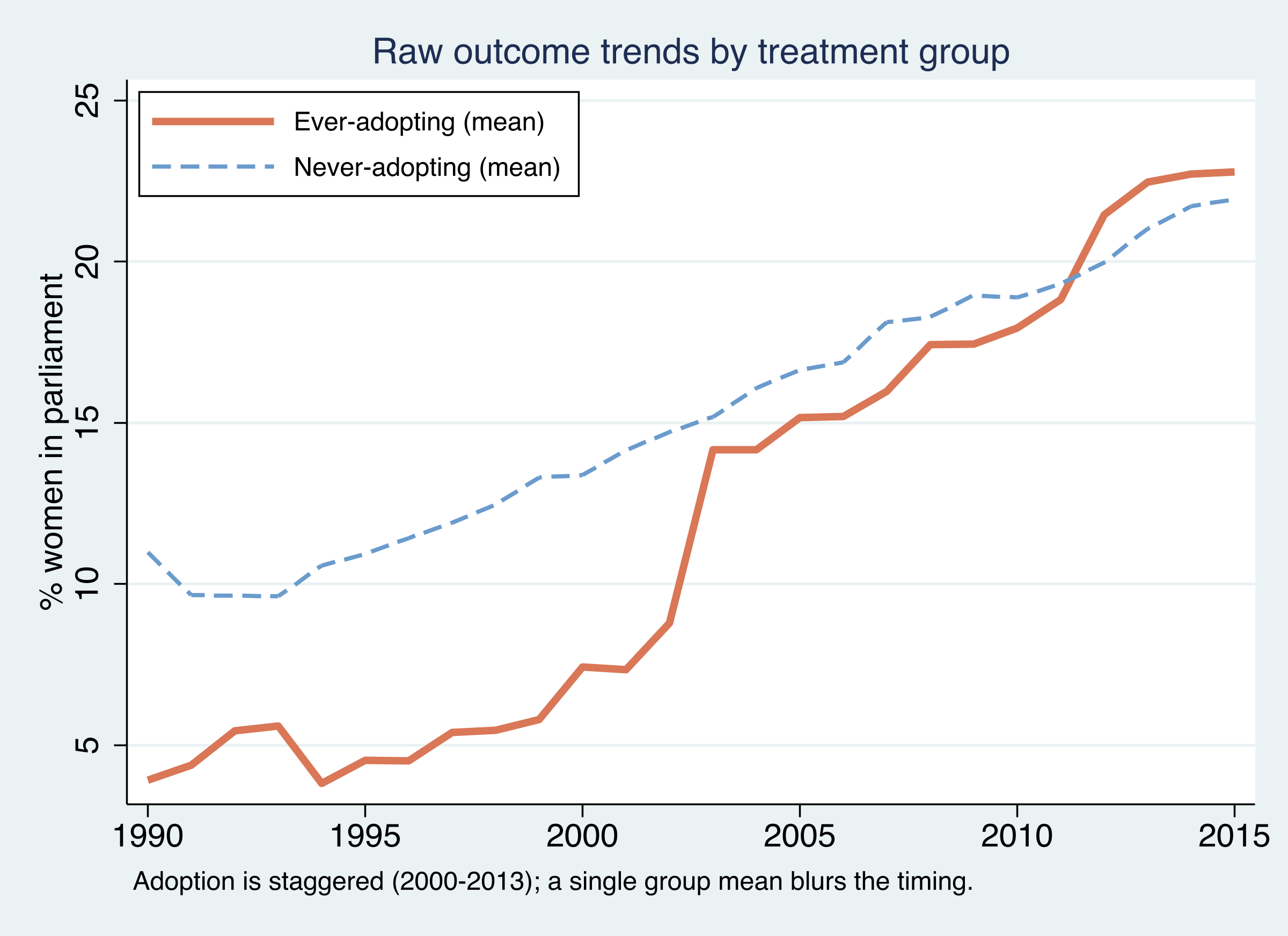
Collapsing to group means tells a cautionary tale. The ever-adopting countries (orange) start the 1990s below the never-adopting countries (about 4% vs 10% women in parliament) and end above them by 2015 (about 23% vs 22%). A naive eyeball difference-in-differences on these two lines would be badly confounded: the groups began at different levels and the “treated” line aggregates countries that switched on in seven different years. The raw means motivate the machinery to come — we must compare each cohort to a tailored synthetic control, not to the grand average.
5. Synthetic difference-in-differences from first principles
Before tackling staggered timing, fix ideas with a single cohort. SDID (Arkhangelsky et al., 2021) is a weighted two-way fixed-effects regression. It chooses an ATT, a constant, unit fixed effects, and time fixed effects to minimize a weighted sum of squared residuals:
$$ \left(\hat{\tau}, \hat{\mu}, \hat{\alpha}, \hat{\beta}\right) = \arg\min_{\tau,\mu,\alpha,\beta} \sum_{i=1}^{N} \sum_{t=1}^{T} \left(Y_{it} - \mu - \alpha_i - \beta_t - W_{it}\,\tau\right)^{2}\, \hat{\omega}_i\, \hat{\lambda}_t $$
In words: run a difference-in-differences regression, but weight each observation by a unit weight $\hat{\omega}_i$ times a time weight $\hat{\lambda}_t$. Here $\alpha_i$ is a country fixed effect, $\beta_t$ a year fixed effect, $W_{it}$ the treatment dummy, and $\tau$ the ATT we want. Set all weights equal and you recover ordinary DiD; the weights are what make SDID special. They are not free parameters — each solves its own optimization.
The unit weights are chosen so that a weighted blend of control countries tracks the treated cohort across the pre-period:
$$ \hat{\omega} = \arg\min_{\omega_0,\, \omega \ge 0} \sum_{t=1}^{T_{pre}} \left(\omega_0 + \sum_{i=1}^{N_{co}} \omega_i\, Y_{it} - \frac{1}{N_{tr}} \sum_{i=1}^{N_{tr}} Y_{it}\right)^{2} + \zeta^{2}\, T_{pre}\, \lVert \omega \rVert^{2} $$
The bracketed term asks the synthetic control $\sum_i \omega_i Y_{it}$ (plus an intercept $\omega_0$) to match the treated average in every pre-adoption year. The intercept $\omega_0$ is the SDID twist: it lets the synthetic match the treated trend without matching its level, because any constant level gap is later absorbed by the unit fixed effect $\alpha_i$. The final term is a ridge penalty with regularization strength $\zeta$; it spreads weight across many donors instead of concentrating it on a few, which stabilizes the estimate. (Synthetic control, by contrast, drops $\omega_0$ and the penalty and must match the level too.)
The time weights are the mirror image — they pick the pre-period years that best predict each control country’s post-period average:
$$ \hat{\lambda} = \arg\min_{\lambda_0,\, \lambda \ge 0} \sum_{i=1}^{N_{co}} \left(\lambda_0 + \sum_{t=1}^{T_{pre}} \lambda_t\, Y_{it} - \frac{1}{T_{post}} \sum_{t=T_{pre}+1}^{T} Y_{it}\right)^{2} + \zeta_{\lambda}^{2}\, N_{co}\, \lVert \lambda \rVert^{2} $$
Years that look most like the post-period get the most weight, so the “before” comparison is built from the most relevant history rather than a flat average over possibly-irrelevant early years. The two weighting schemes together are what distinguish SDID from its cousins, as the table summarizes.
| Method | Unit weights $\omega$ | Time weights $\lambda$ | Unit FE $\alpha_i$ | Must match |
|---|---|---|---|---|
| DiD | uniform | uniform | yes | trend on all controls |
| Synthetic control | optimized | uniform | no | level and trend |
| SDID | optimized | optimized | yes | trend (level gap allowed) |
6. The staggered extension: per-cohort effects and their aggregation
Staggered SDID is a disarmingly simple idea: do the single-cohort analysis once per adoption cohort, then average. For each cohort $a$, take only that cohort’s treated countries plus the pure never-treated controls, solve the SDID problem above on that sub-panel to get its own $\hat{\omega}_a$, $\hat{\lambda}_a$, and cohort effect $\hat{\tau}_a$. Because each cohort is compared only to never-treated controls, an already-treated unit is never used as a control for a later adopter — precisely the contamination that breaks naive TWFE.
graph LR
POOL["110 never-treated<br/>controls (donor pool)"]
C1["Cohort 2000<br/>+ controls"]
C2["Cohort 2002<br/>+ controls"]
CD["Cohorts 2003…2013<br/>+ controls"]
T1["SDID → τ<sub>2000</sub> = 8.4"]
T2["SDID → τ<sub>2002</sub> = 7.0"]
TD["SDID → τ<sub>a</sub><br/>(−3.5 … +21.8)"]
ATT["Aggregate ATT = 8.0<br/>weighted by treated periods"]
POOL --> C1 --> T1 --> ATT
POOL --> C2 --> T2 --> ATT
POOL --> CD --> TD --> ATT
style POOL fill:#6a9bcc,stroke:#141413,color:#fff
style C1 fill:#d97757,stroke:#141413,color:#fff
style C2 fill:#d97757,stroke:#141413,color:#fff
style CD fill:#d97757,stroke:#141413,color:#fff
style T1 fill:#1f2b5e,stroke:#6a9bcc,color:#fff
style T2 fill:#1f2b5e,stroke:#6a9bcc,color:#fff
style TD fill:#1f2b5e,stroke:#6a9bcc,color:#fff
style ATT fill:#00d4c8,stroke:#141413,color:#141413
The overall ATT aggregates the cohort effects with non-negative weights equal to each cohort’s share of treated unit-by-post-period observations:
$$ \widehat{ATT} = \sum_{a \in \mathcal{A}} \frac{N_{tr}^{a}\, T_{post}^{a}}{\sum_{b \in \mathcal{A}} N_{tr}^{b}\, T_{post}^{b}}\ \hat{\tau}_a $$
In words: a cohort counts in proportion to how many treated country-years it contributes. The 2000 cohort, treated for 16 years (2000–2015), carries more weight than the 2013 cohort, treated for only 3. This is the staggered generalization of single-cohort SDID, and — unlike TWFE — every weight is positive and interpretable. (When each cohort has one treated unit, this reduces to the post-period share $T_{post}^{a}/T_{post}$ from Clarke et al., 2024.)
7. Estimation in Stata
One command does the whole staggered procedure. We request bootstrap inference and a fixed seed for reproducibility.
sdid womparl country year quota, vce(bootstrap) seed(1213)
matrix list e(tau)
Synthetic Difference-in-Differences Estimator

-----------------------------------------------------------------------------
     womparl |     ATT     Std. Err.     t      P>|t|    [95% Conf. Interval]
-------------+---------------------------------------------------------------
       quota |   8.03410    3.74040     2.15    0.032     0.70305    15.36516
-----------------------------------------------------------------------------
The overall ATT is +8.03 percentage points (SE 3.74, $t=2.15$, $p=0.032$), with a 95% confidence interval of [0.70, 15.37] that excludes zero. Substantively: adopting a parliamentary gender quota raises the share of women in parliament by about eight percentage points in the adopting countries — a large effect against a sample mean of 15%, and statistically distinguishable from no effect at the 5% level.
The single number, though, is the average of a very heterogeneous set of cohort effects, returned in e(tau):
T[7,3]
           Tau    Std.Err.        Time
r1   8.3888685   .68278345        2000
r2   6.9677465   .64102999        2002
r3   13.952256   9.1289943        2003
r4  -3.4505431   .75603453        2005
r5   2.7490355   .44799502        2010
r6   21.762716   .91589982        2012
r7  -.82032354   .83151601        2013
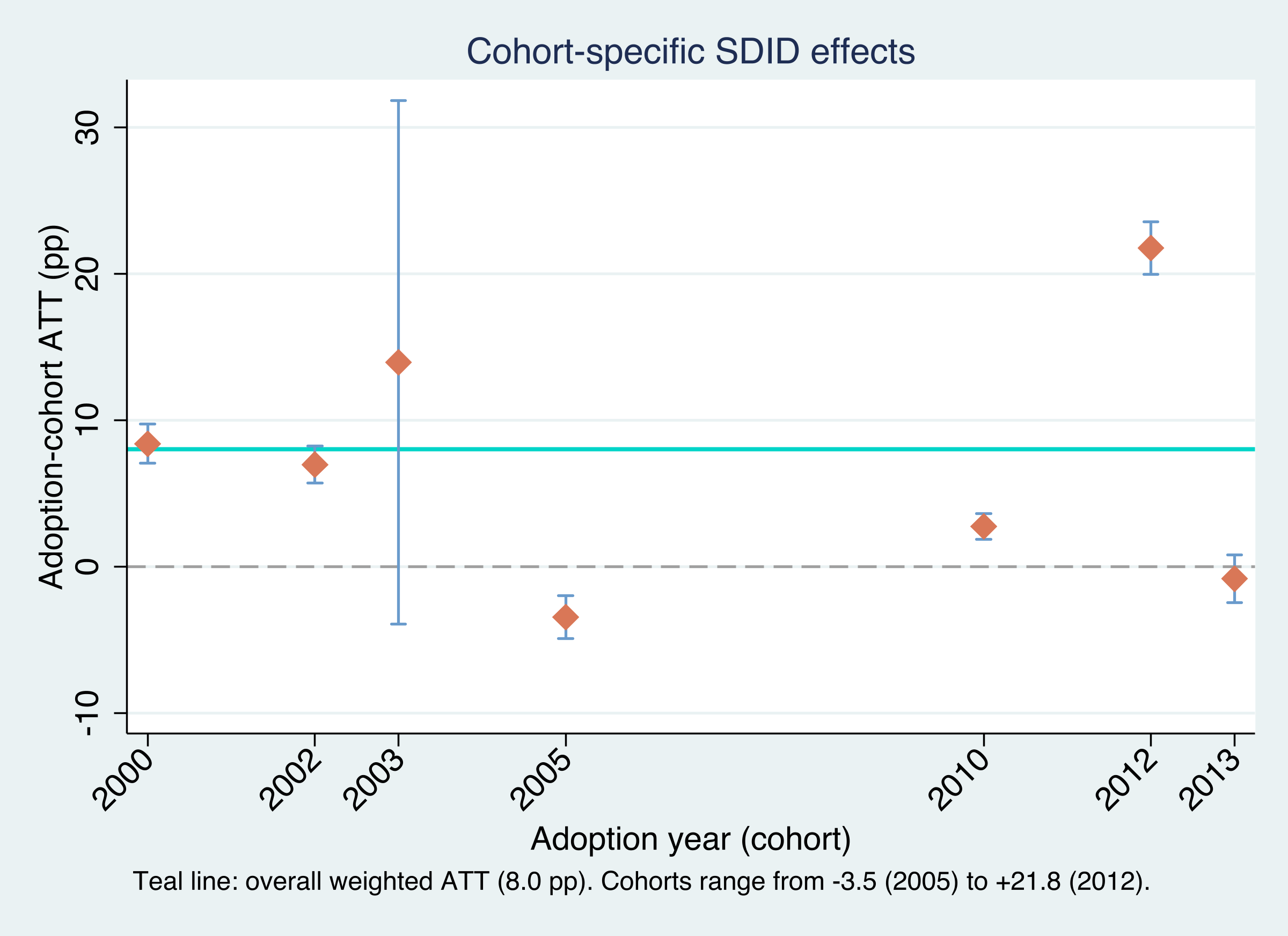
The cohort effects span an enormous range: from −3.5 points (2005 cohort) to +21.8 points (2012 cohort), with the 2003 cohort essentially uninformative (SE 9.13, a confidence interval that runs from −4 to +32). The teal line marks the aggregate ATT of 8.0. Notice that this aggregate is not the simple average of the seven cohort effects — that average would be about 7.0. It is the treated-period-weighted average from the aggregation formula, which up-weights the earlier, longer-exposed 2000, 2002, and 2003 cohorts. The lesson of the figure is that “+8 points on average” is a summary of real heterogeneity, not a universal constant; some quotas were transformative, others did nothing measurable.
To see the synthetic-control machinery underneath one cohort, the figure below plots the 2002 cohort against its synthetic control. Because SDID matches the pre-period trend and lets the unit fixed effect absorb the level gap, we anchor the synthetic to the treated cohort by its $\lambda$-weighted pre-period gap so the two align before adoption.
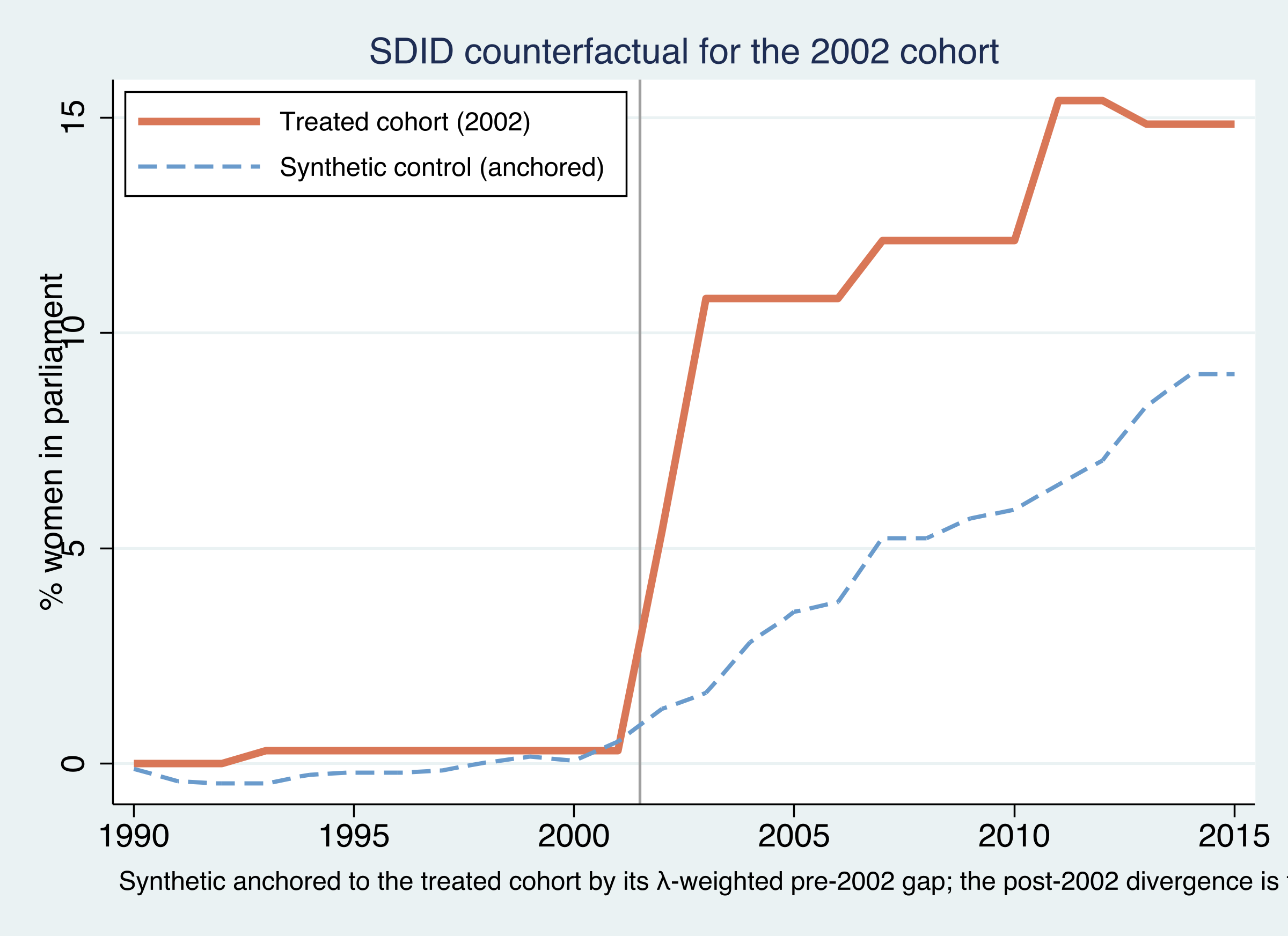
The treated 2002 cohort (orange) and its anchored synthetic control (blue dashed) track each other closely before 2002 — the synthetic was built precisely to do so — and then diverge: the treated cohort climbs to roughly 15% women in parliament while the synthetic counterfactual reaches only about 9–10%. That post-2002 gap is the cohort effect, about +7 points, matching $\hat{\tau}_{2002}=6.97$ from e(tau).
Which pre-period years anchor that comparison? The time weights $\hat{\lambda}_t$ for the 2002 cohort do not spread evenly over 1990–2001 — they concentrate on the years just before adoption.
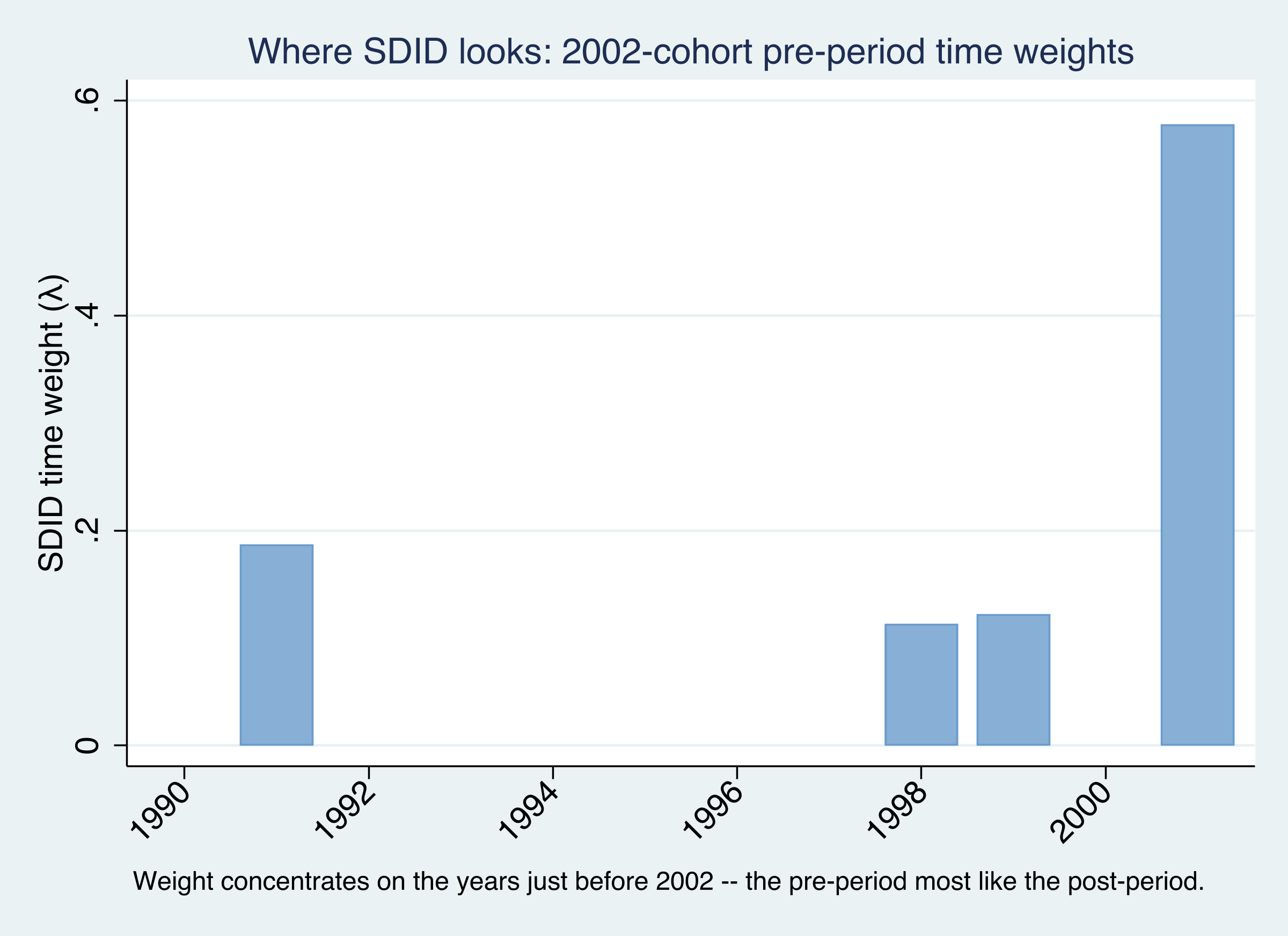
The bars show SDID’s baseline for the 2002 cohort leaning on the late 1990s and 2001 — the pre-adoption years whose level most resembles the post-adoption period — rather than weighting all twelve pre-years equally as a plain difference-in-differences would. This is the time-weighting half of SDID at work: it builds the “before” from the most relevant history, which is also the baseline the event study below measures against.
8. Adding a covariate: optimized vs projected
Does the quota effect simply reflect economic development — richer countries both grow GDP and elect more women? We can condition on log GDP per capita. The sdid command offers two routes, and SDID needs a balanced panel, so we first drop the country-years with missing lngdp.
drop if missing(lngdp)
sdid womparl country year quota, vce(bootstrap) seed(2022) covariates(lngdp, optimized)
sdid womparl country year quota, vce(bootstrap) seed(1213) covariates(lngdp, projected)
SDID + lngdp (optimized) ATT = 8.0515  SE = 3.0466
SDID + lngdp (projected) ATT = 8.0593  SE = 3.1191
The two methods differ in how they estimate the covariate’s coefficient. The optimized method (Arkhangelsky et al., 2021) folds the covariate adjustment into the SDID optimization itself, estimating it jointly with the weights — flexible but computationally heavy. The projected method (Kranz, 2022) instead regresses the outcome on the covariate among the untreated observations first, then runs SDID on the residuals — much faster and numerically more stable. Reassuringly, here they agree to the second decimal: 8.05 and 8.06, essentially unchanged from the no-covariate estimate of 8.03. Controlling for income does not explain away the quota effect; the result is robust to the most obvious confounder.
9. The event study with sdid_event
A single ATT — even per cohort — cannot tell us when the effect appears, or whether treated and control countries were already diverging before the quota. For that we need an event study: the treatment effect traced out by years relative to adoption. The modern sdid_event command (Ciccia, Clarke & Pailañir, 2024) computes exactly this for SDID, including pre-period placebo estimates that serve as a parallel-trends test.
The dynamic effect at event time $\ell$ is the treated-minus-synthetic gap in that period, net of the same gap at baseline, where — characteristically for SDID — the baseline is the $\lambda$-weighted pre-period average rather than a single “year −1”:
$$ \delta_{\ell} = \left(\bar{Y}_{\ell}^{,tr} - \bar{Y}_{\ell}^{,co}\right) - \left(\bar{Y}_{base}^{,tr} - \bar{Y}_{base}^{,co}\right), \qquad \bar{Y}_{base}^{,g} = \sum_{t=1}^{T_{pre}} \hat{\lambda}_t\, \bar{Y}_t^{,g} $$
sdid_event handles the full staggered panel directly, returning a cohort-aggregated ATT plus dynamic effects. To read the dynamics transparently we focus the plot on the 2002 cohort — the package authors’ own worked example — which gives a clean event-time axis; the full-panel call confirms the same aggregated ATT (≈ 8.06).
ssc install sdid_event, replace
* full staggered panel: aggregated ATT + cohort-aggregated dynamic effects
sdid_event womparl country year quota, vce(bootstrap) brep(100) effects(8) placebo(5) covariates(lngdp)
* clean event study on the 2002 cohort, with all placebos
keep if quotaYear==2002 | quotaYear==.
sdid_event womparl country year quota, vce(placebo) brep(100) placebo(all) covariates(lngdp)
             |  Estimate         SE      LB CI      UB CI  Switchers
-------------+------------------------------------------------------
         ATT |  6.853472   3.372744   .2428928   13.46405          2
    Effect_1 |  4.086404   1.191517    1.75103   6.421778          2
    Effect_2 |  9.164442   1.522799   6.179756   12.14913          2
    Effect_3 |  7.938504   2.182572   3.660663   12.21635          2
       ...   |
   Placebo_1 | -.218417   .470226   -1.14006    .703227          2
   Placebo_2 |  .242148   .884557   -1.491584   1.975880          2
       ...   |
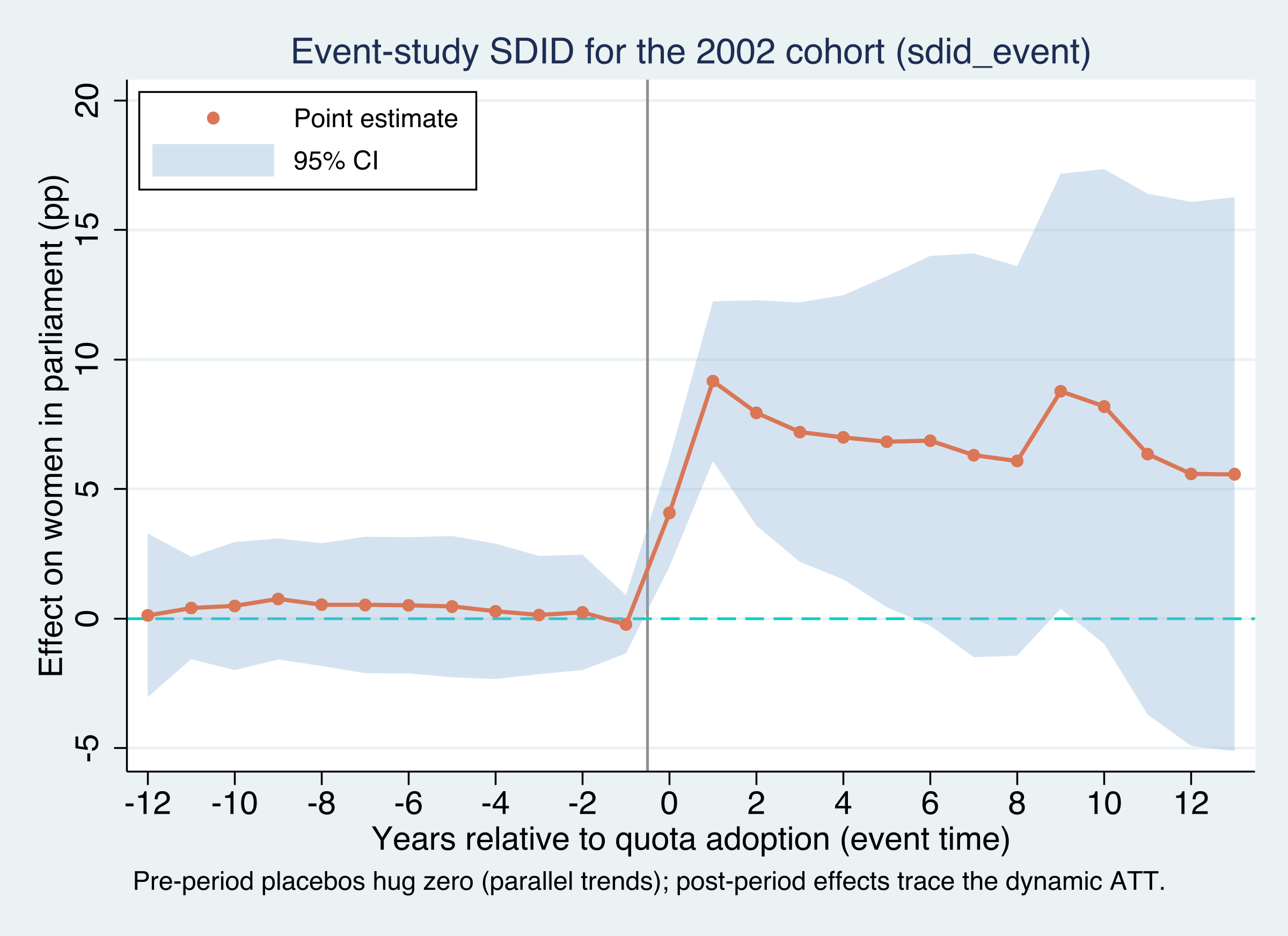
This plot rewards careful reading, and there are three things to look for.
First, the baseline is $\lambda$-weighted, not “the year before.” Unlike a textbook event study that normalizes to $t=-1$, SDID measures everything against the optimally weighted pre-period average. That is why the zero line is a weighted baseline; do not read it as the single pre-adoption year.
Second, the points to the left of zero are placebo tests. Every pre-adoption coefficient (Placebo_1 through Placebo_12, event times −1 to −12) sits within a whisker of zero — ranging only from about −0.2 to +0.8. Because the treated cohort and its synthetic control moved in parallel before 2002, we cannot reject that the parallel-(synthetic-)trends assumption holds. This is the identifying assumption made visible and, here, survived.
Third, the points to the right of zero are the dynamic ATT. The effect appears immediately at adoption (Effect_1 = +4.1 points at event time 0), roughly doubles within a year or two (Effect_2 = +9.2), and then settles in the +6 to +9 range for over a decade. Quotas do not just shift the level once; they sustain a higher share of women in parliament. Aggregated by the same treated-period logic as before, these dynamic effects reproduce the cohort’s overall ATT of about +7 points — but the plot shows the shape the single number conceals.
10. Inference: bootstrap, jackknife, and placebo
With one treated unit (California), the previous tutorial could only use placebo/permutation inference. With nine treated units here, all three of sdid’s variance estimators are on the table. To keep the comparison clean — jackknife needs more than one treated unit per adoption period — we follow Clarke et al. (2024) and restrict to the two-country 2002 and 2003 cohorts by dropping the five single-country cohorts.
graph TD
    Q1{"How many<br/>treated units?"}
    Q1 -->|"One (e.g. California)"| PL1["Placebo only<br/>jackknife undefined"]
    Q1 -->|"Many (e.g. 9 quota adopters)"| Q2{"More controls than treated?<br/>no singleton cohorts?"}
    Q2 -->|"Yes"| ALL["All three available"]
    Q2 -->|"Singleton cohorts"| PL2["Placebo / bootstrap<br/>jackknife drops out"]
    ALL --> BOOT["bootstrap<br/>SE 4.7 (default)"]
    ALL --> JACK["jackknife<br/>SE 6.0 (most conservative)"]
    ALL --> PLAC["placebo<br/>SE 2.3 (homoskedastic)"]
    style Q1 fill:#141413,stroke:#6a9bcc,color:#fff
    style Q2 fill:#141413,stroke:#6a9bcc,color:#fff
    style PL1 fill:#d97757,stroke:#141413,color:#fff
    style PL2 fill:#d97757,stroke:#141413,color:#fff
    style ALL fill:#00d4c8,stroke:#141413,color:#141413
    style BOOT fill:#6a9bcc,stroke:#141413,color:#fff
    style JACK fill:#6a9bcc,stroke:#141413,color:#fff
    style PLAC fill:#6a9bcc,stroke:#141413,color:#fff
drop if inlist(country,"Algeria","Kenya","Samoa","Swaziland","Tanzania")
sdid womparl country year quota, vce(bootstrap) seed(1213)
sdid womparl country year quota, vce(placebo)   seed(1213)
sdid womparl country year quota, vce(jackknife)
method      att        se      ci_l     ci_u
bootstrap   10.33066   4.7291   1.0618   19.5995
placebo     10.33066   2.3404   5.7436   14.9178
jackknife   10.33066   6.0056  -1.4401   22.1014
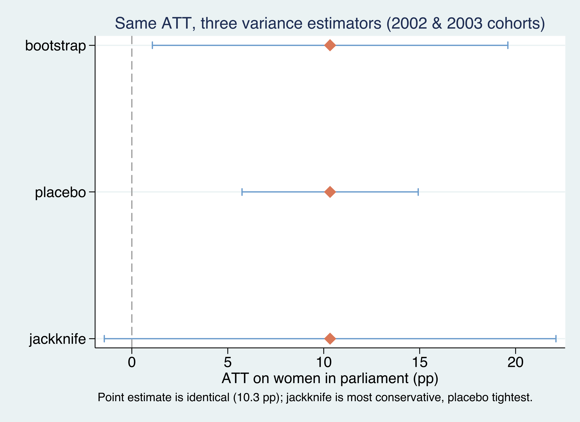
The point estimate is identical across all three methods — 10.33 points on this subsample — because the inference procedure changes only the standard error, never the estimate. But the standard errors differ by a factor of nearly three: jackknife is the most conservative (SE 6.01, a confidence interval that crosses zero), placebo is the tightest (SE 2.34) but rests on a homoskedasticity assumption and requires more controls than treated units, and bootstrap sits in between (SE 4.73) and is the default. The practical takeaway: with only a handful of treated units, report the bootstrap as your headline but cross-check it — a result that is “significant” under placebo but not under jackknife deserves caution. (The subsample ATT of 10.3 is larger than the full-sample 8.0 because dropping the five single-country cohorts discards the negative 2005 and 2013 effects.)
11. Robustness and discussion
Three caveats keep the result honest. Effect concentration: the +8 aggregate leans heavily on a few cohorts — the 2012 cohort alone contributes a +21.8 effect, and the early 2000/2002/2003 cohorts carry most of the aggregation weight. Drop the 2012 cohort and the average falls noticeably. Fragile counterfactuals: with only 110 controls and as few as one treated country per cohort, some synthetic controls are imprecise — the 2003 cohort’s standard error of 9.13 is the tell. Identifying assumptions: SDID still requires no anticipation, an absorbing treatment, no cross-country spillovers, and that quota timing is not itself a response to the outcome’s trajectory; the flat event-study placebos support, but cannot prove, the parallel-trends part. Finally, quota_example is a teaching subset of Bhalotra et al. (2023); these numbers illustrate the method, not a final verdict on quota policy.
12. Summary and key takeaways
- Method. Staggered SDID estimates a separate, clean synthetic difference-in-differences for each adoption cohort — comparing it only to never-treated controls — and aggregates the cohort effects $\hat{\tau}_a$ with non-negative, treated-period-share weights. This avoids the negative-weighting trap that contaminates naive two-way fixed-effects DiD under staggered timing.
- Result. Gender quotas raise the share of women in parliament by an overall ATT of +8.0 percentage points (SE 3.74, $p=0.032$), robust to a log-GDP control (8.05 optimized, 8.06 projected). Cohort effects range widely, from −3.5 to +21.8 points — heterogeneity the single number hides.
- Event study. The
sdid_eventplot shows pre-adoption placebo coefficients near zero (parallel synthetic trends) and post-adoption effects that appear immediately and persist for over a decade — the dynamics behind the average. - Inference. With nine treated units, bootstrap, jackknife, and placebo are all available; they share one point estimate (10.3 on the two-cohort illustration) but report standard errors of 4.7, 6.0, and 2.3. Jackknife is the most conservative.
- Bridge. The block design (Proposition 99, the previous tutorial) and the staggered design here are two faces of one estimator — the staggered version is just single-cohort SDID, done once per cohort and averaged.
13. Exercises
- Re-aggregate by hand. Pull
e(tau)and each cohort’s treated unit-count and post-period length. Verify that the treated-period-weighted average of the seven $\hat{\tau}_a$ reproduces the overall ATT of 8.03, and show that it differs from the unweighted mean (≈ 7.0). Which cohorts move the aggregate the most? - Inference sensitivity. Re-run the full nine-country sample with
vce(bootstrap)and thenvce(placebo)atreps(500). How much do the standard error and confidence interval move, and which would you report given only nine treated units? - Drop the outlier cohort. Re-estimate the overall ATT excluding the 2012 cohort (the +21.8 outlier). How far does the aggregate fall, and what does that tell you about how concentrated the average effect is?
14. References
- Arkhangelsky, D., Athey, S., Hirshberg, D. A., Imbens, G. W., & Wager, S. (2021). Synthetic Difference-in-Differences. American Economic Review, 111(12), 4088–4118.
- Clarke, D., Pailañir, D., Athey, S., & Imbens, G. (2024). On Synthetic Difference-in-Differences and Related Estimation Methods in Stata. The Stata Journal, 24(4). Package:
ssc install sdid. - Ciccia, D. (2024). A Short Note on Event-Study Synthetic Difference-in-Differences Estimators. Package:
ssc install sdid_event. - Bhalotra, S., Clarke, D., Gomes, J. F., & Venkataramani, A. (2023). Maternal Mortality and Women’s Political Power. Journal of the European Economic Association. (Source of the
quota_exampledata.) - Goodman-Bacon, A. (2021). Difference-in-Differences with Variation in Treatment Timing. Journal of Econometrics, 225(2), 254–277.
- de Chaisemartin, C., & D’Haultfœuille, X. (2020). Two-Way Fixed Effects Estimators with Heterogeneous Treatment Effects. American Economic Review, 110(9), 2964–2996.
- Xu, Y., & Hua, L. panelView: Visualizing Panel Data. Package:
ssc install panelview.
Related tutorials on this site: Synthetic Difference-in-Differences (the block design) · Difference-in-Differences.
15. Acknowledgments
This tutorial uses the sdid command (Clarke, Pailañir, Athey & Imbens), the sdid_event command (Ciccia, Clarke & Pailañir), and panelview (Xu & Hua). The data, quota_example, is distributed with sdid and draws on Bhalotra, Clarke, Gomes & Venkataramani (2023). All estimates were produced by the companion analysis.do and verified against Clarke et al. (2024). AI tools (Claude Code) assisted with drafting and figure preparation; all code was executed and every number checked by the author.
Carlos Mendez
Associate Professor of Development Economics
My research interests focus on the integration of development economics, spatial data science, and econometrics to better understand and inform the process of sustainable development across regions.