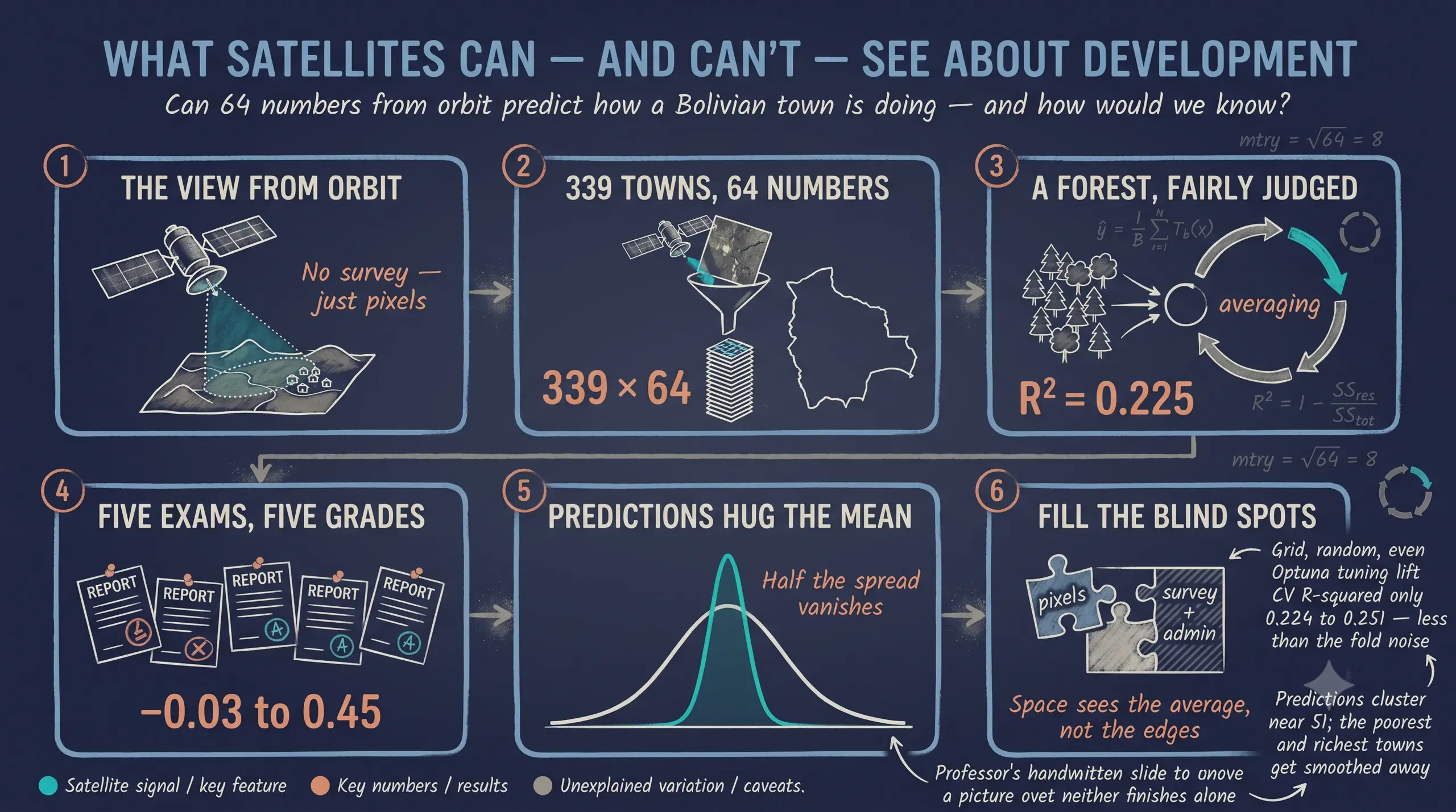
Introduction to Machine Learning: Random Forest Regression
Abstract
Satellite imagery is increasingly used as a low-cost proxy for socioeconomic conditions where survey data are sparse, raising the question of how much development signal it actually contains. This tutorial predicts Bolivia’s Municipal Sustainable Development Index (IMDS) — a 0–100 composite — from satellite image embeddings, and uses the problem to introduce the core ideas of machine learning for continuous outcomes. The data, from the DS4Bolivia repository, cover all 339 municipalities with no missing values, pairing IMDS scores (mean 51.05, standard deviation 6.77) with 64-dimensional embeddings from 2017 imagery. Rather than trusting a single 80/20 split, we evaluate with 5-fold cross-validation: every municipality receives an out-of-fold prediction from a forest that never saw it. A baseline Random Forest explains about 22% of IMDS variation (pooled out-of-fold R² 0.225), but the per-fold R² swings from −0.03 to 0.45 (standard deviation 0.173) — the spread a single number would hide, and the reason we report a standard deviation alongside the mean. The predictions are compressed toward the centre (predicted standard deviation 3.54 vs 6.77; a Kolmogorov–Smirnov test rejects equality, p < 0.001), the classic regression-to-the-mean signature of limited signal. Permutation importance singles out embedding dimensions A30 and A59, with non-linear threshold effects in the partial-dependence plots. Two appendices keep the main story clean: why a single split is unreliable here, and why grid, random, and Optuna tuning buys almost nothing over the baseline. The practical message is that satellite embeddings carry real but limited development signal, so pairing them with administrative or survey data is the natural next step.
1. Introduction
1.1 The research question
Can satellite imagery predict how well a municipality is developing? This tutorial explores that question by applying Random Forest regression to predict Bolivia’s Municipal Sustainable Development Index (IMDS) from satellite image embeddings. IMDS is a composite index (0–100 scale) that captures how well each of Bolivia’s 339 municipalities is progressing toward sustainable development goals. Satellite embeddings are 64-dimensional feature vectors extracted from 2017 satellite imagery — they compress visual information about land use, urbanization, and terrain into numbers a model can learn from. By the end, we will know how much development-related signal satellite imagery actually contains — and where its predictive power falls short.
1.2 Why Random Forest
The Random Forest algorithm is a natural starting point for this kind of tabular prediction task: it captures non-linear relationships and feature interactions automatically, requires almost no preprocessing (no scaling, no manual interaction terms), is robust to irrelevant features, and provides built-in measures of feature importance. It is, in short, a strong and forgiving default — exactly what a beginner wants for a first real machine-learning model on continuous data.
1.3 The end-to-end workflow
This is the road map for the whole tutorial. We load and explore the data, fit a baseline forest, and then — instead of a single train/test split — evaluate it with 5-fold cross-validation, which lets every municipality contribute an honest, out-of-fold prediction. From those predictions we read off per-fold metrics, an actual-vs-predicted picture, and a comparison of distributions, before turning to feature importance and partial dependence. The train/test split and hyperparameter tuning are deliberately moved to the appendices — useful to know, but not needed for the main result.
graph TD
    A["Load and merge DS4Bolivia<br/>339 municipalities, 64 features"] --> B["Exploratory data analysis"]
    B --> C["Baseline Random Forest<br/>default hyperparameters"]
    C --> D["5-fold cross-validation"]
    D --> E["Per-fold metrics<br/>mean +/- SD"]
    D --> F["Out-of-fold predictions<br/>all 339 points"]
    F --> G["Actual vs predicted<br/>colored by fold"]
    F --> H["Distribution overlap<br/>plus KS test"]
    C --> I["Feature importance<br/>MDI and permutation"]
    I --> J["Partial dependence plots"]
    A -.optional.-> K["Appendix A<br/>train/test split"]
    C -.optional.-> L["Appendix B<br/>grid / random / Optuna tuning"]
    classDef box fill:#1f2b5e,stroke:#6a9bcc,stroke-width:1px,color:#e8ecf2;
    classDef appendix fill:#141a2e,stroke:#8a93a8,stroke-width:1px,color:#c8d0e0;
    class A,B,C,D,E,F,G,H,I,J box;
    class K,L appendix;
2. Key learning objectives
By the end of this tutorial you should be able to:
- Explain how a Random Forest works — decision trees, bagging, and random feature subsets — and why it suits tabular data.
- Motivate cross-validation: explain why a single train/test split is unreliable on a small dataset, and what k-fold cross-validation does instead.
- Generate out-of-fold predictions with
cross_val_predictso that every observation is predicted by a model that never saw it. - Report performance as a mean ± standard deviation across folds, and articulate why the standard deviation matters as much as the mean.
- Distinguish pooled out-of-fold metrics from the average of per-fold metrics.
- Compare the distribution of predictions to the distribution of actual values, and recognize regression-to-the-mean / variance compression.
- Interpret MDI and permutation feature importance and partial dependence plots.
- Decide when hyperparameter tuning is worth the effort (Appendix B) and when a baseline model is enough.
3. Key concepts at a glance
The post leans on a small vocabulary repeatedly. Each concept below has three parts. The definition is always visible. The example and analogy sit behind clickable cards: open them when you need them, leave them collapsed for a quick scan. If a later section mentions “out-of-fold prediction” or “permutation importance” and the term feels slippery, this is the section to re-read.
1. Decision tree — recursive binary splits. A tree of yes/no questions on features. Each internal node tests one feature against a threshold; each leaf gives a prediction.
Example
A single tree in this post might split first on satellite-embedding dimension A30 (“built-up signal”), then on A59, and finally output an IMDS prediction at each leaf.
Analogy
A flowchart of yes/no questions ending in a verdict.
2. Bagging (bootstrap aggregating) — $\hat f = \frac{1}{B}\sum_b \hat f_b$. Train $B$ trees, each on a bootstrap resample of the training data, and average their predictions. Reduces variance.
Example
With the default n_estimators = 100, this post grows 100 trees on 100 different bootstrap samples of the training municipalities. The final IMDS prediction is the average across all 100 trees.
Analogy
Polling many slightly different juries and averaging their verdicts.
3. Random Forest — bagging + random feature subsets. At each split, only a random subset of features is considered. Decorrelates trees and further reduces variance.
Example
Each split in this post’s forest considers only sqrt(64) = 8 of the 64 embedding dimensions. Different trees see different subsets — they make different mistakes, and the average is stronger than the parts.
Analogy
Bagging plus also blindfolding each juror to a random subset of evidence.
4. Cross-validation — $k$-fold CV. Split the data into $k$ equal folds. Train on $k-1$ folds and test on the held-out fold; rotate so every fold is the test set exactly once. Averages out the luck of any single split.
Example
This tutorial’s headline result — a pooled out-of-fold R² of about 0.22 — is a 5-fold CV estimate computed over all 339 municipalities (Section 7), not a one-off test-set number.
Analogy
Taking five mock exams instead of one — averaging the scores gives a steadier read.
5. Out-of-fold (OOF) prediction — predict each point when it is held out. Because every fold is the test set exactly once, every observation gets exactly one prediction from a model that never saw it. Collecting these gives a complete, honest set of predictions for the whole dataset.
Example
cross_val_predict returns 339 out-of-fold IMDS predictions — one per municipality — which we can plot and compare to the actual scores in Sections 9 and 10.
Analogy
Every student sits the exam once, graded by a teacher who never tutored them.
6. Train/test split — $D = D_{\mathrm{train}} \cup D_{\mathrm{test}}$. Hold out a portion of the data for a single honest evaluation. Simple, but on a small dataset the score depends heavily on which rows landed in the test set. We use cross-validation instead; see Appendix A for the split and why it is shaky here.
Example
An 80/20 split would put 271 municipalities in training and 68 in test. Appendix A shows that the resulting R² wanders from −0.09 to 0.46 depending only on the random seed.
Analogy
Judging a student on a single pop quiz instead of a term’s worth of exams.
7. Hyperparameter tuning — grid / random / Bayesian search. Search over model settings (number of trees, depth, leaf size) and keep the combination with the best CV score. Often helpful — but not always worth it. Appendix B compares grid search, random search, and Optuna.
Example
In Appendix B, tuning nudges the cross-validated R² from 0.224 (baseline) to 0.251 (Optuna) — a tiny gain, which is why the main analysis keeps the defaults.
Analogy
Adjusting the oven knobs (temperature, time, rack) before baking the real cake.
8. Feature importance — which inputs the model relies on. Two complementary measures: mean decrease in impurity (built into the forest) and permutation importance (shuffle a column and watch R² drop). Higher = more useful feature.
Example
Both measures put embedding dimension A30 far ahead of the rest, with A59 a distant second.
Analogy
Which ingredient mattered most for the cake’s flavour.
9. Partial dependence plot — $\bar f(x_j) = E_{X_{-j}}[\hat f(x_j, X_{-j})]$. Average prediction as one feature varies, with all other features held at their observed distribution. Shows the marginal shape of the relationship.
Example
The partial dependence plot for A30 rises then plateaus — a non-linear pattern a straight-line model would miss entirely.
Analogy
Sliding the salt dial up and down with everything else fixed and tasting after each step.
import sys
if "google.colab" in sys.modules:
    !git clone --depth 1 https://github.com/cmg777/claude4data.git /content/claude4data 2>/dev/null || true
    %cd /content/claude4data/notebooks
sys.path.insert(0, "..")
from config import set_seeds, RANDOM_SEED, IMAGES_DIR, TABLES_DIR, DATA_DIR

set_seeds()
import numpy as np
import pandas as pd
import matplotlib.pyplot as plt
import seaborn as sns
from scipy.stats import gaussian_kde, ks_2samp
from sklearn.ensemble import RandomForestRegressor
from sklearn.inspection import PartialDependenceDisplay, permutation_importance
from sklearn.metrics import r2_score, mean_absolute_error
from sklearn.model_selection import KFold, cross_validate, cross_val_predict

# Configuration
TARGET = "imds"
TARGET_LABEL = "IMDS (Municipal Sustainable Development Index)"
FEATURE_COLS = [f"A{i:02d}" for i in range(64)]
N_FOLDS = 5

DS4BOLIVIA_BASE = "https://raw.githubusercontent.com/quarcs-lab/ds4bolivia/master"
CACHE_PATH = DATA_DIR / "rawData" / "ds4bolivia_merged.csv"
4. Data
4.1 Loading and merging the data
The data come from the DS4Bolivia repository, which provides standardized datasets for studying Bolivian development. We merge three tables on asdf_id — the unique identifier for each municipality: SDG indices (our target variables), satellite embeddings (our features), and region names (for context).
if CACHE_PATH.exists():
    df = pd.read_csv(CACHE_PATH)
else:
    sdg = pd.read_csv(f"{DS4BOLIVIA_BASE}/sdg/sdg.csv")
    embeddings = pd.read_csv(
        f"{DS4BOLIVIA_BASE}/satelliteEmbeddings/satelliteEmbeddings2017.csv"
    )
    regions = pd.read_csv(f"{DS4BOLIVIA_BASE}/regionNames/regionNames.csv")
    df = sdg.merge(embeddings, on="asdf_id").merge(regions, on="asdf_id")
    CACHE_PATH.parent.mkdir(parents=True, exist_ok=True)
    df.to_csv(CACHE_PATH, index=False)

X = df[FEATURE_COLS]
y = df[TARGET]
mask = X.notna().all(axis=1) & y.notna()
X = X[mask].reset_index(drop=True)
y = y[mask].reset_index(drop=True)

print(f"Dataset shape: {df.shape}")
print(f"Observations after dropping missing: {len(y)}")
print(y.describe().round(2))
Dataset shape: (339, 88)
Observations after dropping missing: 339
count    339.00
mean      51.05
std        6.77
min       35.70
25%       47.00
50%       50.50
75%       54.85
max       80.20
Name: imds, dtype: float64
4.2 The target and the features
All 339 Bolivian municipalities load successfully with no missing values — the dataset provides complete national coverage. The merged data has 88 columns: the 64 satellite embedding features (A00–A63), SDG indices, and region identifiers. IMDS scores range from 35.70 to 80.20 with a mean of 51.05 and standard deviation of 6.77, so most municipalities cluster within about 7 points of the national average on the 0–100 scale. Keep that 6.77 in mind: it is the natural yardstick for our errors, and it is the spread our model will try — and partly fail — to reproduce.
5. Exploratory data analysis
Before building any model, we explore the data to understand its structure. EDA helps us spot issues — skewed distributions, outliers, or weak feature correlations — that could affect model performance, and it builds intuition about what patterns the model might find.
5.1 Target distribution
The histogram below shows how IMDS values are distributed across municipalities. The shape of this distribution matters: a highly skewed target can bias predictions toward the majority range.
fig, ax = plt.subplots(figsize=(8, 5))
ax.hist(y, bins=30, edgecolor="white", alpha=0.85, color="#6a9bcc")
ax.axvline(y.mean(), color="#d97757", linestyle="--", linewidth=2, label=f"Mean = {y.mean():.1f}")
ax.axvline(y.median(), color="#141413", linestyle=":", linewidth=2, label=f"Median = {y.median():.1f}")
ax.set_xlabel(TARGET_LABEL); ax.set_ylabel("Count")
ax.set_title("Distribution of IMDS across 339 municipalities")
ax.legend()
plt.savefig(IMAGES_DIR / "ml_target_distribution.png", dpi=300, bbox_inches="tight")
plt.show()
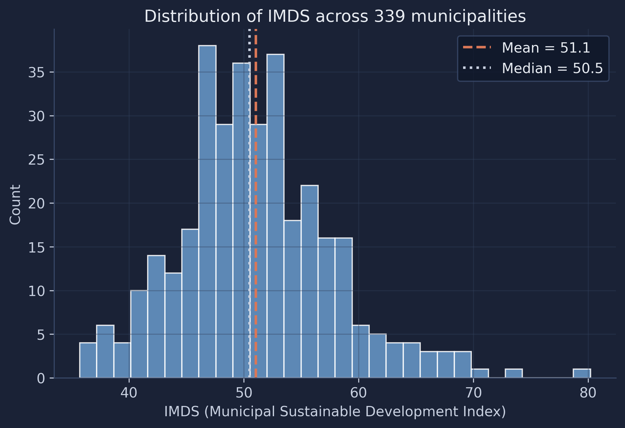
The distribution is roughly bell-shaped with a slight right skew — the mean (51.1) sits just above the median (50.5), indicating a small tail of higher-performing municipalities. Most scores fall between 47 and 55, meaning the majority of Bolivia’s municipalities have similar mid-range development levels. The handful of outliers above 70 likely correspond to larger urban centers like La Paz, Santa Cruz, and Cochabamba, which have significantly higher development infrastructure. These extremes are exactly the municipalities a low-signal model will struggle with later.
5.2 Embedding correlations
Next we examine which satellite embedding dimensions are most correlated with the target. Strong correlations suggest the model has useful signal to learn from; weak correlations across the board would be a warning sign.
correlations = X.corrwith(y).abs().sort_values(ascending=False)
top10_features = correlations.head(10).index.tolist()
corr_matrix = df.loc[mask, top10_features + [TARGET]].corr()

fig, ax = plt.subplots(figsize=(10, 8))
sns.heatmap(corr_matrix, annot=True, fmt=".2f", cmap="RdBu_r", center=0,
            square=True, ax=ax, vmin=-1, vmax=1)
ax.set_title("Correlations: top-10 embeddings & IMDS")
plt.savefig(IMAGES_DIR / "ml_embedding_correlations.png", dpi=300, bbox_inches="tight")
plt.show()
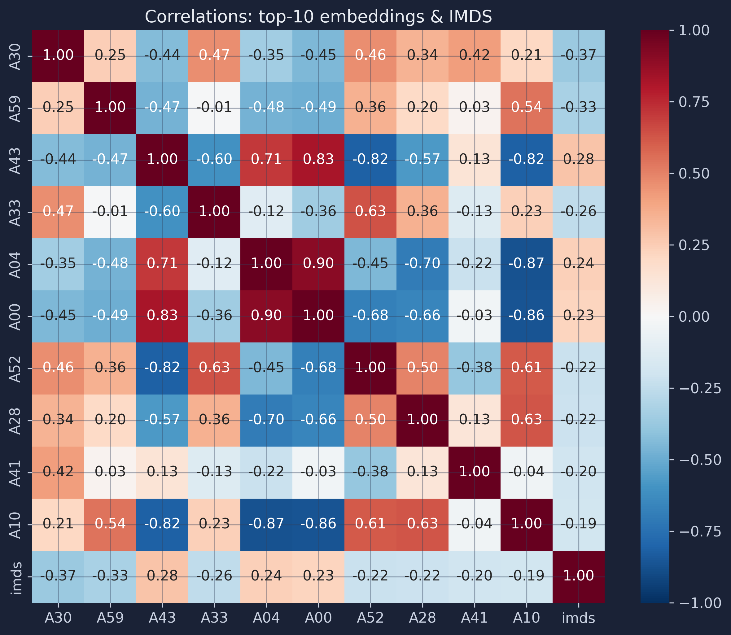
The strongest individual correlation between any single embedding dimension and IMDS is about 0.37 (dimension A30); the rest of the top ten sit in the 0.25–0.35 range. These are moderate correlations — typical for satellite-derived features predicting complex socioeconomic outcomes, and an early hint that no single feature will carry the model. Several embedding dimensions are also correlated with each other, suggesting they capture overlapping spatial patterns. A Random Forest handles this multicollinearity (features carrying overlapping information) gracefully because it selects feature subsets at each split. There is real signal here, just not a lot of it — so let’s build the model and measure exactly how much.
6. The baseline Random Forest model
6.1 How a Random Forest works
A Random Forest builds many decision trees on random subsets of the data and features, then averages their predictions. This “wisdom of crowds” approach reduces overfitting compared to a single decision tree. Formally, the prediction is:
$$\hat{y} = \frac{1}{B} \sum_{b=1}^{B} T_b(\mathbf{x})$$
In words, the predicted value $\hat{y}$ is the average of predictions from all $B$ individual trees. Each tree $T_b$ sees a different random subset of training rows (bagging) and, at each split, a different random subset of features — so the trees make different errors, and averaging cancels out much of the noise. Here $B$ is the n_estimators parameter (100 by default) and $\mathbf{x}$ is the 64-dimensional satellite embedding vector for a given municipality.
6.2 Fitting the baseline model
We deliberately keep scikit-learn’s defaults. A baseline with default hyperparameters is the honest reference point every project should start from: it tells us what “no effort” already achieves, so we can judge whether any later complication actually earns its keep. (Appendix B confirms that, for this problem, tuning barely moves the result.)
baseline_rf = RandomForestRegressor(n_estimators=100, random_state=RANDOM_SEED)
That single line defines the model. We have not evaluated it yet — and how we evaluate it is the heart of this tutorial.
7. Cross-validation: a better way to test predictions
7.1 Why not just one train/test split?
The textbook recipe is to hold out, say, 20% of the data as a test set, train on the other 80%, and report the score on the held-out part. With only 339 municipalities, that test set is just 68 points — about 1.5% of the data per prediction — and the score you get depends heavily on which 68 municipalities happen to land in it. Get a few easy ones and the model looks great; get a few of the urban outliers and it looks terrible. The estimate is noisy, and it wastes data — the 68 test points never help the model learn. Appendix A makes this concrete: across 200 random splits the test R² wanders from −0.09 to 0.46 for the same model on the same data. We need something steadier.
7.2 What is k-fold cross-validation?
k-fold cross-validation turns that one wasteful split into $k$ efficient ones. Shuffle the data and cut it into $k$ equal folds. Then run $k$ rounds: in each round, one fold is held out as the test set and the model trains on the other $k-1$. Because every fold takes a turn as the test set, every observation is tested exactly once — and every observation is also used for training in the other $k-1$ rounds. We use $k = 5$.
graph TD
    D["All 339 municipalities"] --> S["Shuffle and split into 5 folds"]
    S --> R1["Round 1: test = Fold 1, train = Folds 2-5"]
    S --> R2["Round 2: test = Fold 2, train = Folds 1,3,4,5"]
    S --> R3["Round 3: test = Fold 3, train = Folds 1,2,4,5"]
    S --> R4["Round 4: test = Fold 4, train = Folds 1,2,3,5"]
    S --> R5["Round 5: test = Fold 5, train = Folds 1,2,3,4"]
    R1 --> O["Out-of-fold predictions:<br/>every municipality predicted once,<br/>by a forest that never saw it"]
    R2 --> O
    R3 --> O
    R4 --> O
    R5 --> O
    classDef box fill:#1f2b5e,stroke:#6a9bcc,stroke-width:1px,color:#e8ecf2;
    class D,S,R1,R2,R3,R4,R5,O box;
In code, KFold defines the folds and cross_validate runs the five rounds, returning a score per fold for each metric we ask for. We score with R², RMSE, and MAE at once.
kf = KFold(n_splits=N_FOLDS, shuffle=True, random_state=RANDOM_SEED)

cv = cross_validate(
    baseline_rf, X, y, cv=kf,
    scoring=("r2", "neg_root_mean_squared_error", "neg_mean_absolute_error"),
)
fold_r2   = cv["test_r2"]
fold_rmse = -cv["test_neg_root_mean_squared_error"]
fold_mae  = -cv["test_neg_mean_absolute_error"]

print("Per-fold R²:", fold_r2.round(3))
print(f"Mean R²: {fold_r2.mean():.3f} ± {fold_r2.std():.3f}")
Per-fold R²: [ 0.209  0.121 -0.032  0.453  0.367]
Mean R²: 0.224 ± 0.173
(scikit-learn reports RMSE and MAE as negative numbers so that “higher is better” holds for every scorer; we flip the sign back.) We will dissect these five numbers in Section 8. First, let’s get a prediction for every municipality.
7.3 Out-of-fold predictions for every municipality
cross_validate gives us scores, but not the individual predictions. For that we use cross_val_predict, which runs the same five rounds and, in each round, records the predictions for the held-out fold. Stitched together, the result is one out-of-fold (OOF) prediction for each of the 339 municipalities — each made by a forest that was trained without that municipality. We pass the same kf object so the folds line up exactly with the metrics above, and we record which fold each point belonged to.
oof_pred = cross_val_predict(baseline_rf, X, y, cv=kf)

fold_id = np.empty(len(y), dtype=int)
for k, (_, test_idx) in enumerate(kf.split(X), start=1):
    fold_id[test_idx] = k

pooled_r2 = r2_score(y, oof_pred)
print(f"Out-of-fold predictions: {len(oof_pred)} municipalities")
print(f"Pooled out-of-fold R²:   {pooled_r2:.3f}")
Out-of-fold predictions: 339 municipalities
Pooled out-of-fold R²:   0.225
We now have an honest prediction for all 339 municipalities, with no data leakage. Everything that follows — the per-fold metrics, the actual-vs-predicted scatter, and the distribution comparison — is built from these out-of-fold predictions.
8. Evaluating predictions across folds
8.1 Per-fold performance metrics
The five rounds produce five of each metric. Three metrics tell us complementary things: R² is the fraction of IMDS variance the model explains (1.0 is perfect, 0 is no better than guessing the mean, and negative is worse than guessing the mean); RMSE is the typical error in IMDS points, penalizing large misses; MAE is the average absolute error, more robust to outliers. Here is every fold:
| Fold | n | R² | RMSE | MAE |
|---|---|---|---|---|
| 1 | 68 | 0.209 | 6.61 | 4.73 |
| 2 | 68 | 0.121 | 7.34 | 5.05 |
| 3 | 68 | −0.032 | 5.73 | 4.43 |
| 4 | 68 | 0.453 | 4.49 | 3.82 |
| 5 | 67 | 0.367 | 5.14 | 4.05 |
| Mean | 0.224 | 5.86 | 4.42 | |
| SD | 0.173 | 1.01 | 0.44 |
Look at the R² column before reading on. Fold 4 reaches 0.45 — a respectable score — while fold 3 comes in at −0.03, meaning that on those 68 municipalities the forest did slightly worse than just predicting the national average. Same model, same data, same procedure; only the luck of the fold differs. This is the single most important table in the tutorial.
8.2 Why the standard deviation matters
If we reported only “R² = 0.22” we would be telling the truth and hiding the most important part of it. The standard deviation of 0.173 is almost as large as the mean of 0.224 — the model’s quality is genuinely unstable across different slices of Bolivia. A single train/test split would have handed us exactly one of these five numbers, and we would have had no way to know whether we drew the 0.45 or the −0.03. Reporting the spread is what separates an honest performance claim from a lucky one. The figure below shows each metric fold-by-fold, with the mean (dashed line) and a ±1 standard-deviation band.
fig, axes = plt.subplots(1, 3, figsize=(15, 4.5))
folds = np.arange(1, N_FOLDS + 1)
for ax, (name, vals, color) in zip(axes, [
        ("R²", fold_r2, "#6a9bcc"), ("RMSE", fold_rmse, "#d97757"), ("MAE", fold_mae, "#00d4c8")]):
    ax.bar(folds, vals, color=color, edgecolor="white", alpha=0.9, width=0.65)
    m, s = vals.mean(), vals.std()
    ax.axhspan(m - s, m + s, color="#141413", alpha=0.08)
    ax.axhline(m, color="#141413", linestyle="--", linewidth=1.5)
    ax.set_xticks(folds); ax.set_xlabel("Fold"); ax.set_ylabel(name)
    ax.set_title(f"{name}: {m:.3f} ± {s:.3f}")
plt.savefig(IMAGES_DIR / "ml_per_fold_metrics.png", dpi=300, bbox_inches="tight")
plt.show()
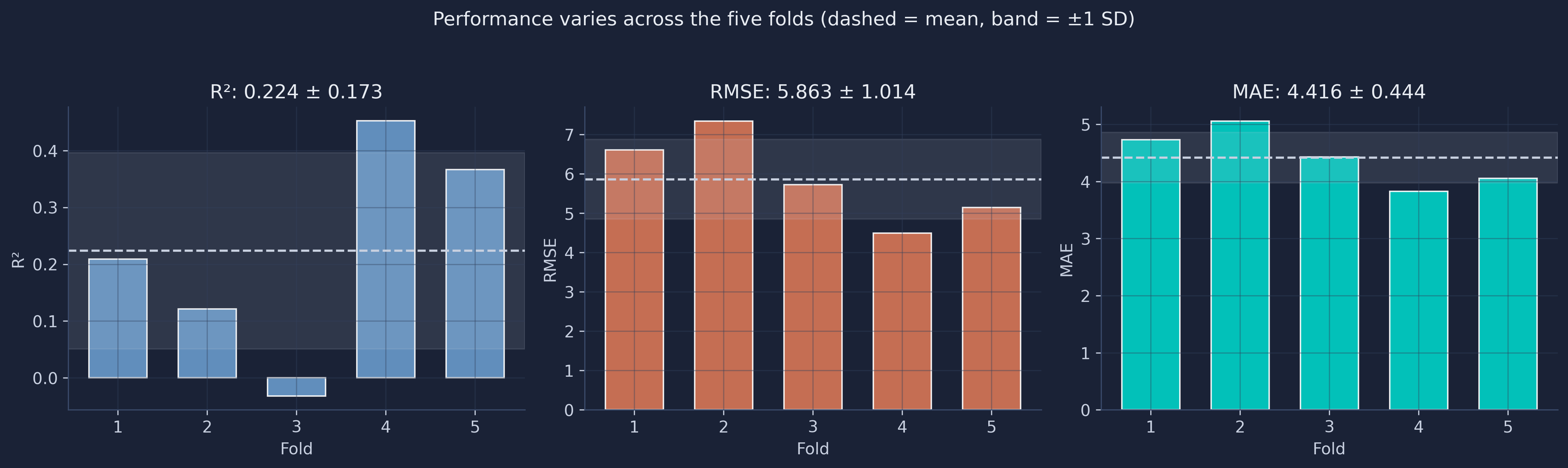
Notice that the three metrics partly disagree about which fold is hardest. Fold 2 has the worst RMSE (7.34) and MAE (5.05) but not the worst R²; fold 3 has the worst R² but a middling RMSE. That happens because R² is measured relative to each fold’s own variance — fold 3 must contain municipalities that are unusually close together, so even small absolute errors blow up the R². This is a useful reminder that no single metric is the whole story, and that R² in particular can be deceptive when the test sample is small and homogeneous.
8.3 Pooled vs averaged R², and repeated CV
There are two defensible ways to summarize R² across folds, and they answer slightly different questions:
- Average of the per-fold R² (the 0.224 above): the mean of the five fold scores. This is what we pair with a standard deviation, because it is a set of five comparable numbers.
- Pooled out-of-fold R² (the 0.225 from Section 7.3): compute a single R² over all 339 out-of-fold predictions at once.
Here the two nearly coincide (0.224 vs 0.225), but they need not — the pooled value weights every observation equally while the average weights every fold equally, and the two diverge when folds differ in size or difficulty. The scikit-learn documentation explicitly warns against confusing them. Our advice for beginners: use the per-fold mean ± SD to communicate performance and uncertainty, and use the pooled OOF predictions for plotting (Sections 9–10), where you want one prediction per point.
One honest caveat: with only five folds, the standard deviation itself is estimated from just five numbers and is therefore rough. If you want a more stable estimate of the spread, RepeatedKFold reruns the whole k-fold procedure several times with different shuffles and pools the scores — at a proportional cost in compute. For a teaching example, plain 5-fold is enough; for a paper, repeated CV is worth it.
9. Actual vs predicted — all municipalities
9.1 The out-of-fold scatter, colored by fold
Because we have an out-of-fold prediction for every municipality, we can plot all 339 of them — not just a 68-point test slice. Points on the dashed 45-degree line are perfect predictions. We color each point by the fold in which it was held out, so you can literally see which round produced which prediction.
residuals = np.asarray(y) - oof_pred
fold_colors = ["#6a9bcc", "#d97757", "#00d4c8", "#8e6fb0", "#e0a23a"]

fig, ax = plt.subplots(figsize=(7.2, 7.2))
for k in range(1, N_FOLDS + 1):
    m = fold_id == k
    ax.scatter(y[m], oof_pred[m], s=34, alpha=0.75, edgecolors="white",
               linewidth=0.4, color=fold_colors[k - 1], label=f"Fold {k}")
lims = [y.min() - 2, y.max() + 2]
ax.plot(lims, lims, "--", color="#141413", linewidth=1.8, label="Perfect prediction")
ax.set_xlim(lims); ax.set_ylim(lims); ax.set_aspect("equal")
ax.set_xlabel("Actual IMDS"); ax.set_ylabel("Predicted IMDS (out-of-fold)")
ax.set_title("Out-of-fold predictions for all 339 municipalities")
ax.legend(loc="lower right", ncol=2, fontsize=9)
plt.savefig(IMAGES_DIR / "ml_actual_vs_predicted.png", dpi=300, bbox_inches="tight")
plt.show()
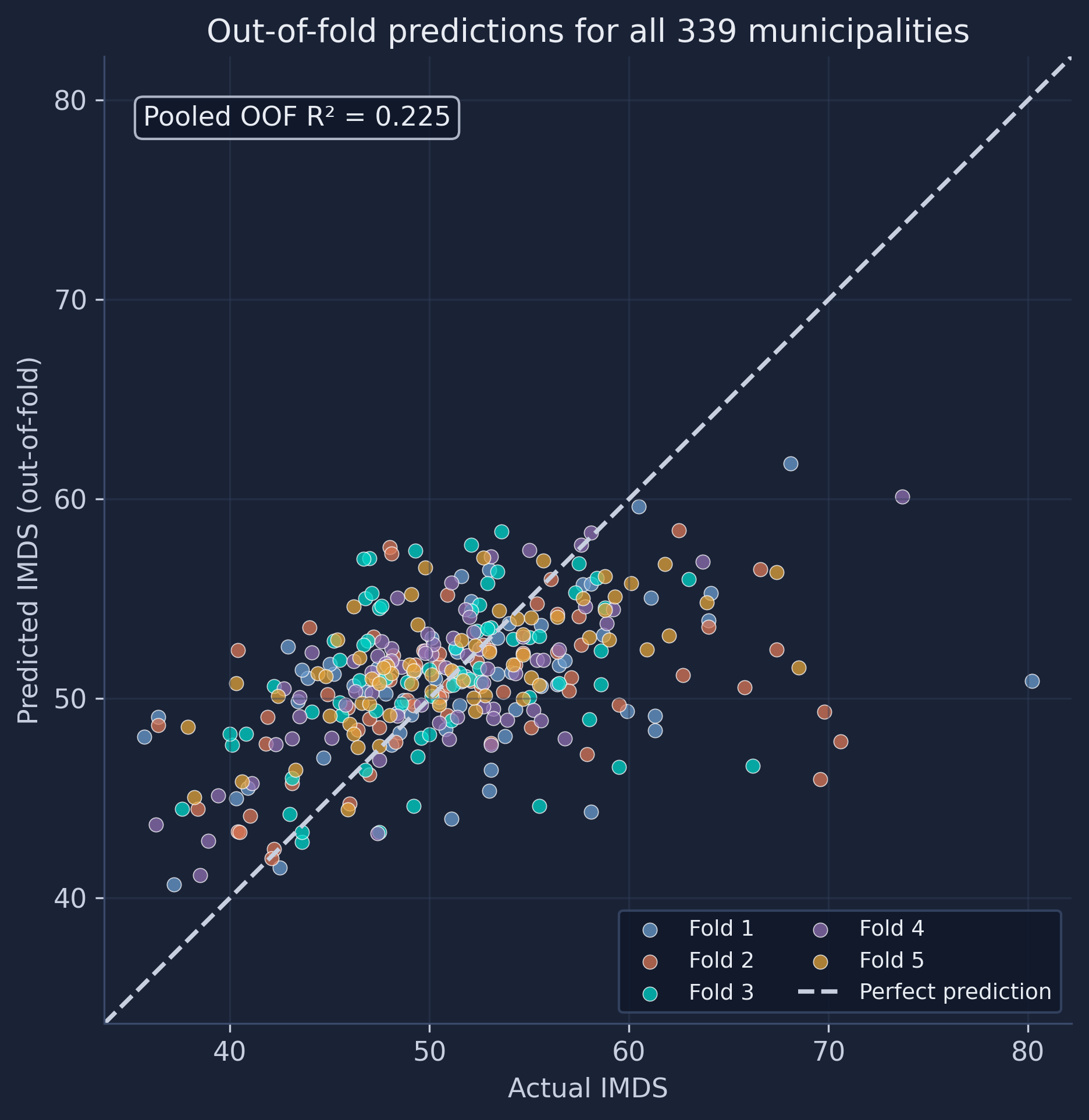
Two things stand out. First, the colors are thoroughly intermingled — there is no region of the plot that belongs to a single fold — which is the visual confirmation that KFold(shuffle=True) mixed the municipalities well; if one fold occupied, say, only the high-IMDS corner, our per-fold metrics would be untrustworthy. Second, and more substantively, the cloud is clearly flatter than the 45-degree line: low-IMDS municipalities (left) are predicted too high, and high-IMDS municipalities (right) are predicted too low. The town with the highest actual IMDS (80.2) is predicted at only about 51. This regression to the mean is the fingerprint of a model with limited signal — it hedges toward the safe national average rather than committing to extreme values.
9.2 Residual analysis
Residuals (actual minus predicted) should ideally scatter randomly around zero. Patterns reveal systematic bias. We plot the out-of-fold residuals against the predictions, keeping the fold coloring.
fig, ax = plt.subplots(figsize=(8, 5))
for k in range(1, N_FOLDS + 1):
    m = fold_id == k
    ax.scatter(oof_pred[m], residuals[m], s=30, alpha=0.7, edgecolors="white",
               linewidth=0.4, color=fold_colors[k - 1], label=f"Fold {k}")
ax.axhline(0, color="#141413", linestyle="--", linewidth=1.8)
ax.set_xlabel("Predicted IMDS (out-of-fold)"); ax.set_ylabel("Residual (actual − predicted)")
ax.set_title("Out-of-fold residuals vs predicted values")
ax.legend(loc="upper right", ncol=2, fontsize=9)
plt.savefig(IMAGES_DIR / "ml_residuals.png", dpi=300, bbox_inches="tight")
plt.show()
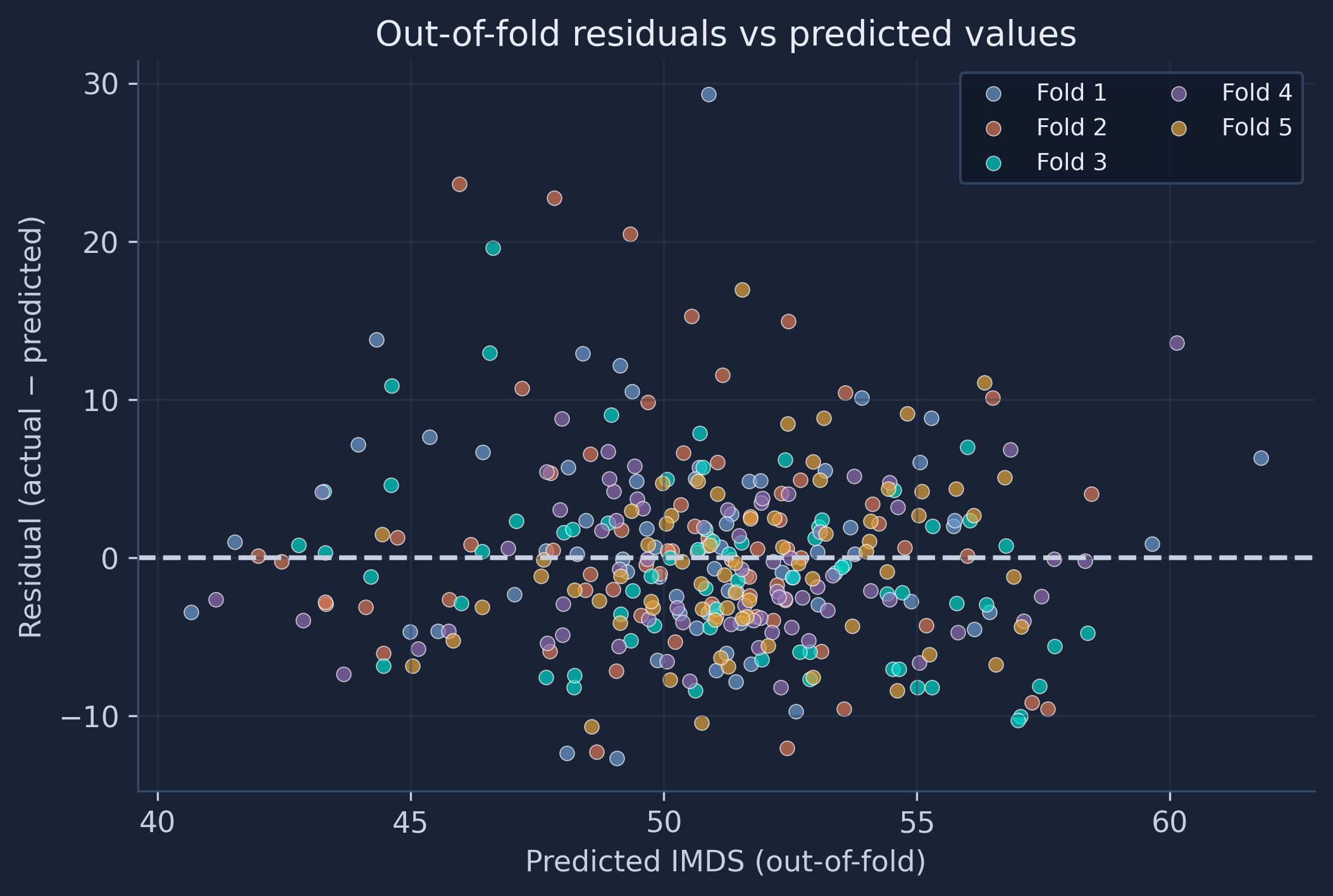
The residual cloud is centered near zero overall, but it is not patternless: it tilts upward on the right, where the largest positive residuals sit. Those are the high-IMDS municipalities the model under-predicts — the same regression-to-the-mean effect, viewed from a different angle. The spread of residuals is also a little wider at the extremes than in the middle (mild heteroscedasticity). Because the colors are again well mixed, we can be confident this pattern is a property of the model, not an artifact of one unlucky fold.
10. Comparing distributions — predicted vs actual
10.1 Overlapping histograms
A scatter plot shows errors point by point; a distribution comparison asks a complementary question: do the predictions, taken as a whole, look like the real thing? We overlay the histogram (and a smooth density estimate) of the actual IMDS scores and the out-of-fold predictions.
ks_stat, ks_p = ks_2samp(np.asarray(y), oof_pred)
bins = np.linspace(y.min() - 2, y.max() + 2, 28)
grid = np.linspace(y.min() - 2, y.max() + 2, 300)

fig, ax = plt.subplots(figsize=(8.5, 5))
ax.hist(y, bins=bins, density=True, alpha=0.45, color="#6a9bcc", edgecolor="white", label="Actual")
ax.hist(oof_pred, bins=bins, density=True, alpha=0.45, color="#d97757", edgecolor="white", label="Predicted (OOF)")
ax.plot(grid, gaussian_kde(np.asarray(y))(grid), color="#6a9bcc", linewidth=2)
ax.plot(grid, gaussian_kde(oof_pred)(grid), color="#d97757", linewidth=2)
ax.axvline(y.mean(), color="#6a9bcc", linestyle=":", linewidth=1.6)
ax.axvline(oof_pred.mean(), color="#d97757", linestyle=":", linewidth=1.6)
ax.set_xlabel("IMDS"); ax.set_ylabel("Density")
ax.set_title(f"Predicted vs actual distribution  (KS = {ks_stat:.3f}, p = {ks_p:.3g})")
ax.legend()
plt.savefig(IMAGES_DIR / "ml_distribution_overlap.png", dpi=300, bbox_inches="tight")
plt.show()
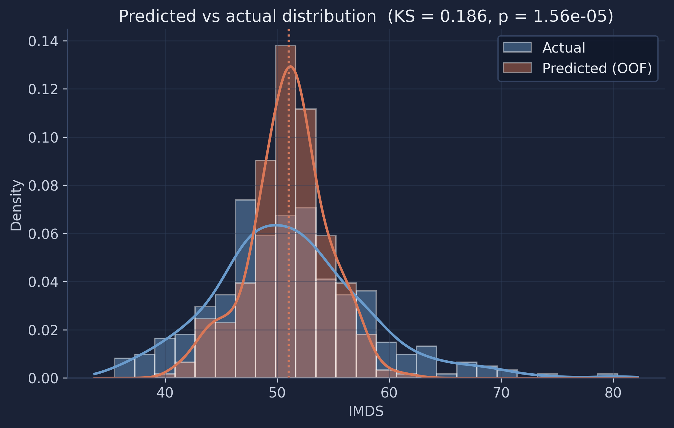
The two distributions share almost the same center but have very different widths. The predictions form a tall, narrow spike around 51, while the actual scores spread out into both tails. The model has essentially learned the average municipality very well and the unusual ones hardly at all — it reproduces the location of the distribution but not its shape.
10.2 Summary statistics and a KS test
Numbers make the picture precise:
| Statistic | Actual | Predicted (OOF) |
|---|---|---|
| Mean | 51.05 | 51.02 |
| Standard deviation | 6.77 | 3.54 |
| Min | 35.70 | 40.66 |
| Max | 80.20 | 61.79 |
The means match almost exactly (51.05 vs 51.02) — the model is unbiased on average. But the predicted standard deviation, 3.54, is only about half of the actual 6.77 (a 48% reduction), and the predicted range collapses from [35.7, 80.2] to [40.7, 61.8]. A two-sample Kolmogorov–Smirnov test — which measures the largest gap between two cumulative distributions — gives a statistic of 0.186 with $p < 0.001$, so we can firmly reject the hypothesis that predictions and actuals share the same distribution. This variance compression is not a bug to be fixed by tuning; it is the mathematically expected behavior of any regression with modest $R^2$. A model that explains only ~22% of the variance should produce predictions with much less spread than the truth — committing to extreme predictions it cannot support would only increase its error. The lesson for a beginner: a good average and a good $R^2$ do not guarantee that your predictions reproduce the real distribution, and checking that distribution is a quick, revealing diagnostic.
11. Which satellite features matter?
To inspect what the model learned, we fit one baseline Random Forest on all 339 municipalities (the cross-validation above already gave us an honest performance estimate; importance and partial dependence are about interpretation, so using all the data here is appropriate).
rf_full = RandomForestRegressor(n_estimators=100, random_state=RANDOM_SEED).fit(X, y)
11.1 Mean decrease in impurity (MDI)
MDI measures how much each feature reduces prediction error across all splits in all trees. It is fast (built into the trained model) but can be biased toward high-cardinality features — those with many distinct values, like continuous numbers.
mdi = pd.Series(rf_full.feature_importances_, index=FEATURE_COLS)
top20 = mdi.sort_values(ascending=False).head(20)

fig, ax = plt.subplots(figsize=(10, 6))
top20.sort_values().plot.barh(ax=ax, color="#6a9bcc", edgecolor="white")
ax.set_xlabel("Mean decrease in impurity")
ax.set_title("Top-20 feature importance (MDI) for IMDS")
plt.savefig(IMAGES_DIR / "ml_feature_importance_mdi.png", dpi=300, bbox_inches="tight")
plt.show()
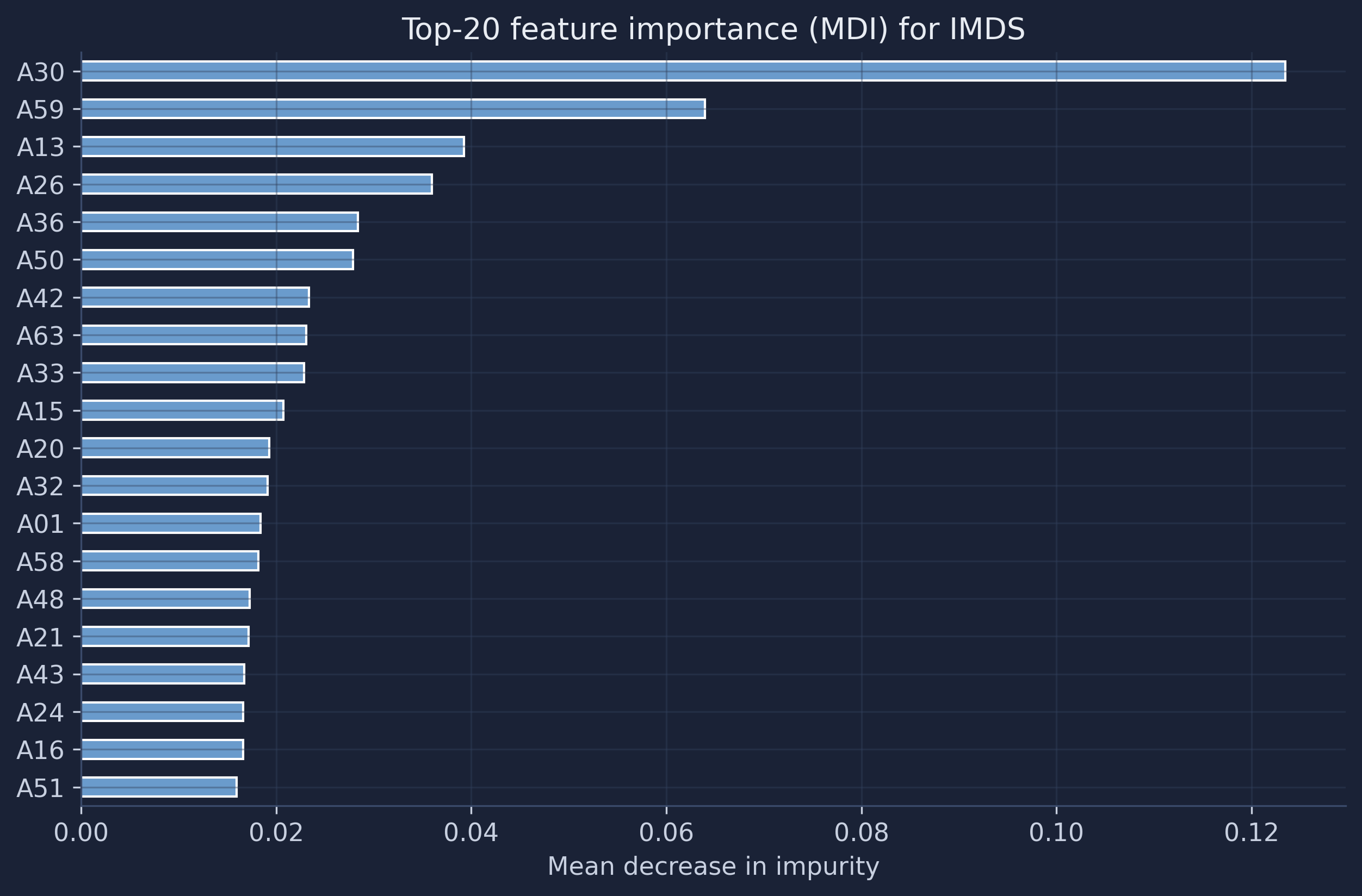
One dimension dominates: A30 accounts for about 12% of the total impurity reduction, roughly twice the next feature, A59. After those two the importance falls off into a long tail of dimensions contributing 1–4% each. This matches what we saw in the correlation heatmap (A30 was the single most correlated feature) and tells us the forest leans heavily on a small handful of visual signals, with everything else playing a supporting role.
11.2 Permutation importance
Permutation importance is more trustworthy. Imagine scrambling all the values in one column — if the model’s accuracy barely changes, that column wasn’t contributing much. That is exactly what it measures: shuffle each feature and record how much R² drops. It is not biased by feature scale or cardinality.
perm = permutation_importance(rf_full, X, y, n_repeats=10, random_state=RANDOM_SEED, n_jobs=-1)
perm_imp = pd.Series(perm.importances_mean, index=FEATURE_COLS)
top20 = perm_imp.sort_values(ascending=False).head(20)

fig, ax = plt.subplots(figsize=(10, 6))
top20.sort_values().plot.barh(ax=ax, color="#d97757", edgecolor="white")
ax.set_xlabel("Mean decrease in R² (permutation)")
ax.set_title("Top-20 feature importance (permutation) for IMDS")
plt.savefig(IMAGES_DIR / "ml_feature_importance_permutation.png", dpi=300, bbox_inches="tight")
plt.show()
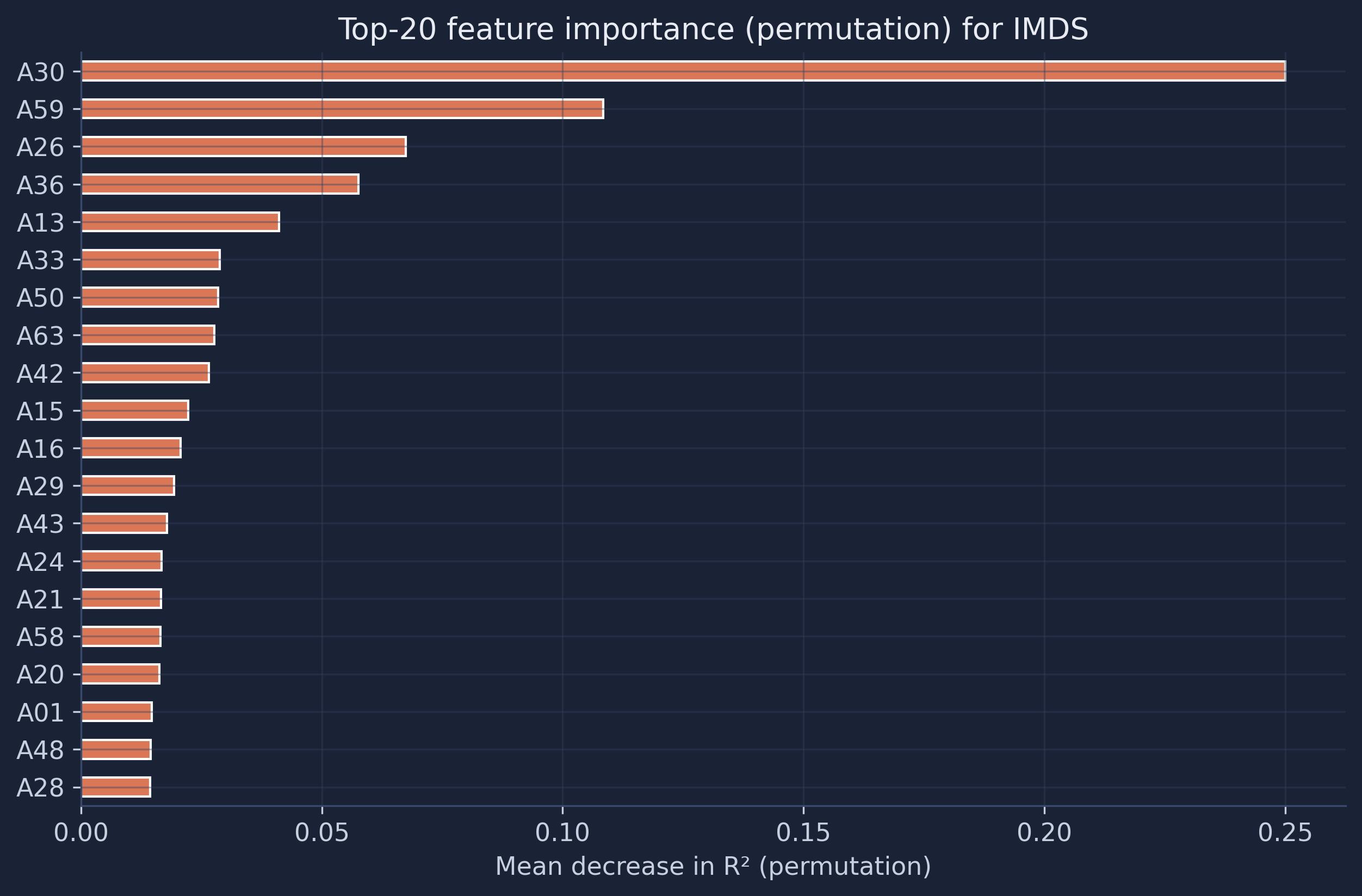
Permutation importance tells the same story even more emphatically: shuffling A30 alone costs the model about 0.25 in R² — larger than the model’s entire out-of-fold R² of 0.22, because removing the best feature drags the model below the mean-prediction baseline. A59 is again second (about 0.11), followed by A26, A36, and A13. The close agreement between the two very different importance methods is reassuring: A30 and A59 are genuinely the embedding dimensions that distinguish Bolivia’s municipalities, not artifacts of how a particular method counts.
12. Partial dependence plots
Feature importance says which features matter; partial dependence says how. A partial dependence plot shows the average prediction as a single feature varies, holding the others at their observed distribution — revealing non-linear shapes a correlation coefficient cannot. We plot the top-6 features by permutation importance.
top6 = perm_imp.sort_values(ascending=False).head(6).index.tolist()
fig, axes = plt.subplots(2, 3, figsize=(15, 8))
PartialDependenceDisplay.from_estimator(rf_full, X, top6, ax=axes.ravel(), grid_resolution=50, n_jobs=-1)
fig.suptitle("Partial dependence — top-6 features for IMDS", fontsize=14)
plt.tight_layout(rect=[0, 0, 1, 0.95])
plt.savefig(IMAGES_DIR / "ml_partial_dependence.png", dpi=300, bbox_inches="tight")
plt.show()
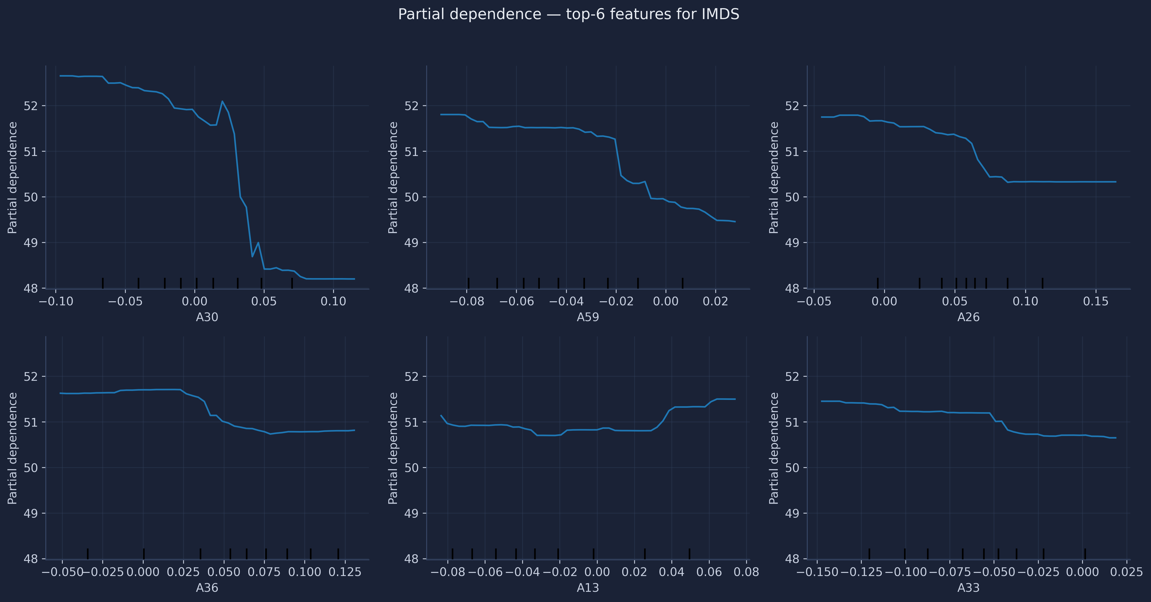
The curves are clearly non-linear. Several dimensions — A30 most visibly — show a threshold effect: predicted IMDS is flat across low values, then rises over a narrow band, then plateaus. These step-like shapes are precisely what a linear regression would miss and what justifies a Random Forest here. Notice, too, the vertical scale: even the most important feature moves the prediction by only a few IMDS points over its whole range. No single dimension is a magic lever — consistent with the modest R² and the broadly distributed importance we have seen throughout.
13. Summary and key takeaways
| Metric | Per-fold mean ± SD | Pooled OOF |
|---|---|---|
| R² | 0.224 ± 0.173 | 0.225 |
| RMSE | 5.86 ± 1.01 | 5.95 |
| MAE | 4.42 ± 0.44 | 4.42 |
- Method insight — cross-validation over a single split. By evaluating with 5-fold CV we obtained an honest prediction for every municipality and, crucially, a standard deviation (0.173) that exposed how unstable the model is across slices of the country. A single train/test split would have hidden that entirely (Appendix A).
- Why the spread matters. The per-fold R² ranged from −0.03 to 0.45. Reporting only the mean would have been technically true and practically misleading. Always report the spread.
- Data insight. Satellite embeddings explain roughly a fifth of IMDS variation — real but limited signal. Both importance measures agree that dimensions A30 and A59 carry most of it, with non-linear threshold effects in the partial dependence plots.
- Distributions, not just points. The predictions match the center of the IMDS distribution almost perfectly but reproduce only half its spread (predicted SD 3.54 vs 6.77; KS $p < 0.001$). This variance compression is the expected behavior of a low-$R^2$ model, and it means the model cannot reliably flag the very best or worst municipalities.
- Tuning is optional. Grid search, random search, and Optuna all improve the cross-validated R² by less than 0.03 (Appendix B). With limited signal, the performance ceiling comes from the features, not the model settings.
14. Limitations and next steps
- Modest R². The model captures meaningful patterns but leaves most variation unexplained — development is driven by many factors invisible from space (governance, migration, the informal economy).
- Variance compression. Predictions are pulled toward the mean, so the model is poorly suited to ranking the most extreme municipalities.
- Temporal mismatch. We use 2017 satellite imagery with SDG indices from a potentially different period.
- Feature interpretability. Embedding dimensions (A00–A63) are abstract; connecting them to physical landscape features requires further analysis.
- Small sample. With only 339 municipalities, every estimate carries real uncertainty — which is exactly why cross-validation and its standard deviation matter.
Next steps could include combining satellite embeddings with administrative or survey data, trying gradient boosting, or using explainability tools like SHAP values for richer interpretation.
15. Exercises
- Repeat the cross-validation. Replace
KFoldwithRepeatedKFold(n_splits=5, n_repeats=10)and recompute the mean and standard deviation of R². Does the spread estimate stabilize? Is the mean roughly unchanged? - Predict a different SDG index. DS4Bolivia contains individual SDG indices (
sdg1–sdg15) alongside the composite IMDS. Pick one, re-run the out-of-fold pipeline, and compare its distribution-overlap plot to this one. Which outcomes are most predictable from satellite imagery? - Swap the algorithm. Replace
RandomForestRegressorwithGradientBoostingRegressorinside the samecross_validate/cross_val_predictcalls. Does the per-fold R² improve, and does the variance compression change? - Read the residuals geographically. Merge the region names and look at which departments have the largest out-of-fold residuals. Are the model’s biggest misses spatially clustered?
References
- scikit-learn — RandomForestRegressor
- scikit-learn — Cross-validation: evaluating estimator performance
- scikit-learn —
cross_val_predict - scikit-learn — Permutation Importance
- scikit-learn — Partial Dependence Plots
- Optuna — A hyperparameter optimization framework
- QUARCS Lab. DS4Bolivia — Open Data for Bolivian Development.
- Breiman, L. (2001). Random Forests. Machine Learning, 45(1), 5–32.
Appendix A — The train/test split approach
The classic alternative to cross-validation is a single train/test split: hold out 20% of the data, train on the rest, and report the score on the held-out part. It is simpler and faster than CV, and it is the right tool when data are plentiful. Here is the split this tutorial would have used:
from sklearn.model_selection import train_test_split

X_train, X_test, y_train, y_test = train_test_split(X, y, test_size=0.2, random_state=42)
rf = RandomForestRegressor(n_estimators=100, random_state=42).fit(X_train, y_train)
print(f"Train: {len(X_train)}  Test: {len(X_test)}")
print(f"Test R²: {r2_score(y_test, rf.predict(X_test)):.3f}")
Train: 271  Test: 68
Test R²: 0.231
That 0.231 looks reassuringly close to our cross-validated 0.225 — but it is one draw from a lottery. To see the lottery, we repeat the split under 200 different random seeds and look at the distribution of the test R².
split_r2 = []
for seed in range(200):
    Xtr, Xte, ytr, yte = train_test_split(X, y, test_size=0.2, random_state=seed)
    m = RandomForestRegressor(n_estimators=100, random_state=42).fit(Xtr, ytr)
    split_r2.append(r2_score(yte, m.predict(Xte)))
split_r2 = np.array(split_r2)
print(f"Test R² over 200 splits: min={split_r2.min():.2f}, max={split_r2.max():.2f}, "
      f"mean={split_r2.mean():.2f}, sd={split_r2.std():.2f}")
Test R² over 200 splits: min=-0.09, max=0.46, mean=0.21, sd=0.11
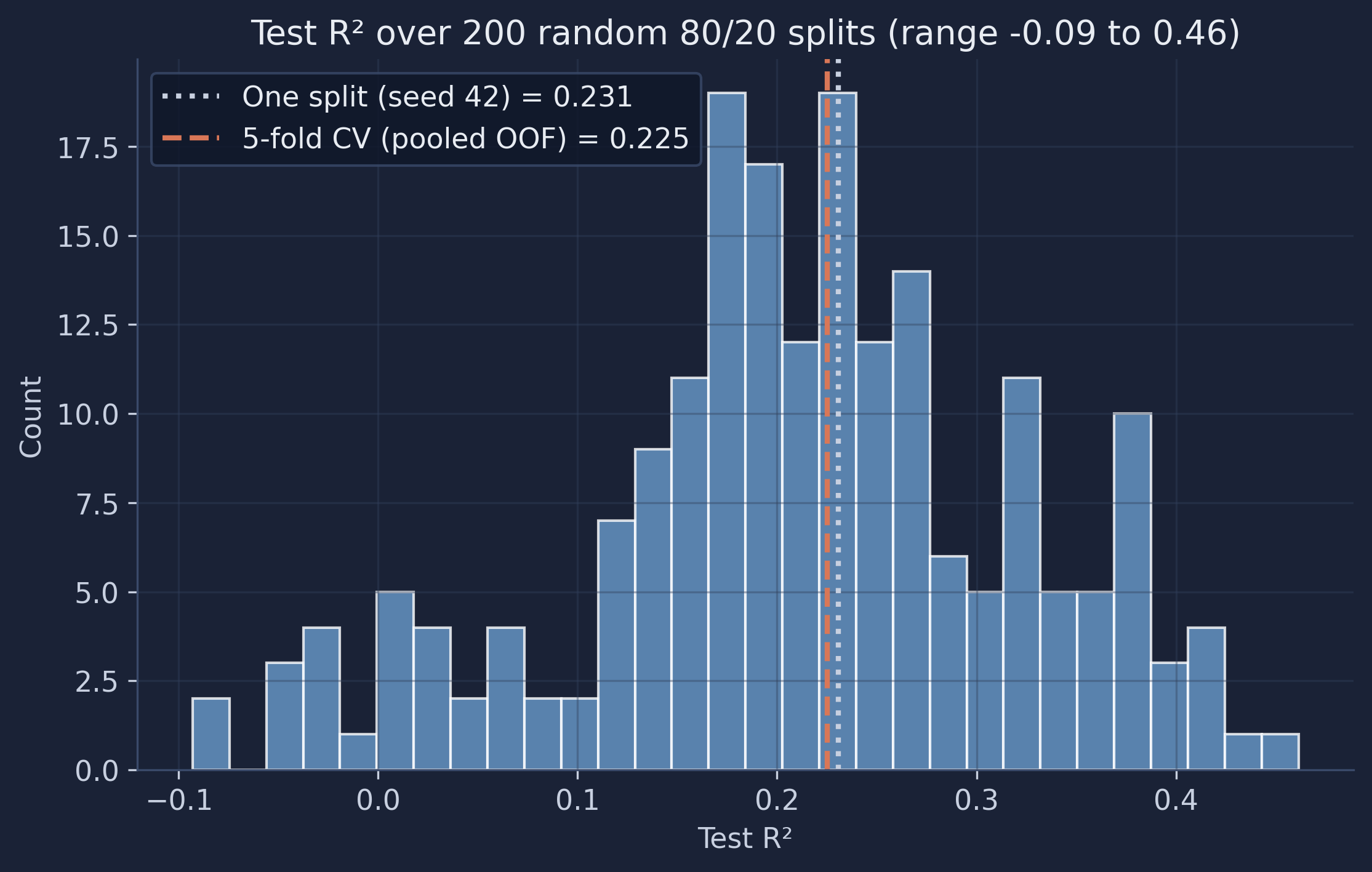
The same model on the same data scores anywhere from −0.09 to 0.46 depending only on which municipalities land in the test set. The seed-42 split we started with (0.231) was simply a middle-of-the-road draw; a less lucky researcher reporting a single split might have published 0.05 or 0.40 with equal justification. Cross-validation’s pooled estimate (0.225) sits sensibly in the middle of this cloud, but it comes with a standard deviation and uses every observation for both training and testing. That is why the main tutorial uses CV — and why, on small datasets, you should be deeply suspicious of any performance number that comes from a single split.
Appendix B — Hyperparameter tuning: grid vs random vs Optuna
B.1 Why tune (and why the baseline is enough here)
Hyperparameters are the settings we choose before fitting — the number of trees, how deep they grow, how many features each split may consider. Tuning searches over these settings for the combination with the best cross-validated score. It often helps; this appendix shows three ways to do it and then asks whether, for this problem, it was worth the trouble. To keep every method honest and comparable, all three optimize the same 5-fold cross-validated R² (the kf from Section 7) and search the same space.
B.2 Grid search
Grid search is exhaustive: you list a discrete set of values for each hyperparameter and it tries every combination. It is thorough and perfectly reproducible, but the number of fits explodes — three parameters with four values each is already $4^3 = 64$ combinations, times five folds. It only ever tries the values you list, so a good setting between grid points is invisible to it.
from sklearn.model_selection import GridSearchCV

grid = GridSearchCV(
    RandomForestRegressor(random_state=42),
    param_grid={"n_estimators": [100, 300], "max_depth": [None, 20], "max_features": ["sqrt", 1.0]},
    cv=kf, scoring="r2", n_jobs=-1,
).fit(X, y)
print(f"Grid best CV R²: {grid.best_score_:.3f}  {grid.best_params_}")
Grid best CV R²: 0.244 {'max_depth': 20, 'max_features': 'sqrt', 'n_estimators': 300}
B.3 Random search
Random search samples random combinations from the search space (which can include continuous ranges) for a fixed budget of iterations. The famous result of Bergstra & Bengio (2012) is that, for the same budget, random search usually beats grid search: most hyperparameters barely matter, and random sampling spends more of its budget exploring the few that do, instead of wasting fits on a dense grid of the ones that don’t. This was the original tutorial’s approach.
from sklearn.model_selection import RandomizedSearchCV
from scipy.stats import randint

rand = RandomizedSearchCV(
    RandomForestRegressor(random_state=42),
    param_distributions={
        "n_estimators": [100, 200, 300, 500], "max_depth": [None, 10, 20, 30],
        "min_samples_split": randint(2, 11), "min_samples_leaf": randint(1, 5),
        "max_features": ["sqrt", "log2", 1.0]},
    n_iter=40, cv=kf, scoring="r2", random_state=42, n_jobs=-1,
).fit(X, y)
print(f"Random best CV R²: {rand.best_score_:.3f}  {rand.best_params_}")
Random best CV R²: 0.248 {'max_depth': 20, 'max_features': 'log2', 'min_samples_leaf': 3, 'min_samples_split': 2, 'n_estimators': 100}
B.4 Bayesian optimization with Optuna
Grid and random search are memoryless — each trial ignores everything learned so far. Optuna is smarter: it is a Bayesian optimizer whose default TPE (Tree-structured Parzen Estimator) sampler builds a probabilistic model of which regions of the search space tend to score well, and concentrates new trials there. You write an objective function that takes a trial, suggests a value for each hyperparameter, and returns the score to maximize.
import optuna
optuna.logging.set_verbosity(optuna.logging.WARNING)
from sklearn.model_selection import cross_val_score

def objective(trial):
    params = {
        "n_estimators": trial.suggest_int("n_estimators", 100, 500, step=100),
        "max_depth": trial.suggest_categorical("max_depth", [None, 10, 20, 30]),
        "min_samples_split": trial.suggest_int("min_samples_split", 2, 10),
        "min_samples_leaf": trial.suggest_int("min_samples_leaf", 1, 4),
        "max_features": trial.suggest_categorical("max_features", ["sqrt", "log2", 1.0]),
    }
    model = RandomForestRegressor(random_state=42, **params)
    return cross_val_score(model, X, y, cv=kf, scoring="r2", n_jobs=-1).mean()

study = optuna.create_study(direction="maximize", sampler=optuna.samplers.TPESampler(seed=42))
study.optimize(objective, n_trials=40)
print(f"Optuna best CV R²: {study.best_value:.3f}  {study.best_params}")
Optuna best CV R²: 0.251 {'n_estimators': 200, 'max_depth': None, 'min_samples_split': 3, 'min_samples_leaf': 1, 'max_features': 'sqrt'}
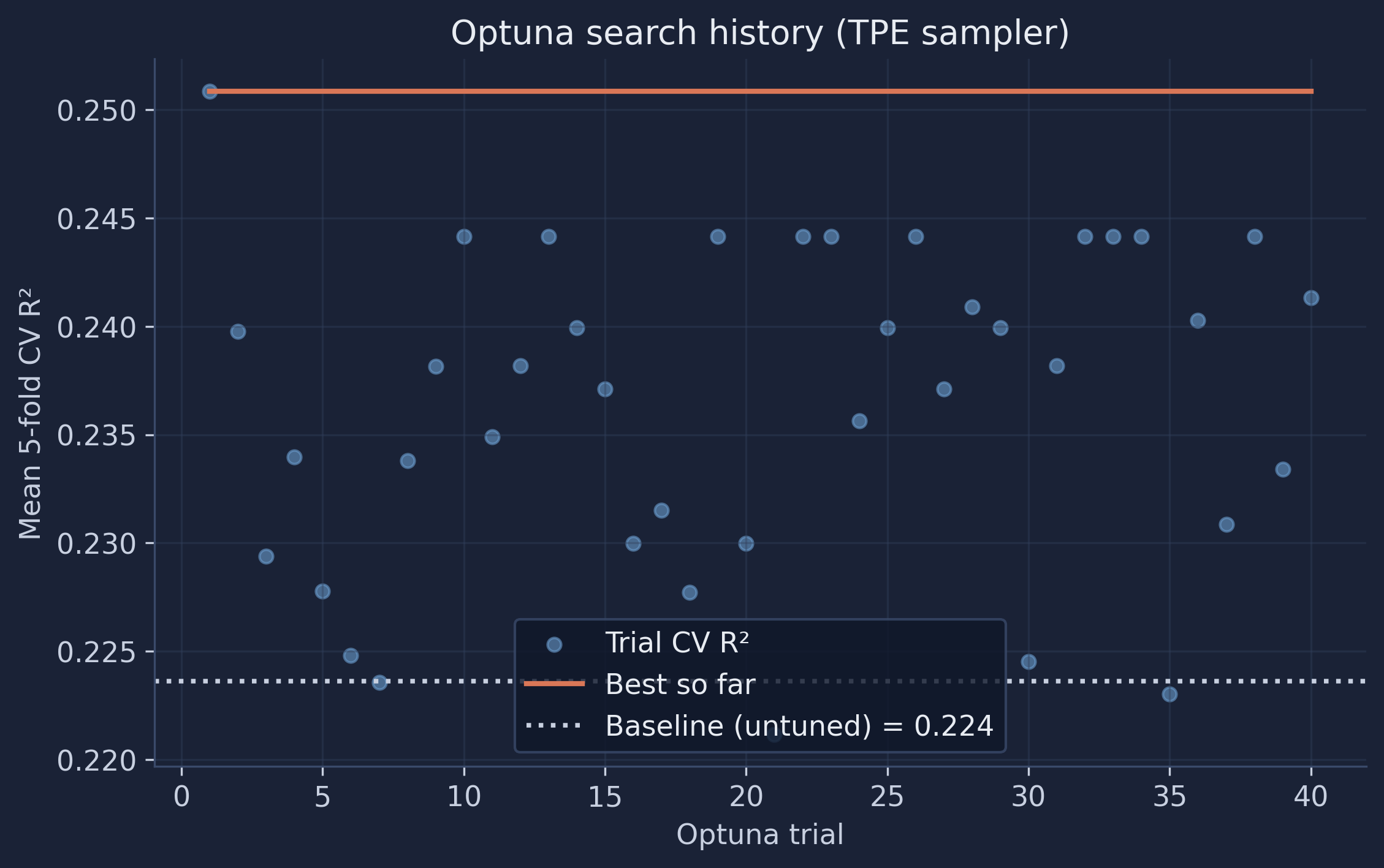
The history plot shows the TPE sampler quickly climbing above the baseline and then refining — most of the gain arrives in the first dozen trials. Optuna also scales naturally to larger search spaces, supports pruning unpromising trials early, and records every trial for later inspection, which is why it has become a popular choice for serious tuning.
B.5 Did tuning help?
| Method | Best CV R² |
|---|---|
| Baseline (untuned) | 0.224 |
| Grid search | 0.244 |
| Random search | 0.248 |
| Optuna (TPE) | 0.251 |
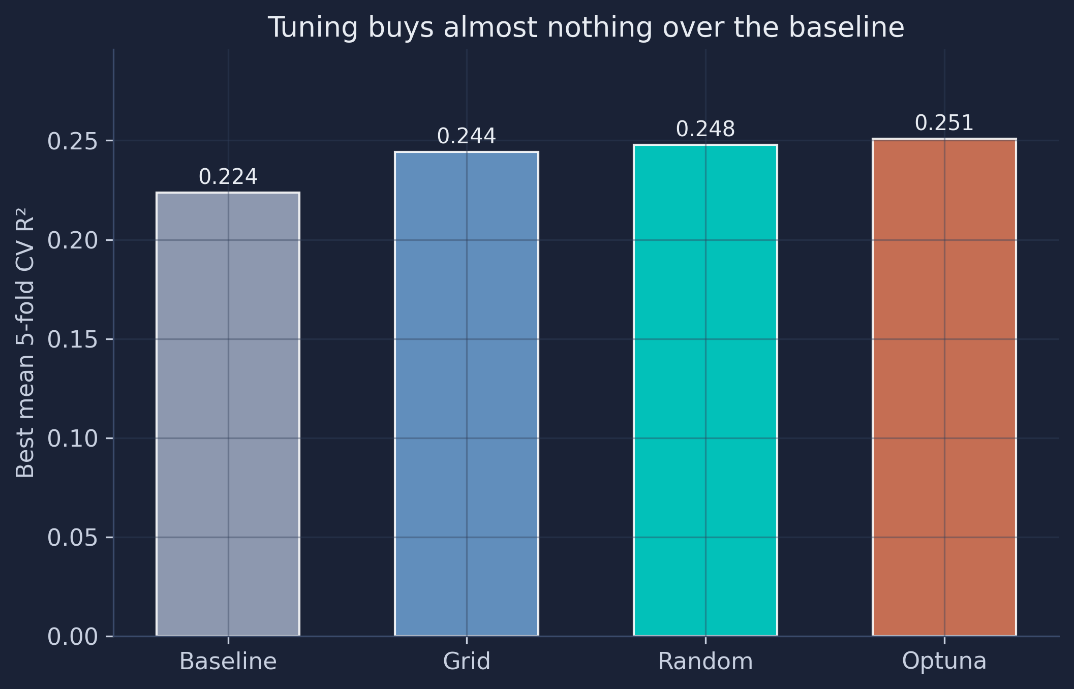
All three search strategies improve the cross-validated R², and they rank exactly as theory predicts: Optuna (Bayesian) ≥ random ≥ grid, given equal budgets. But the size of the improvement is tiny — from 0.224 to 0.251, well within the 0.173 fold-to-fold standard deviation we measured in Section 8. In other words, the tuning gain is smaller than the noise. That is the honest reason the main tutorial keeps the defaults: when the signal in the features is the binding constraint, hyperparameter tuning rearranges the deck chairs. Tuning is a powerful tool — just spend your effort on it when a baseline and a learning curve suggest there is headroom to win.
Appendix C — Introduction to machine learning with multivariate regression
The main tutorial used a Random Forest — a flexible “black box” that fits non-linear patterns across all 64 features. This appendix re-introduces the same machine-learning workflow with the simplest possible model: multiple linear regression, on only the first four satellite features (A00–A03). The goal is transparency: a model you can write as a single equation, evaluated with the identical 5-fold cross-validation, out-of-fold predictions, metrics, plots, importance, and partial dependence you saw above. If you have never built a machine-learning model before, start here.
C.1 The model — predict IMDS from four features
Multiple linear regression assumes the target is a weighted sum of the features plus an intercept:
$$\hat{y} = \beta_0 + \beta_1\,A00 + \beta_2\,A01 + \beta_3\,A02 + \beta_4\,A03$$
Each coefficient $\beta_j$ is the change in predicted IMDS for a one-unit increase in that feature, holding the others fixed. We use scikit-learn’s LinearRegression and deliberately keep just four features so the whole model fits on one line.
from sklearn.linear_model import LinearRegression

LR_FEATURES = FEATURE_COLS[:4]   # A00, A01, A02, A03
X4 = X[LR_FEATURES]
lr = LinearRegression().fit(X4, y)
print("intercept:", round(lr.intercept_, 2))
print({f: round(float(c), 2) for f, c in zip(LR_FEATURES, lr.coef_)})
intercept: 54.42
{'A00': 19.59, 'A01': -0.35, 'A02': 15.99, 'A03': 12.66}
Fitted on all 339 municipalities, the model is $\hat{y} = 54.42 + 19.59\,A00 - 0.35\,A01 + 15.99\,A02 + 12.66\,A03$. Unlike the forest, every term is visible and interpretable: A00, A02, and A03 push IMDS up, while A01 barely moves it. But a model fit on all the data tells us nothing about generalization — for that we need cross-validation.
C.2 Five-fold cross-validation and out-of-fold predictions
We reuse the exact same KFold object and the same cross_validate / cross_val_predict calls as the main body — only the model and the feature set change. Every municipality again gets one out-of-fold prediction from a model that never saw it.
from sklearn.model_selection import cross_validate, cross_val_predict

cv = cross_validate(lr, X4, y, cv=kf,
                    scoring=("r2", "neg_root_mean_squared_error", "neg_mean_absolute_error"))
lr_fold_r2 = cv["test_r2"]
lr_oof = cross_val_predict(lr, X4, y, cv=kf)
print("Per-fold R²:", lr_fold_r2.round(3))
print(f"Mean R²: {lr_fold_r2.mean():.3f} ± {lr_fold_r2.std():.3f}")
print(f"Pooled OOF R²: {r2_score(y, lr_oof):.3f}")
Per-fold R²: [ 0.054  0.071 -0.04   0.094  0.056]
Mean R²: 0.047 ± 0.046
Pooled OOF R²: 0.059
C.3 Evaluating the predictions
| Fold | R² | RMSE | MAE |
|---|---|---|---|
| 1 | 0.054 | 7.23 | 5.40 |
| 2 | 0.071 | 7.55 | 5.89 |
| 3 | −0.040 | 5.75 | 4.55 |
| 4 | 0.094 | 5.79 | 4.27 |
| 5 | 0.056 | 6.28 | 5.00 |
| Mean | 0.047 | 6.52 | 5.02 |
| SD | 0.046 | 0.74 | 0.58 |
The linear model explains only about 6% of the variation in IMDS (pooled out-of-fold R² 0.059; RMSE 6.56, MAE 5.02), and on fold 3 it again dips slightly negative. That is low — but the number is not the point. The point is that four raw features and a straight-line model already let you run the entire honest evaluation pipeline. With more features or a more flexible model (the Random Forest), the same pipeline does better; the method is identical.
C.4 Evaluation plots
The same two diagnostics as the main body: out-of-fold predicted-vs-actual (colored by fold) and the residuals.
fig, ax = plt.subplots(figsize=(7.2, 7.2))
for k in range(1, 6):
    m = fold_id == k
    ax.scatter(y[m], lr_oof[m], s=34, alpha=0.75, color=fold_colors[k - 1], label=f"Fold {k}")
ax.plot(lims, lims, "--", color="#141413", label="Perfect prediction")
plt.savefig(IMAGES_DIR / "ml_lr_actual_vs_predicted.png", dpi=300, bbox_inches="tight")
plt.show()
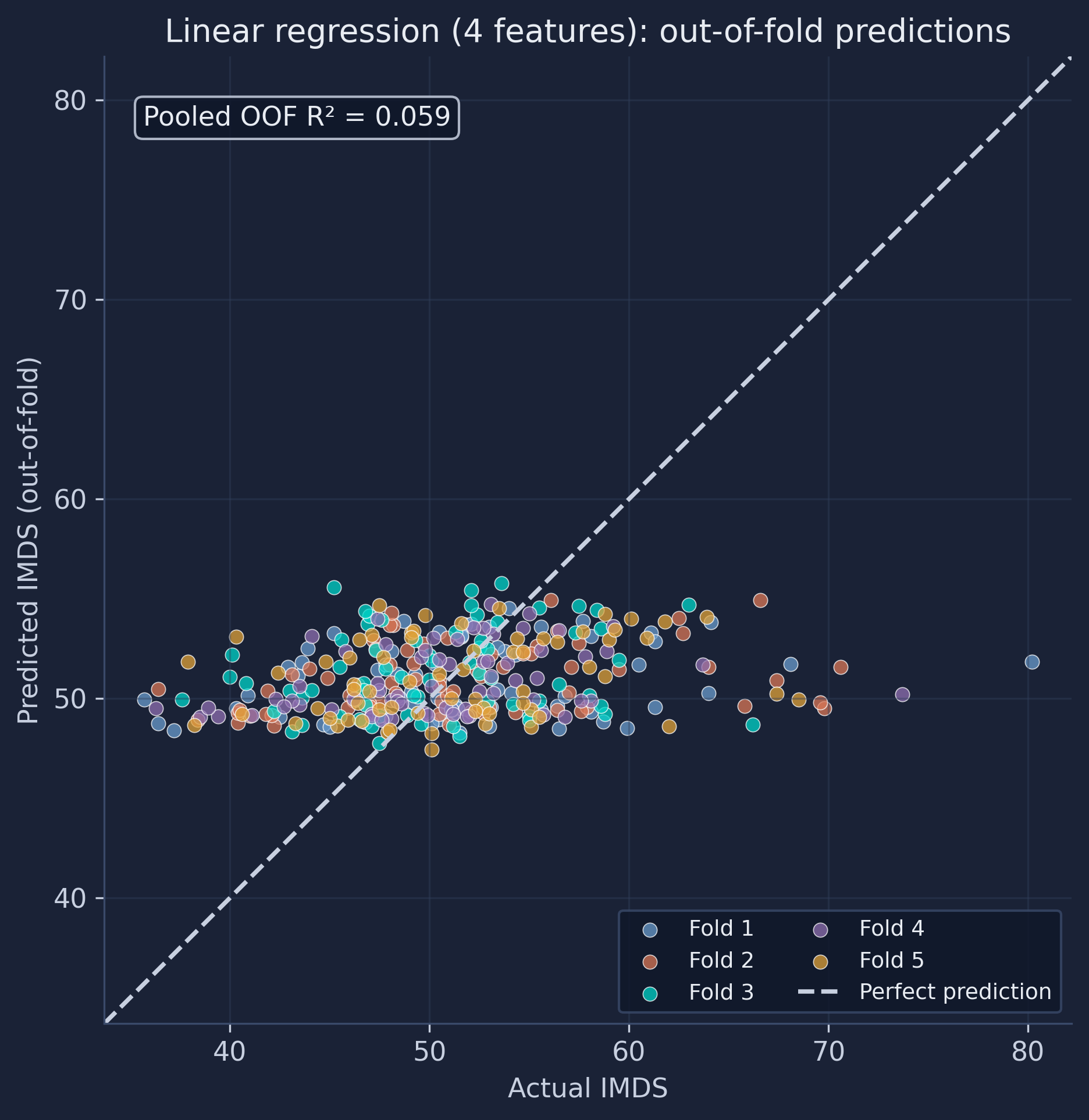
With so little signal, the predictions barely spread along the vertical axis — almost every town is predicted close to the national mean of 51, so the cloud is nearly horizontal and the extremes are missed entirely. The residuals tell the same story:
residuals = y - lr_oof
fig, ax = plt.subplots(figsize=(8, 5))
ax.scatter(lr_oof, residuals, alpha=0.7, c=[fold_colors[k - 1] for k in fold_id])
ax.axhline(0, color="#141413", linestyle="--")
plt.savefig(IMAGES_DIR / "ml_lr_residuals.png", dpi=300, bbox_inches="tight")
plt.show()
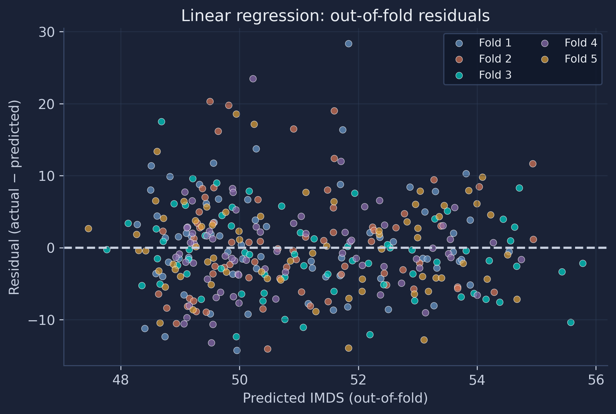
The residuals are large and centered on zero with no strong curvature — a straight-line model cannot bend to fit what four features miss.
C.5 Feature importance
For a linear model, importance is the coefficient itself. To compare features on a common scale we standardize them first (so each is in standard-deviation units); the standardized coefficient then measures how many IMDS points the prediction moves per one-standard-deviation change in the feature, and its sign gives the direction.
from sklearn.preprocessing import StandardScaler
from sklearn.pipeline import make_pipeline

std = make_pipeline(StandardScaler(), LinearRegression()).fit(X4, y)
print({f: round(float(c), 2) for f, c in zip(LR_FEATURES, std[-1].coef_)})
{'A00': 1.61, 'A01': -0.02, 'A02': 0.7, 'A03': 0.42}
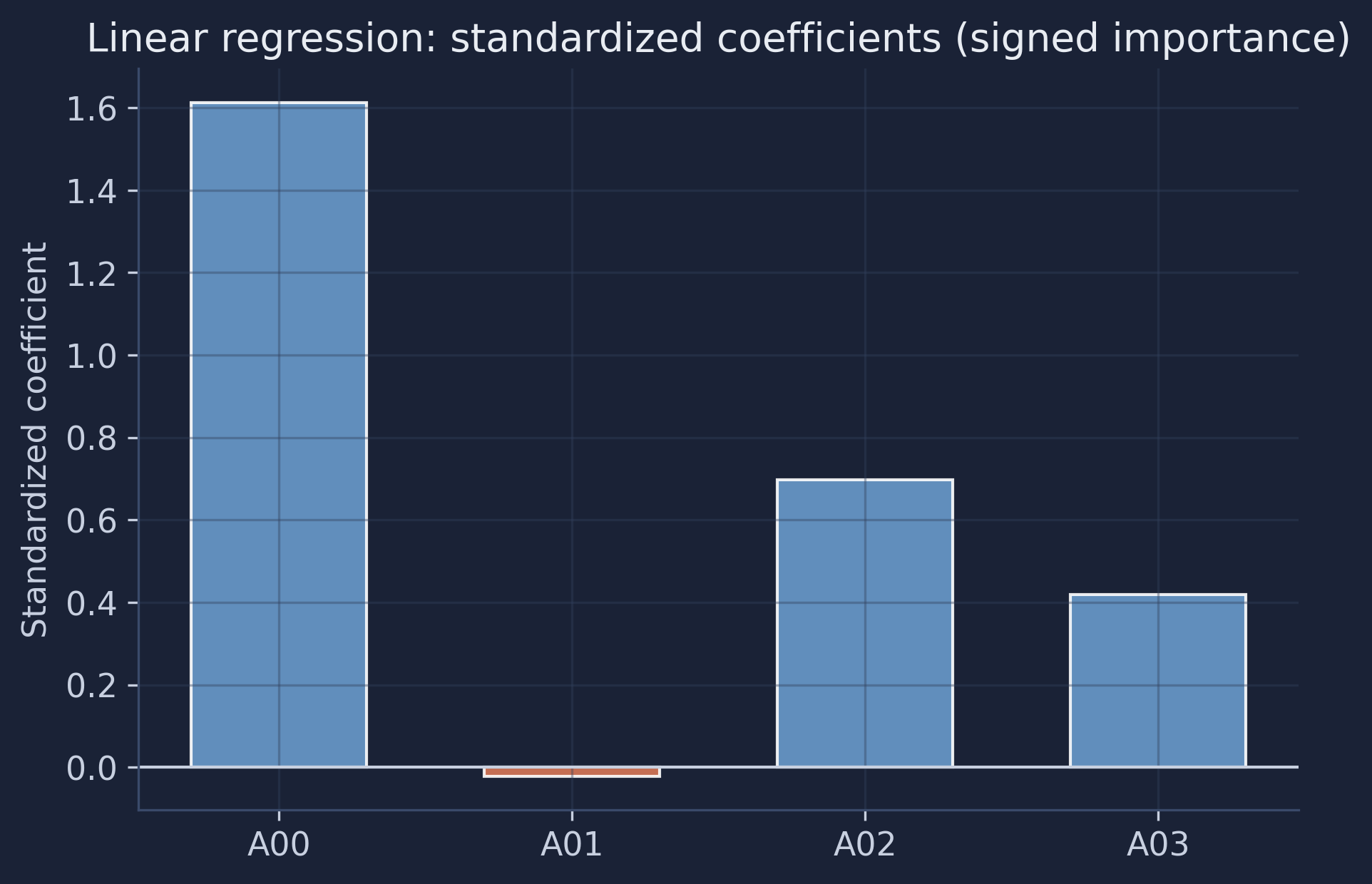
A00 is by far the most important feature — a one-standard-deviation increase raises predicted IMDS by about 1.6 points — followed by A02 and A03; A01 contributes almost nothing (and slightly negatively). This is the linear analogue of the Random Forest’s permutation importance, but here it comes for free, with a direction, directly from the fitted equation.
C.6 Partial dependence
The same PartialDependenceDisplay we used for the forest, applied to the linear model:
from sklearn.inspection import PartialDependenceDisplay

PartialDependenceDisplay.from_estimator(lr, X4, LR_FEATURES)
plt.savefig(IMAGES_DIR / "ml_lr_partial_dependence.png", dpi=300, bbox_inches="tight")
plt.show()
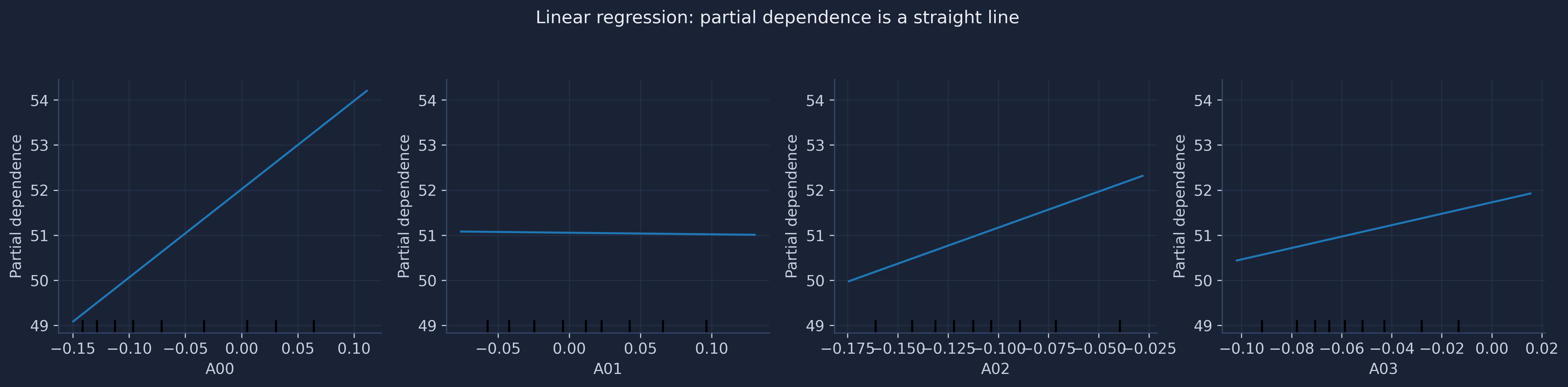
Every panel is a straight line — because a linear model’s effect is, by construction, constant. The slope of each line is exactly that feature’s coefficient: steep and positive for A00, nearly flat for A01. Contrast this with the forest’s partial-dependence plots (Section 12), which bend and plateau. That contrast is the difference between a linear model and a flexible one: the forest can discover thresholds and interactions that the straight lines here cannot.
C.7 How it compares to the Random Forest
| Model | Features | Pooled out-of-fold R² |
|---|---|---|
| Linear regression | 4 (A00–A03) | 0.059 |
| Random Forest | 64 | 0.225 |
The Random Forest explains roughly four times as much variance — partly because it sees all 64 features, partly because it captures non-linear patterns the straight lines cannot. But the linear model is fully transparent (one equation, four coefficients you can read off directly), and — the real lesson of this appendix — both were built and judged with the identical workflow: a 5-fold split, out-of-fold predictions, R²/RMSE/MAE, evaluation plots, feature importance, and partial dependence. Once you know that workflow, swapping LinearRegression() for RandomForestRegressor() — or any other estimator — is a one-line change.
Acknowledgements
AI tools (Claude Code, Gemini, NotebookLM) were used to make the contents of this post more accessible to students. Nevertheless, the content in this post may still have errors. Caution is needed when applying the contents of this post to true research projects.
Carlos Mendez
Associate Professor of Development Economics
My research interests focus on the integration of development economics, spatial data science, and econometrics to better understand and inform the process of sustainable development across regions.