Spatial Inequality and the Kuznets Curve: Parametric and Semiparametric Estimates in R
Abstract
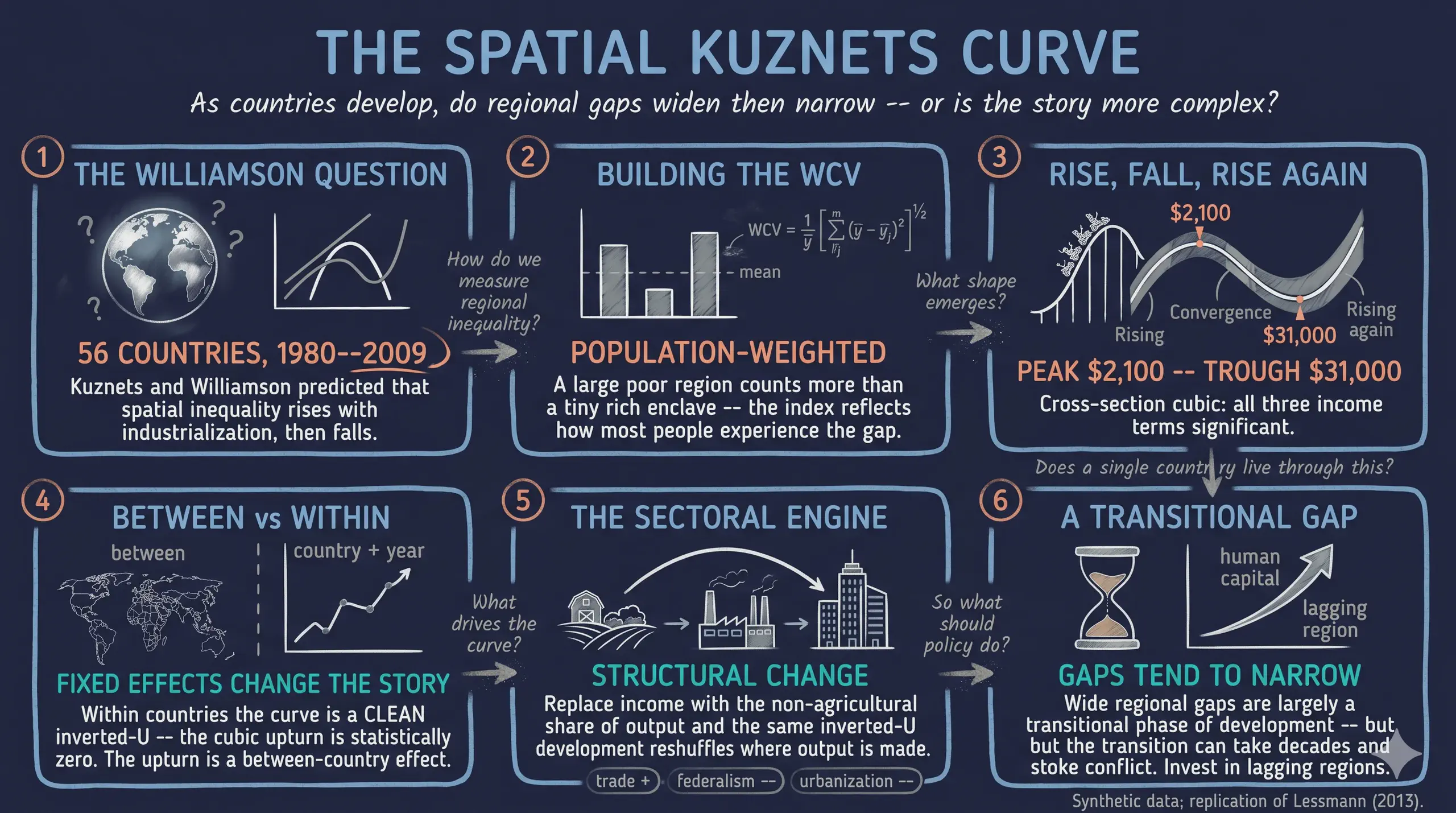
Why do some countries have huge gaps between their richest and poorest regions while others are remarkably even? Lessmann (2014) revisits a classic idea from Kuznets (1955) and Williamson (1965): as countries develop, spatial inequality first rises, then falls — an inverted-U. This tutorial replicates that study in R on a synthetic dataset, so the entire data-generating process is open and reproducible. We simulate regional GDP per capita for 56 countries over 1980–2009, compute the population-weighted coefficient of variation (WCV) of regional income from those regions, and estimate the relationship with cross-section OLS, two-way fixed effects via fixest, and the Robinson (1988) and Baltagi–Li (2002) semiparametric estimators. The cross-section recovers a significant inverted-U with a high-income upturn — a cubic whose turning points sit at about \$2,100 and \$31,000 of GDP per capita — while the within-country panel shows a clean inverted-U (the cubic term is insignificant). Spatial inequality correlates with personal (Gini) inequality at about 0.32, and a sectoral channel — the non-agricultural share of output — reproduces the same curve. The practical lesson is that wide regional gaps are, to a first approximation, a transitional feature of development that tends to narrow as economies mature; for learners, the post is a hands-on tour of measurement, fixed effects, polynomial specification, and flexible semiparametric regression.
1. Overview
The case-study question. Is the link between spatial inequality and economic development an inverted-U — and does it turn N-shaped (rising again) at very high income? Lessmann (2014) assembled a hard-to-find panel of regional accounts to answer it. We cannot share that proprietary data, so we do the next best thing for teaching: build a synthetic world whose data-generating process reproduces the paper’s findings, and walk through every estimator on it.
Why does this matter? Wide regional gaps are not just an accounting curiosity. Interregional inequality often travels with ethnic and political tension, and in extreme cases raises the risk of internal conflict. Understanding when such gaps widen and when they close is directly useful for regional policy.
Learning objectives. By the end you will be able to:
- Compute the weighted coefficient of variation (WCV) of regional income and explain why it is population-weighted.
- Estimate polynomial OLS with heteroskedasticity-robust (White) standard errors and read an inverted-U off the coefficients.
- Fit two-way fixed effects with
fixest::feols, and explain why country and year fixed effects change the story. - Solve for the turning points of a cubic and convert them to dollar thresholds.
- Read the Robinson and Baltagi–Li semiparametric partial-fit curves and say how they differ from a polynomial.
graph LR
    A["Simulate regional GDP"] --> B["Compute WCV"]
    B --> C["Cross-section OLS<br/>Table 2"]
    B --> D["Two-way FE<br/>Table 3"]
    C --> E["Turning points"]
    E --> J["Discriminant test"]
    C --> F["Robinson semiparametric<br/>Fig 4"]
    D --> G["Baltagi–Li semiparametric<br/>Fig 5"]
    B --> H["Sectoral channel<br/>Table 6"]
    B --> I["Robustness"]
    style A fill:#1f2b5e,stroke:#6a9bcc,color:#e8ecf2
    style J fill:#1f2b5e,stroke:#00d4c8,color:#e8ecf2
    style B fill:#1f2b5e,stroke:#00d4c8,color:#e8ecf2
    style C fill:#1f2b5e,stroke:#6a9bcc,color:#e8ecf2
    style D fill:#1f2b5e,stroke:#d97757,color:#e8ecf2
    style E fill:#1f2b5e,stroke:#6a9bcc,color:#e8ecf2
    style F fill:#1f2b5e,stroke:#6a9bcc,color:#e8ecf2
    style G fill:#1f2b5e,stroke:#d97757,color:#e8ecf2
    style H fill:#1f2b5e,stroke:#00d4c8,color:#e8ecf2
    style I fill:#1f2b5e,stroke:#6a9bcc,color:#e8ecf2
The pipeline above is the whole post in one picture: simulate regions, compute the inequality index, then estimate the development–inequality relationship four ways (parametric and semiparametric, cross-section and panel), and probe the sectoral channel and robustness.
Key concepts at a glance
The post reuses a small vocabulary. Each concept below has a definition (always visible) plus an example and analogy behind clickable cards — open them when a term feels slippery.
1. Weighted coefficient of variation (WCV). $\mathrm{WCV} = \frac{1}{\bar{y}}\left[\sum_{j} p_j,(\bar{y}-y_j)^2\right]^{1/2}$ — the population-weighted spread of regional GDP per capita, divided by the country mean. Scale-free, so it compares countries of any income level.
Example
A country with a rich capital (\$28,000, 35% of people) and a poorer hinterland (\$12,000, 65%) has WCV ≈ 0.43.
Analogy
Like a “spread score” for a class where bigger groups of students count more toward the average gap.
2. Inverted-U / Kuznets curve. The hypothesis that inequality rises with development, peaks, then falls — tracing an upside-down U.
Example
In §5 the quadratic gives a positive linear term and a negative squared term — the algebraic signature of an inverted-U.
Analogy
A roller-coaster hill: climb during industrialisation, crest, then descend as the modern economy spreads out.
3. Between vs within variation. Between compares different countries; within compares one country with itself over time. Cross-section regressions use between variation; panel fixed effects use within variation.
Example
The high-income upturn shows up between countries (§5) but vanishes within countries (§6) — the central contrast of the study.
Analogy
Comparing different students’ heights (between) vs tracking one student as they grow (within).
4. Two-way fixed effects (TWFE). Adding a dummy for every country and every year, so the income effect is identified only from within-country, within-year variation.
Example
feols(wcv ~ lnGDP + I(lnGDP^2) | country + year) — the | country + year part absorbs both sets of dummies.
Analogy
Grading each student against their own past, and against everyone’s average that semester — removing fixed advantages.
5. Polynomial specification. Entering income as $Y, Y^2, Y^3$ lets a straight-line model bend into curves — quadratic for an inverted-U, cubic for an N-shape.
Example
Column (5) of Table 2 adds $Y^3$; its positive coefficient produces the high-income upturn.
Analogy
Adding hinges to a ruler so it can follow a winding road instead of cutting straight across.
6. Turning points. The income levels where the curve changes direction — found by setting the derivative to zero: $\beta_1 + 2\beta_2 Y + 3\beta_3 Y^2 = 0$.
Example
Our cubic peaks at ln(GDP) ≈ 7.7 (≈ \$2,100) and troughs at ≈ 10.4 (≈ \$31,000).
Analogy
The crest and the valley of the roller-coaster — where the track is momentarily flat.
7. Semiparametric / partially-linear model. $\mathrm{WCV} = \alpha + f(Y) + \gamma X + \epsilon$: the controls $X$ enter linearly, but the income effect $f(Y)$ is an unknown smooth curve estimated from the data instead of forced into a polynomial.
Example
The Robinson estimator (§8) and the Baltagi–Li B-spline (§9) draw $f(Y)$ as a flexible curve with a confidence band.
Analogy
Tracing a coastline freehand instead of approximating it with a few straight rulers.
8. Omitted-variable bias. When a left-out factor correlated with both income and inequality distorts the estimated relationship; fixed effects defend against the time-invariant version of it.
Example
Geography (mountains, coasts) drives spatial inequality but is hard to measure; country fixed effects absorb all of it at once.
Analogy
Blaming coffee for poor sleep when it’s really the late-night screen time that travels with it.
9. Discriminant of the cubic. A single number, $D = \beta_2^2 - 3\beta_1\beta_3$, that tells you whether a fitted cubic has two real turning points ($D>0$), one inflection ($D=0$), or none ($D<0$). It is computed from the coefficients, so it answers “does the curve bend?” — a different question from “is each term significant?”
Example
In §7 the cross-section cubic has $D = +0.0055 > 0$ with both turning points in range (genuine N-shape), while the panel cubic’s implied turning points fall outside the data.
Analogy
A road can curve gently yet never actually turn back; the discriminant is the test for whether it makes a genuine U-turn or just leans.
2. Setup and the synthetic data-generating process
2.1 Packages and theme
We lean on fixest for fixed effects, np for the Robinson estimator, splines for the Baltagi–Li B-spline, sandwich/lmtest for White standard errors, and ggplot2 for dark-themed figures.
set.seed(123)
pacman::p_load(dplyr, tidyr, ggplot2, scales, patchwork, fixest, sandwich, lmtest,
               splines, np, modelsummary, gt, webshot2, gridExtra)
options(np.messages = FALSE)
2.2 Simulating regional GDP and a country panel
The key design choice is that the WCV is computed, not assumed. For each of 56 synthetic countries we build a realistic territorial structure — the actual number of regions and land areas from the paper’s appendix — then draw regional GDP per capita and a population share for each region. We engineer two layers into the data: a within-country inverted-U (how a country’s regional spread evolves as it develops) and a between-country cubic that lives in a time-invariant country term. This separation is what lets the panel show a clean inverted-U while the cross-section shows the N-shape.
# region j in country i, year t:  y_ijt = country_mean × exp(δ_it · z_ij)
# z_ij is a persistent regional "position" (a rich region stays rich);
# δ_it (the log-dispersion) follows the structural inverted-U in development.
delta <- sqrt(log(1 + target_wcv^2))         # lognormal-CV inversion
y_reg <- exp(lnGDP) * exp(delta * z - 0.5 * delta^2)
Simulating regional micro-data for 56 countries ...
  annual obs N=890 | 5-year obs N=212 | cross-section N=56
The simulated panel has 890 annual observations, 212 five-year cells, and 56 countries in the cross-section — close to the paper’s 915 / 207 / 56. The unbalanced shape is deliberate: rich OECD economies have long, dense coverage; developing countries have short, gappy series, exactly as in the real data.
3. Measuring spatial inequality: the WCV
Lessmann measures spatial inequality with the population-weighted coefficient of variation of regional GDP per capita:
$$\mathrm{WCV}_{i,t} = \frac{1}{\bar{y}}\left[\sum_{j=1}^{n} p_j,(\bar{y} - y_j)^2\right]^{1/2}$$
where $\bar{y}$ is the country’s average regional GDP per capita, $y_j$ is region $j$’s GDP per capita, $p_j$ is region $j$’s share of the country’s population, and $n$ is the number of regions. The population weighting is the crucial feature: a tiny, very rich (or very poor) region barely moves the index, while a populous region counts a lot.
wcv_fun <- function(y, p) {
  ybar <- sum(p * y)                          # population-weighted mean
  sqrt(sum(p * (ybar - y)^2)) / ybar          # weighted SD / mean
}
toy <- data.frame(gdp_pc = c(28000, 12000), pop_share = c(0.35, 0.65))
wcv_fun(toy$gdp_pc, toy$pop_share)
Worked WCV example: ybar = 17600, WCV = 0.434
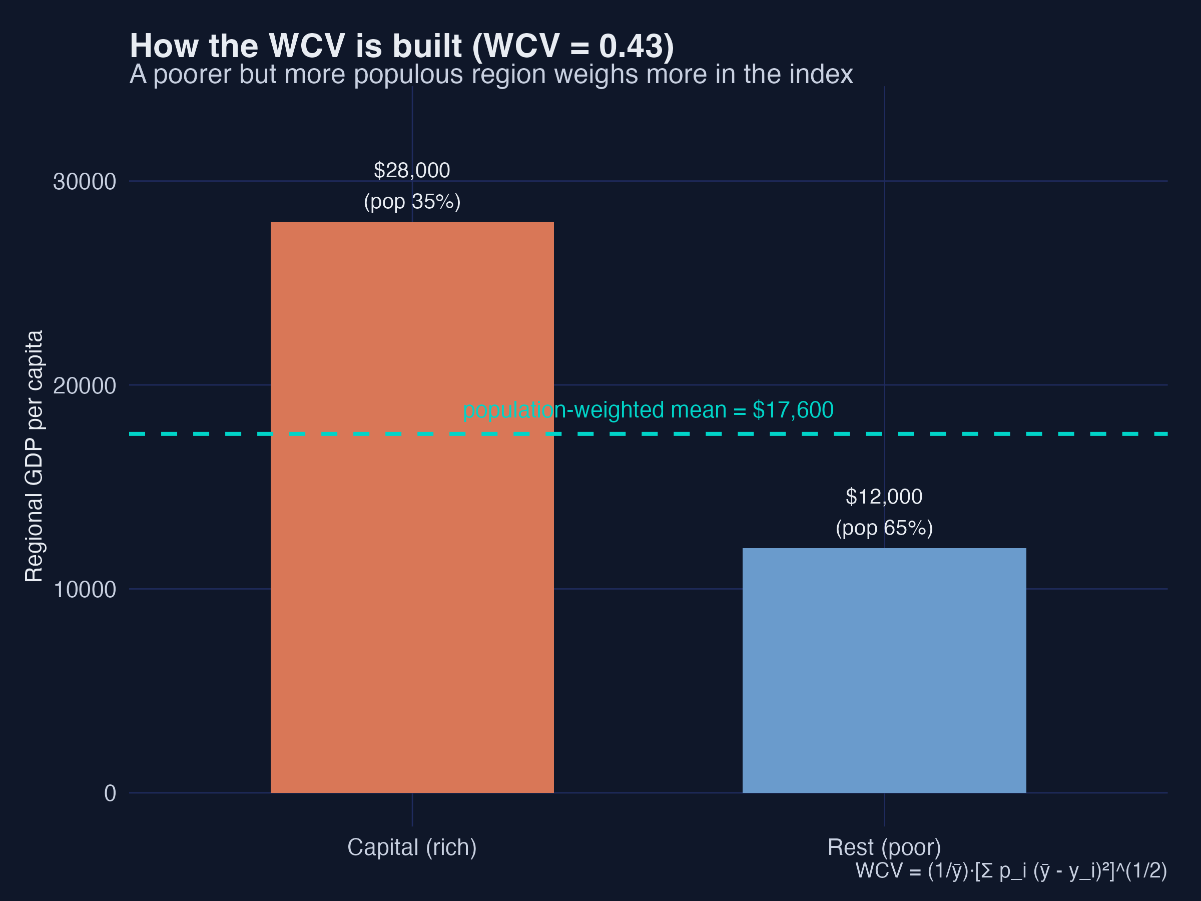
A rich capital region at \$28,000 (35% of the population) and a poorer hinterland at \$12,000 (65%) give a population-weighted mean of \$17,600 and a WCV of 0.434. Because the larger, poorer region carries more weight, the index reflects how most people experience the regional gap — not just the extremes. Mapping the same calculation across all 56 synthetic countries reproduces the familiar geography of spatial inequality.
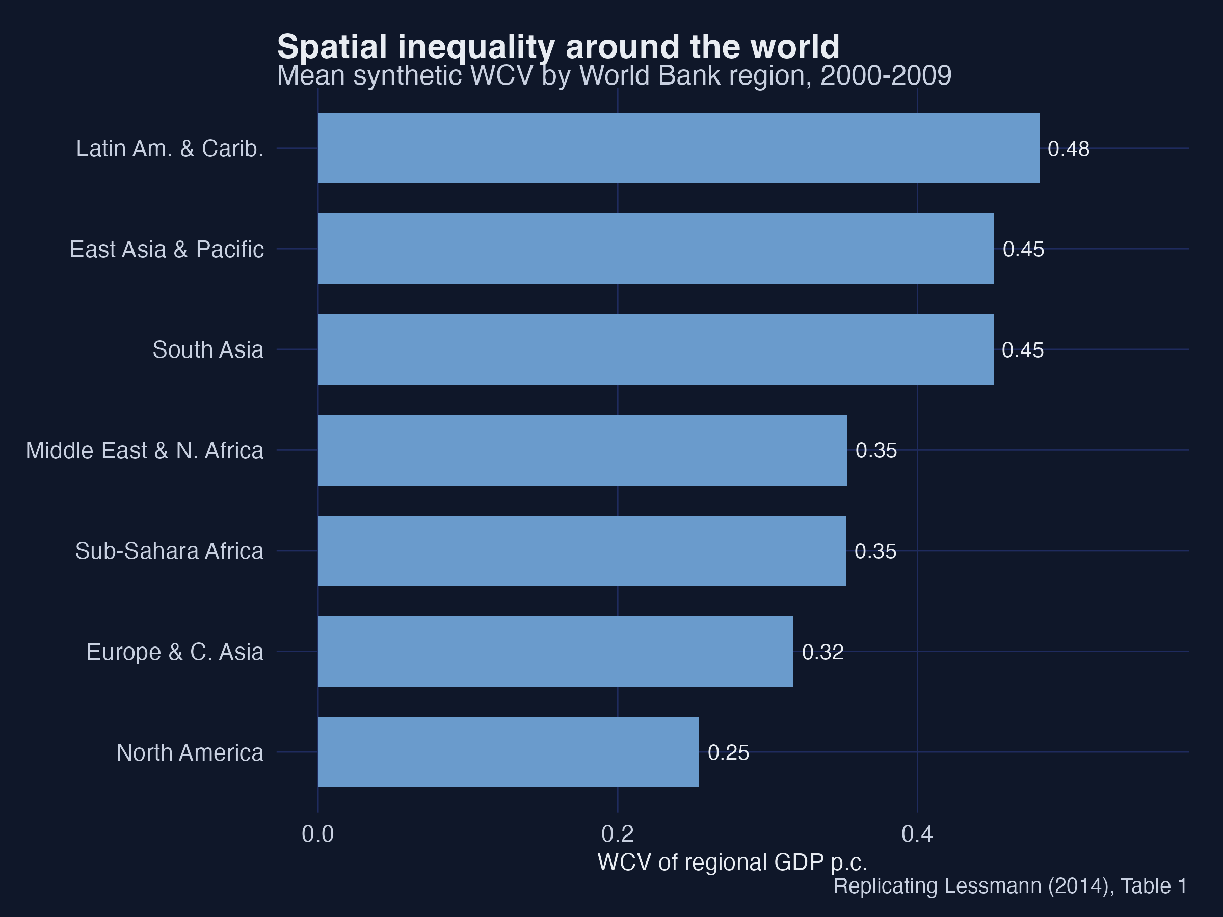
High-income North America and Europe show the lowest spatial inequality, while East Asia, Latin America and Sub-Saharan Africa show the highest — the cross-regional ranking Lessmann reports in Table 1.
4. Spatial vs personal inequality (Fig 3)
Before modelling development, it is worth asking how spatial inequality relates to the more familiar personal inequality (the household-income Gini). If they were the same thing, studying regions would add nothing.
fig3_fit <- lm(gini ~ wcv, cs)
coef(fig3_fit); cor(cs$gini, cs$wcv)
Fig 3: GINI = 0.311 + 0.208 * WCV (t = 2.45), corr = 0.316
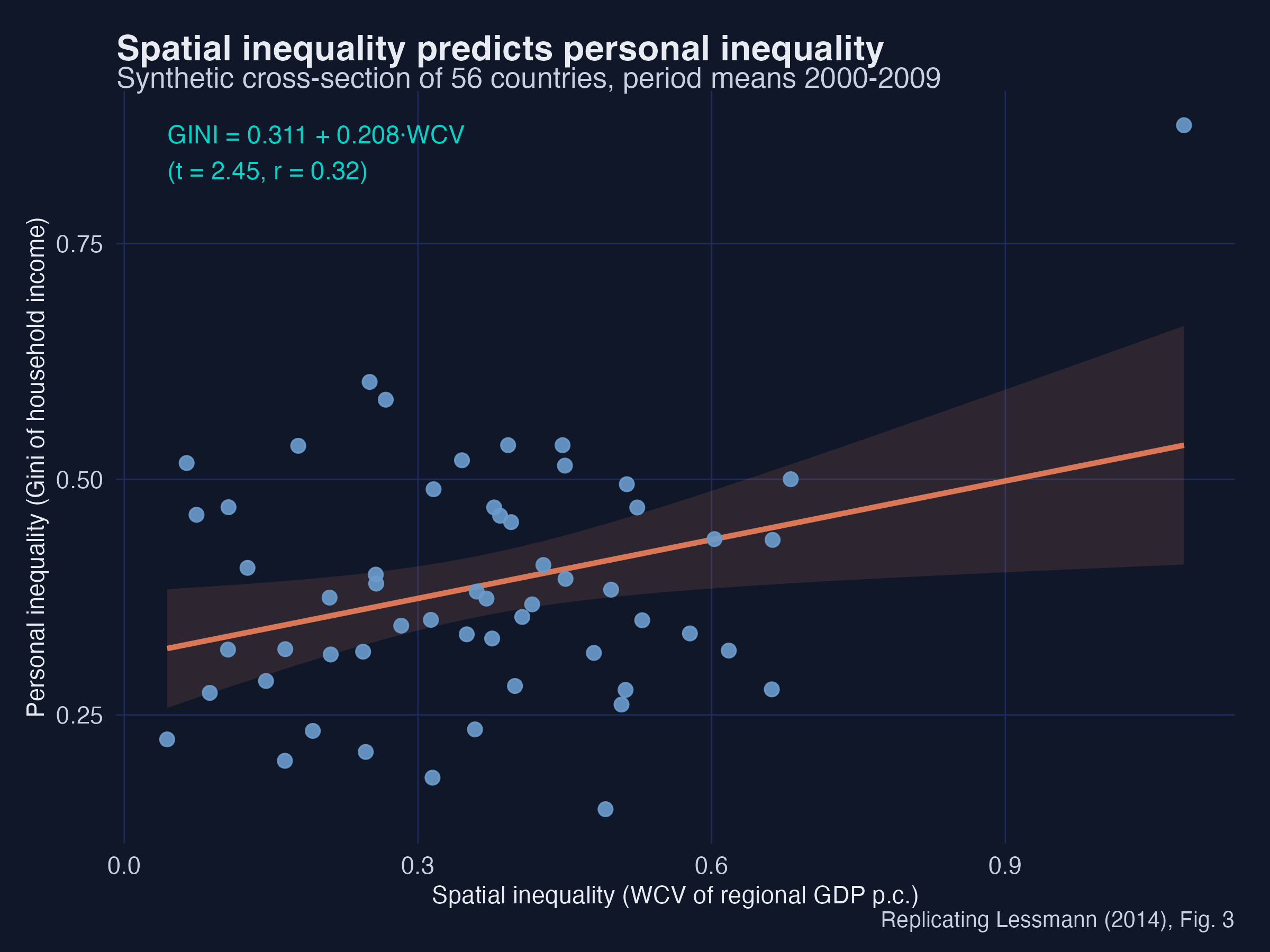
The slope is positive and significant (0.208, t = 2.45) and the correlation is 0.316 — close to the paper’s 0.324. Spatial inequality explains a real but partial share of personal inequality: the two are related, not interchangeable. A country can have high personal inequality with low regional inequality (the United States) or the reverse (a small, ethnically split economy). That partial overlap is exactly why the rest of the post focuses on the spatial dimension in its own right.
5. Cross-section parametric estimates (Table 2)
We start where Williamson (1965) did: a cross-section of countries, using period means over 2000–2009. The estimating equation is a polynomial in development with controls:
$$\mathrm{WCV}_{i} = \alpha + \sum_{j=1}^{k}\beta_j,Y_{i}^{,j} + \gamma X_{i} + \epsilon_{i}$$
where $Y = \ln(\text{GDP per capita})$. An inverted-U needs $\beta_1 > 0$ and $\beta_2 < 0$. We use White (HC1) heteroskedasticity-robust standard errors to match the paper.
m1 <- lm(wcv ~ lnGDP, cs)                                            # bivariate
m4 <- lm(wcv ~ lnGDP + I(lnGDP^2) + lnunits + lnarea + area_units +
              ethnic + trade_gdp + urbanization + federal, cs)       # full controls
m5 <- lm(wcv ~ lnGDP + I(lnGDP^2) + I(lnGDP^3) + lnunits + lnarea +
              area_units + ethnic + trade_gdp + urbanization + federal, cs)  # + cubic
lmtest::coeftest(m1, vcov = sandwich::vcovHC(m1, "HC1"))
CS (1) lnGDP       -0.098*** ->  -0.092***
CS (4) lnGDP/^2  +0.33*/-0.021* ->  0.338* / -0.020**
CS (5) cubic 3.86**/-0.45**/0.017** ->  4.40***/-0.499***/0.0184***
CS adjR2 0.43/0.66/0.69 ->  0.33/0.67/0.73
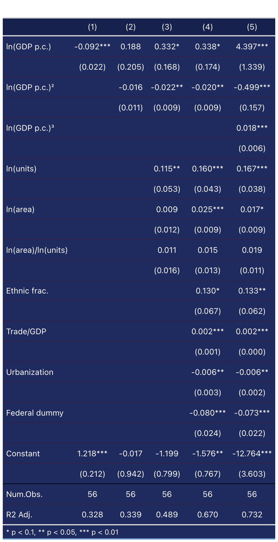
The five specifications tell a story. The bivariate slope is negative (−0.092***): on average, richer countries have lower spatial inequality — but a straight line hides the structure. Once the controls enter (column 4), the inverted-U emerges: the linear income term turns positive (+0.338*) and the squared term is negative (−0.020**). Adding a cubic (column 5) makes all three income terms significant — +4.40*** / −0.499*** / +0.0184*** — and the positive cubic coefficient reveals an upturn at very high income (the N-shape). Every control carries the expected sign: more trade and more regions raise spatial inequality, while federal constitutions and urbanisation lower it.
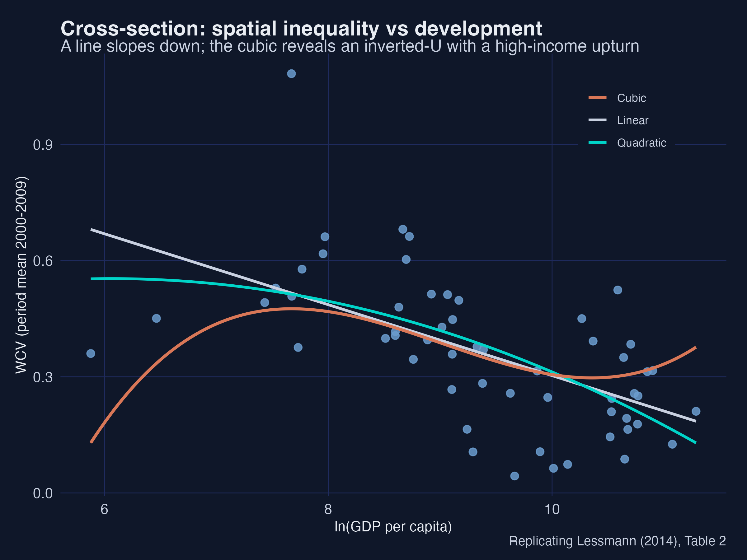
The scatter makes the algebra visual: the straight line slopes down, the quadratic bends into an inverted-U, and the cubic adds the high-income upturn among the richest economies. Interpretation: the same data support three different stories depending on the functional form — which is exactly why Lessmann reports all of them and then turns to semiparametric methods that do not force a shape.
6. Panel two-way fixed effects (Table 3)
6.1 Why fixed effects?
The cross-section compares different countries, so any unmeasured, time-invariant trait correlated with income — geography, history, ethnic geography — can bias the estimate. A panel lets us compare each country with itself over time and absorb all such traits with country dummies.
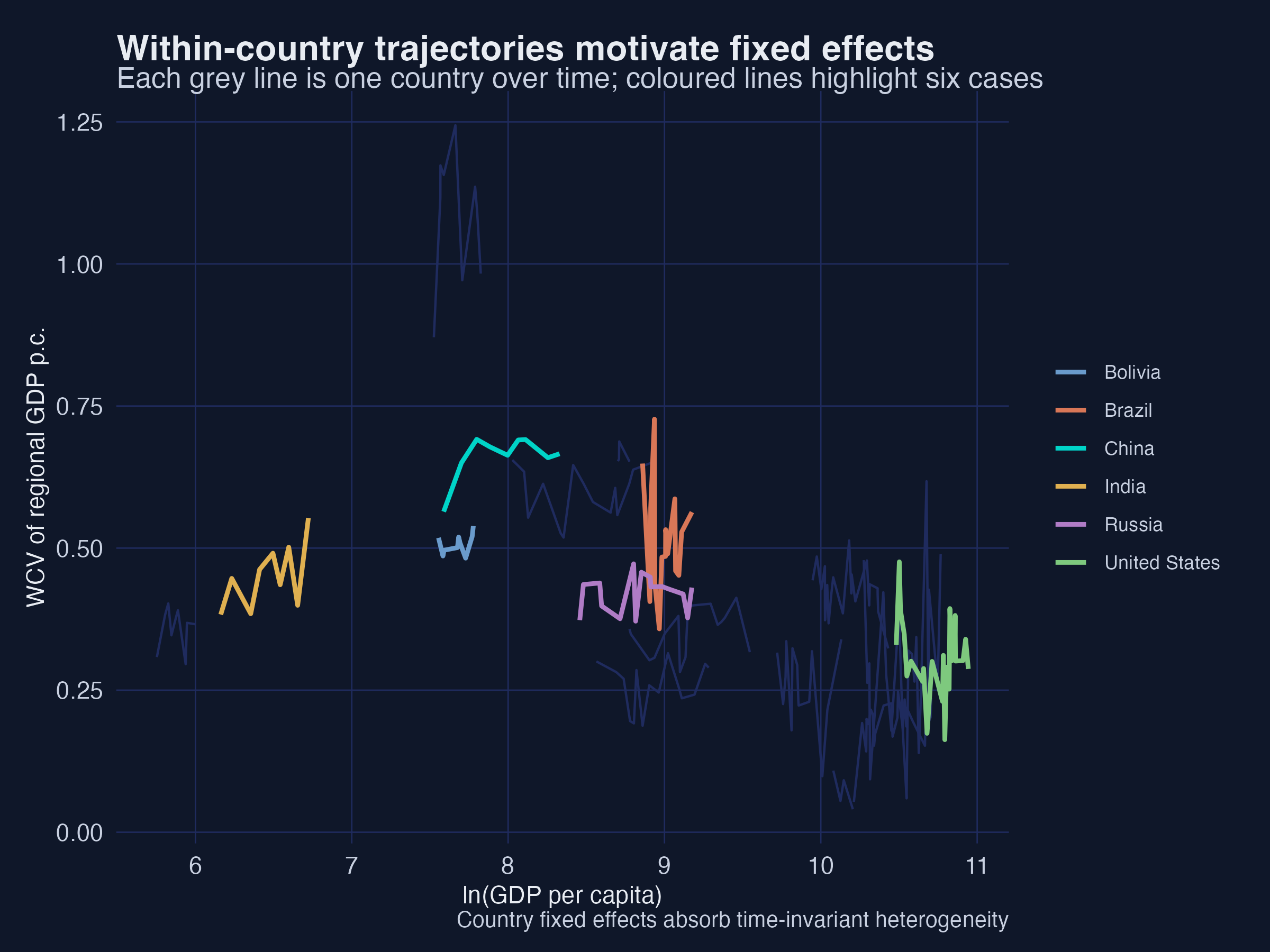
Each grey line is one country’s path; the coloured lines highlight China, India, Russia, Brazil, the United States and Bolivia. Countries sit at very different inequality levels for reasons unrelated to their income trajectory — and those level differences are precisely what country fixed effects remove.
6.2 The fixest::feols specification
The panel model adds country and year fixed effects:
$$\mathrm{WCV}_{i,t} = \beta_1 Y_{i,t} + \beta_2 Y_{i,t}^2 + \gamma X_{i,t} + \alpha_i + \mu_t + \epsilon_{i,t}$$
In fixest, the fixed effects go after a vertical bar, and vcov = "hetero" reproduces the paper’s White standard errors (clustering by country is the modern alternative):
fa2 <- feols(wcv ~ lnGDP + I(lnGDP^2) + trade_gdp + urbanization |
                   country + year, data = annual, vcov = "hetero")
fa3 <- feols(wcv ~ lnGDP + I(lnGDP^2) + I(lnGDP^3) + trade_gdp + urbanization |
                   country + year, data = annual, vcov = "hetero")
PAN (2) lnGDP/^2 0.345**/-0.018** -> 0.394**/-0.0211** ; cubic n.s. -> -0.0008
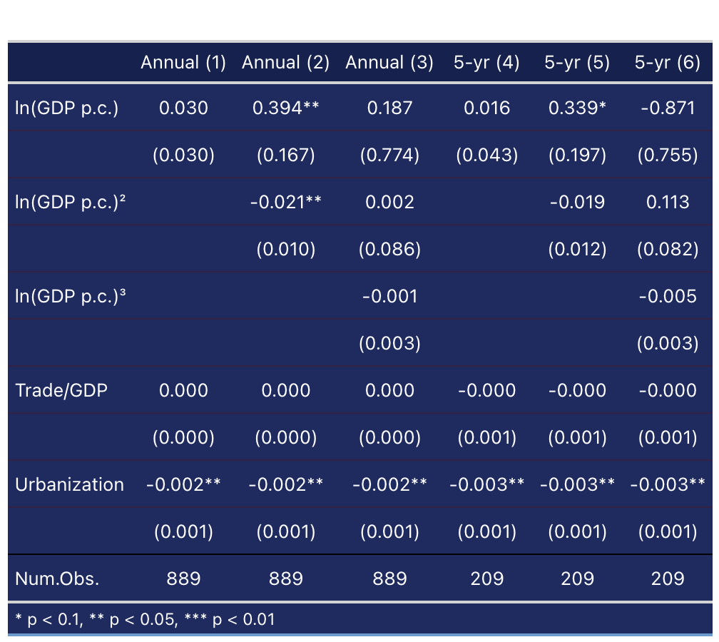
The within-country relationship is a clean inverted-U: the quadratic gives +0.394** and −0.0211**, matching the paper. Crucially, the cubic term is insignificant (−0.0008, t = −0.26): there is no high-income upturn within countries. This is the study’s central contrast — the upturn we saw in the cross-section is a between-country phenomenon (rich service economies differ from rich manufacturing ones), not something a single country experiences as it grows.
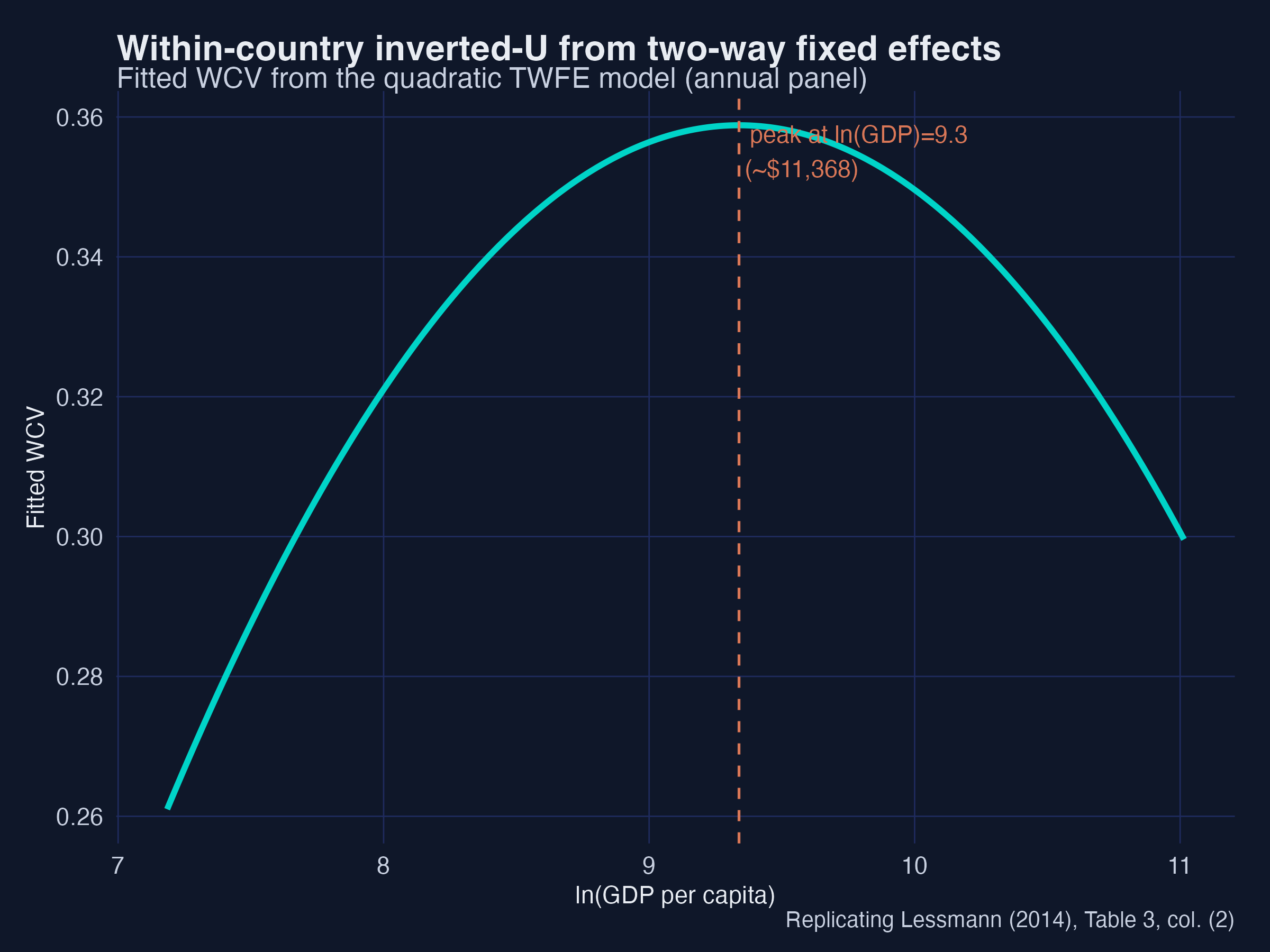
The fitted TWFE quadratic peaks around ln(GDP) ≈ 9.8 (~\$18,000): as a typical country develops past that point, its regional gaps start to close. Interpretation: fixed effects do not just tidy up standard errors — they change the substantive conclusion about whether the upturn is real for any given country.
6.3 Annual vs 5-year averages
Annual data can be noisy because of business cycles, so Lessmann also estimates on 5-year averages. We build them by grouping years into six periods and averaging within country-period cells; the inverted-U survives (5-year quadratic ≈ +0.34 / −0.019), confirming the result is not a short-run artefact.
7. Turning points and the discriminant test
A cubic can bend twice — but does it actually? And does it bend inside the range of incomes we observe? This section answers both. It is the most transferable skill in the post: any time you fit a cubic, these two checks tell you whether the curve really has the shape your coefficients seem to promise.
7.1 Calculating the turning points
Where does the curve change direction? At a turning point the slope is zero, so we set the derivative of the cubic to zero:
$$\frac{\partial \mathrm{WCV}}{\partial Y} = \beta_1 + 2\beta_2 Y + 3\beta_3 Y^2 = 0$$
This is a quadratic in $Y$, so it has at most two roots — the inverted-U peak and the high-income trough. One direct way to find them is polyroot:
bc <- coef(m5)
roots <- sort(Re(polyroot(c(bc["lnGDP"], 2*bc["I(lnGDP^2)"], 3*bc["I(lnGDP^3)"]))))
data.frame(ln_gdp = roots, gdp_usd = round(exp(roots)))
     ln_gdp  gdp_usd
1     7.671     2146
2    10.356    31443
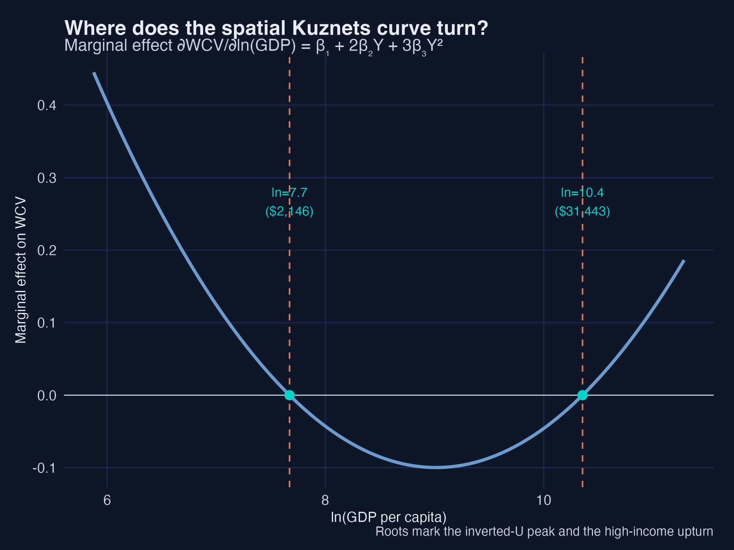
Spatial inequality rises with development up to ln(GDP) ≈ 7.7 (about \$2,100), falls until ln(GDP) ≈ 10.4 (about \$31,000), and then rises again. Interpretation 1: the first threshold marks the industrial take-off where a few leading regions surge ahead; the second marks the maturity where convergence has run its course and post-industrial forces (tertiarisation) begin to pull rich regions apart again. Because the regressor is $\ln(\text{GDP})$, we exponentiate each root to read it back in dollars.
7.2 The discriminant: does the curve really bend?
Computing the roots numerically works, but it hides why a cubic sometimes has two turning points and sometimes none. The quadratic $\beta_1 + 2\beta_2 Y + 3\beta_3 Y^2 = 0$ has two real solutions exactly when its discriminant is positive. After dropping a harmless factor of 4 (see the algebra below), the rule simplifies to a single number:
$$D ;\equiv; \beta_2^2 - 3,\beta_1\beta_3.$$
There are three regimes:
| Discriminant | Real turning points | Shape over the real line | Verdict |
|---|---|---|---|
| $D > 0$ | 2 | rise–fall–rise (an “N on its side”) | the cubic shape is real |
| $D = 0$ | 1 (inflection) | a single flat spot, no reversal | knife-edge boundary |
| $D < 0$ | 0 | monotonic — never reverses | the cubic shape is not real |
The standard quadratic-formula discriminant is $b^2-4ac = (2\beta_2)^2 - 4(3\beta_3)(\beta_1) = 4(\beta_2^2 - 3\beta_1\beta_3) = 4D$; the factor of 4 never changes the sign, so we work with $D = \beta_2^2 - 3\beta_1\beta_3$. When $D>0$, the turning-point locations come straight from the quadratic formula (then exponentiate to dollars):
$$Y^{\star} = \frac{-\beta_2 \pm \sqrt{D}}{3\beta_3}, \qquad \mathrm{GDP}^{\star} = \exp!\left(Y^{\star}\right).$$
In R the whole test is two short functions:
cubic_disc <- function(b1, b2, b3) b2^2 - 3 * b1 * b3          # the discriminant
cubic_tp   <- function(b1, b2, b3) {                            # turning points (if any)
  D <- cubic_disc(b1, b2, b3)
  if (D <= 0) return("no real turning points (monotonic)")
  sort(exp(c(-b2 - sqrt(D), -b2 + sqrt(D)) / (3 * b3)))         # in GDP-per-capita units
}
bc <- coef(m5)
cubic_disc(bc["lnGDP"], bc["I(lnGDP^2)"], bc["I(lnGDP^3)"])
[1] 0.005519
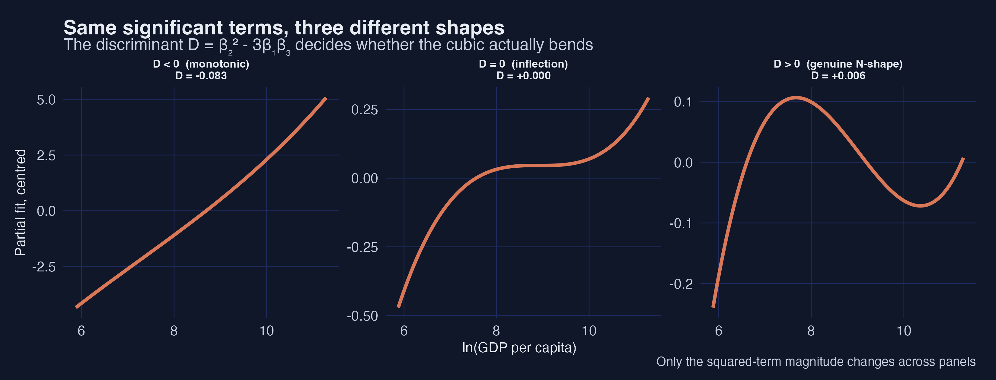
Interpretation 2: the figure holds the linear and cubic coefficients fixed and changes only the squared term. A small change flips the regime: when $D<0$ the curve climbs monotonically, at $D=0$ it develops a single flat inflection, and once $D>0$ it bends into the genuine rise–fall–rise N-shape. The sign of one number — the discriminant — is what separates “a cubic that bends” from “a cubic that merely curves.”
7.3 Two checks, not one: significance is not shape
Here is the trap. In our cross-section, all three income terms are statistically significant (§5: $\beta_1=4.40^{***}$, $\beta_2=-0.499^{***}$, $\beta_3=0.018^{***}$). It is tempting to conclude “therefore the relationship is a genuine cubic with two turning points.” That inference is wrong as stated. Significance answers “does the data prefer keeping this term?”; it does not answer “does the fitted curve actually bend inside the income range we observe?” The discriminant — plus a check on where the turning points fall — answers the second question. Applying both checks to this project’s two cubics, and to three illustrative cases, makes the distinction concrete:
# applied to the cross-section cubic, the panel cubic, and three synthetic cases
                               case     b1      b2        b3       D                              regime  in_range
1  Cross-section cubic (significant) 4.3965 -0.4988  0.018447 +0.0055    2 turning points (both in range)      TRUE
2        Panel cubic (insignificant) 0.1875  0.0017 -0.000836 +0.0005  2 turning points (>=1 OUT of range)     FALSE
3      Synthetic 5a: genuine N-shape 4.4000 -0.5000  0.018000 +0.0124    2 turning points (both in range)      TRUE
4       Synthetic 5b: monotonic trap 4.4000 -0.4000  0.018000 -0.0776                     monotonic (D<0)     FALSE
5   Synthetic 5c: turns out of range 4.4000 -0.5000  0.001000 +0.2368  2 turning points (>=1 OUT of range)     FALSE
Read the rows from top to bottom:
- Cross-section cubic — $D = +0.0055 > 0$ and both turning points (\$2,146 and \$31,443) fall inside the observed income range (\$315–\$82,653). This is a genuine N-shape. Significance and shape agree.
- Panel cubic — the within-country cubic term was insignificant (§6, $t=-0.26$), so it fails the first check already. Even taking its coefficients at face value, $D>0$ but one implied turning point sits at roughly \$0.0003 — absurdly far below any real economy — so the curve does not bend inside the observed range. Two independent reasons to reject a within-country N-shape, exactly matching §6’s clean inverted-U.
- Synthetic 5b (the trap) — same sign pattern as the genuine case, only $\beta_2$ is a touch smaller in magnitude, and $D = -0.078 < 0$. The curve is monotonic everywhere. A cubic regression on such data could report all three terms as “significant” and still have no turning point at all.
- Synthetic 5c — $D>0$, so two turning points exist mathematically, but they land at \$86 and an astronomically high income. Inside any realistic range the curve is monotonic. “Two turning points exist” would be technically true and practically misleading.
Interpretation 3: significance (does the data want the term?) and the discriminant-plus-range check (does the curve actually bend, and where?) are different questions, and you need both. Reporting “all three GDP terms are significant, so the curve is cubic” can be wrong in two distinct ways — the discriminant can be negative (5b), or the turning points can fall outside the data (5c). The honest workflow is: report the coefficients, compute $D$, and if $D>0$ confirm the turning points lie inside the observed income range before claiming an inverted-U or N-shape.
Aside (for Bayesian model averaging). The same trap appears with a different label. In a BMA, a term’s posterior inclusion probability (PIP) near 1.00 is the Bayesian analogue of “statistically significant” — it says the data prefer keeping the term. But a high PIP on the cubic term no more guarantees a genuine bend than a significant cubic coefficient does: you still compute $D = \beta_2^2 - 3\beta_1\beta_3$ from the posterior-mean coefficients and check the turning-point range. The companion note Turning Points and Discriminant Analysis (Mendez, 2026) works through real cases — cross-country CO₂ ($D>0$, genuine) versus Chinese provincial PM₂.₅ (PIPs ≈ 1.00 but $D<0$, monotonic) — that make the point with field data.
8. Semiparametric cross-section: the Robinson estimator (Table 4, Fig 4)
A polynomial forces a shape. A partially-linear model lets the income effect be any smooth curve while keeping the controls linear:
$$\mathrm{WCV} = \alpha + f(Y) + \gamma X + \epsilon$$
Robinson’s (1988) estimator is a clever two-step “double residual” idea: first partial $Y$ out of both the outcome and each control non-parametrically, then run OLS on the residuals to recover $\gamma$; finally smooth the leftover against $Y$ to draw $f$.
# Step 1: non-parametrically remove lnGDP from y and each control
resid_np <- function(v, z) residuals(npreg(v ~ z, regtype = "ll", ckertype = "gaussian"))
ey <- resid_np(cs$wcv, cs$lnGDP)
eX <- sapply(Xnames, function(nm) resid_np(cs[[nm]], cs$lnGDP))
# Step 2: OLS of residualised y on residualised X  ->  linear part (Table 4)
rob <- lm(ey ~ eX - 1)
# np::npplreg implements exactly this estimator and returns identical coefficients
             robinson_coef       t   npplreg_coef
lnunits             0.1650  3.9405        0.1575
trade_gdp           0.0021  4.0348        0.0020
urbanization       -0.0057 -3.0047       -0.0056
federal            -0.0670 -1.7456       -0.0525
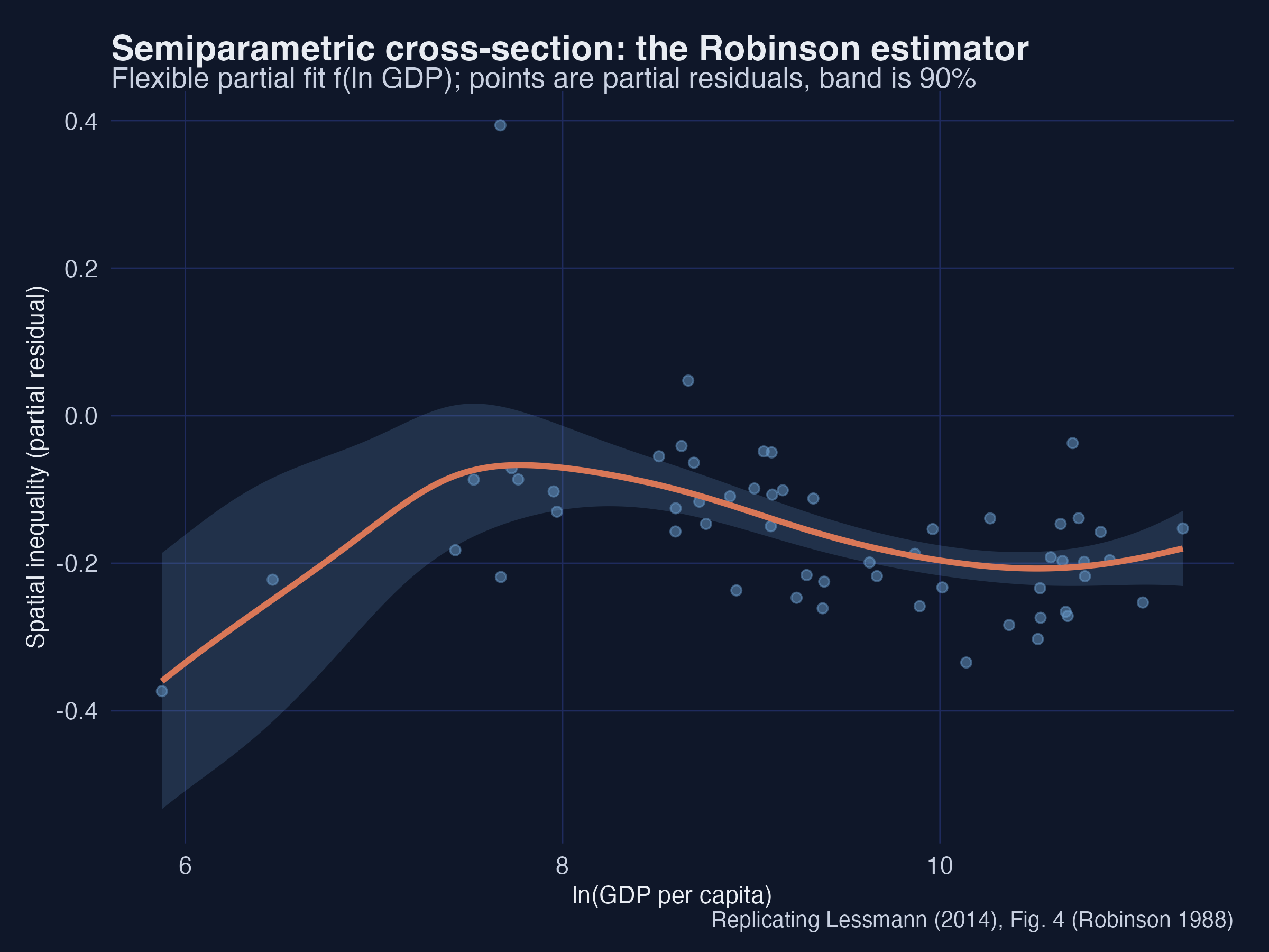
The linear-part coefficients match the parametric estimates — more regions and more trade raise inequality, urbanisation and federalism lower it — and np::npplreg returns the same numbers, confirming the hand-built estimator. The flexible curve $f(Y)$ traces the inverted-U with a high-income upturn, and the 90% band widens at the sparse low-income end. Interpretation: because the curve was never told to be a cubic, its agreement with the parametric cubic is independent evidence that the N-shape is in the data, not an artefact of the polynomial.
9. Semiparametric panel: the Baltagi–Li series estimator (Table 5, Fig 5)
For the panel, Baltagi & Li (2002) remove the fixed effects and approximate $f(Y)$ with a cubic B-spline (order $k = 4$). We implement this faithfully in fixest: a B-spline basis of the income term, with country and year fixed effects absorbed.
B <- splines::bs(annual$lnGDP, degree = 3, df = 5)        # cubic B-spline (order k=4)
colnames(B) <- paste0("bs", 1:5)
m_bl <- feols(wcv ~ bs1+bs2+bs3+bs4+bs5 + trade_gdp + urbanization |
                    country + year, data = cbind(annual, B), vcov = "hetero")
                 estimate       t   within_r2
trade_gdp          0.0002  0.564     0.021   (annual)
urbanization      -0.0027 -2.785     0.021   (annual)
urbanization      -0.0029 -2.634     0.068   (5-year)
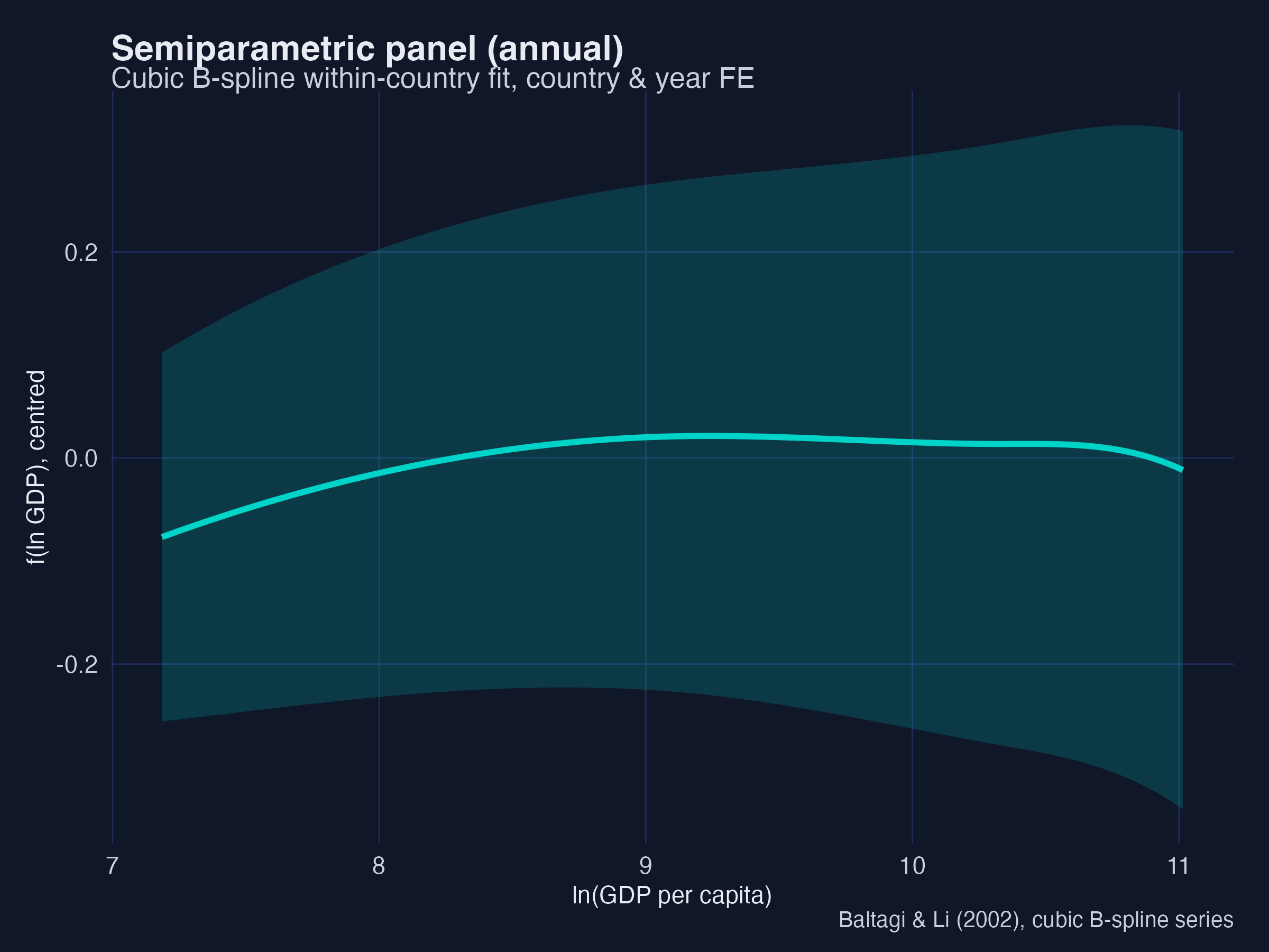
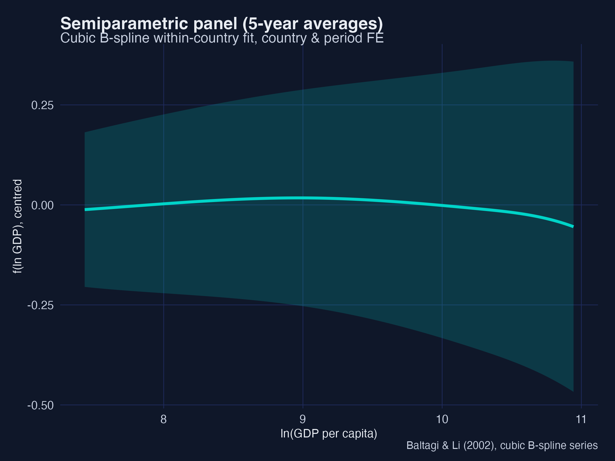
Trade is insignificant and urbanisation is significantly negative (−0.0027** annual, −0.0029** on 5-year averages), matching the paper’s Table 5. The recovered $f(Y)$ curves show the within-country inverted-U with no upturn at high income — the same message as the parametric panel, now without assuming a polynomial. Interpretation: two very different flexible methods (kernel-based Robinson and spline-based Baltagi–Li) agree with the parametric models, which is exactly the kind of triangulation that makes a descriptive finding credible.
10. The sectoral channel (Table 6)
Kuznets and Williamson argued that the real driver is structural change — the shift from agriculture to industry and services — with income just a proxy. We test this directly by replacing income with the non-agricultural share of gross value added.
s4 <- lm(wcv ~ nonag + I(nonag^2) + lnunits + lnarea + area_units +
              ethnic + trade_gdp + urbanization + federal, cs)
== Table 6: sectoral data (non-agricultural GVA / GDP) ==
  nonag = 0.0165***   nonag^2 = -0.00014***
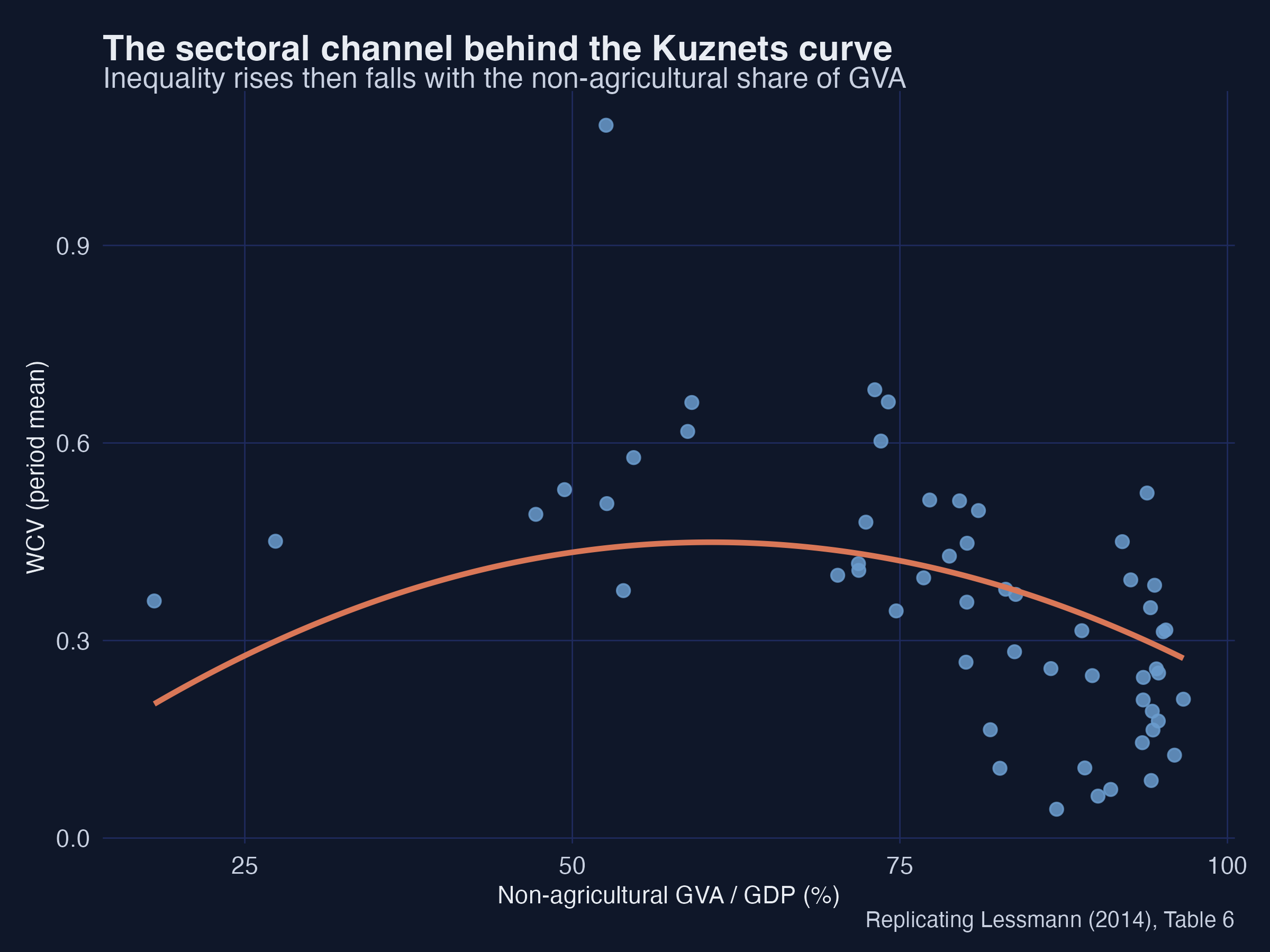
Spatial inequality rises then falls with the non-agricultural share (+0.0165*** and −0.00014***) — an inverted-U in the structural variable itself. Interpretation: this is the mechanism behind the income result. As an economy industrialises, a few regions capture the new activity and gaps widen; as the modern sector matures and spreads, gaps narrow. Development raises inequality because it reshuffles where output is produced.
11. Robustness
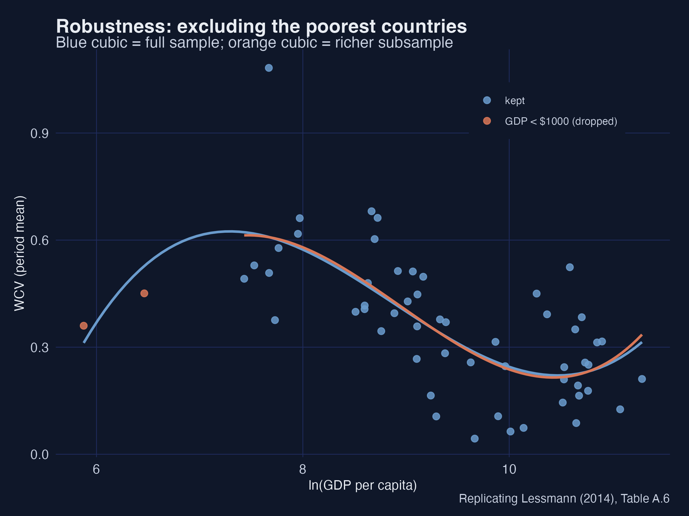
11.1 Excluding the poorest countries
The rising arm of the curve depends on poor countries. Dropping those with GDP per capita below \$1,000 weakens the full inverted-U — the cubic no longer traces the complete shape, just as the paper finds.
11.2 Excluding capital regions
Capital regions are often far richer than the rest of a country. Recomputing the WCV without them and correlating with the original gives 0.84 (paper 0.81) — capitals matter in individual cases but do not overturn the cross-country picture.
11.3 Alternative inequality measures
Swapping the population-weighted WCV for the unweighted coefficient of variation or a regional Gini leaves the cubic in place — the inverted-U is not an artefact of the particular index.
11.4 Income in logs vs levels (Fig 7)
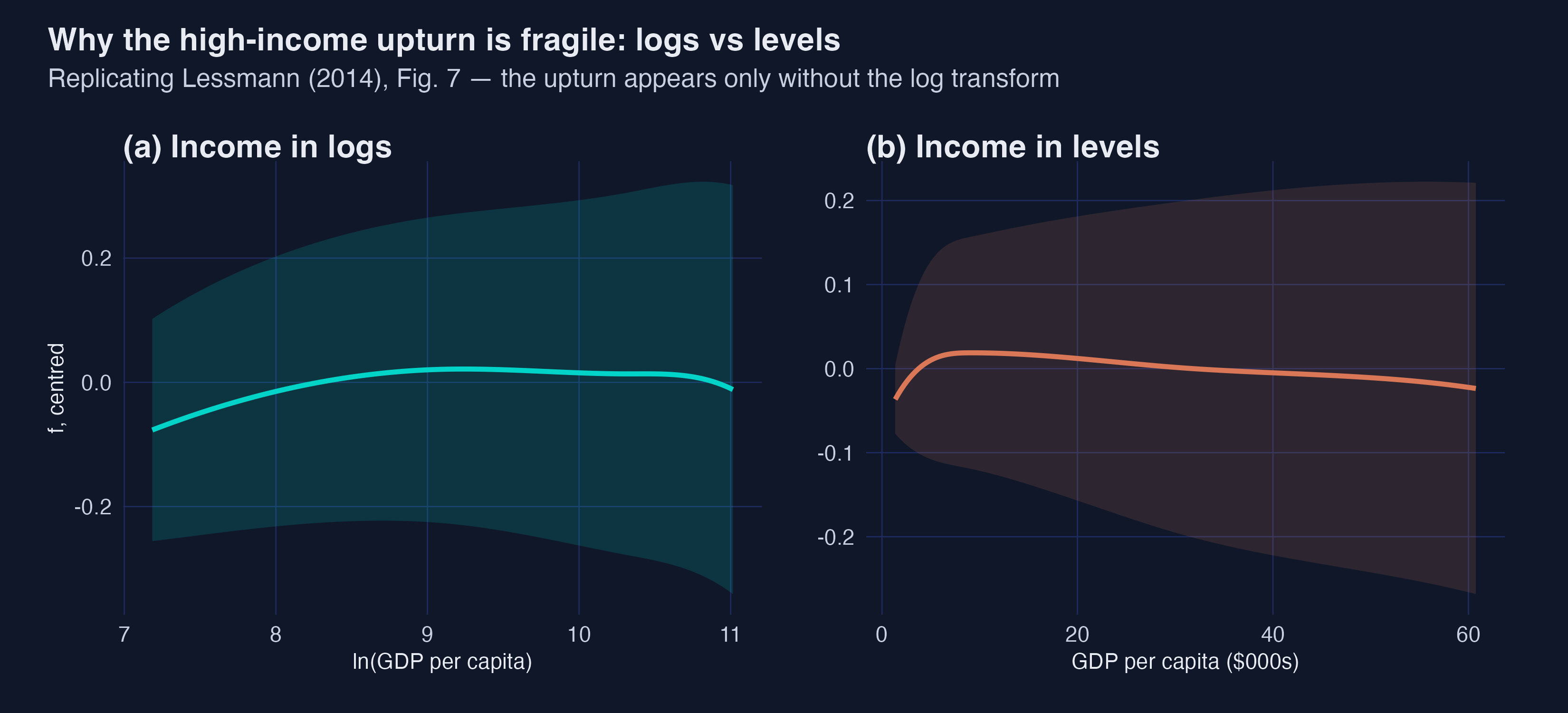
This is the most important caveat. With income in logs there is no high-income upturn; with income in levels a slight upturn reappears. Interpretation: the existence of the upturn is partly a measurement choice. The robust finding is the inverted-U; the N-shape is real but fragile — which is why Lessmann hedges it and why we should too.
12. Summary statistics (Table A.3)
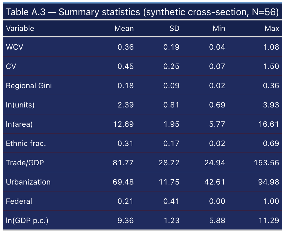
The synthetic variables match the paper’s Table A.3 within about ±10% on every dimension: WCV mean 0.36 (paper 0.35), ln(units) mean 2.39, ln(area) mean 12.69, ethnic fractionalisation 0.31, Trade/GDP 82, urbanisation 69, federal share 0.21. Anchoring the marginal distributions to the paper is what makes the regression coefficients land in the right place.
13. Discussion
So, is there an inverted-U? On this synthetic data, calibrated to the paper, the answer is a clear yes — with a nuance. Between countries, the relationship is N-shaped: spatial inequality rises until about \$2,100 of GDP per capita, falls until about \$31,000, then edges up again. Within countries, the relationship is a clean inverted-U with no upturn. The two pictures are reconciled by recognising that the high-income upturn is a cross-sectional feature — rich service economies are simply more spatially unequal than rich manufacturing ones — rather than something a developing country marches through.
What does this mean for policy? Wide regional gaps are, to a first approximation, transitional: they tend to widen during industrial take-off and narrow as economies mature. That is cautiously good news, but the transition can take decades and the gaps can be politically dangerous while they last. The sectoral result points to the lever: because structural change drives the curve, investing in the human capital and connectivity of lagging regions can shorten the painful middle stretch.
14. Summary and next steps
- The inverted-U is robust. Across parametric OLS, two-way fixed effects, and two semiparametric estimators, spatial inequality rises then falls with development.
- The high-income upturn is fragile. It appears between countries and in levels, but vanishes within countries and under the log transform.
- Fixed effects change the conclusion, not just the standard errors — the upturn is between-country, not within-country.
- Structural change is the mechanism: the non-agricultural share reproduces the same curve.
- Next steps. Re-run the simulation with a different seed to see sampling variability; cluster the panel standard errors by country; or extend the data window and test whether the second turning point moves.
15. Exercises
- Re-seed the world. Change
set.seed(123)to another value and re-run. Which coefficients are stable and which bounce around? What does that tell you about the fragility of the cubic? - Cluster the standard errors. Re-estimate the panel with
vcov = ~countryinstead of"hetero". Do the quadratic terms stay significant? Why might clustering matter here? - Swap the measure. Replace
wcvwith the regional Gini (gini_reg) in the cross-section cubic. Does the inverted-U survive? What does that say about measurement robustness? - Apply the discriminant. A colleague fits a cubic and reports $\beta_1 = 4.4$, $\beta_2 = -0.40$, $\beta_3 = 0.018$, all significant. Compute $D = \beta_2^2 - 3\beta_1\beta_3$ by hand. Does the curve have two turning points? (Compare your answer with synthetic case 5b in §7.3.) Then halve $\beta_3$ and recompute — does the verdict change, and would you trust two turning points that fall at \$80 and \$10^{40}?
16. References
- Lessmann, C. (2014). Spatial inequality and development — Is there an inverted-U relationship? Journal of Development Economics, 106, 35–51.
- Kuznets, S. (1955). Economic growth and income inequality. American Economic Review, 45(1), 1–28.
- Williamson, J. G. (1965). Regional inequality and the process of national development: A description of the patterns. Economic Development and Cultural Change, 13(4), 1–84.
- Robinson, P. M. (1988). Root-N-consistent semiparametric regression. Econometrica, 56(4), 931–954.
- Baltagi, B. H., & Li, D. (2002). Series estimation of partially linear panel data models with fixed effects. Annals of Economics and Finance, 3, 103–116.
- Mendez, C. (2026). Turning Points and Discriminant Analysis — a note on why high posterior inclusion probabilities (or statistical significance) do not guarantee a genuine cubic shape.
- Gravina, A. F., & Lanzafame, M. (2025). “What’s your shape?” A data-driven approach to estimating the Environmental Kuznets Curve. Energy Economics, 148.
- Eicher, T. S., Papageorgiou, C., & Raftery, A. E. (2011). Default priors and predictive performance in Bayesian model averaging, with application to growth determinants. Journal of Applied Econometrics, 26(1), 30–55.
- Bergé, L. (2018). Efficient estimation of maximum likelihood models with multiple fixed effects: the R package
FENmlm. CREA Discussion Papers, 13. - Hayfield, T., & Racine, J. S. (2008). Nonparametric econometrics: the
nppackage. Journal of Statistical Software, 27(5).
Carlos Mendez
Associate Professor of Development Economics
My research interests focus on the integration of development economics, spatial data science, and econometrics to better understand and inform the process of sustainable development across regions.